
Five Best Practices For Email Template Design
Good visual design, in every corner of your business, just makes your brand sing.
It shows customers that you care deeply about every detail of your business, even the super-small things.
And it shows them that you’ll take care of every detail of their need, too.
Let’s drill down into the sometimes-forgotten spots where good design can serve you well, and dig into your email marketing template.
Email marketing templates help you save time, narrow your focus, and build trust – with an end result of increasing conversions.
{Go deeper: Check out my post on how email marketing templates boost your bottom line.}
But what makes a great email template?
A few quick guidelines will whip your email marketing template into shape so it can support this hard-working arm of your marketing strategy.

Five best practices for email template design
- Set your goal.
Is it to inform? To get clicks? To visually excite or entertain?
Templates are not one-size-fits-all.
In the course of designing campaigns, you are likely to have several different types of information to convey. Don’t try to cram them all into one Frankenemail: it’s too much for readers to absorb.
Various marketing campaigns can have different goals, for example:
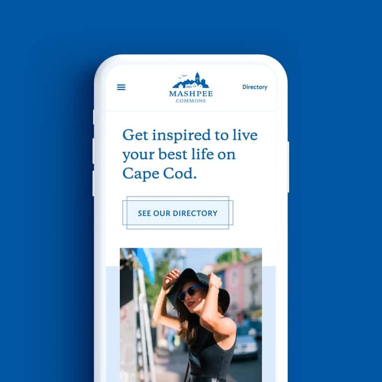
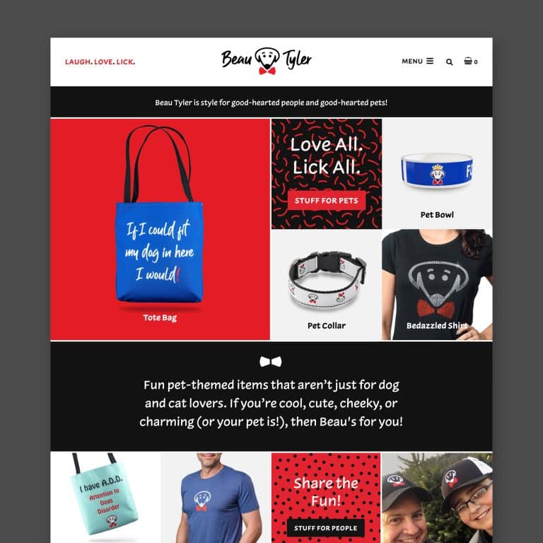
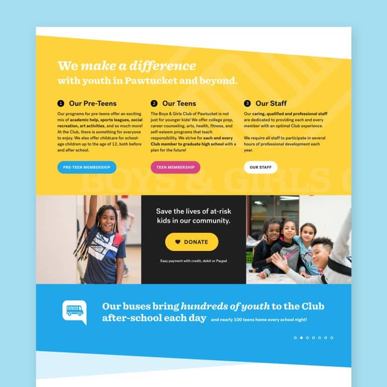
- To inform: Sharing a blog post or company news will mostly feature text.
- To sell: A sales email will outline benefits with a small amount of text, present any visuals or videos that support your message, and feature a few prominent opportunities to click the CTA (call to action). Your goal is to get readers to click within 30 seconds.
- To excite: Launching a new product? Don’t make people spend their energy reading. Stick to lots of images that will drum up excitement and a CTA link to more info or the product listing.
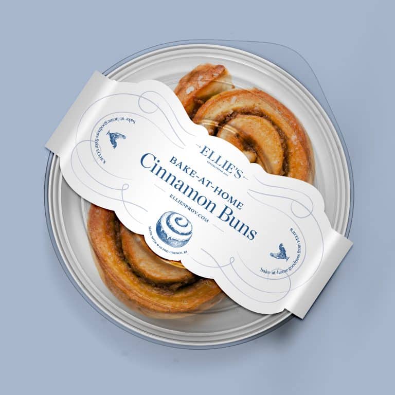
- Shrink your logo.
When done well, the perfect logo is an instant brand representative, and it’s tempting to give it prime real estate at the top of your email.
But your readers can see who the email is from before they open it. Don’t waste precious space with a huge version of your logo at the top.
Instead, immediately give them something valuable to digest, and keep your logo as a small icon or part of a header image to reinforce your brand.
It’s even OK to put it unobtrusively at the end of your email.
- Cliff notes only.
Most readers will shut down when they see a wall of text.
If you make each email a newspaper, little to nothing will get through. Don’t assume your readers want to know about what’s important to you and your business – they want bite-sized nuggets that clearly convey how you’ll make their lives better.
Frame your news in benefit language: what does my customer get or accomplish by buying from me?
It’s perfectly OK to send an email with just one focus.
If you include multiple tidbits, utilize short sections with prominent headlines and keep each campaign to no more than 3-4 sections.
- Nail your subject.
No matter what type of email you’re sending, a knockout subject line and preheader text (the bit that shows in a reader’s inbox before they open your email) are critical.
Generic or vague subjects are just wasted real estate.
The time you spend crafting short, compelling teasers can mean the difference between being opened or trashed.
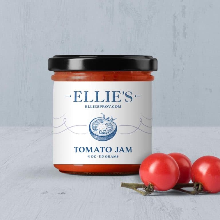
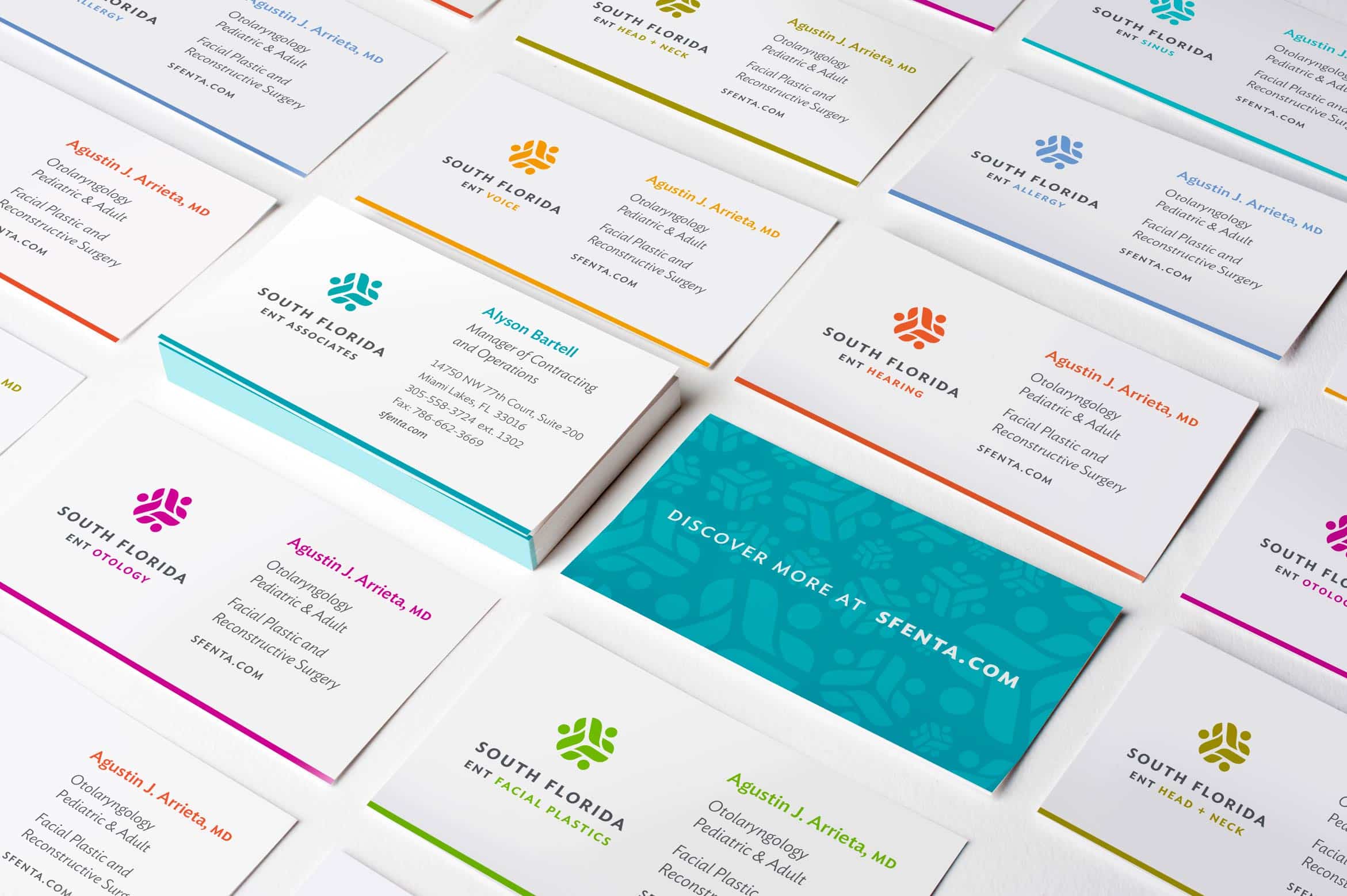
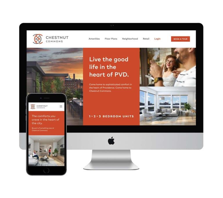
- Leverage brand colors and fonts.
By harmonizing your visuals across all your marketing channels (website, email, printed materials, signage, etc.), your brand will consistently shine and build up that oh-so-valuable trust.
Choose a serif or sans serif font that’s easy to read and supports the style of your logo. Change the size and weight for headlines and CTAs to draw attention to certain text while maintaining a cohesive look.
Utilize pops of your brand color in headings and CTA buttons to further evoke your brand and style (don’t mix link colors with heading colors, though – readers may be confused about what’s clickable).
Last but not least: Keep white text on a dark background to a minimum. It’s much easier for your readers to absorb dark text on a white background.
Time to bring in a pro?
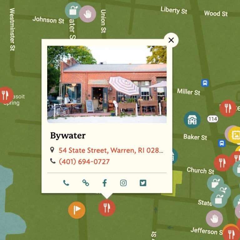
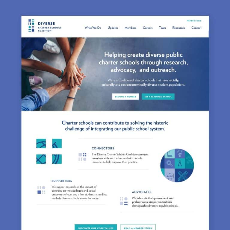
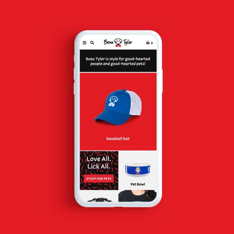
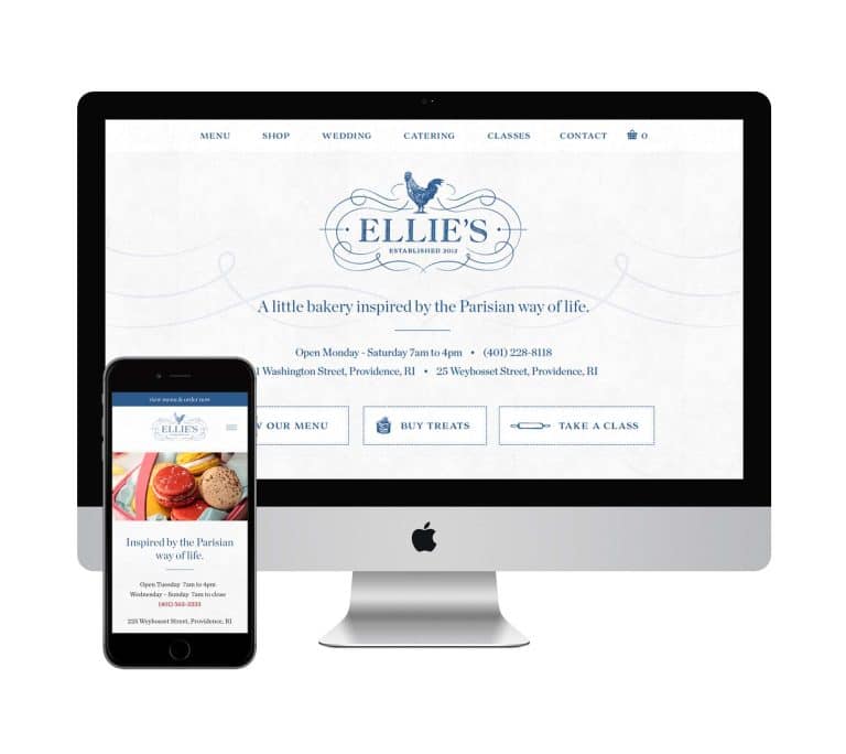
Email templates are an example of a quick add-on project that I love to do for clients after we’ve worked on a larger core project, like a logo or web design.
Those larger pieces of branding create the trust needed to quickly and effectively whip up these extras and tie all of a business’s visuals together with a bow.
If visual design is not your wheelhouse, your brand will benefit from investing in a relationship with a high-impact visual designer (like me!) who will spend the time learning about your marketing needs.
Think of it as a gift (to yourself) that keeps on giving.
Here are 11 questions you’ll want to ask to find a good fit.
Key Takeaways:
- Consistent, clear design – everywhere your clients and customers find you – strengthens your brand.
- An email marketing template reinforces your brand, saves time, and focuses every campaign you send.
- Not all types of emails are the same, and if your campaigns have varying goals you should design a separate template for each.
- Simple techniques – such as writing a strong subject line, trimming your copy, minimizing your logo, and leveraging your brand colors and fonts – will make your email template more effective.
- Investing in a visual designer to create several templates you can use will whip your email campaigns into shape so you can focus on other things.
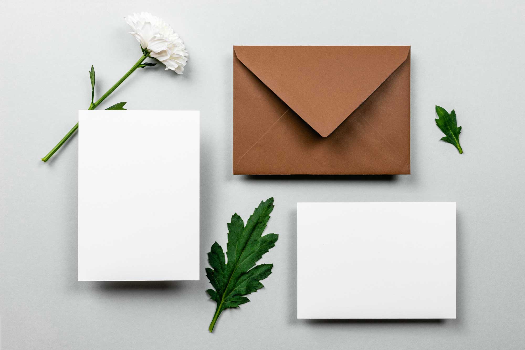
NOTE: Images in this post are by Edward Howell, Diana Akhmetianova, and Razvan Dumitrasconiu
It's hard to market an unfocused brand.
Your business must tell a powerful story with strong optics and a persuasive storyline so you can stand out from the crowd and change more minds. Get a brilliant visual framework tailor-made for you.


