What is a CTA and Why do I Need One on my Website?
CTA. SEO. HTML. LOL, amiright?
In today’s episode of “what IS that website acronym?” we’ll be introducing you to your new best friend: the CTA.
Short for “call to action,” a CTA is the clear, concise, direct invitation to your website visitors to do what you want them to do. Once you’ve given them just the right amount of information about what you provide and how it will change their lives, your CTA is going to tell them exactly what to do first, or do next, to move from being a potential client to a real one.
Why do I need a CTA?
A CTA is critical on your site because, in a world that is saturated with both information and options, the CTA brings it home.
People crave bite-size chunks of tasty, relevant info.
When choosing where to spend their money, they really, really want and need guidance for their overstimulated brains. A good CTA is the perfect nudge and signals relief to your site visitors because it narrows down their options to one tasty choice. It is the difference between making it very simple for people to move forward right now, or leaving them to just drift off and move on.
Psychologically speaking, there is great power in asking for what you want.
Think about dating. Now, in this world, as with customer attraction, you don’t want to be pushy. But think about which option is truly compelling. Is it the guy (or girl) sitting at the end of the bar, looking hopeful, waiting for someone to come up and ask him what he has to offer? Or is it the guy that walks right up, introduces himself and asks you out – who clearly lets you know that he’s interested and that he wants you to choose him?
So go ahead and ask! The language and style of your CTA will give your potential clients key info about whether they want to accept that date.
What makes a good CTA?
CTAs should be short, sweet, and very clear. Examples of good CTAs include:
- Subscribe to our mailing list
- Sign up for free
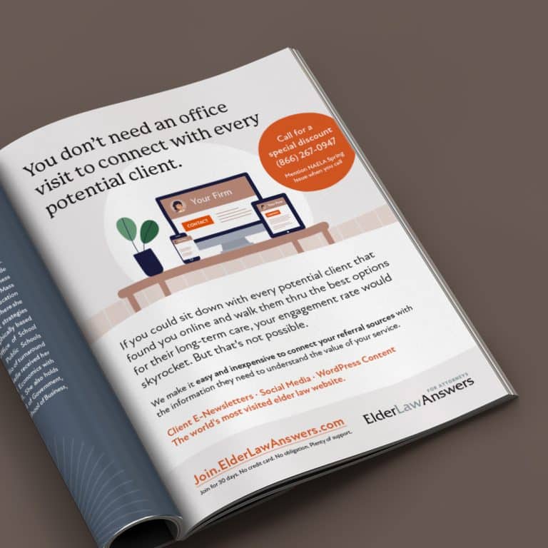
- Call for a free consultation
- Book now
- Send me coupons
- Get started
The beauty and power of web CTAs are that they are generally designed on buttons (or in text links) that take the user immediately to the action they’ve clicked on.
A “subscribe” button should take users directly to your email signup form. “Call now” should open their phone app for seamless calling on mobile devices.
Crafting the perfect CTA
There are three main components of crafting the perfect CTA. First, you need to determine what you really want your web visitors to do.
If you ask them to do something that’s not very relevant or useful, you risk losing them in the process. Your CTA doesn’t have to push a hard sell, but think about what you want them to do that will keep them in the pipeline of considering your product or services. Or continue cementing your brand. Signing up for a mailing list, reading through your success stories, or sharing content on social media are all examples of steps you may want web visitors to take that don’t involve a sale.
Second, you want to carefully choose your wording. The language you use should be clear & concise and should be an extension of your brand voice.
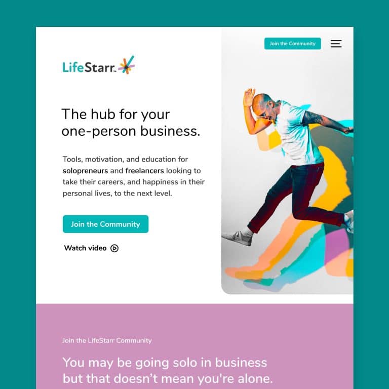
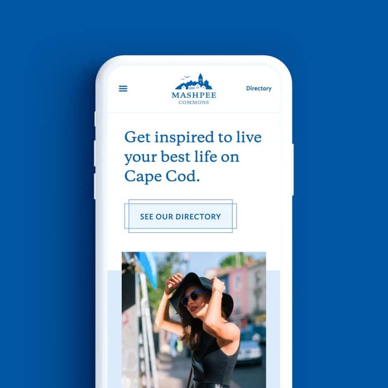
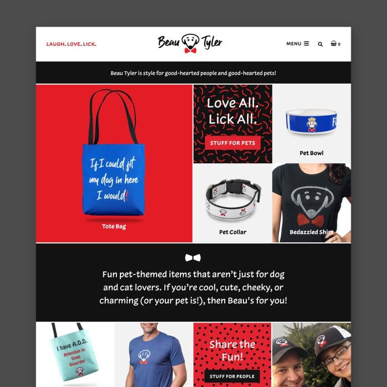
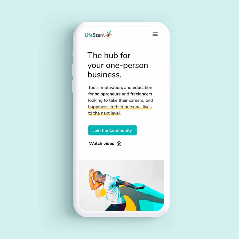
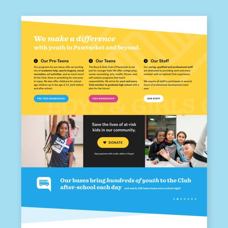
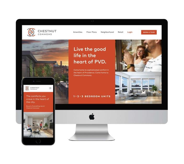
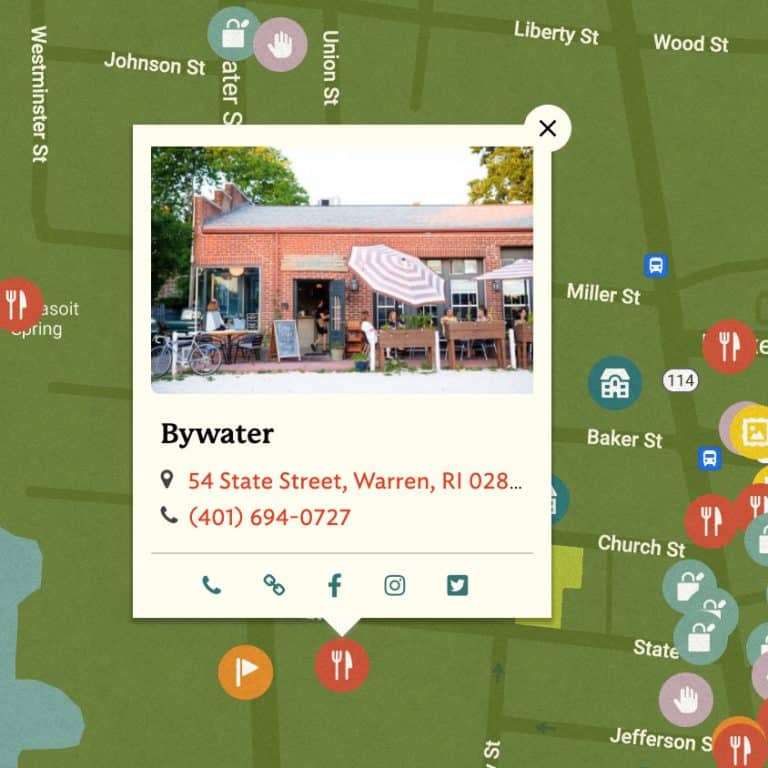
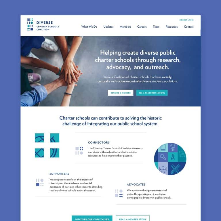
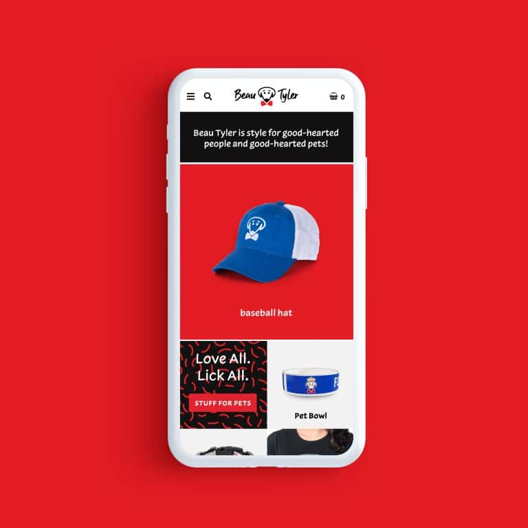
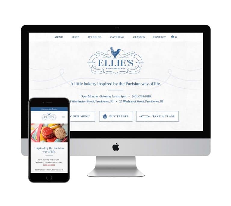
The words and tone should echo other pieces of content that people might have already absorbed when reading about your services or benefits, and it will also convey a sense of your brand persona. Check out these examples of great CTAs that nicely fit their brand.
Third, you need to determine exactly how much information your site visitors need in order to be ready to take action.
You wouldn’t ask someone to BUY NOW before you’ve described how what you’re selling will revolutionize their lives! The nudge will only work when all of the other information is complete. A well-designed site will nestle it perfectly on the page where it’s most likely to be effective.
Crafting simple things isn’t usually simple.
For some businesses, crafting the perfect CTA will be clear, and for others, it may take time and consideration.
For example, if you provide a unique or specific service, you’re not necessarily going to ask people to BUY NOW or even to call you right away. As an example, I’ll use a small business marketing firm I designed a site for, JScott Marketing. As a niche firm, the owner doesn’t want to field calls from poorly matched web visitors all day long! But she still wants the right web visitors, true potential clients, to take action to move forward.
So I designed the site around making sure that not everyone takes action.
Along with making sure that qualified potential customers are ready to move forward, crafting the perfect CTA has another important goal: it actually helps weed out people who aren’t a good fit for your product or service (otherwise known as a huge timesaver!).
Can I have multiple CTAs?
This “weeding out” process can come into play when having more than one CTA is truly the right choice.
For many businesses, it’s just not possible to share all the info necessary for customers to make a choice on the home page. What if a customer isn’t ready to sign up, but isn’t quite ready to leave the page yet?
“Mini CTAs” guide site visitors through the site to the places they need to go, in order to get the info they need. At each stage, we assume (and accept!) that people who are a bad fit will drop off. You may choose to feature an initial CTA that leads them to check out your success stories, or to a page that intelligently lays out the benefits of your products for the right customers.
For most of my clients, their product or service isn’t universal or easily explained. They’re (generally) not plumbers or iPhone repairmen – so having a CTA right at the top of their homepage might be a waste of space. I work carefully with them and compile info about their unique business gained through interviews and research, to set up the wording and placement of each CTA.
Remember, people are overwhelmed and often suffer decision paralysis. They need to be won over. The majority of websites out there don’t have a strong, well-placed CTA and that is a lost opportunity for converting hard-won website visitors.
It's hard to market an unfocused brand.
Your business must tell a powerful story with strong optics and a persuasive storyline so you can stand out from the crowd and change more minds. Get a brilliant visual framework tailor-made for you.


