
Top Nine Web Design Mistakes – Which Ones Are You Making?
Competition for your customers’ attention is stiff – and getting stiffer.
Your website has to be on point – attractive, functional, user-friendly – to showcase your brand and make conversions seamless for your customers.
But simple web design mistakes can give your site an amateur feel that detracts from your message and makes it frustrating for your customers to connect.
While making one of these mistakes on its own may not be too damning, if you’re guilty of a handful or more, your customers may also worry that you aren’t focused on making sure your products and services are as fresh and solid as they can be, either.
Many of the mistakes have simple fixes you can make on your own. For large-scale changes, a good visual designer will be able to get you on the right track to a gorgeous website that works hard – and really works.
Outdated practices now considered web design mistakes

Best practices in web design shift over time and naturally evolve with trends and with technology.
Some of the web design mistakes I talk about below are simply outdated practices that miss an opportunity to take advantage of how your customers are using the web now.
If your website hasn’t been updated in a while, or if you recently created it based on an out-of-date impression of what makes a great website, here are some overt mistakes to look out for.
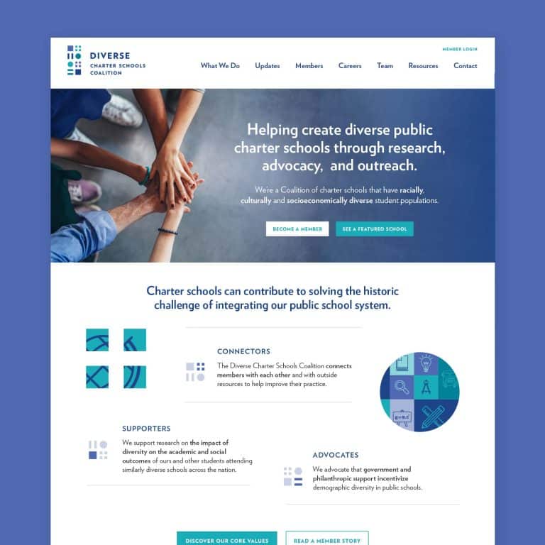
- ‘Home’ is featured in the navbar
This is a throwback to early web design when including a ‘Home’ link in your navbar was standard. Now, users are accustomed to clicking on the business’s logo to return to the homepage, if and when they need to (which shouldn’t be necessary if your site is designed well).
Continuing to feature a ‘Home’ link in your navbar adds clutter and wastes vital space that could be better organized to help visitors quickly navigate to the information they need.
- Centered paragraphs of text
While headlines, short testimonials, and visual elements can be centered, any block of text longer than two sentences should be justified left. Bulleted lists, too.
When we’re reading a paragraph of text – as we would in a book – our eyes naturally want to jump to the same horizontal spot on the next line to continue reading.
When the line doesn’t begin where your eyes expect it to, your eyes have to do more work. Tired customers are more likely to leave your site, and left-justified text will make it easier for them to find what they’re looking for.
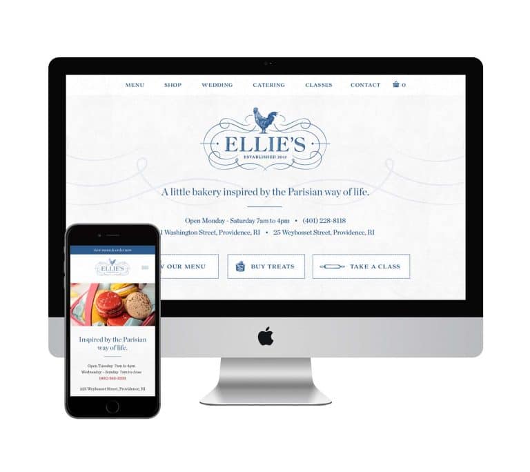
- Too much text on the homepage
Even when beautifully justified left, too much homepage copy is a total buzzkill.
When potential customers come to your site, you want them to quickly get a sense of who you are, getting just enough information to be pulled along on the seamless path to becoming your customer.
Nobody wants to read your company’s entire history – or, really, hear much of anything about you, for that matter.
The story your customers need to hear helps them see themselves as the hero of your story, solving their problems by choosing your brand. It creates an invitation that compels them to join you.
Be ruthless with curating your content. The vast majority of site visitors won’t read your company history, so move it to an ‘About’ or ‘Team’ page where it’s available but unobtrusive.
Making the most of your opening statement and your call to action (CTA) will bring you far more conversions than paragraphs of even the most beautifully written copy.
- Two words: ‘Click here’
When you use ‘click here’ as anchor text, you’re using more words than needed (see above) and you’re asking your users to do more work than they need to.
It’s not immediately apparent what the result of ‘clicking here’ will be. Users have to read before and after the ‘click here’ linked text to figure out where the link will take them and why they should visit.
Instead, embed your links in text that is action-oriented.
Bad: Click here if you would like to read a post about good website design.
Good: See my corresponding post on good website design.
Strong anchor text can also boost SEO since search engines weigh anchor text slightly higher than regular text. That should give you extra motivation to emphasize keywords you are trying to rank for.
- Non-clickable colored text
Just because you can change the color of text on a page, doesn’t mean you should.
Text in a sentence that appears in a different color font but is not a clickable link confuses most users who expect that convention to indicate a hyperlink. To make text stand out, you can use bold text.
Also, some colors of text may not be easily readable to visually challenged eyes. Bright and pale colors may not provide enough contrast. Visitors may have different monitor settings, too, so that what you can easily read on your screen disappears on their screen.
A safe choice is to use black (or my personal favorite, dark grey) for all of your copy and allow your CMS (content management system) to automatically change only hyperlinks to the pre-set link color you have set in your design scheme.
Web design mistakes that reflect a lack of strategy or skill

If you’re building a website on your own, keep an eye out for these common mistakes that reflect a lack of strategy or skill.
You may be able to make headway with research, time, and effort. But I recommend hiring an expert to remedy these mistakes.
When you can invest in great results, they often pay for themselves many times over in the form of conversions, brand appeal, and customer loyalty.
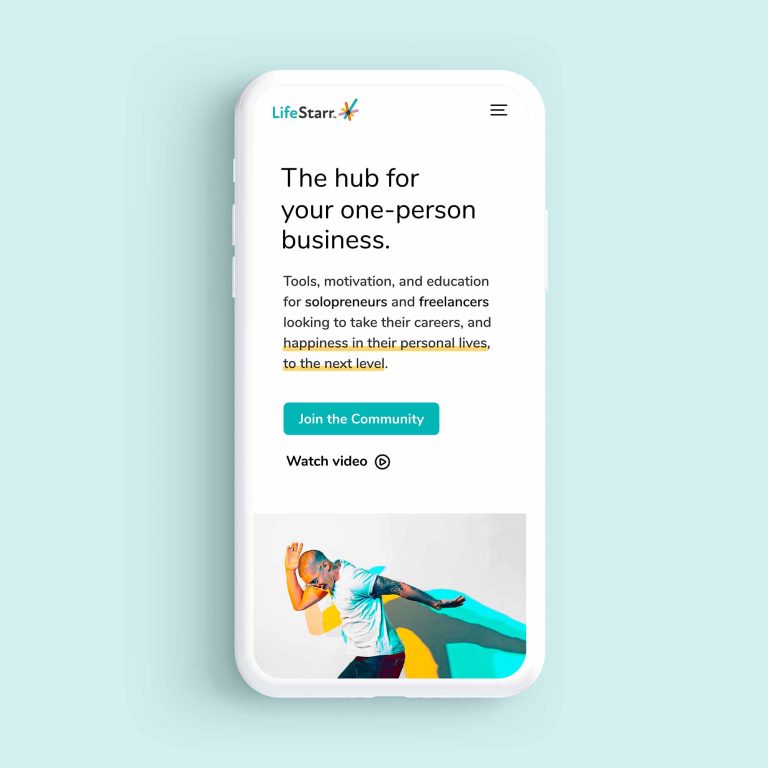
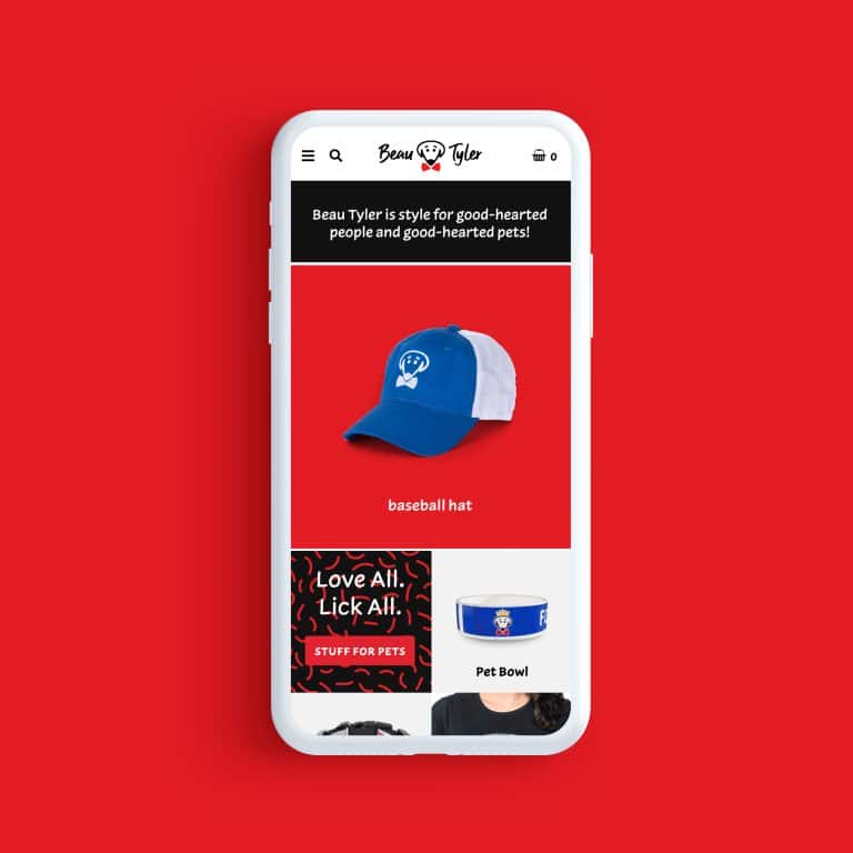
- Non-mobile-friendly
Worldwide, mobile web traffic has increased 222% in the last seven years and the mobile share of search engine visits has increased from around a quarter to over half in that time.
It’s very likely that a majority of your website visitors are viewing your site on a mobile device, and if it isn’t mobile-friendly, they’ll leave the second they arrive.
A mobile-friendly website includes:
- Text that is easy to read without zooming or swiping
- Clearly displayed CTAs
- Simple menus or a hamburger menu icon
- Simplified content and structure
- Vertically stacked content where applicable
Read more about mobile-friendly design in this comprehensive guide from Quicksprout.
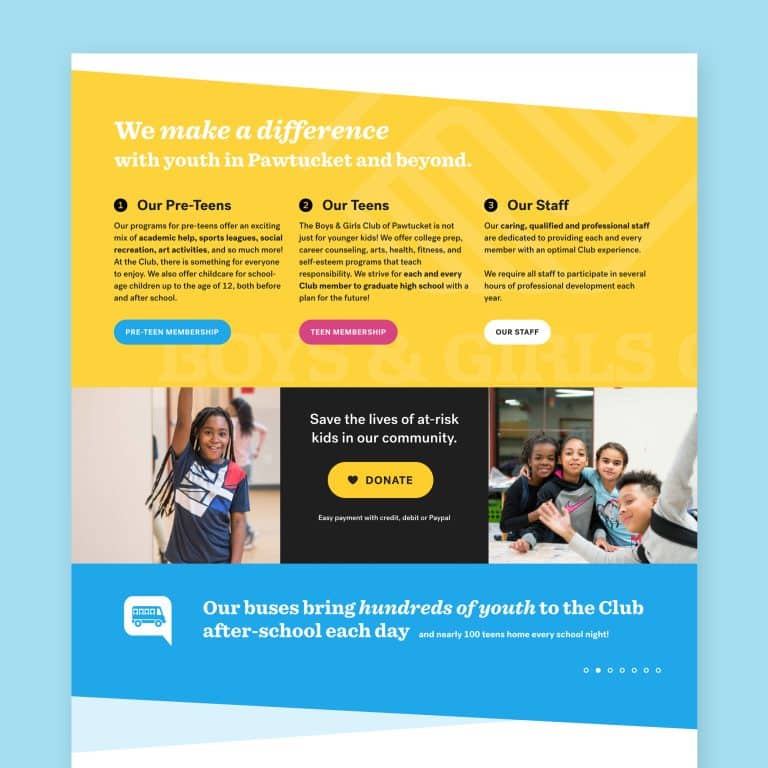
- No clear explanation of what your business does
You have about five seconds to capture your readers’ attention and interest.
Brevity is an understatement here, but you have to say more than “We Do Plumbing.” You need a 1-2 sentence message that answers the question of why I would hire your plumbing business.
This is my specialty and my great joy: using visual design to help bring your business into sharp focus, stand out from your competition, and be loved and understood by your customers.
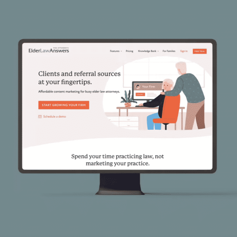
- No clear call to action (CTA)
From what to wear, to what to eat, to what to watch, we make hundreds of decisions every day.
I promise you this: the way to convert customers is to quickly give them a reason to choose your business, and then make it really easy for them to do. A good CTA is short, sweet, and very clear:
- Subscribe now
- Sign up for free
- Book now
- Get started
For a deep dive, check out my post on what a CTA is and why your website needs one.
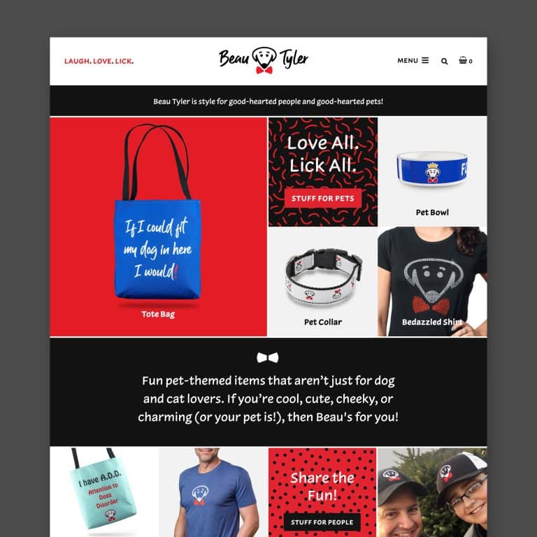
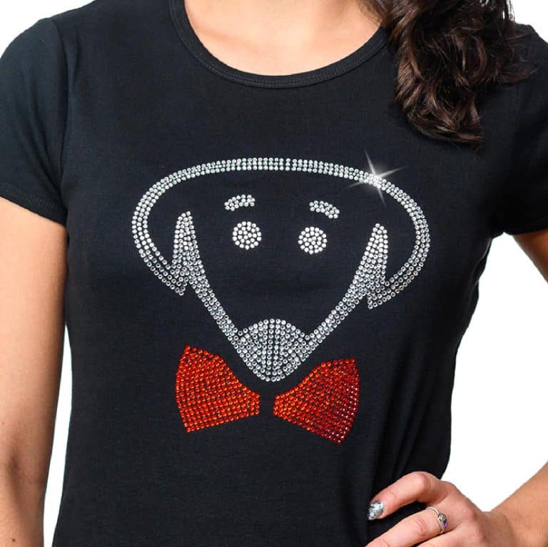
- Bad stock photography
Your website visuals need to convey value. Bland stock photography (including the dreaded handshake photo) may convey a generic concept like professionalism or happiness, but wastes an opportunity to showcase what’s special and amazing about your brand.
A great photo will tell people why they should give you their money.
Choosing good stock photography should be a time-intensive process that starts with a loose theme, then proceeds as you carefully – through gut instinct – curate images that are compelling, consistent, and speak to your business personality.
Errors on your website can damage your brand and render your efforts ineffective by missing opportunities to hook visitors and lead them to a sale.
Avoiding all of these problems won’t automatically mean that you have a gorgeous, perfect website.
But your return on the investment of time, money, and intention you put into creating a solid, up-to-date site that uses current web design best practices will be well worth it.
Would you like help clearing your site of common mistakes and creating a gorgeous, seamless path to conversion? If you think I might be the right partner, check out my Project Start guide.
Key Takeaways:
- Web design mistakes can damage your brand and reduce your sales.
- These mistakes make users work harder than necessary to get the information they need, and they make your brand look outdated and less professional.
- Many common web design mistakes can be fixed easily on your own.
- Thornier web design mistakes require more research and time to remedy and would benefit from a visual design expert producing a gorgeous result that frees you up to focus on what you do best in your business.
It's hard to market an unfocused brand.
Your business must tell a powerful story with strong optics and a persuasive storyline so you can stand out from the crowd and change more minds. Get a brilliant visual framework tailor-made for you.


