")
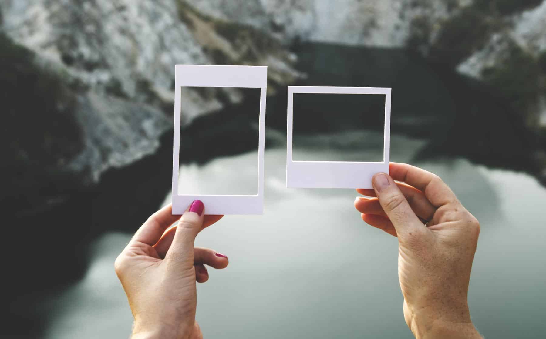
How to Choose Good Stock Photography (and where to find it)
Cheesy stock photography: You can spot it a mile away. That generic smile, the forced pose. A sense of disconnect, or a feeling that you just can’t relate.
It might be technically pretty, but those negative feelings make it a poor choice for representing a brand that strives to be authentic, honest, and connected to its customers.
There’s a world of gorgeous imagery out there, ready to speak volumes for your business – and I want to help you find it!
Why you should avoid generic stock photography
Far faster than it can bring up a specific thought, an image accesses our emotions. We use these instant emotional “surges” to determine what things are worth our time and energy.
We use them to gather information about the people, places, and things we’re viewing. So you want potential customers who interact with your brand to feel something – and generic images give little for customers to connect with.
Generic images are bland filler. They leave the viewer without any sense of what it would feel like to work with your specific business.

With these types of images, customers may sense that you’re trying to convey that you work hard, you’re professional, and you enjoy your job. These are all overarching concepts that stock photography is capable of hinting at. But customers won’t get any sense of your brand’s personality, your vibe, or what truly sets you apart from other businesses like yours.
With bad or generic stock photography, feeling “nothing” is kind of the best-case scenario.
Beyond that, your customers may actually develop a subtle impression that you don’t care enough to put your brand’s best foot forward, or weren’t willing to take the time to fully convey your capabilities and strengths.
Types of images to avoid
Generic stock photography that leaves viewers feeling flat may include images of:
Handshakes

Business meetings or conferences

Workers at a computer or desk

Sales presentations

Workers smiling, looking stressed, or pointing

People looking excited for no good reason

Whiteboard or chalkboard messages

Money

Graphics of buzzwords, like ‘strategy,’ ‘innovate,’ and ‘goals’

Posed photos, or images where everyone looks perfect

Photos that show many ethnicities for the purpose of suggesting diversity

If you struggle to avoid these image constructions, find a sponsor that you can call when you’re tempted to select one!
What makes a great image?
Now that I’ve scared you away from truly awful stock photography, let’s pivot to the process of finding great images.
If you make it a priority and practice your eye, this can be a fun part of defining and presenting your brand!
Your topmost goal in choosing quality stock photography should be to select images that access all those positive feelings that the generic images neglect.
Emotions are the driver of all decisions, including when we open our wallets, and how much we spend. A great photo will make a potential customer feel good. Feel desire. Feel connected to your brand, and feel that your brand aligns with their goals and dreams.
Plainly put, a great photo will tell people why they should give you their money.
How to find good stock photography
- Give it time.
Don’t rush the process of finding quality images that truly speak to your brand and the message or content you’re trying to convey.
If you’re designing a new website or marketing piece and you’re not investing in professional photography, build in time for photo research. Even if you think you know exactly the type of image you’re looking for, try going in with an open mind to see what speaks to you.
But expect that likely 95% of what you find may not work for your purposes.
How much time does it take? I often think it’s going to take me a few minutes… then about an hour and a half later, I finally feel like I’m getting close. Your time range will depend on the project, the feeling you’re going for, and how practiced you are at knowing when you’ve landed on the perfect image. Sometimes it’s an hour, an hour and a half, sometimes significantly less. Allot an hour if you’re trying to find one good photo, but if possible, do not set time limits. Keep looking until you find the image that totally jives with your message.
- Start with a loose theme.
Maybe your brand is bold and bright. Images that feature a strong color from your logo, perhaps in what the person is wearing or in the background, can really pop. Or maybe the style of the photo goes really well with the feeling of your brand. Is it sassy? Whimsical? Imaginative? Cleanly designed?
- Think: Eye-catching.
I look for a photo that has something different about it. Something that makes it the opposite of generic.
If I’m looking through scores of images on a page, I’ll scroll at a pace that lets me just make them out, to the point where one that catches my eye in a subconscious way will stand out from the rest.
If from a pool of 300 images, I wind up with three or four that struck me, then I’ll take the time to think more deeply about why they stuck out and whether they stand up to scrutiny.
- Go concrete or totally abstract.
Avoid the trap of using photos in the “middle ground,” ones that are related to the concept you’re conveying – but in a generic way.
Make a statement by either concretely referencing an element of the concept, or abstractly referencing the emotion.
Say you’re a business coach aiming to communicate the importance of turning your phone off at specific times of the day for time management. Rather than a photo of a businessman with a phone, you might look for a very concrete image of a bright old rotary phone with the receiver off the hook. This image will get more attention – and convey your point more effectively – because it features an object we no longer see every day, and because it can pop with an appealing color or visual style.
If you choose to go abstract, just make sure the photo has some pop or visual interest, and that it connects in some way to your project’s theme, overall brand style or strategic intention.
- Pursue visual consistency.
I’m not taking back what I just said about being eye-catching, and abstract.
But spend time curating a visual consistency that is totally unique to your business. When multiple images will be used in one platform, or even across multiple marketing materials related to your brand, consistency carries a lot of weight.
Consistency makes people feel safe. They can recognize it and describe it. It reduces confusion, which if unchecked can cause potential customers to avoid your brand entirely.
One way to support visual consistency is to use images from the same photographer, or even from the same shoot (see my go-to stock photography sources below for more on this). Even if you use one image of people and one image of a detail from the scene, the lighting, tones, and textures will be the same. If you’ve chosen really well, it can almost look like they were shot professionally just for you.
- Check your gut.
Ultimately, allow the process of choosing images to access your feelings.
Let them guide your choices. If something doesn’t feel right to you, discard it immediately. Seek out photos that feel real and authentic. Ask yourself: Does this image depict real people? Would this happen in real life? Will it help my customers to see themselves using my products and services?
- Curate and compare images.
Use the techniques above to help you narrow down the possibilities, then spend time comparing the images that have initially caught your eye and fit your theme.
Some online services feature a lightbox or gallery in which to collect images for comparison, or you can keep multiple tabs open in your browser.
You could choose to get feedback from others and check their gut reactions at this point.
This collection of images may even serve as a pool of photography for future needs (such as for regular blog posts or adding new pages to your site) so that you don’t have to start the process over again every time.
tipIf you’re about to begin an image search but you really only have five minutes? Consider whether you really need an image.
Since a poorly chosen image can actually detract from your message and do more damage than having no image at all, it may be better to ask whether you really need an image. You may have a greater impact by teasing out a short quote or statement from your writing for a pull quote at the top.
Easy (and sometimes free!) sources of good stock photography
- Unsplash
Unsplash offers a free collection of gorgeous, “do whatever you want” photos (meaning there are no limits on how the photos can be used, or requirements to list the photographer).
There’s a good variety of professional, non-cheesy stock photos (although there are definitely some cheesy ones mixed in there, so note my advice above). You can search by keyword or browse curated collections on topics or themes.
Signing up for a (still free) account gives you the option to create your own collections. Additionally, Unsplash (along with Death to Stock, see below) feature more images of models who are “perfectly imperfect”: older, with messy hair, or otherwise look like normal humans.
- Death to the Stock Photo
Death to Stock features solid collections of beautiful imagery (and video) that is ideal for blog posting.
Monthly memberships for a single business or brand begin at $12/month, but they also offer a free membership that gets you a limited selection with a good mix of photos each month.
They use a consistently diverse mix of photographers, and the images reflect that diversity. Frequently photographers shoot a group of photos with similar colors, lighting, and textures, but different subjects, for a deep catalog of visually related images.
Their catalog is set up to browse images by group, making it the easiest of all the sites to curate images by the same photographer. I may spend more time searching on Death to Stock, but I’m also more likely to find a more exciting or interesting option that I never would have originally considered.
- Picjumbo
Picjumbo is another source of free stock images that don’t require attribution.
Their catalog trends toward more generic and obvious images, but if you’re looking for a particular image and you’ve seen something like it before, Picjumbo might be the first place to start.
If you’re overall looking to spend less time sourcing a usable image, start here. Their free plan gives you access to over 2000 images; paid plans start at $10/month and give you access to more than double the images, in premium photo collections, with new photos being added every month.
- iStock
iStock is a well-known paid source with a deep catalog of professional photos and illustrations (including EPS vector files).
They also have their fair share of cheesy and generic images, but there are plenty of quality images to choose from. A helpful feature of iStock is that they offer all of their images in multiple sizes. Easily save yourself the time of resizing by downloading a smaller version of an image when you only need it for social media, email or another place where a low resolution will do just fine.
iStock includes a lightbox/album feature for collecting potential images and easily sharing that collection with other stakeholders.
iStock is the priciest of the sources listed, with monthly plans starting at $29/month for “essential” images and $70/month for premium “signature” images, but you can also purchase credits that can be spent on individual images (with no subscription required).
Remember: you get out of an image what you put into finding it. But I’m confident that if you give it the priority that it needs, finding beautiful images can be rewarding AND actually fun!
It's hard to market an unfocused brand.
Your business must tell a powerful story with strong optics and a persuasive storyline so you can stand out from the crowd and change more minds. Get a brilliant visual framework tailor-made for you.


