
Above the Fold: Are You Mucking Up the Best Part of Your Website?
Print newspapers no longer run the only game in town. But “above the fold”? Still a thing!
A quick refresher: in print news, above the fold referred to the part of a newspaper that you could see when it was folded and laying in a stack. It had to be saucy and eye-catching, a compelling combination of images and headlines that convinced readers to buy a copy and read what lay inside.
Web-wise? Above the fold web content similarly refers to the portion of your website that loads for a user, visible before they click or scroll.
Why is solid above the fold web design important?
You have about three seconds to engage someone’s attention before they decide to leave. So it’s important for this content to:
- be eye-catching and compelling
- have a clear visual hierarchy
- convey key concepts about your offerings in bite-sized amounts
Along with strong navbar design, a solid visual design above the fold makes it easy for your readers to understand what you sell and how to buy it. It will engage users on your website where they can then become your customer.
What goes into effective above the fold design?
One reason it can be hard for a non-designer to figure out what belongs above the fold is that – when working on your own business messaging – everything feels important.
It can be difficult to prioritize what belongs at the top and to craft bite-sized tidbits that will hook a reader.
A designer looks at your business and messaging through a ‘clarity lens’. She’ll ask, “What do we want readers to see first, and how do we show that in an effective way?”
Luckily, there isn’t just one answer to the question of what to display above the fold on your website. (If this were the case, the web would be a boring place indeed.)
But there are effective and energizing ways to design above the fold. Keep these guidelines in mind:
- Text length
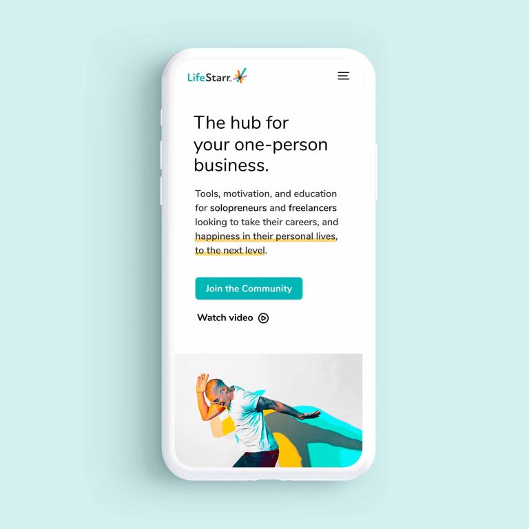
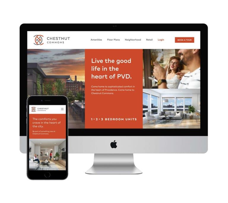
Keep the amount of copy above the fold to a bare minimum.
A reader who sees too much text will leave your site before even starting to read it. At most, there’s space for one short phrase, title, or headline, plus a 1–2 sentence description. (If the description isn’t strictly necessary, save it for another spot on your site.)
What you choose to say (with words) should be the most powerful, compelling, and succinct messaging – your “one-liner” or an extension of your logo tagline – that explains what you do, why you do it, and how you take your customers’ pain away.
After you trim unnecessary paragraphs or phrases, get rid of unnecessary words, including filler words like “very” and “that” (as in, “so that you can sleep better.”)
Don’t say: “I’m very good at cleaning your drain pipes.”
Say: “I’m great at cleaning drain pipes.”
Keep your language short, simple, and powerful.
- Contrast and coloring
Text should stand out easily from the background and be easy to read.
When it comes to paragraph text, any play in color should be limited.
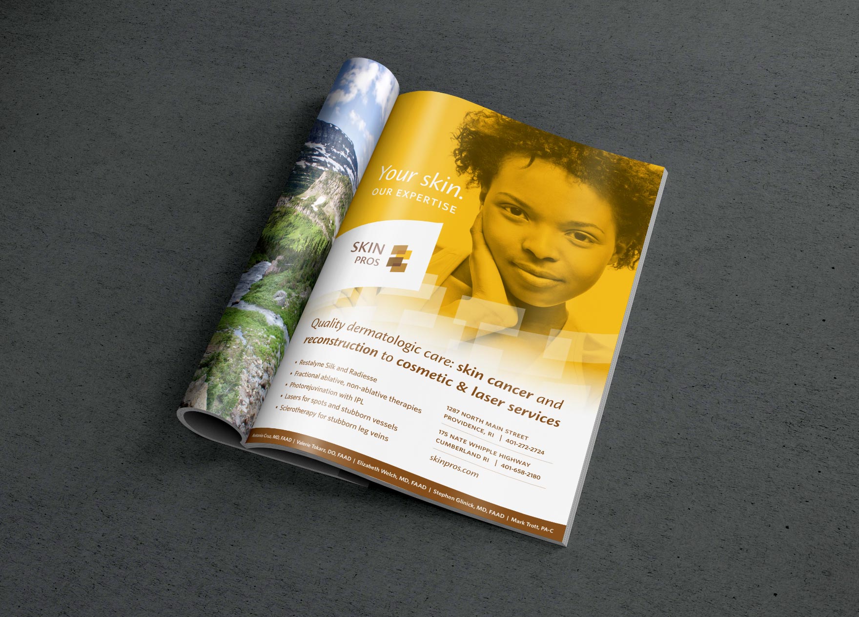
Light gray copy on a white background, for instance, or white copy on a yellow background will cause trouble for readers.
In the same vein, white copy on a magenta background may provide good contrast but be such a bright background that readers may be somewhat visually distressed while reading.
The simplest option is black text on a white background – save flashy or brand-specific colors for your logo, buttons, and other visual elements not involving multiple lines of text.
- Font size
Text copy should be large enough to be read universally: you should be able to squint and still make it out.
This ensures that readers with visual impairment or older or color-faded screens can still read your high-level messaging.
While you don’t need to cater to extreme cases, make sure that most people on most screens can quickly and easily read your copy.
- Visuals
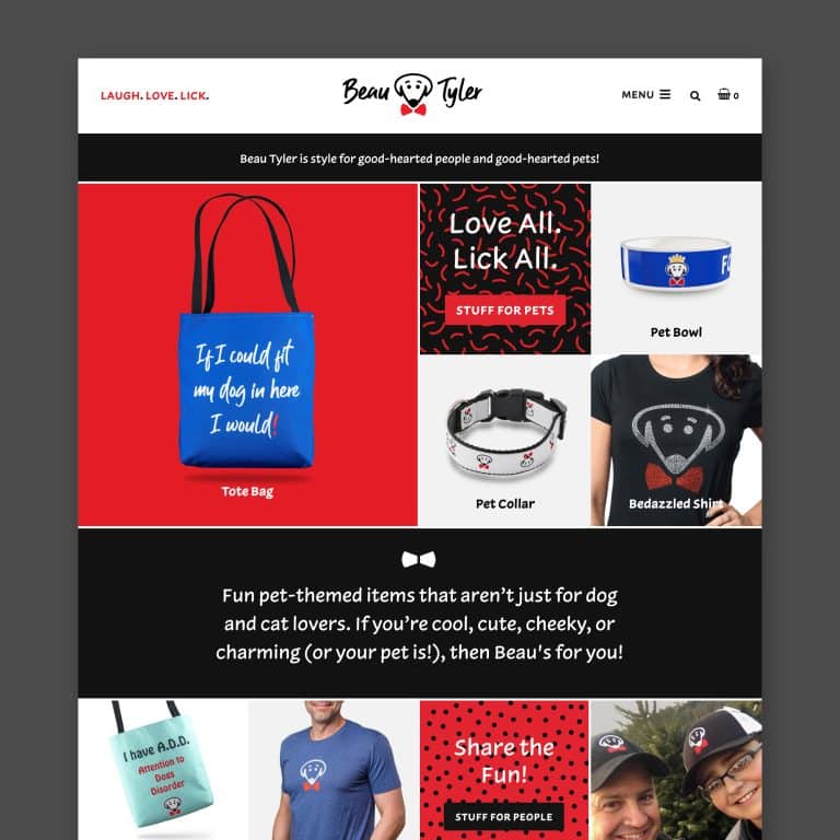
Above the fold visuals can effectively be either super creative or very simple.
The overarching guideline is to make sure there isn’t a lot of competing detail that might confuse or overwhelm the reader, making them unsure where to look first.
A good visual hierarchy will direct the reader’s attention to the first thing you want them to see.
A few ways to make a visual impact above the fold:
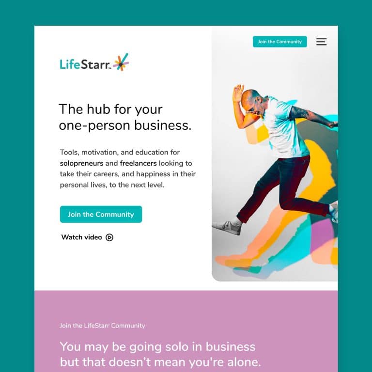
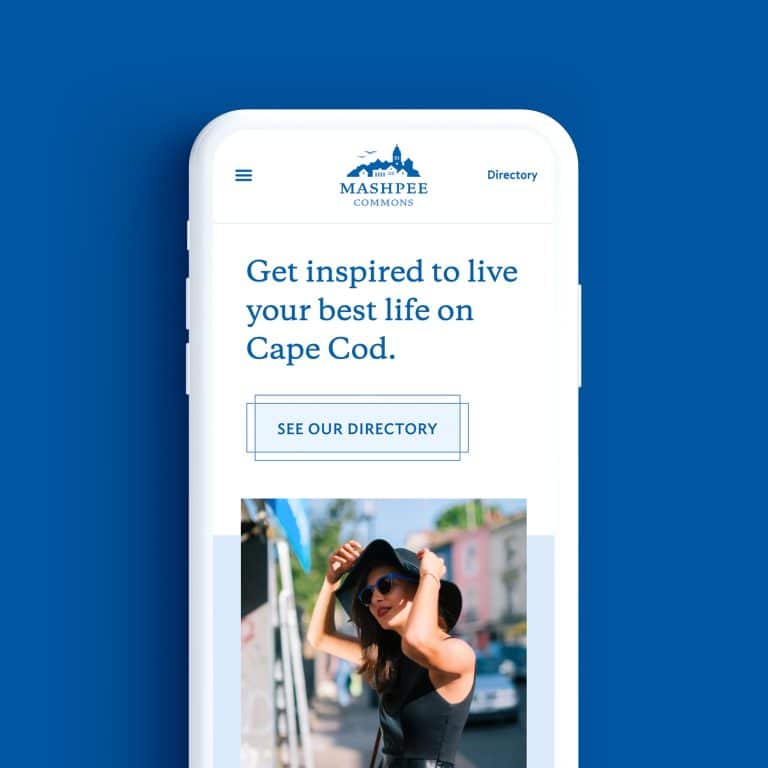
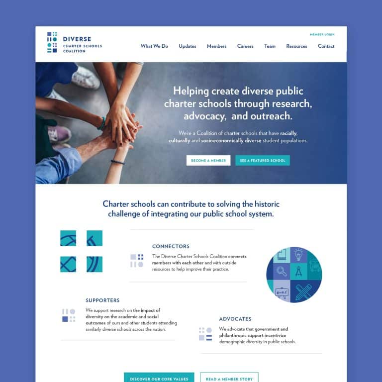
- Background images (without too much contrast or detail) that stretch the full width and height of the browser window
- Well-produced video clips, no more than 30 seconds long, without sound
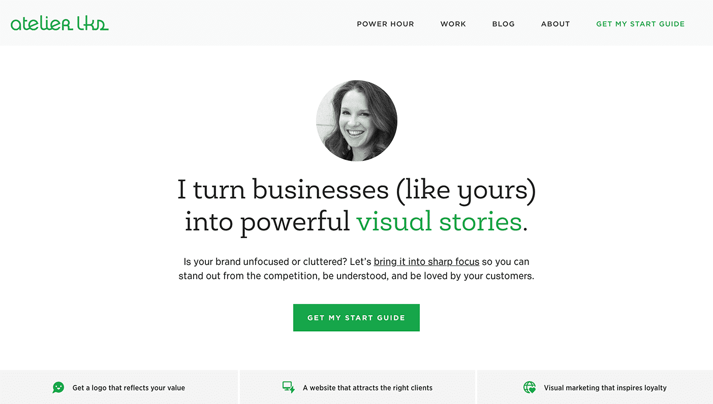
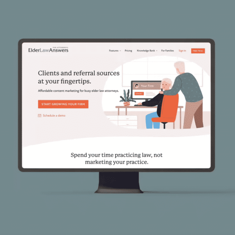
- Gorgeously designed text, with lots of white space and careful use of brand colors. For example, on my website, a simple, bold statement of what I do quickly tells readers how I can help them, in a way no images or work samples could.

- CTA
Strong above the fold web design features a call to action (CTA) that is visible and compelling, so readers can quickly take action and make a purchase.
An effective CTA could be a button or a very obvious (underlined or contrasting color) text link, no more than 4–5 words, with solid words about the benefits of your product or service.
[Read more about why you need a CTA and what makes a great one.]
Strong above the fold web design is just one example of many things good visual design can do for your business.
It’s critical to invest time and care into how your first impression (on the web) is conveyed.
If visual design isn’t in your wheelhouse, or if you’re busy getting your business off the ground, hire an expert designer to focus solely on your web design. You’ll get a valuable outsider’s perspective.
If you aren’t in a position to hire a professional, get feedback from someone smart, who you trust to be transparent about what’s working and what isn’t.
Don’t let this key piece of your business fall to the bottom of the priority pile.
Think I might be a great fit for you?
Grab my project start guide to find out.
Key takeaways:
- Your above the fold real estate is one of the most important parts of your website. Readers will decide to stay or leave within about three seconds.
- Effective above the fold web design engages users immediately and makes it easy for them to understand what you do, how you’ll solve their problem, and how to take action.
- There are many different ways to design a visually pleasing and engaging website above the fold, but you must never overwhelm your reader with too much content.
- How you handle text, visuals, and your CTA all contribute to the strength of your above the fold web design.
- This area of your website is so critical that you should consider hiring a professional to design it, or at a minimum get feedback from an honest and trusted outside source.
It's hard to market an unfocused brand.
Your business must tell a powerful story with strong optics and a persuasive storyline so you can stand out from the crowd and change more minds. Get a brilliant visual framework tailor-made for you.
Get my best tips every month.
Recent Posts - CTA


