
Spike your presentation: Five secrets to a pitch deck that sells
This article will help you:
Craft a pitch deck that leaves a big impression and inspires people to act.
In visual design, there are certain elements that function like “core muscles.”
Without heavy lifters like a powerful logo and an effective website, your brand will buckle and sag. But even with a strong core, if you want to dance like JT and his friends, your brand will need support from the “minor muscles.”
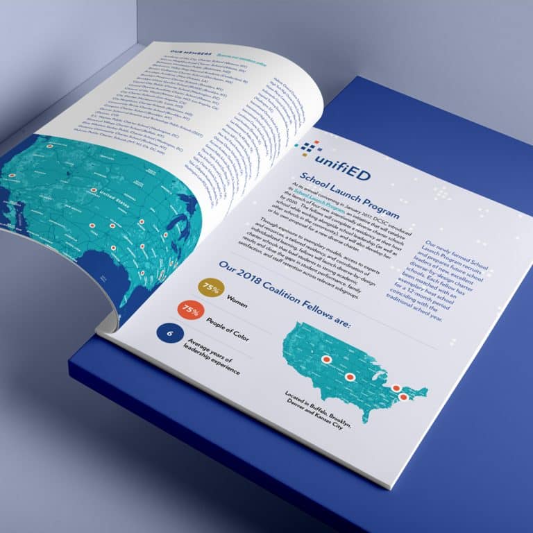
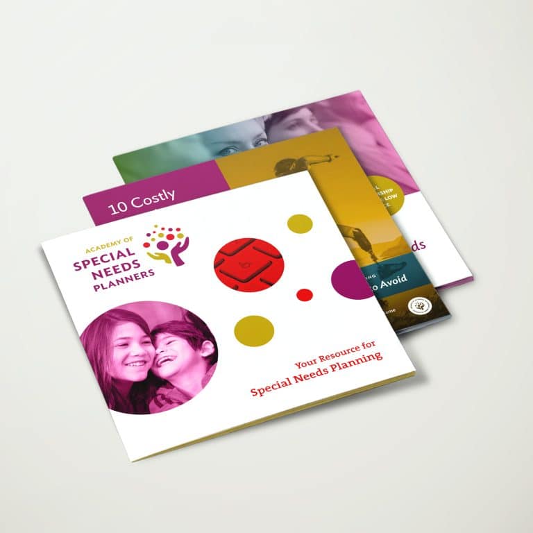
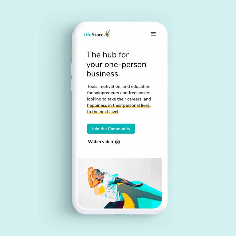
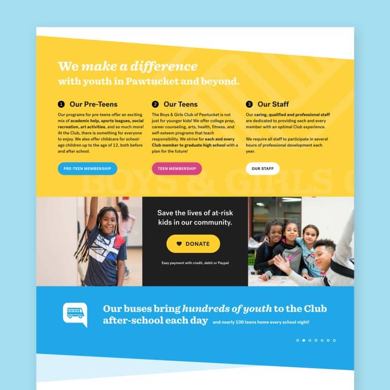
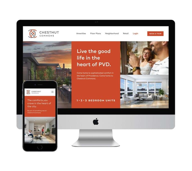
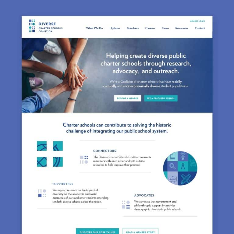
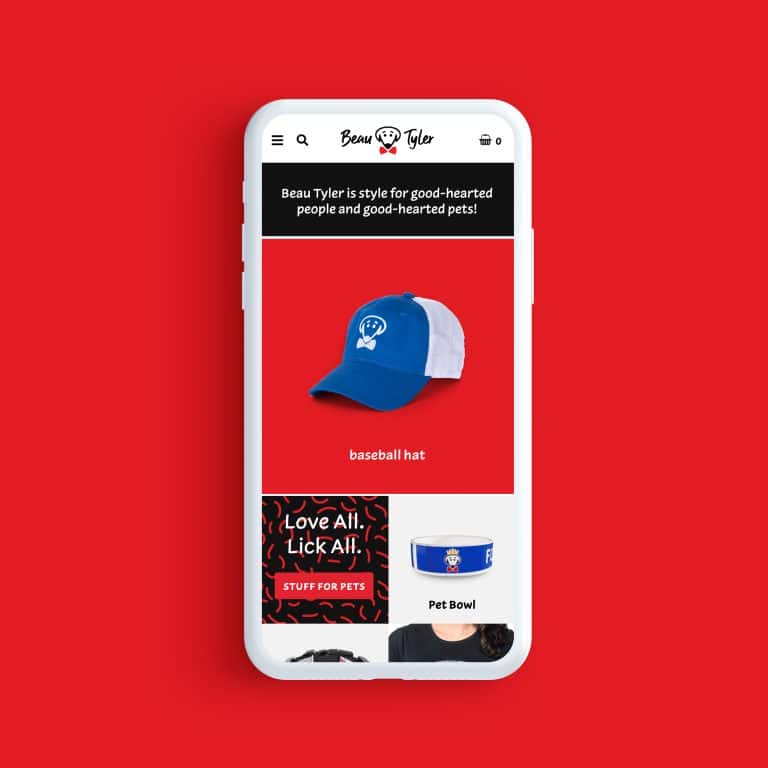
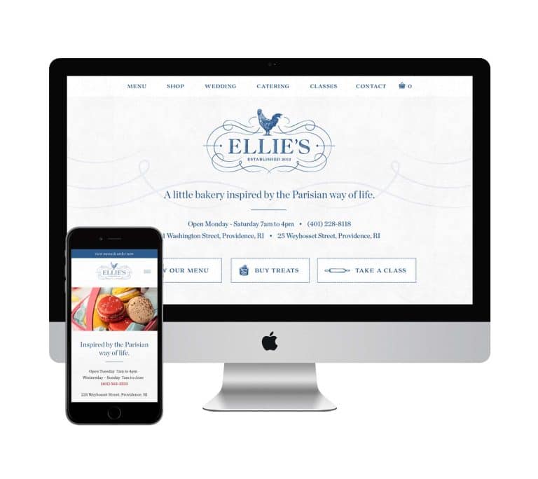
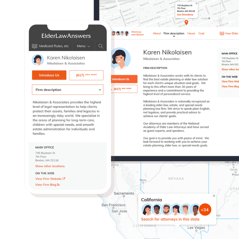
Thoughtful touches like an email marketing template, a specialized contact form, and an impressive proposal elevate your brand and tie all the pieces together in a slick, professional package that will convince your prospects that you’re worth more money.
Today we’re focusing on another one of these supporting “muscles” that help your marketing dance. Having a strong pitch deck will wow your audience and build trust from the start, as you impress them with an attention to detail that will take their project to the next level.
What can a great pitch deck do?
If you think that a pitch deck doesn’t apply to you, think again. Pitch decks aren’t just for entrepreneurs raising capital.
Any time you create a visual presentation, you’re creating a “pitch deck” designed to sell. The product could be an actual widget or even your expertise. And by thinking of every presentation as a “pitch,” you’ll give it the weight it deserves.
A great pitch deck takes your ego out of the way and leaves your audience with:
- A clear understanding of the value and benefits of your product, service, or ideas
- A clear sense of what you want them to do with the information
As you can see, a pitch deck designed with these elements in mind is going to leave a big impression and inspire your audience to act.
Are you ready to learn how to turn your generic slides into a subtle-yet-effective piece of marketing? Super! Because I’m here to share a few design secrets that will win you more business and boost your bottom line.
Five secrets of a great pitch deck

- Start strong.
Don’t think of your first slide like the title page of a book, that readers will skip right past on the way to chapter one.
Instead of slapping up your logo with the title of the talk, take advantage of the fact that your audience might be looking at it for two, or even ten minutes before you start speaking. Leverage your first slide as an opportunity to connect with your audience.
The best way to do this is to frame the problem you’re about to solve, ask a question that gets them thinking about how your information will help them, or drop a fun hint about a key nugget they’ll learn. This immediately shows your audience that you understand what they need – and it’s less likely they’ll be bored!
For example, someone crafting a presentation for a meal planning service might change their title slide from “XXX Meal Service” to:
- “Let’s make dinner easy for busy families.”
- “How do we take the stress out of feeding your family?”
- “Imagine dinnertime with smiles instead of stress.”
Creating a connection with your first slide gets them off their phones, engages them, and sparks interest before you even open your mouth.
- Organize for clarity.
Create a strong outline for your slides that clearly states the problem and lays out the solution.
Jumping around, side notes, and unrelated material will overwhelm your audience – they’ll stop listening, and it will affect their image of your brand.
Make each section very clear, so that your audience knows where you are in the story you’re telling. Don’t be afraid to support your outline by labeling “The Problem” and “The Solution,” or using sequential numbering to walk your audience through a multi-pronged approach.
If you struggle to bring this level of organization to your material, get help from a colleague, a professional content writer, or a public speaking coach.
- Utilize thoughtful design touches.
Good design is never a bad idea. Consider these tips for design that supports your message and keeps the focus where you want it:
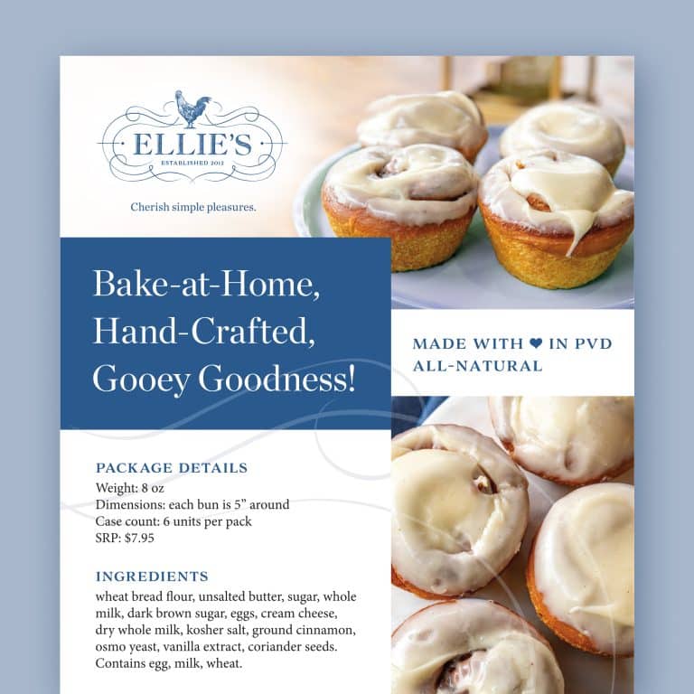
- Stick to one font (two at most). One is the simplest and easiest, but two is safe if you want to use a separate font for your title slide. Any more than that is messy and subconsciously distracting.
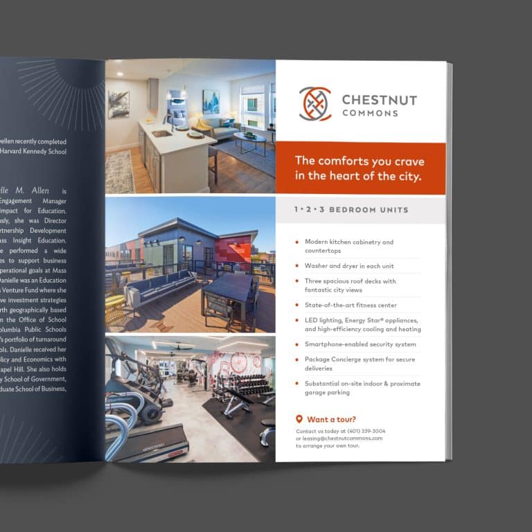
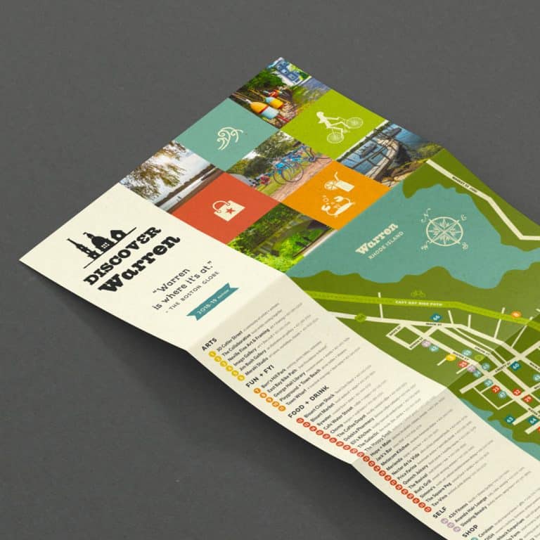
- Keep your logo small. Resist the urge to splash it across the title slide and on every slide in your presentation. Keeping your logo small, or leaving it off where it isn’t absolutely necessary, ensures your important information won’t have extra visuals muddying the view and competing for attention.
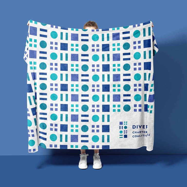
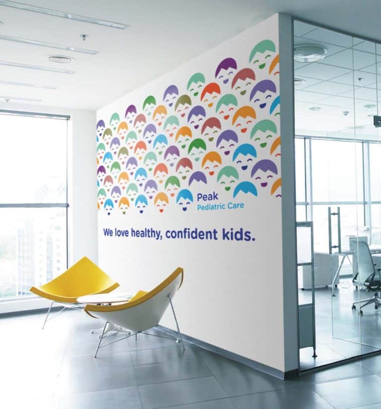
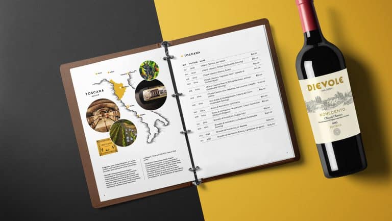
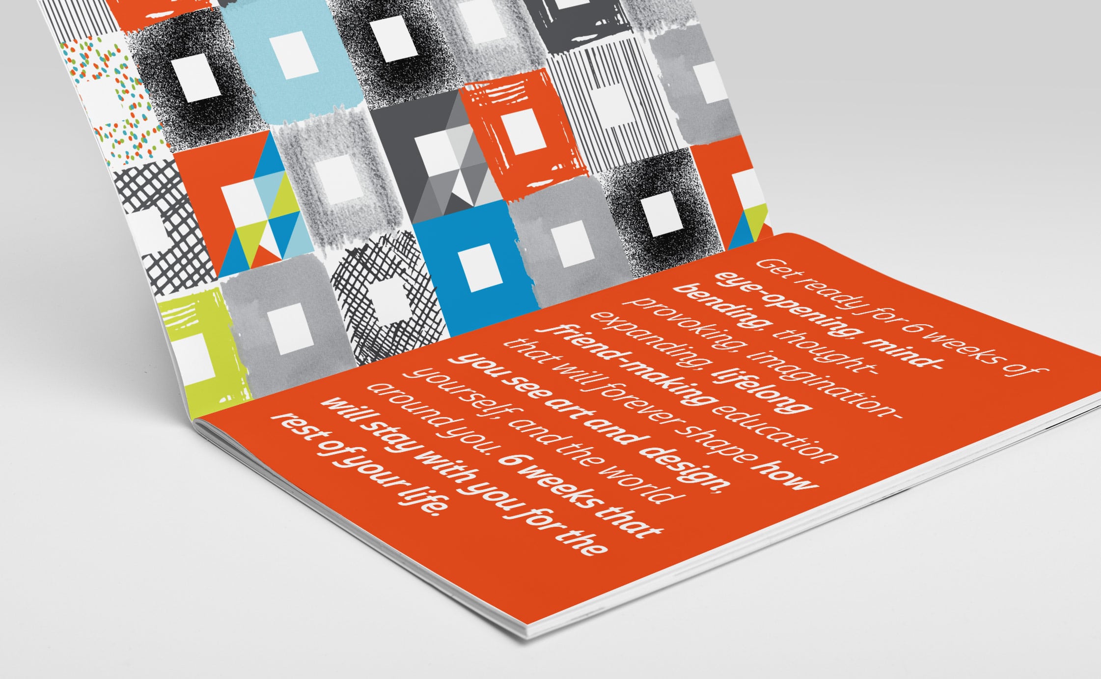
- Use the colors from your logo as accent colors. Choose one of your brand colors for accent elements on your slides, or multiple brand colors when designing graphs or charts. The subtle branding effect ties everything together and makes you stand out from the crowd.
TipGet more bite-sized logo tips: Seven Places Your Logo is Too D*$% Big
- Cut your text, and then cut some more.
Give your audience bite-sized bits of text to read, to reinforce your main points.
Slides should be easily scannable. Too much text is visually overwhelming – and while your audience is reading it, they won’t be able to concentrate on what you’re saying.
Cut any extraneous text, and boil larger concepts down to one sentence or statement. Use bullet points – using good bullet point etiquette – to highlight key takeaways. Let your visuals tell the bigger story wherever possible. Your audience will be much more likely to absorb the information and identify with your point.
When you cut words, you may need to invest time in practicing giving your presentation without reading it straight from the slides. I promise this will be time well spent!
- End with a bang.
Don’t just stop after the last chart and ask if there are any questions.
Use your final slide to leave a lasting impression that crystallizes the benefits of your solution and clearly articulates the next steps your viewers should take.
Solid endings include:
- Restating your title slide
- Summarizing a multi-pronged solution
- Asking them directly if they’re ready to solve the problem
- Inviting them to take action by A) directing them to a web page with additional key steps or B) specifying the date for your follow-up meeting
Good design gets you out of your own way.

We so often get in our own way, letting a mediocre presentation or sloppy design obscure our professionalism and our expertise.
Use these secrets of a great pitch deck to clear a path that tells your story more beautifully, succinctly, and powerfully. Getting out of your own way will cut down on the work you need to do and net you better results.
Do you need more targeted advice? I can help make your presentation beautiful and effective. Book a Power Hour to walk through your pitch deck in detail.
Professional visual design that brings your brand into sharp focus
I help you get measurable results from your brand design without the hassle, cost, or stress of an agency.
Do you want better market positioning so you can command a higher market value? I’ll visually harmonize and effectivize* your brand content so that it can be better understood by the right people.
Here’s what I offer:
- Strategic Design Partnerships to help your company command more sales, deeper customer relationships, and premium pricing
- 90-minute sessions to fix that pesky design issue you’re facing
*Yes, I made this word up.
It's hard to market an unfocused brand.
Your business must tell a powerful story with strong optics and a persuasive storyline so you can stand out from the crowd and change more minds. Get a brilliant visual framework tailor-made for you.
Get my best tips every month.
Key Takeaways
- Any time you create a visual presentation, you’re creating a pitch deck designed to sell.
- A great pitch deck will leave a big impression and inspire your audience to act.
- A strong opening and closing will take your deck to the next level. Use these slides to connect with your audience, convince them you understand their problem, and crystallize the ways your solution will make their lives better.
- Showcase your brand with clear organization and thoughtful design elements that stay focused on your product or ideas.


