Just Say No to Handshake Photos
Like pop-up ads and cat memes, there are a lot of handshake photos on the internet. I’m here to tell you that you can do a lot better.
Hey, what’s wrong with a handshake photo?
There’s nothing intrinsically wrong with a handshake photo. (Though perhaps now, post COVID-19, they may cause a double-take or feel outdated.) But there’s not much that’s right about one, either.
When you think of doing business with a friend, you wouldn’t just walk up and say “I’ve got the money. Hand me the stuff,” and walk away. That’s essentially what a handshake photo conveys.
No matter how striking the angle or how beautiful the manicure, a handshake photo just doesn’t convey anything specific.
By focusing on a purely transactional exchange, these images give off a generic, stale “we do business” tone that wastes space and does nothing to help showcase the exceptional, special nature of your brand.
So much more than just a missed opportunity, a handshake photo’s lack of personality and care can actually be damaging to your brand.
For your customer, every visual element on your website is a representation of how much personal care and attention you would give them. Ask yourself: Does this photo leave my potential clients feeling the way I want them to feel?
Now, if your brand’s vibe IS suits-and-ties-on-Wall-Street, then we can have a conversation about whether a handshake works (I’d still vote for something better!).
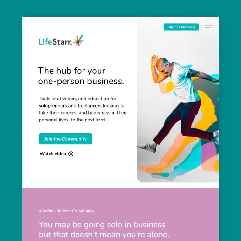
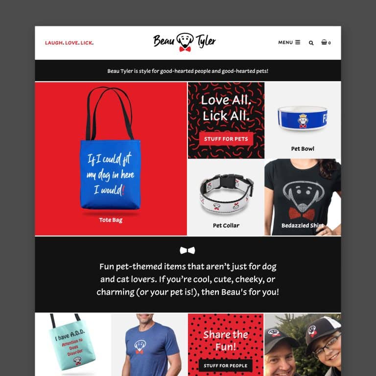
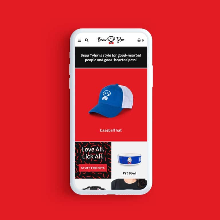
But if your vibe is different, then I challenge you to use the space on your website wisely – even if that means not using an image at all. Fonts, colors, and text styling can go a long way toward creating a gorgeous page that matches your brand image and reinforces that key sense of consistency and trust.
What about a photo of me shaking hands with a customer?
OK, now we’re getting closer.
If the handshake photo in question focuses on you and your client, and in particular expresses the joy you each feel from your relationship and your interactions with each other, that could work.
It could be a professional image or a cheesy smartphone shot (as long as that approach fits squarely with the style & personality of your brand!). Either way, it shouldn’t take itself too seriously.
But think – what does this photo say about your business?
If an image doesn’t convey any real benefit – except that your clients like you – then I still want to know why they like you! Why are you cut out to solve their thorniest problems? How are you meeting their needs and helping them thrive?
As a potential client, I need more evidence before I’m ready to do business with you.
Again, consider whether this photo of you shaking hands is the best use of visual space toward reinforcing your brand voice.
Does that mean all stock photography is bad?
Nope! There are some great stock photography sites and agencies (I like Unsplash, Death to the Stock Photo, and Pexels).
Many small businesses don’t have the budget or the bandwidth to source all of their own professional photography, especially when they’re getting their marketing feet firmly beneath them.
Stock photography is often a legitimate, affordable, and sensible solution.
But it’s just as important to choose good stock photography that conveys warmth and depth while being visually stimulating.
Avoid the stuff that gives off a generic feel of happiness or contentment, but doesn’t feel personal.
No second chances for first impressions
The moral of the handshake story is that you’re better off not using a photograph at all, rather than using one that is going to leave a negative impression (or that might even slide right past your viewer so they don’t get hooked and spend time reading the content that you so thoughtfully curated).
Your brand is your baby. Every aspect of its visual footprint should thoughtfully cultivate and broadcast its voice.
Do you want help crafting just the right visual design for your brand?
Get in touch today to banish handshakes and shake things up.
Key takeaways:
- Handshake photos represent a missed opportunity to showcase what is special about your brand.
- They can even be damaging to your brand image when they leave viewers with the impression that your relationship will be generic, too.
- A photo of you shaking hands with a customer is likely a better option than a stock handshake photo, but you may still be missing a chance to really sell a positive impression of what it’s like to do business with you.
- Every visual element on your site should build your relationship with a potential client.
- In the absence of a really great photo, it’s OK to go without one. Strong visual design using elements like font, color, and text styling may better support your brand.
It's hard to market an unfocused brand.
Your business should tell a powerful story to attract loyal customers. Get a brilliant visual framework tailor-made to help you build trust.


