Seven Places Your Logo is Too D*$% Big
This article will help you:
Identify key areas where you should downsize your logo so you can connect with your audience in more meaningful ways.
- Want a quick summary? Watch the video
Is your logo the perfect representation of your business, a tantalizing blend of imagery, color, font, and style that builds buzz and trust for your brand?
The perfect logo will do that.
But guess what? Too often, I see logos terribly abused. (Don’t get me started on these 7 crushing logo mistakes.)
The number one way businesses abuse their logo is by making it too big. Your logo needs to make space for your messaging, design, and visuals to work together to capture the attention – and hearts – of your customers.
What’s wrong with a big logo?
Your logo is meant to create curiosity.
It’s a jumping-off point for the rest of your branding and marketing; an anchor that connects what you do so that people who see it immediately recognize your brand and experience the feelings associated with it.
But your logo isn’t meant to be the story in and of itself.
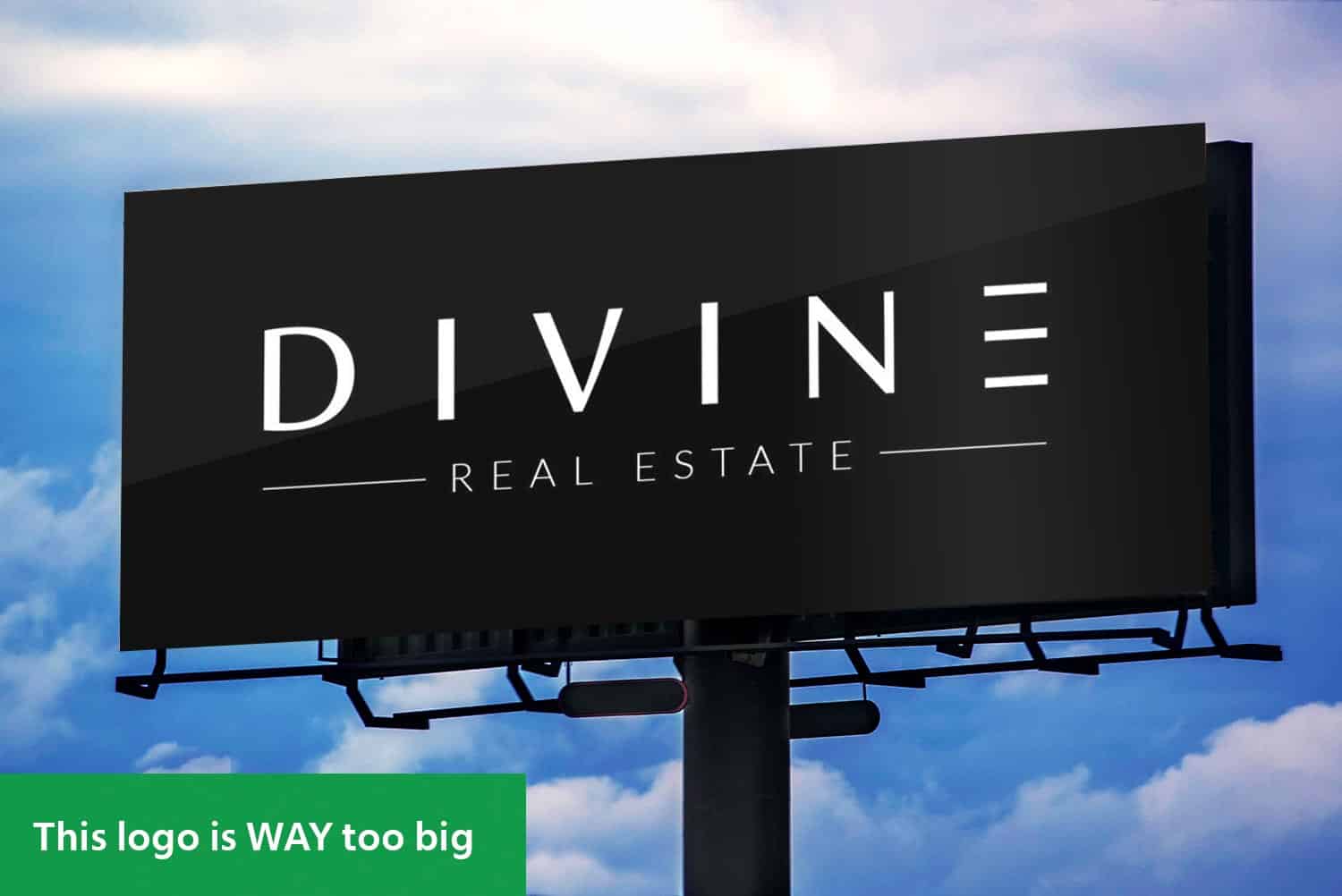
If you’re splashing a giant logo everywhere you go, making it the dominant feature of your website, email campaign, or printed marketing materials, you’re misrepresenting what you want to do for your clients.
A giant logo centers you, shouting: Look at me, I’m so cool! It’s an instant, subconscious non-starter for your target audience.
Truth be told, your prospective clients don’t care how cool your logo looks until they know what it can do for them.
An outsized logo points the spotlight directly at yourself and takes the focus off of inviting your clients to imagine their problems being solved.
Seven places to cut your logo down to size
There are seven key places where I commonly see logos getting too big for their britches.
- Website header
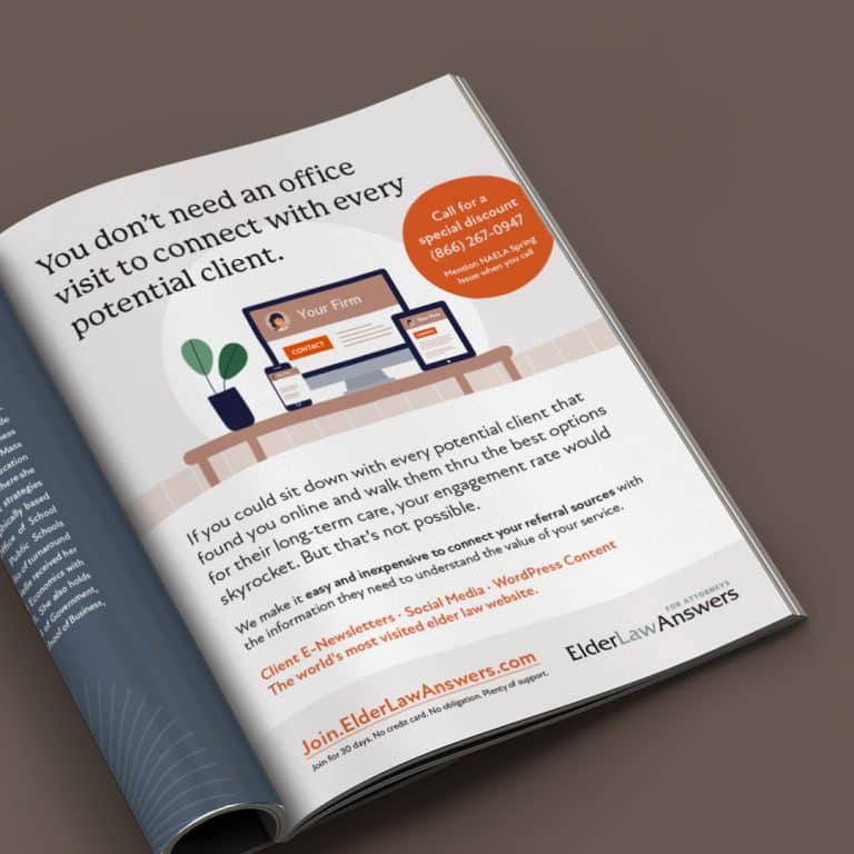
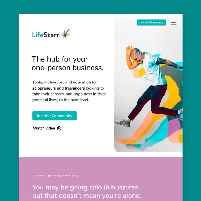
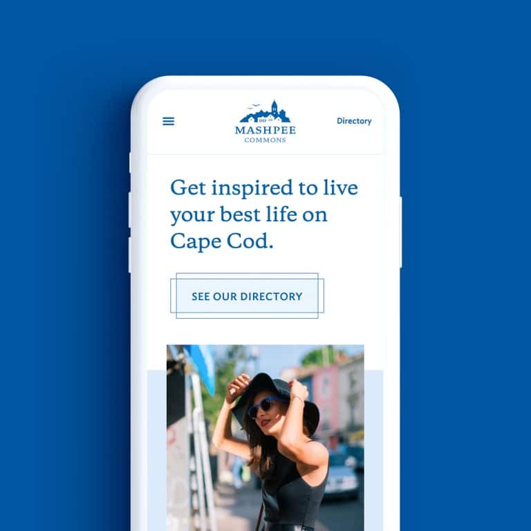
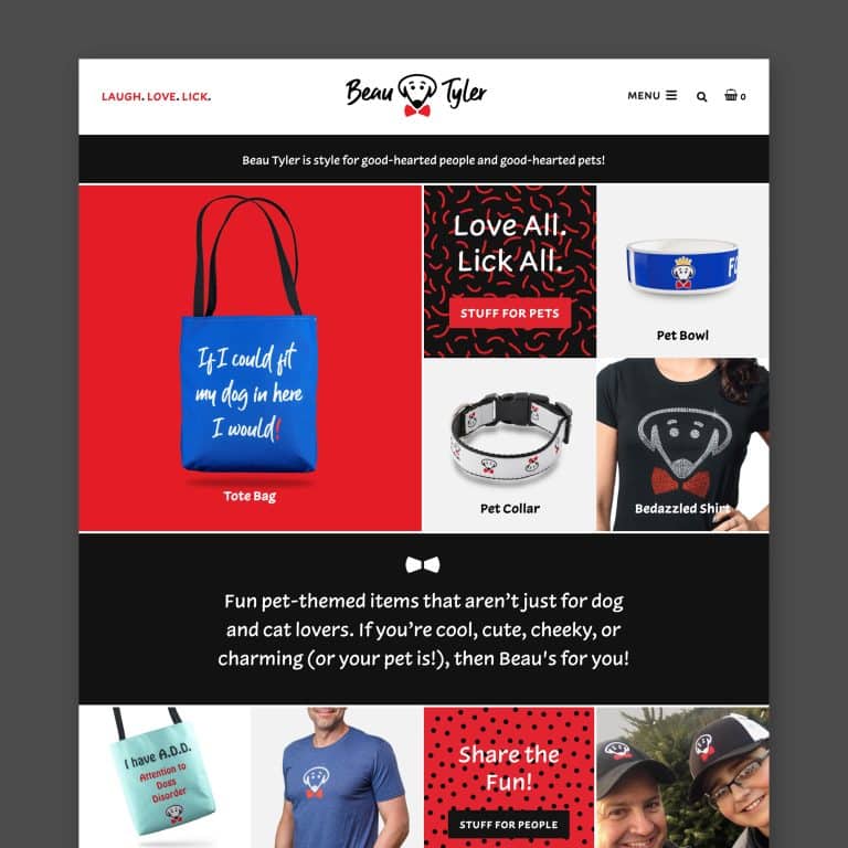
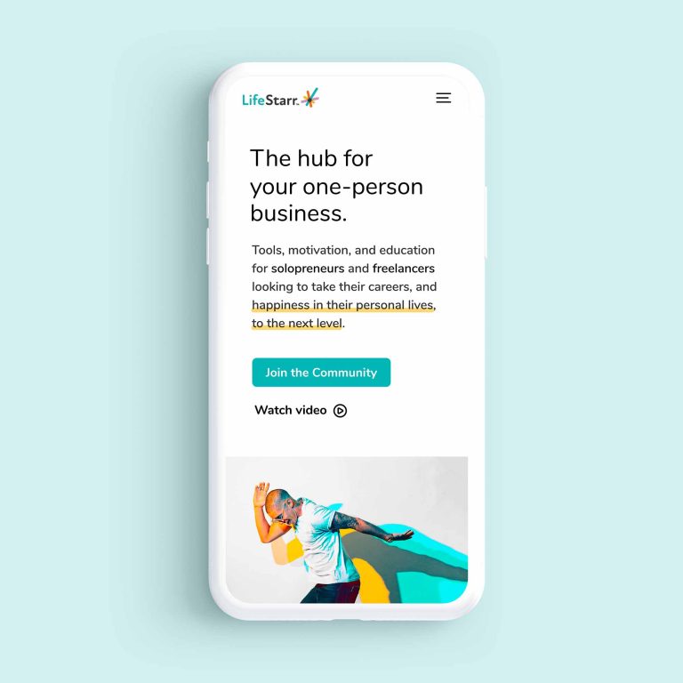
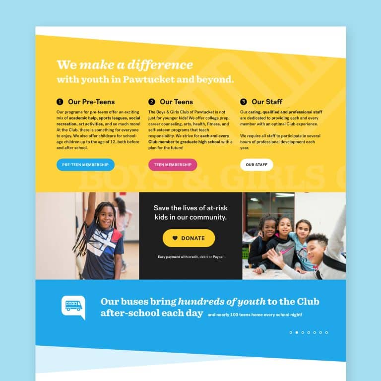
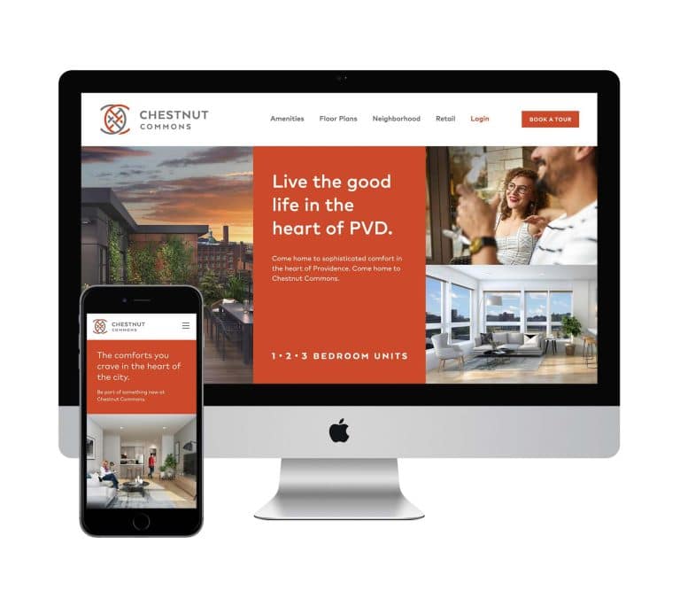
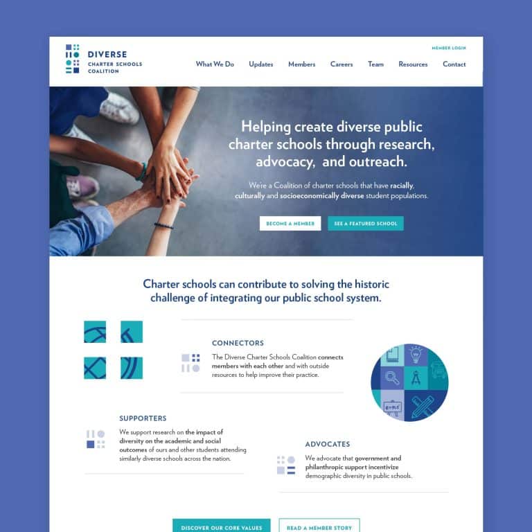
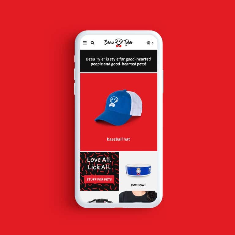
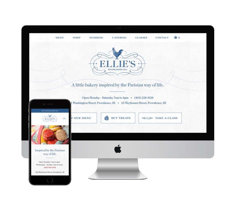
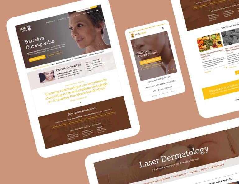
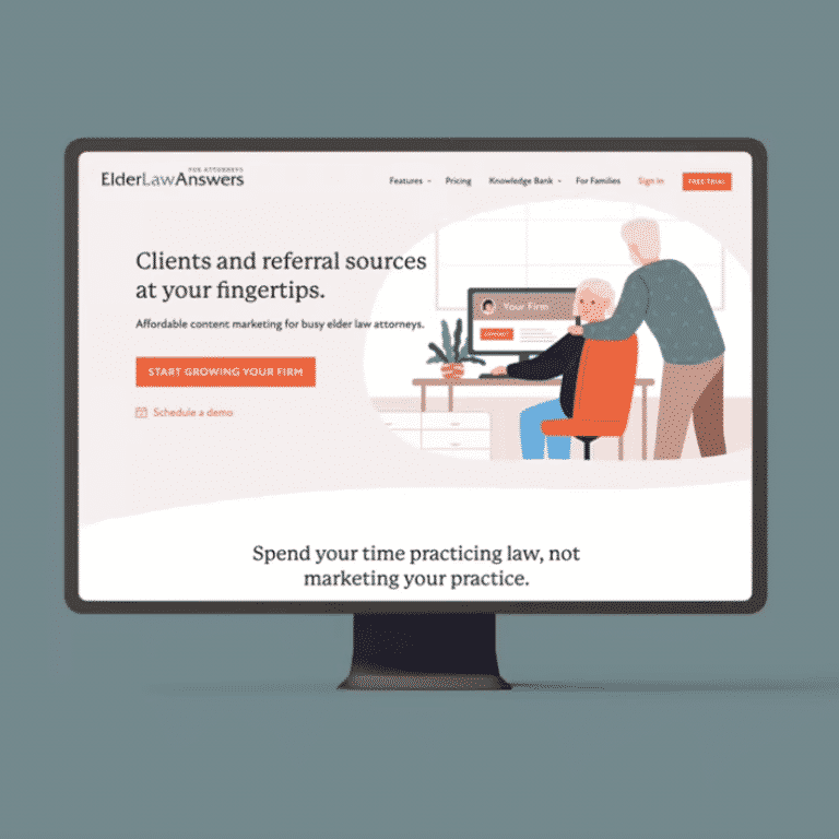
Unless you’re a designer who has mastered the golden rule of thirds, your logo is probably about twice as big as it should be in your website header.
This means it’s crowding out other essential elements of messaging that belong above the fold on your website. Keep sizing it down until it’s uncomfortably small – then you’re getting close.
- Email campaigns
The “From” field of your email campaign will tell the reader who it’s from. A small, unobtrusive logo (at the top or the bottom of the email body itself) will serve to anchor your brand without beating your reader over the head.
And as with your website, a small logo will leave room for your greeting and part of your message, giving you another chance to hook your readers and keep them scrolling.
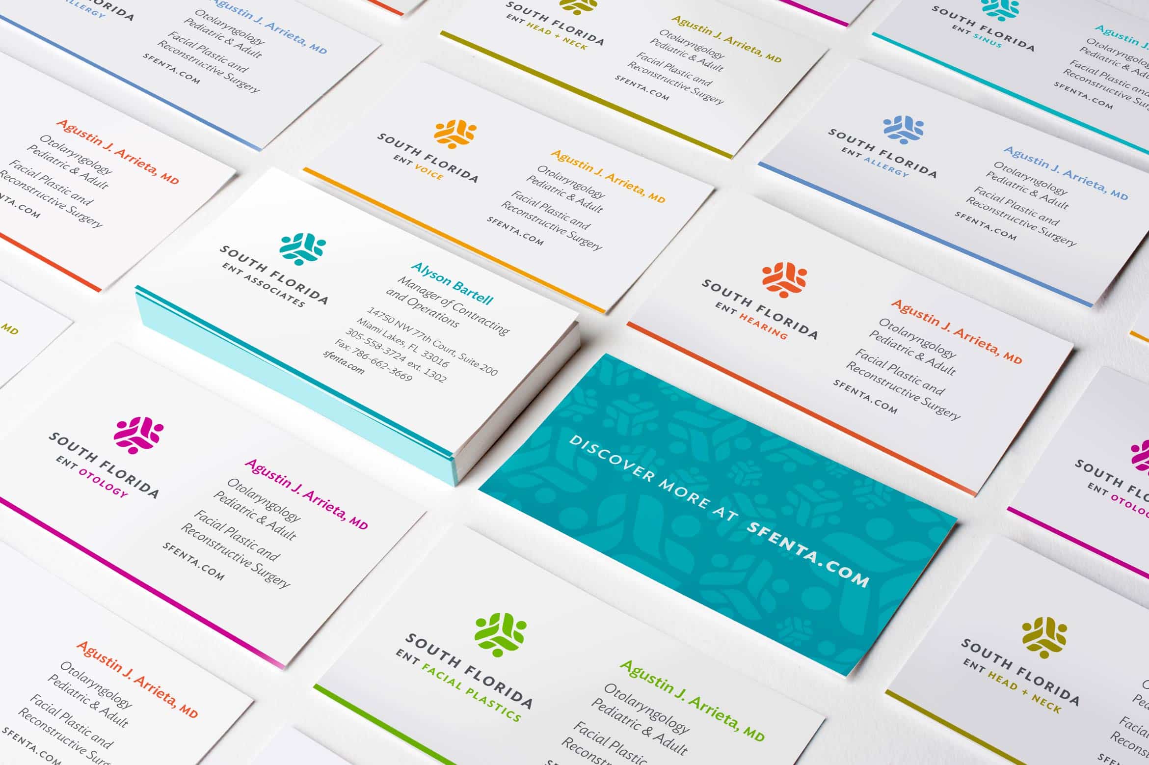
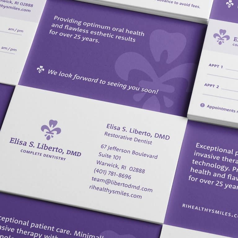
- Business cards
You’ve got a very small amount of real estate to work with here. Keep your logo in check to make your contact details incredibly clear.
And don’t squander an opportunity to include a memorable detail – like a quote or a clear statement about how you help people – that creates an emotional connection and explains why you’re the best solution to someone’s problem.
- Social media profiles
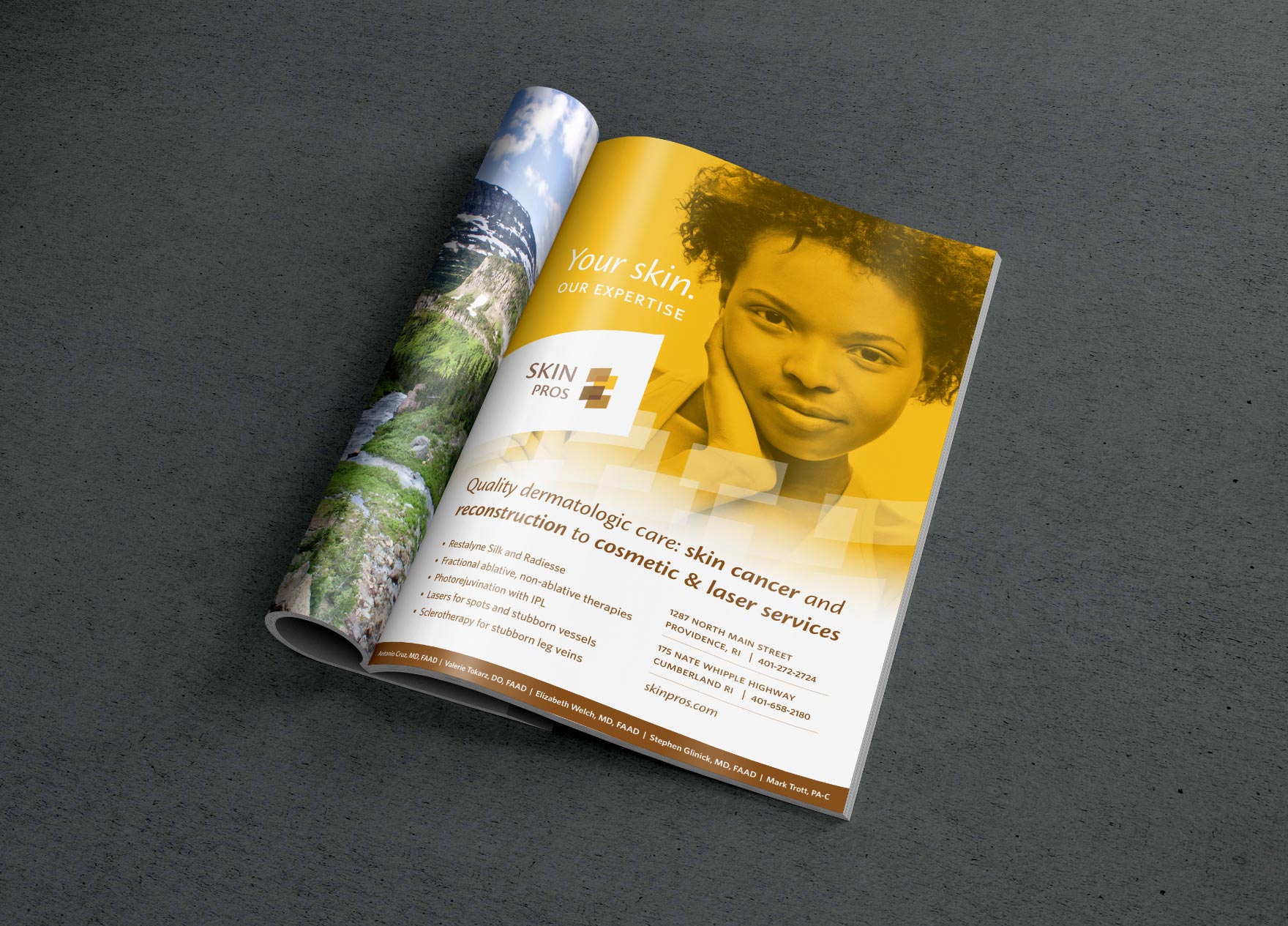
Resist the urge to use your logo as your large cover image, in the “hero” spot. This space should be dedicated to an image that reinforces who your customers are, that shows you understand their problem, and that you’ll take care of them.
- Billboards
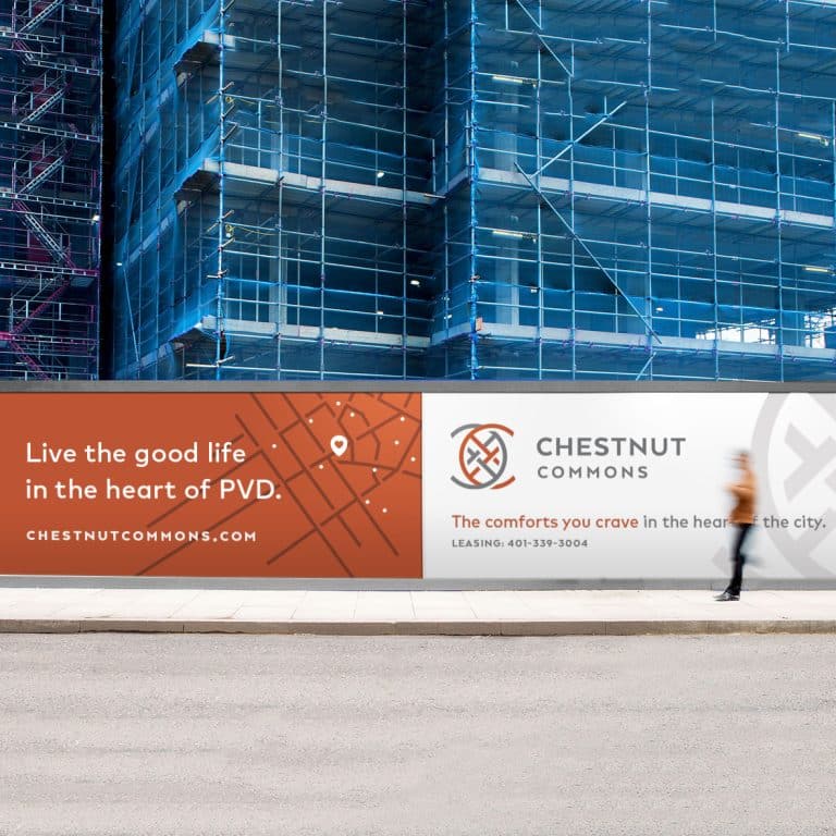
Giant logos on a billboard are a dead giveaway that your cousin designed it (see the above misfire). Is that the subtle message you’re paying a lot of money to send to drivers every day?
- Slide decks
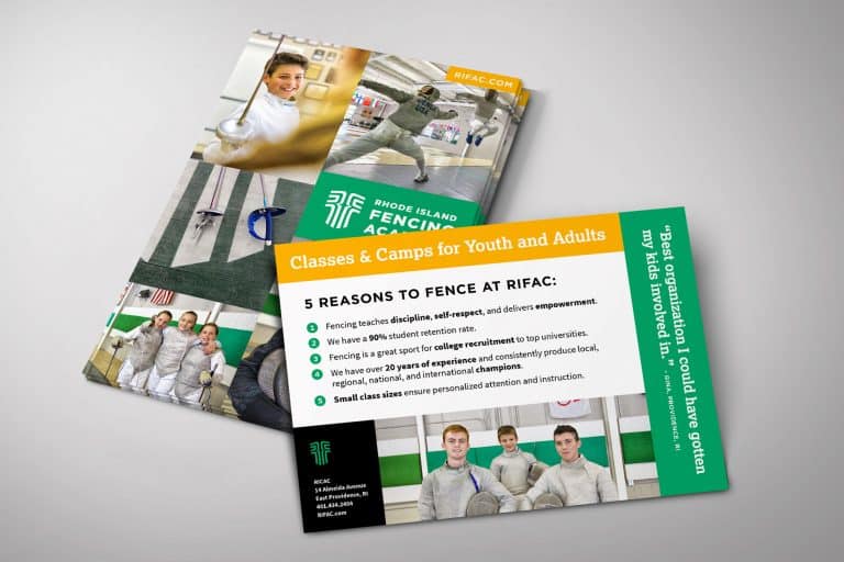
Every slide in your presentation should convey meaningful information. Taking up an extra slide – or ample space on each slide – with your logo makes it harder for your audience to pick out what’s important, and prevents that content from making an impact.
- Video intros
Like slide decks, giant logos in video intros tell your audience that you weren’t quite sure what you have to offer that is truly meaningful. Or that you haven’t taken the time to come up with a title graphic that explains the content for them.
Ring clear through the noise
As business owners, we’re always trying to figure out how to stand out, how to rise above the noise with a clear siren call.
Making your logo big is easier than pinpointing the message that explains your core value. But outsized logos hinder your business because they squander an opportunity to connect with your audience in more meaningful ways.
The first step is to go ahead and make your logo smaller. By “turning the volume down,” this step goes a long way toward presenting your brand in a calm and confident manner.
This first step will free up space to tell your audience how you can improve their lives. How can I help my customers understand how I will fix their problems? How can I bring that message to the spotlight? Shine a light on that intention, instead of on your brand directly.
This is the messaging that captivates and connects with your customers to generate wildly successful conversions.
I challenge you to take one piece of your marketing – one of the seven listed above – and spend the time it takes to use that space to explain how you make problems go away. Whether it takes five minutes or five hours, this will be one of the best time investments you could possibly make in the future success of your business.
I’ll be cheering you on!
Professional design that makes all your brand touchpoints sing in harmony
I help you get measurable results from your brand design without the hassle, cost, or stress of an agency.
Do you want better market positioning so you can command a higher market value? I’ll visually harmonize and effectivize* your brand content so that it can be better understood by the right people.
Here’s what I offer:
- Strategic Design Partnerships to help your company command more sales, deeper customer relationships, and premium pricing
- 90-minute sessions to fix that pesky design issue you’re facing
*Yes, I made this word up.
It's hard to market an unfocused brand.
Your business should tell a powerful story to attract loyal customers. Get a brilliant visual framework tailor-made to help you build trust.
Key Takeaways
- Your logo brings your brand together – but even for perfect logos, bigger isn’t better.
- The seven most common places I see too-large logos span the gamut of digital and print marketing.
- Outsized logos center the attention on you, and squander the opportunity to convey to your audience how you can make their lives better.
- Cutting your logo down to size keeps the spotlight on clear, captivating messaging that converts potential clients – and developing this messaging is a worthwhile time investment.
Video summary
Here’s a breakdown of where I often see logos abused and the key benefits of downsizing your logo.


