7 Crushing Logo Design Mistakes – And How to Avoid Them

You can do better.
I see it all the time. A thriving business sullied by an amateur logo design. When you’re just starting out, your cousin/nephew/savvy friend offers to help. Hey, a free logo. Great! You can always get a professional one later, you think. But then you get mad busy and years later, you’re still using a cheap, unprofessional logo as the primary visual representation of your business. Guess what every single customer sees as the primary visual representation of your business? Your logo.
When you’re ready to hire a professional logo designer, make sure to avoid these 7 common mistakes.
1. Color-only logo design
To avoid odd or unintended representations of your logo when printed or displayed in grayscale (which is a fancy way to say shades of black and white), make sure that, when reviewing a logo design concept with your designer, you see what it looks like in both color and in black and white.
Similarly, see what your logo looks like with the grayscale ‘inverted’. If your logo is typically dark against a white or light background, ask your designer to show you what it will look like in light colors against a dark background.
You should have multiple color formats:
2. One format logo design
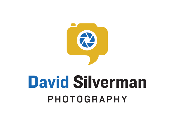
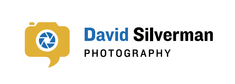
If you don’t have a logo that fits nicely into a square-shaped area, what the heck are you going to do when the space offered is rectangular (stretch it to fit? Answer: definitely not!)? A professional graphic designer should create a logo that has more than one layout if your logo arrangement calls for it (although one option should serve as the ‘official’ logo). Ask for your logo in several layouts, including a square shape and a rectangular shape. A good designer won’t make a fuss about creating different shapes and layouts.
If your logo is long or tall, you should have more than one ‘shape’ orientation:
3. ‘LLC’ in the logo design
Despite what your lawyer may tell you, you don’t need to include the “LLC” in your logo after your business name. It’s sufficient to include it in the footer on your website and in other formal paperwork. But let your logo shine as a design element – without the legal jargon.
4. Single format logo design
This part gets a bit technical, but hang with me. It’s important to have your visual designer send your final logo in a variety of file formats. Sounds complicated, right? It’s not once you know what I’m talking about. A file format is specified by the letters that appear after the “.” in an electronic file name. So a file named ‘TestDoc.doc’ is a Microsoft Word Doc. A file named ‘FamilyPhoto.jpg’ is a jpeg image file.
Certain formats are better for printing, while others are ideal for the web and on-screen viewing. Here’s a quickie guide so you’ll never have to read this paragraph again!
A Guide to File Formats:
| Filetype | Ideal For | Do You Need It? |
|---|---|---|
| PNG | Online uses, such as social media updates, Word documents, PowerPoint presentations, and Desktop Publishing | Yes |
| Print uses, such as an advertisement, brochure, or T-shirts | Yes | |
| EPS / AI | These particular file extensions are called “vector” files. What you need to know about vector files is that you can use them to make your logo as big or as small as you desire without pixilation or blurriness. You may not be able to open a vector file that your graphic designer sends you, unless you have hot-shot software like Adobe Acrobat or Illustrator, but you will need your logo in vector format. | Yes |
| JPG | Photos and images with a lot of detail and multiple colors. You don’t need this format, unless your logo includes a highly detailed visual. | No |
| SVG | Online uses, especially a website. Think of .svg as the web version of a vector file. An .svg file is infinitely scaleable, without any pixilation. Your web developer will find .svg files useful. | Maybe |
5. Limited color profile
There’s this thing called the Pantone Matching System. It’s a universal database of color swatches that businesses and designers use for consistency when printing anything professionally (usually when working with a local printer or promotional company). Ask your graphic designer for your logo in “Pantone colors” so that no matter where you get your logo printed, no matter what country you’re in, the colors will look the same. Exactly the same.
If you print your logo at home, then print it out at my house, then print it at Staples… well, you’ll have three differently colored logos because we all use different desktop printers, inks and toners. To avoid this mess (and ensure your logo always looks perfect), have your graphic designer work with a local printer that can print with Pantone inks (sorry, no desktop printing machines support Pantone inks).
And by the way, Pantone is just for printing. There are no Pantone colors for the web.
6. Nothing but the logo
A top graphic designer will create a ‘brand bible’ or brand guideline for you. It’s a comprehensive guide to the elements of your brand and you’ll definitely need it down the line. A brand bible gives you the technical breakdown of the components of your logo, and may be updated later to include print design and web design samples once your designer completes these projects for you (note: the design of your logo should always be established before beginning any print or web marketing projects). This is what you’ll want your brand bible or guideline to include:
- Pantone colors of your logo
- RGB color breakdown of your logo (‘RGB’ stands for red-green-blue and is used in determining accurate on-screen colors)
- CMYK color breakdown of your logo (‘CMYK’ stands for cyan-magenta-yellow-black and is used to determine accurate color in professional full-color printing applications)
- HTML hex colors of your logo (hex codes are a way of easily specifying RGB colors on a website)
- Typography used in your logo (all the fonts utilized by your logo and tagline; note: the designer should provide the font name and weight – it may be up to you to purchase the actual font if you wish to use it in your own documents)
- Suggested typography for use in desktop publishing documents (fonts that blend well or contrast nicely with your logo)
tipCan we talk fonts for a moment? It’s almost never a good idea to re-use your logo font for content titles or paragraph styles in your print or web marketing. This can cheapen the ‘special-ness’ of your logo.
7. Worst practices
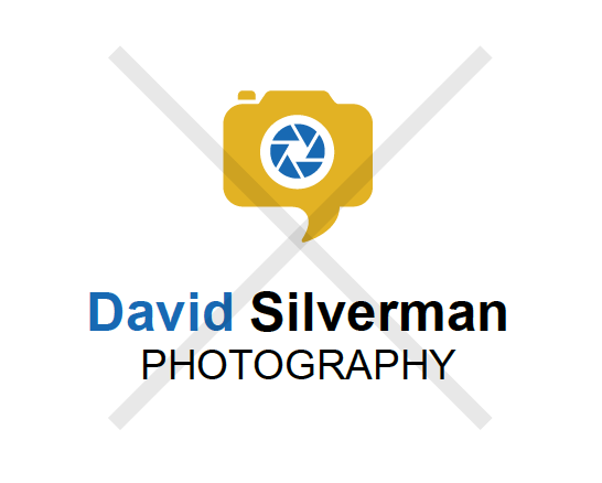
I provide all my clients with a Best Practices Guide to Your Logo. Call me a logo nerd, but I really want your logo to shine! So I take the time to share how to make the best use of your logo and how not to use your logo (essentially, how to keep your brand looking pristine and avoid any ‘muddiness’ or unprofessional-looking visuals). In addition to identifying which colors and fonts should be used, and I like to show you how your logo may look like if you don’t use my recommendations. Sometimes, the best way to see how and why a logo fits together well is to see it a little bit broken.
Your designer should show how NOT to use your new logo:
It's hard to market an unfocused brand.
Your business must tell a powerful story with strong optics and a persuasive storyline so you can stand out from the crowd and change more minds. Get a brilliant visual framework tailor-made for you.


