Six Tips for Strong Navbar Design That Converts Users
While your website has a number of important jobs, your navbar design makes an outsized contribution to the site’s overall success.
In order to do its job (of converting your website visitors into customers), you’ve got to trim the fat.
Keep things simple, streamlined, clear, and helpful. This may mean engaging a critical eye and performing a Marie Kondo-style purge to what you’ve been doing in the past.
I’ll tell you what: this investment in navbar design will pay off by allowing your users to navigate quickly to the information they truly need to make a decision.
Keep reading for six best practices that makes your navbar a lean, mean converting machine.
Best Practices for Navbar Design
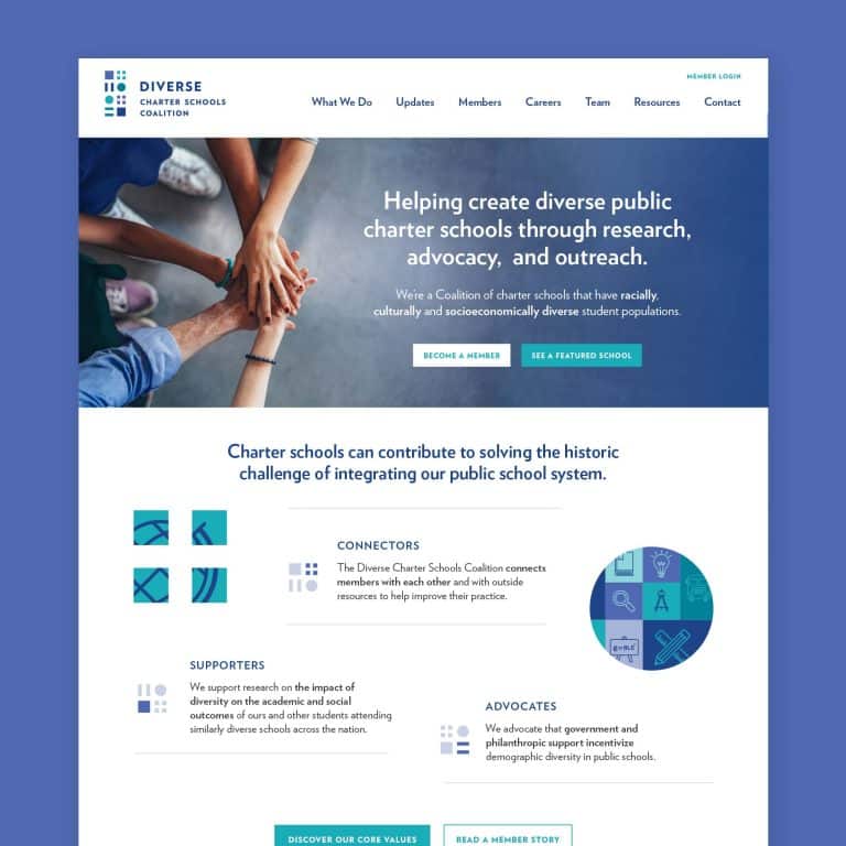
- Use 3–6 links.
The first thing to take your red editing pen to is the number of links you include.
Links in the navbar indicate a certain level of importance, and the mere thought that 10 to 12 of your links all need to appear at the top level will be instantly overwhelming to users.
They won’t know where to go first or how to find what they want.
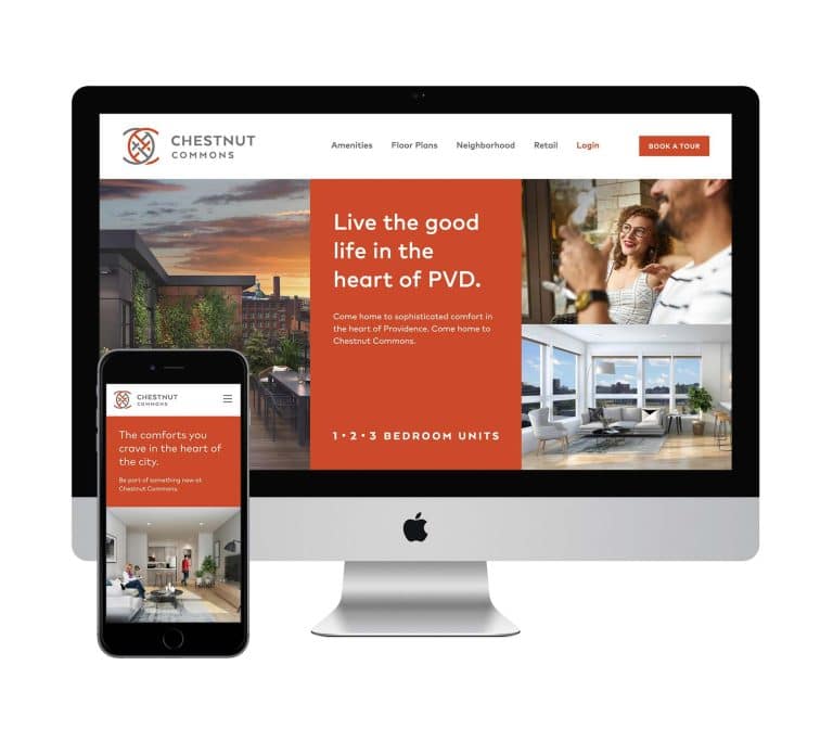
An easy trim, if you’re still using this, is to remove ‘Home’ from the navbar. Customers now expect that clicking on your logo will take them back to the homepage.
Using up a precious navbar spot for ‘home’ is one of several website design mistakes that will make your site feel outdated at first glance.
Aim for no more than six top-level links. It’s better to keep that number lower where possible.
But what if you have 10 key pieces of content?
First, determine whether each one of those pages is truly necessary. Can some pages be combined?
Once you’ve trimmed and merged to the fewest number of pages, group items intentionally for users in sets of 1, 2, or 3 (numbers the human brain easily parses in a set) as drop-down options that appear when a user hovers over a top-level navbar link.
- Cut words where you can.
Now that you’ve trimmed the number of links in your navbar, it’s time to trim even more fat by cutting out any words that are not 100% necessary.
For example, use ‘contact’ instead of ‘contact us’ and ‘team’ instead of ‘our team.’ Remove articles like ‘the’ and remove the pluralizing ‘s’ on words where it isn’t required.
Ruthlessly trimming characters makes your navbar clean and makes the next best practice even easier. Plus, it’s kinda empowering to not mince your words.
- Create visual space.
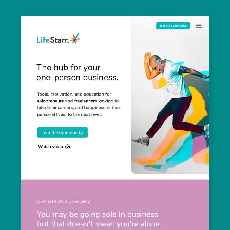
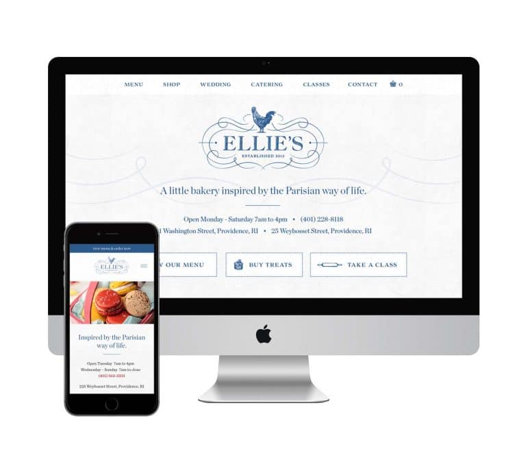
White space gives people space to decide where they want to go.
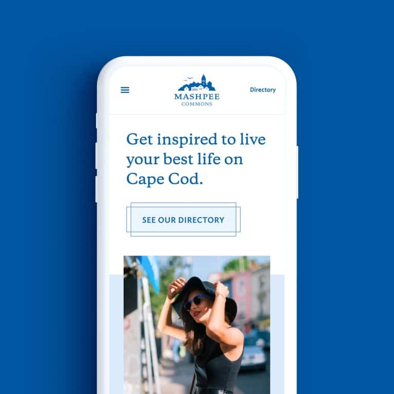
A crowded website header, even if its individual elements are clear, can limit the mental breathing space your visitors need. Creating white space between your navbar and your logo will help your customers feel calm and make decisions.
Bonus: it will also help your logo stand out and better support your brand identity.
- Make external links visually distinct.
Have you ever been happily browsing a restaurant’s website, when you hit a link that unexpectedly takes you over to GrubHub? Before you were ready to leave the site?
To avoid surprising your visitors, make a visual distinction between navbar links that navigate to content within the site and CTAs – such as ‘book now’ or ‘order now’ – that will take them off to another site to complete the sale.
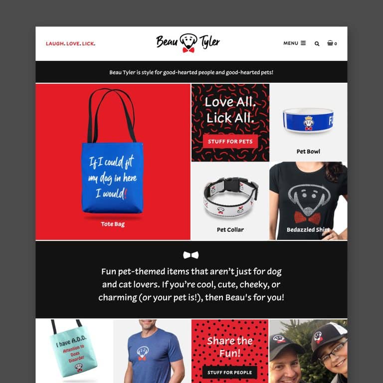
Make these links appear visually different. Provide a helpful alert, by using a different color and/or showcasing them with a button, to avoid confusion.
- Keep drop-downs clean.
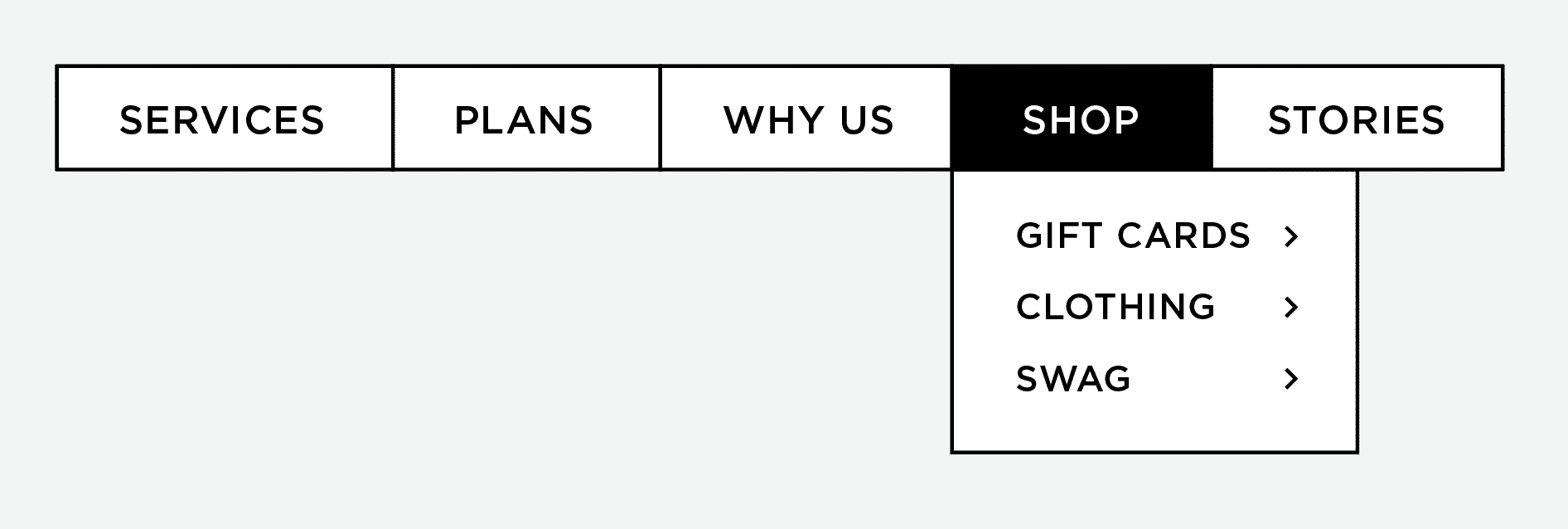
If an online shop makes up part of your website, and assuming you’ve done your homework in Tip #1 and Tip #2, you might now have a single ‘shop’ top-level link in your navbar, with drop-downs for various shopping categories.
Rather than display a long list of ten items, try to narrow down your drop-down links into umbrella categories to keep it clean. For example:
- earrings, necklaces, bracelets
- gift cards, clothing, swag
- men, women, kids
The categories you choose will vary widely depending on what customers purchase most often or what you are promoting.
- Use a keyword workaround.
You may have heard that including keywords in your links is good for SEO.
While that is true – and some keywords will fit nicely – your navbar is primarily for people, not bots. So this is one spot in your navbar where you may need to find a workaround.
If the keywords you’re trying to rank for are long and clunky, including them in your navbar would run contrary to what I advised you to aim for in Tip #2. They’re a poor fit for a trim, clean, easy-to-use navbar.
To accommodate for SEO while keeping your navbar pristine, you can include your top keywords in the slug portion of the hyperlink for the page.
The slug is the distinct name you give each page of the site. For example, I might use the single word ‘blog’ in the navbar to link to my client’s blog, but the URL for the blog (jscottmarketing.com/marketing-blog) works in the keyword she’s aiming to rank for: ‘marketing blog.’
If your keywords fit with navbar best practices, count yourself lucky. But don’t force it just to score extra points with Google if you risk breaking any of the rules above and turn off actual human customers.
In summary, your navbar has a big job to do, and these best practices will help.
It needs to be visually clean and incredibly useful so that your users can quickly and easily get engaged, find what they need, and be compelled to take action. Your navbar is not a place to be precious or quirky.
Readers should know in an instant what information each page holds. It’s better to be clear than cute.
With a little love (and editing), a solid navbar design will work hard to turn visitors into customers.
Do you need help from a solid – and fun – visual designer? Contact me to see if we’re a good fit.
Key takeaways:
- Good navbar design is a critical component of an effective website.
- A good navbar helps customers quickly navigate to the information they need and makes it simple for them to take action.
- Outdated web practices, good intentions, and amateur web design may be contributing to a navbar that is preventing you from converting customers.
- Having a cluttered, crowded navbar with too many choices and too many words make your customers work harder than they need to.
- Creating white space invites your customers to ‘breathe’ mentally and decide where they’d like to go.
- A few simple best practices that are easy to implement can make a huge difference for your website’s overall user experience and can translate to increased sales.
It's hard to market an unfocused brand.
Your business should tell a powerful story to attract loyal customers. Get a brilliant visual framework tailor-made to help you build trust.


