Color Psychology: What Color Says About Your Business
When choosing a logo for your business, it’s tempting to go with a color scheme pleasing to your eye. But while the colors should be personal to you, it’s important to also consider basic color psychology and think about what the colors you choose will say about your business.
You want your logo to stand out, be memorable, and pleasing to your potential clients – but also to convey concepts and feelings that reflect and cement your brand image.
Color psychology is the study of how hues affect our behavior and choices – and as you might guess, that makes it an important component of branding and marketing. Beyond the words used, your color gives your logo and marketing materials a chance to leave the viewer with emotions and perceptions about your product, service, and brand personality. Is your brand exciting? Calming? Bold? Gentle? It’s important to acknowledge that culture, personality, and life experiences can affect individual perceptions of color.
But an introductory overview can acknowledge common “themes” within an American cultural milieu. And while color psychology has several important dimensions beyond basic color associations (more on that below), at its most basic level here are some thoughts on the automatic, intrinsic connections each color may spark in the mind of the viewer.
Red
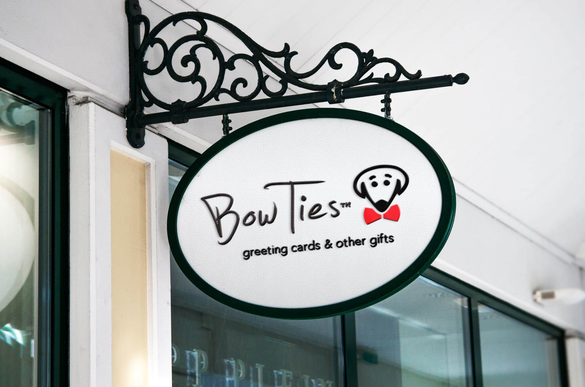
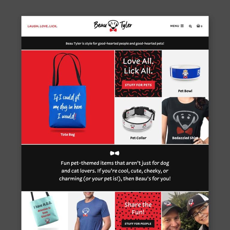
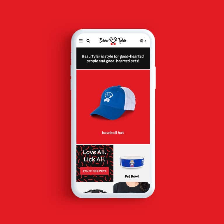
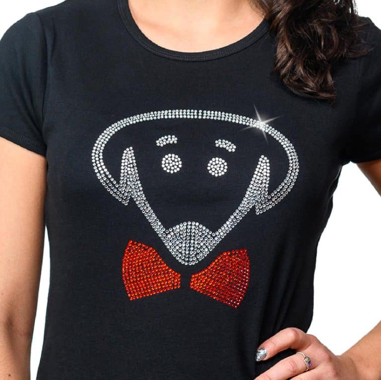
No matter the connotation, red attracts attention. It can be a cool, but also signifies danger, alarm, and heat. Depending on what your business is, that could prove very useful. Red also denotes energy, power, and passion. See examples of my own logos:
Yellow
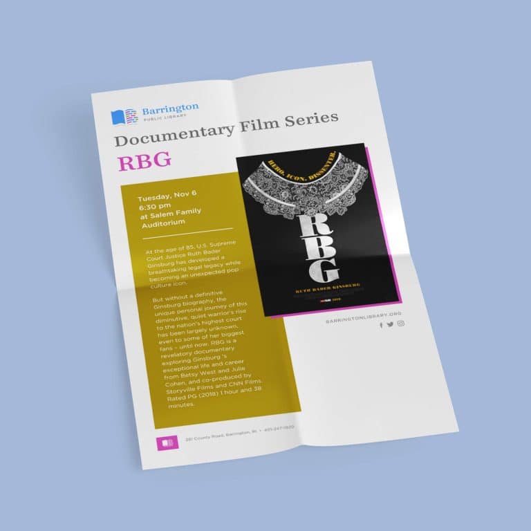
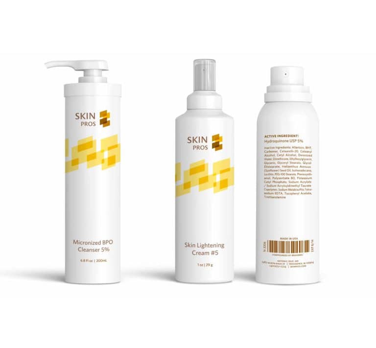
Yellow often calls up energy, happiness, and warmth. Used less frequently in Western culture, yellow makes for an interesting branding choice. Because of its select use, it can stand out more. In order for a yellow logo to ‘pop’ and read well (especially when printed on a white background), it’s best to use a deep gold or rich yellow hue. Here are a few examples of how I used yellow to stand out:
Green
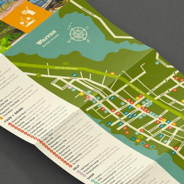
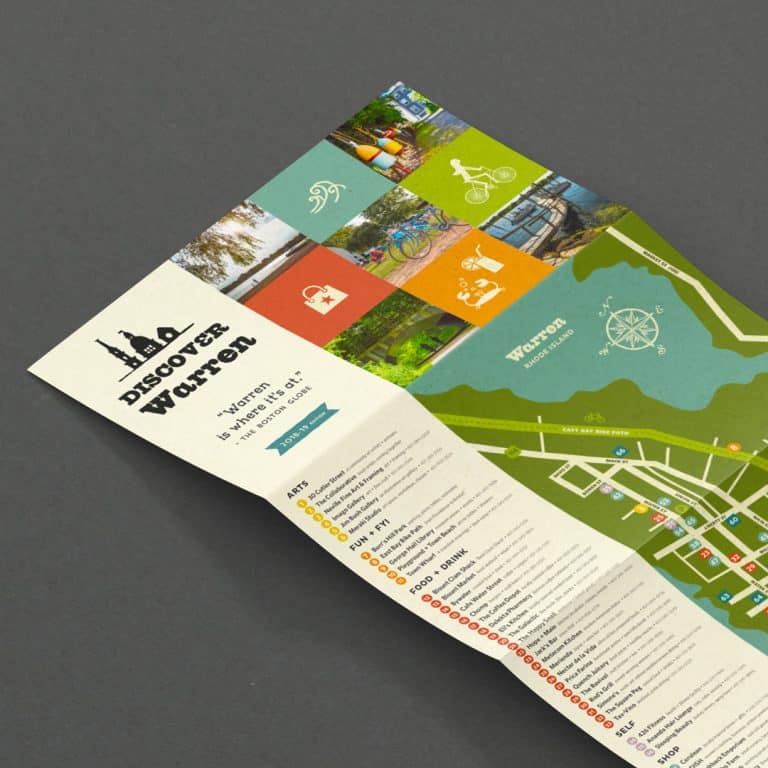
This color connotes nature, safety, growth, and peace. As an example of how strict color associations can backfire, however, green is often associated with money and is the choice of many financial brands. But that can be too simple and obvious, and therefore not as interesting. For brands that want to convey newness or freshness, green is often a more interesting choice than blue (although this is quickly becoming a common theme). See examples of my own logos:
Blue
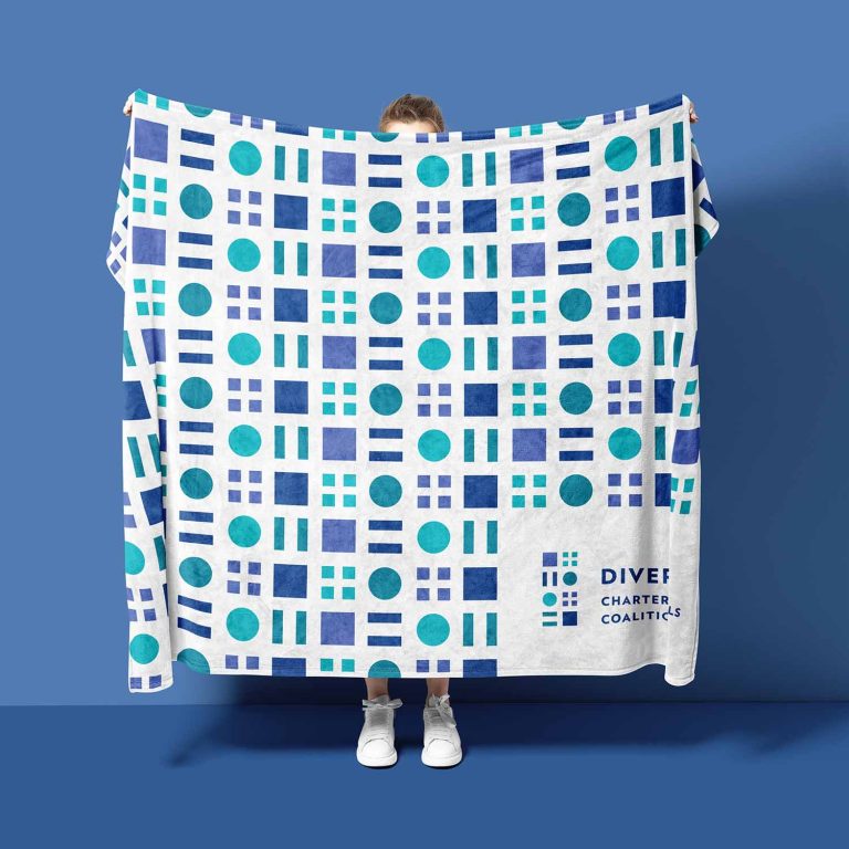
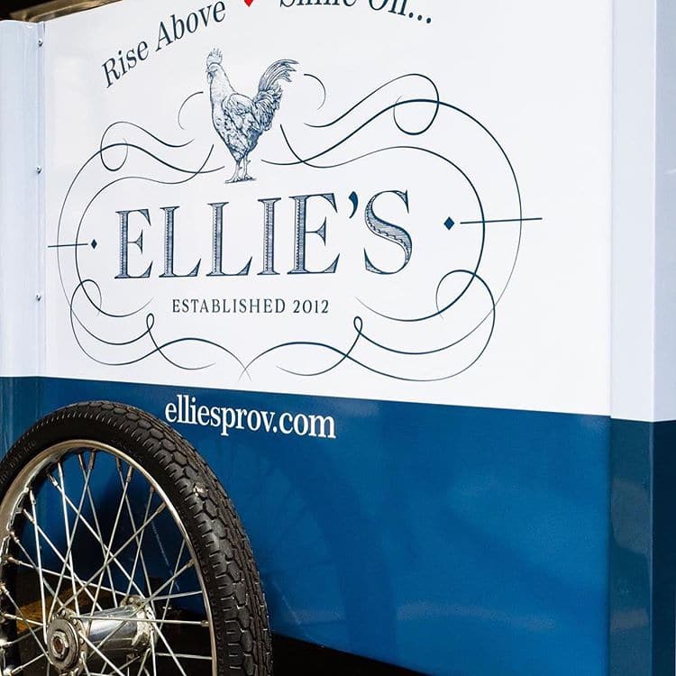
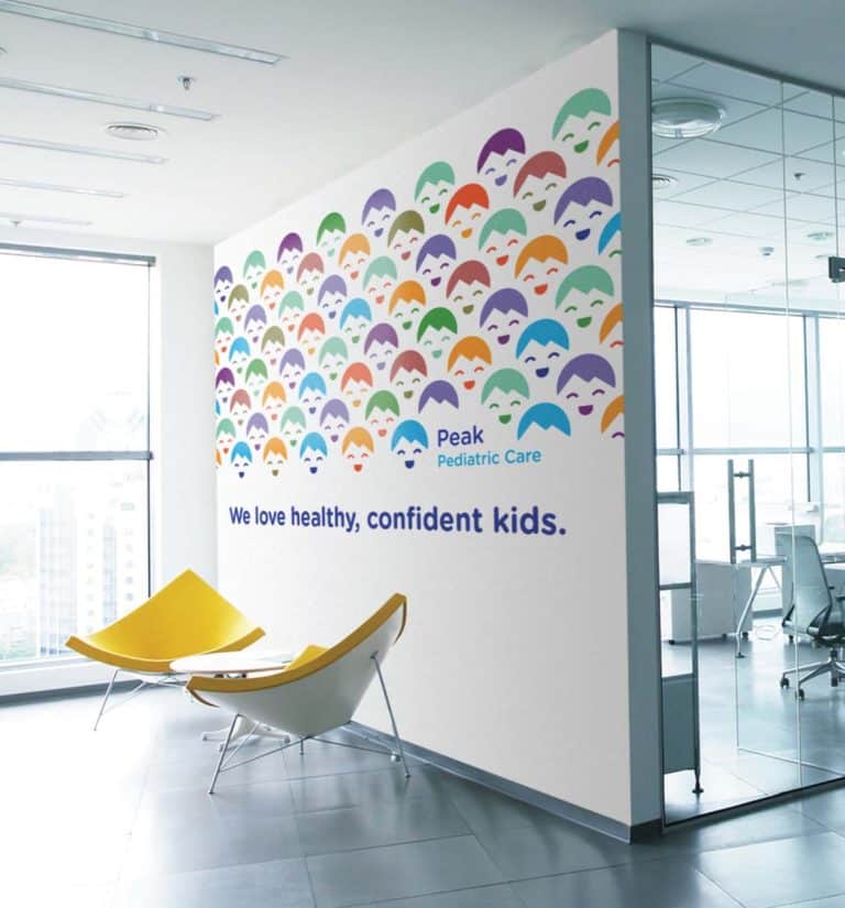
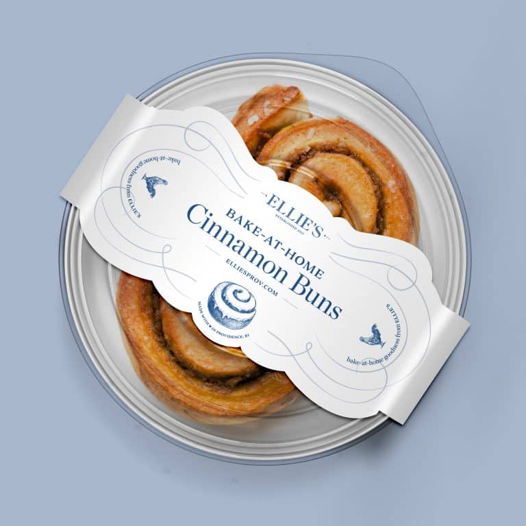
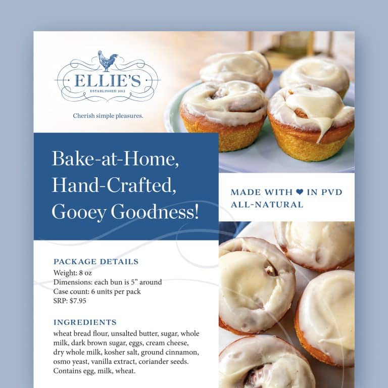
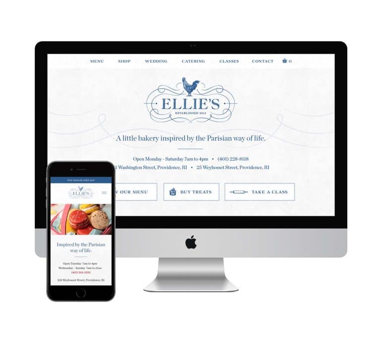
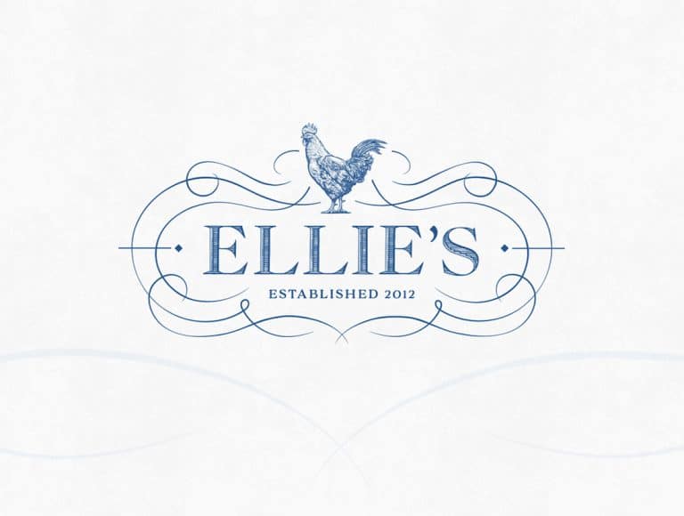
In Western society, blue is one of the most popular colors because it implies positive attributes such as trust, honesty, and faithfulness. Blue is a very common choice in logos, so the challenge is to create a distinguished blue. For instance, if you like sky blue, don’t settle for the sky blue color that in your basic desktop publishing software. Dig a little deeper to create a blue that is darker, or brighter, or has a little more green in it, or a little more purple in it. Here are a few examples of how I’ve used unusual blue hues to set my clients apart:
Purple
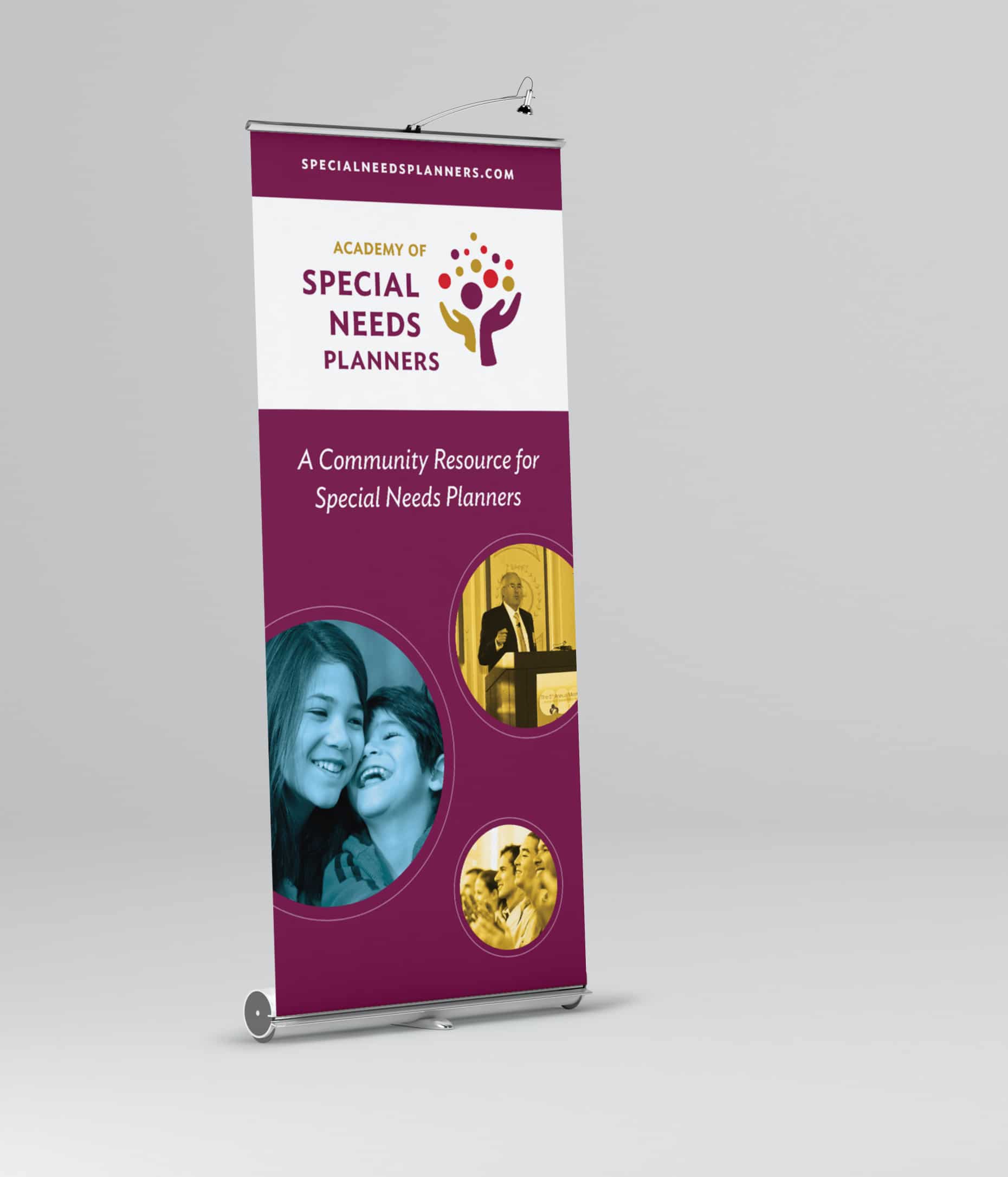
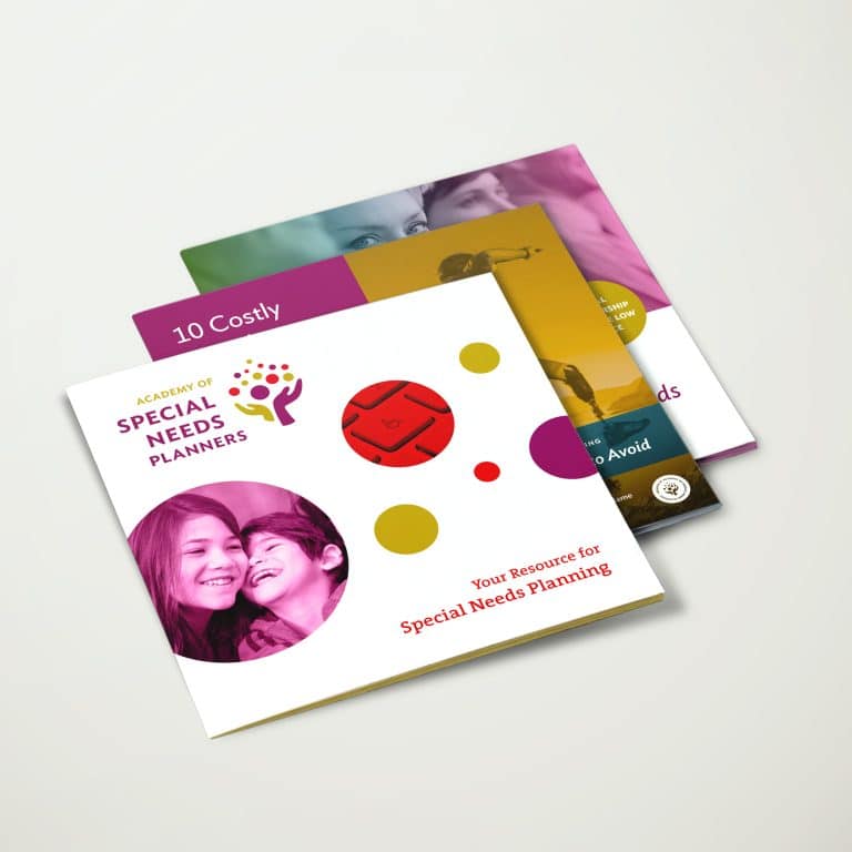
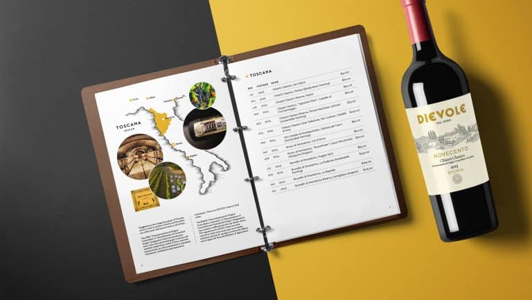
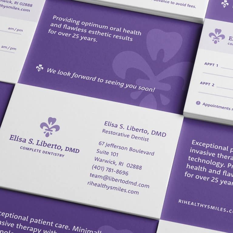
Depending on shade, purple runs the range from depicting royalty and luxury, to wisdom, creativity, and mystery. Some purple is seen as very feminine depending on the shade, but it can also be a more exciting and daring alternative to blue.
Black
Distinguished, elegant, powerful, and tough, black is a bold choice. Frequently used as a base or grounding color, to complement other logo choices, black can be a strong component of a good logo but can easily fall into a contrast trap: overpowering light colors (too much contrast) or blending too closely with dark hues of blue or purple.
Beyond the basics of color associations, there are additional concepts that will inform your logo color choices:
Color schemes
Certain arrangements of colors on the palette produce combinations that are pleasing, coordinated and work well in a logo colorway.
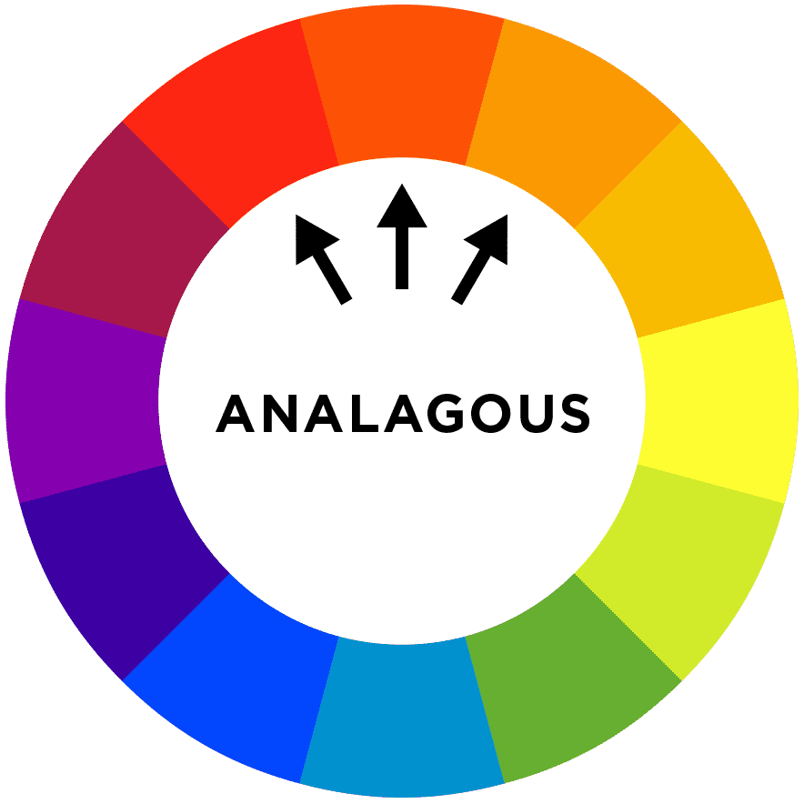
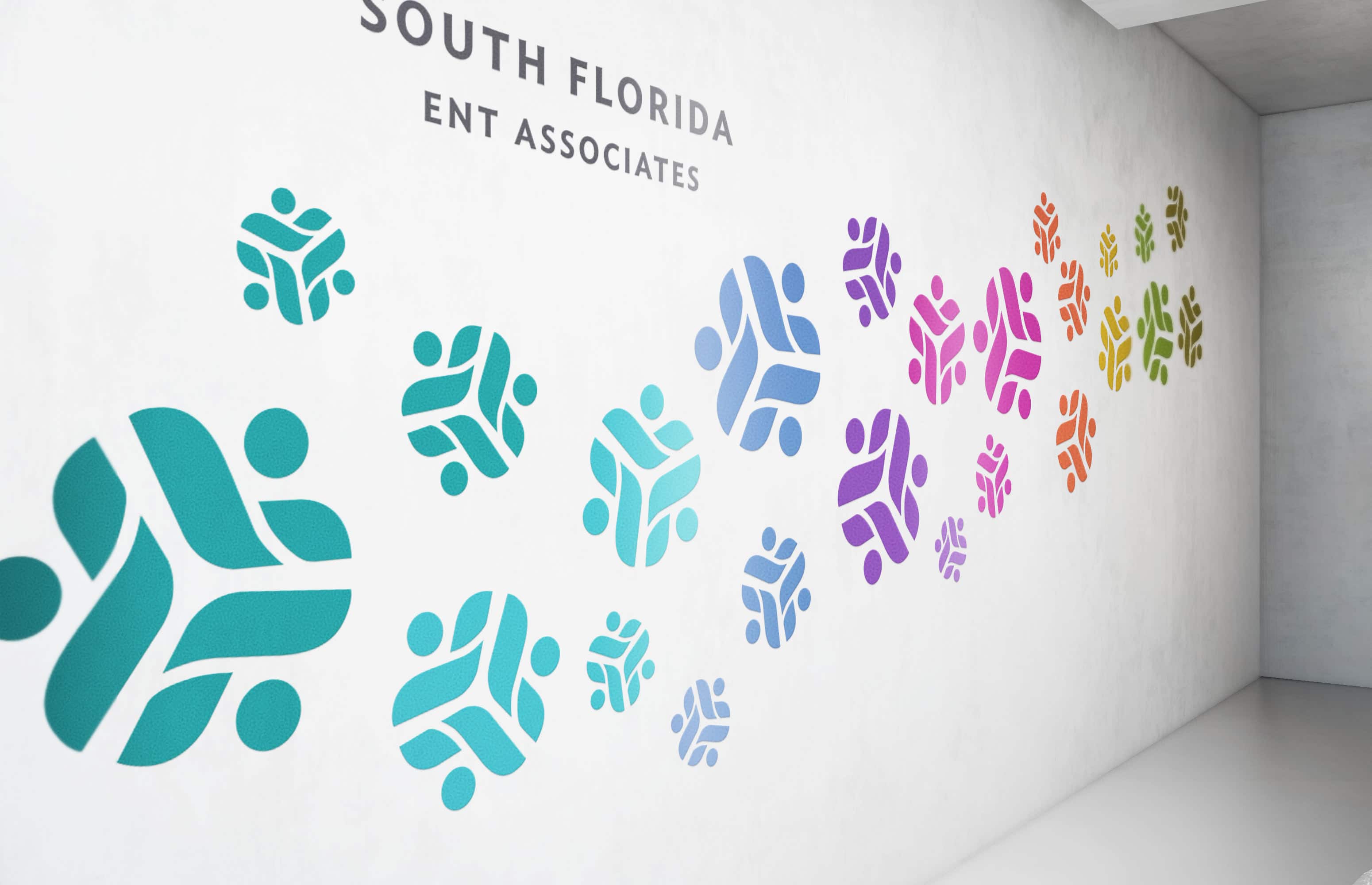
Analogous color schemes, consisting of colors found side-by-side or near each other on the color wheel, often mimic naturally-occurring color schemes, creating a feeling of peace and calm.
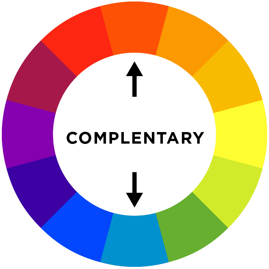
Complementary color schemes feature two colors opposite each other on the color wheel, creating a juxtaposition and impact that commands attention.
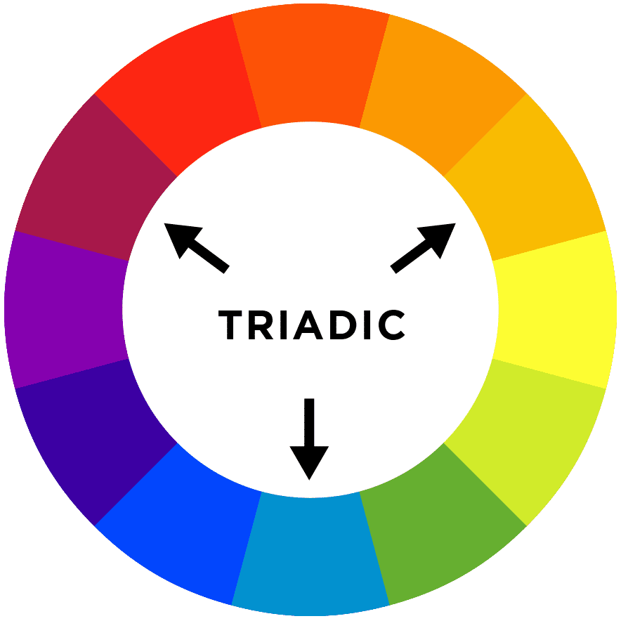
Triadic color schemes are formed by three colors equidistantly spaced around the color wheel, which can create a harmonious and vibrant trio of colors that intrigues and sets itself apart from other color schemes.
For fun, you can play around with creating palettes based on these established color formulas (and more) at Adobe Color.
Coolers allows you to generate random, editable 5-color palettes, as a way to play around with options you may not have thought of initially.
Hue and Saturation
Hue connotes the nearly infinite variations of color. While we refer to many things as “blue,” they can be further broken down: navy, turquoise, sky blue, slate, and cornflower all fall under the category of “blue” but each provides a very different feel and tone.
Hue: Blue has many hues, tones and shades
Saturation refers to the density of a given color (in printing, saturation actually refers how many “dots” of color are used in a certain sized area). Denser, more saturated colors are bolder and more strongly expressed, while less saturation will allow a color to feel faded and lighter. Playing with the hue and saturation of the colors in your logo provides you with numerous ways to tailor a color palette that encapsulates your brand personality and speaks to your preferred customer.
Saturation: Dark red can be de-saturated to a warm pink
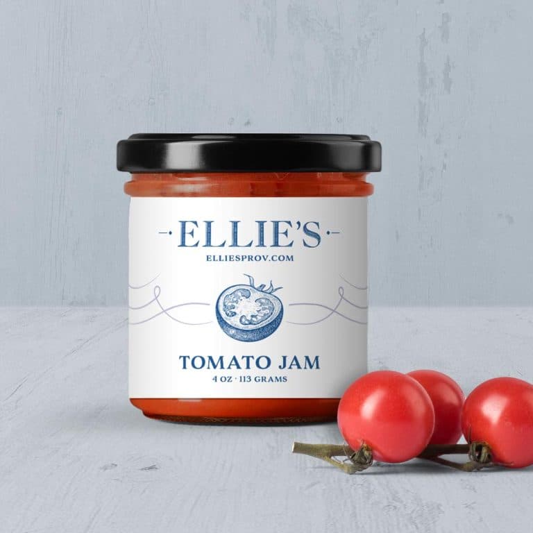
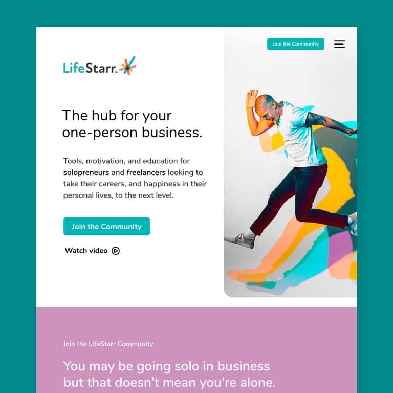
In particular, muted colors stand out precisely by not bonking customers over the head with a blaring need to be noticed. Sometimes, an understated color, as in the examples below, can send just the right message.
Consumers are surrounded by marketing messages, in every crevice of their lives, all day long. To ensure your logo stands out, it has two tasks: a) It must differentiate itself from the crowd, and b) it must convey and match your brand’s tone and personality. What types of colors would attract, motivate, and inspire your ideal customer or client? Which hue best connotes the aspects of your brand that you want clients and customers to be left with? Color psychology shouldn’t be your only resource, but it’s an important – and fun – place to start!
Need more logo advice?
Check out these helpful posts:
It's hard to market an unfocused brand.
Your business should tell a powerful story to attract loyal customers. Get a brilliant visual framework tailor-made to help you build trust.


