
Logos: Formats and Sizes I Prepare for All My Clients
You’ve invested in new design and have come away with a logo you absolutely love. Congratulations!
Now you need to be prepared to use it.
Powerful, solid logos don’t just come one way. A good designer will make sure that you have it in multiple proportions and formats to fit any use.
From digital and printed materials to corporate swag and more, your logo needs to look amazing everywhere – with its proportions beautifully correct, the colors spot-on, and no morphing or squeezing of any elements.
Sleek, streamlined, consistent presentation is critical to your business being perceived as excellent and reliable.
Subtle inconsistencies – where your logo doesn’t appear as sharp, vibrant, or sophisticated as it should – erode trust in your brand. A beautifully consistent logo presentation cuts through the noise and becomes a shining beacon for your customers everywhere they see it.
I make sure your new logo looks fantastic wherever you need it to speak for your business.
Here are straight answers to two frequently asked questions I get about what my logo design projects include.
What applications are included when I create a logo for your brand?
Your logo will come in the best proportions and formats for:
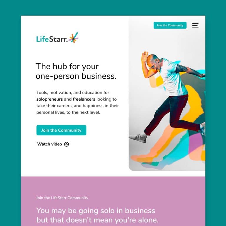
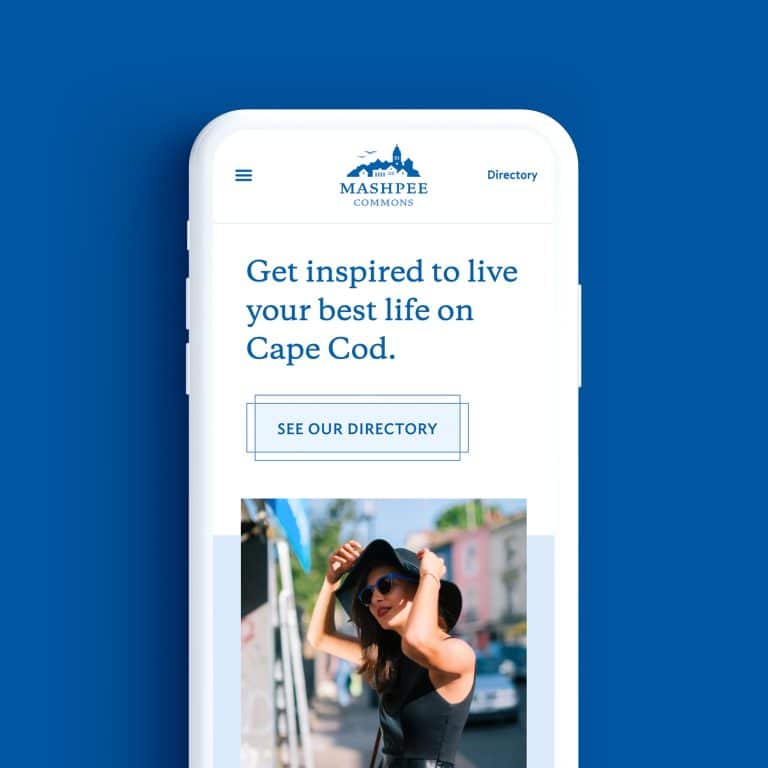
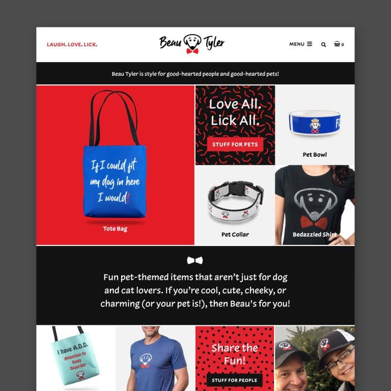
Digital media
- Website
- Email campaigns
- Social media profiles
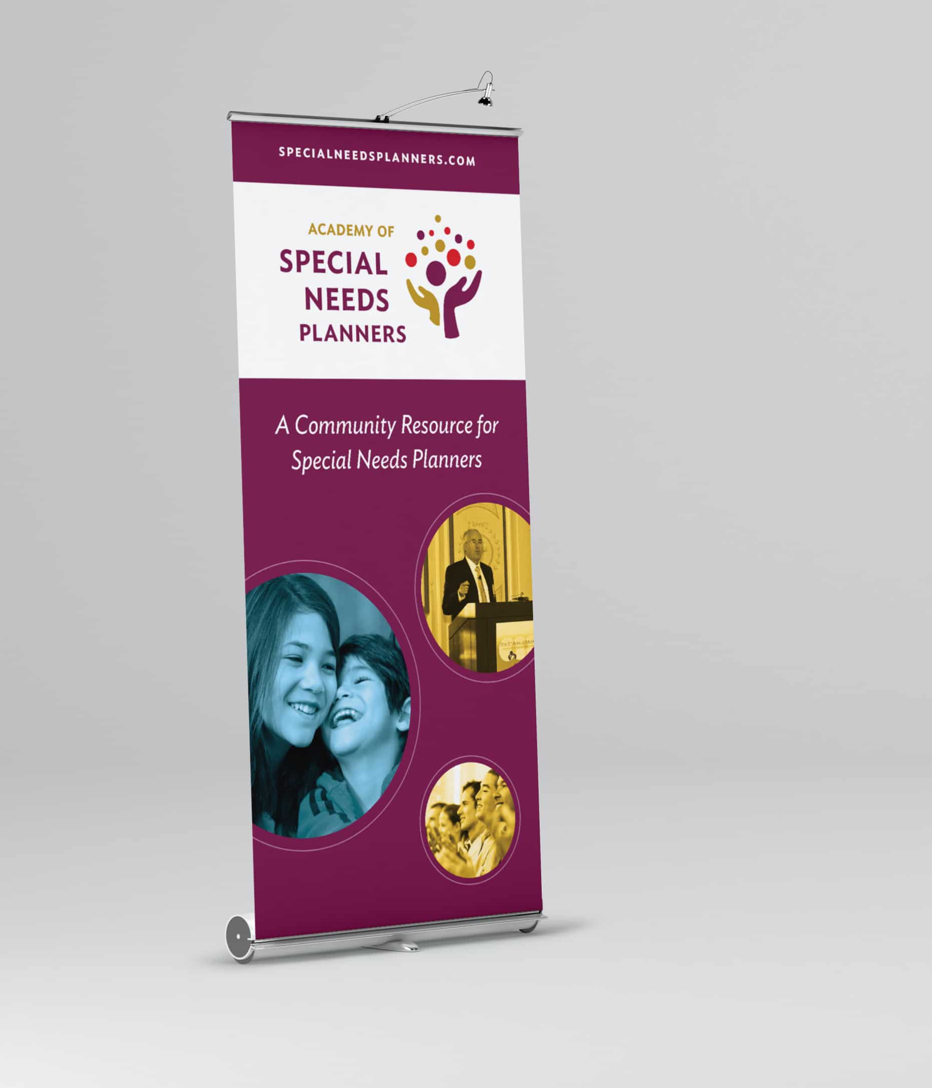
Printed media
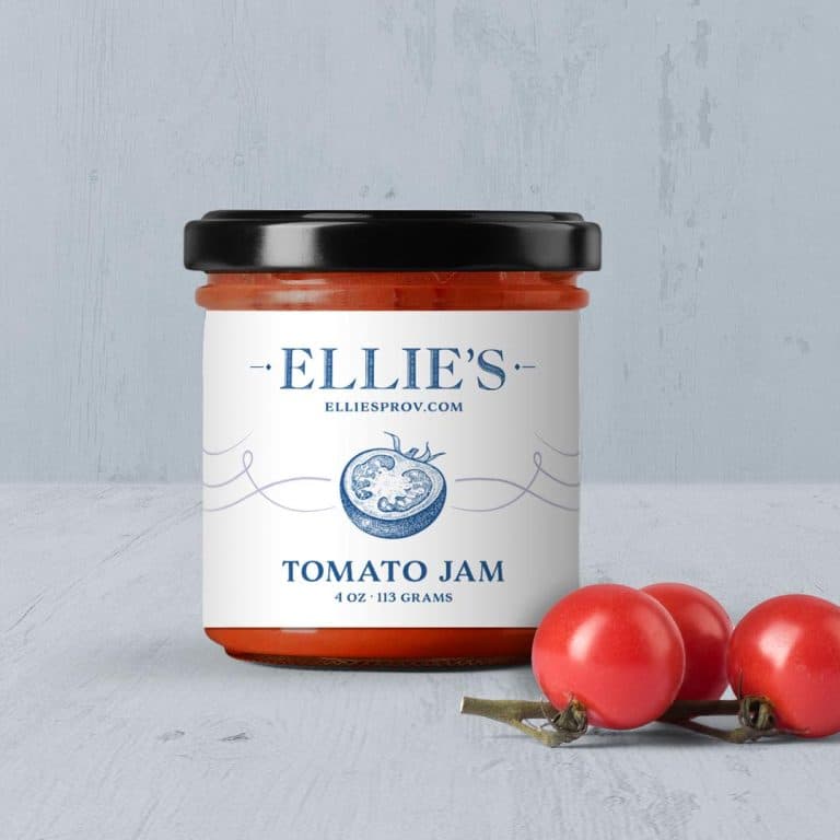
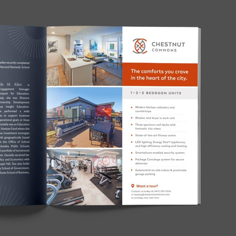
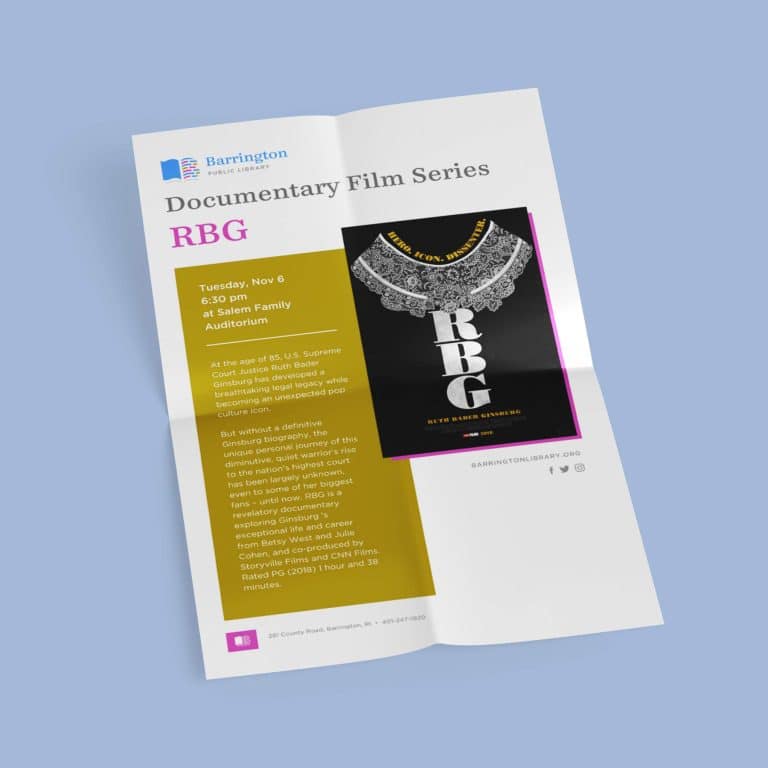
- Brochures
- Business cards
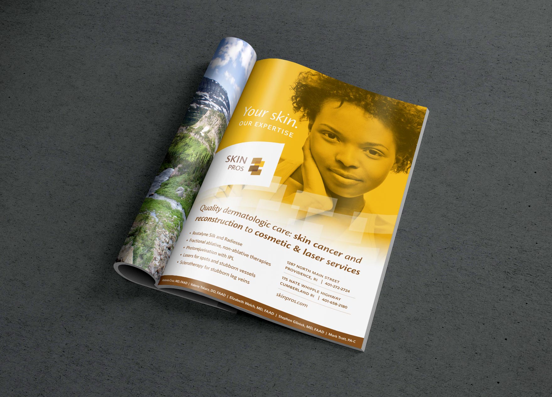
- Advertisements
- Banners
- Postcards
- Menus
- Letterhead
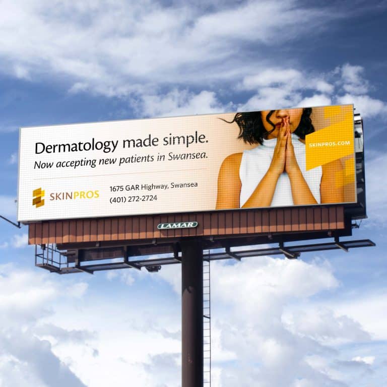
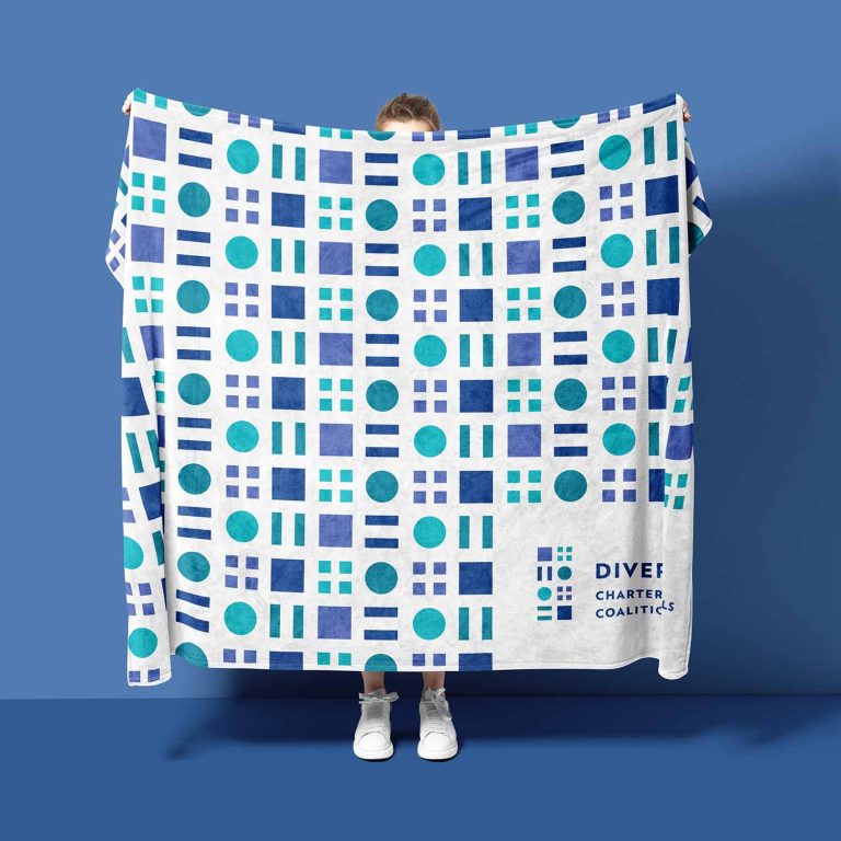
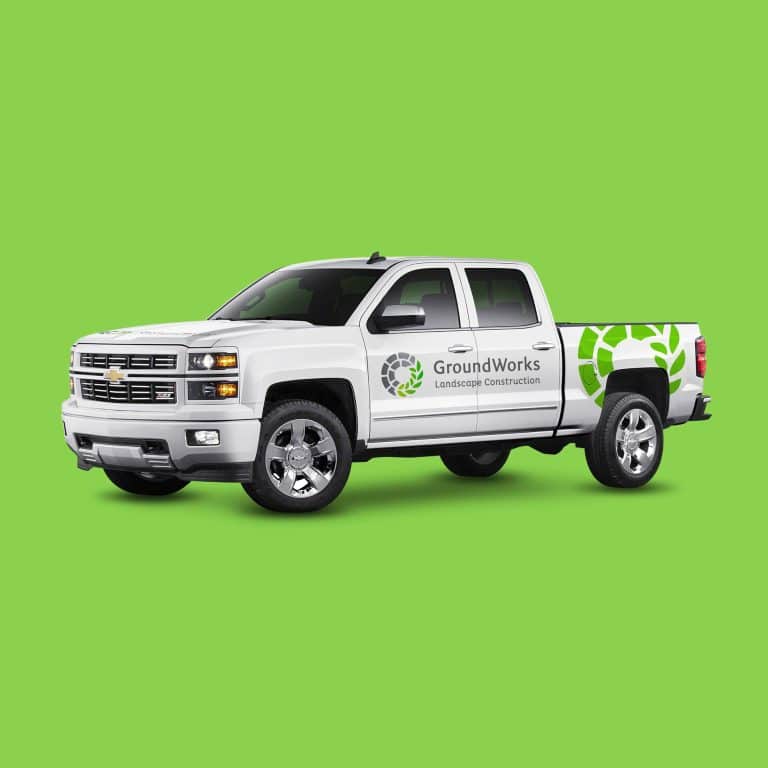
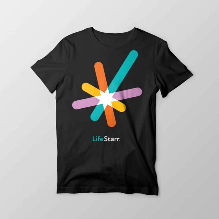
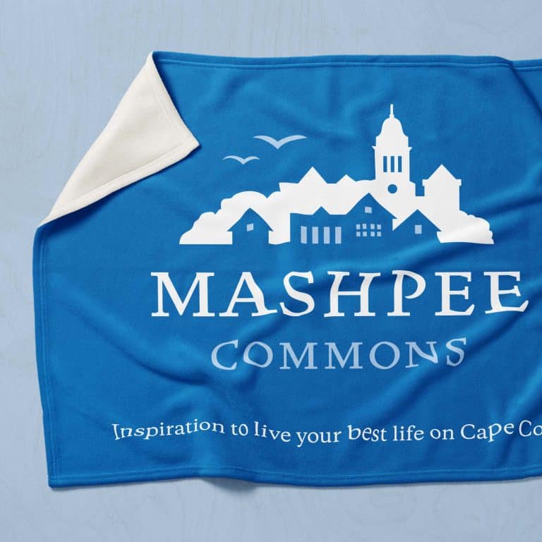
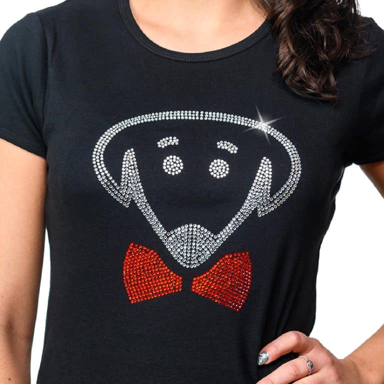
Corporate swag
- T-shirts
- Hats
- Pens
- (and much, much more)
How are logos for various applications different?
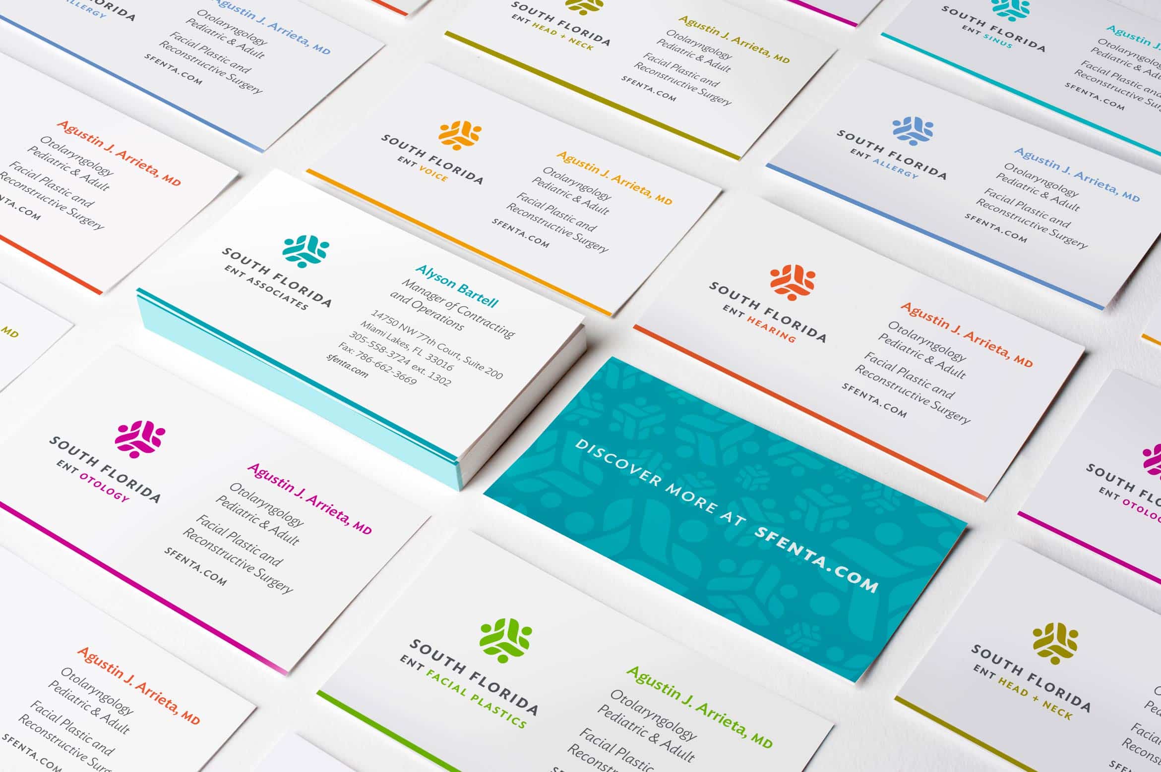
Shapes
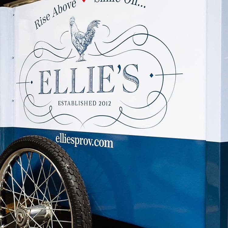
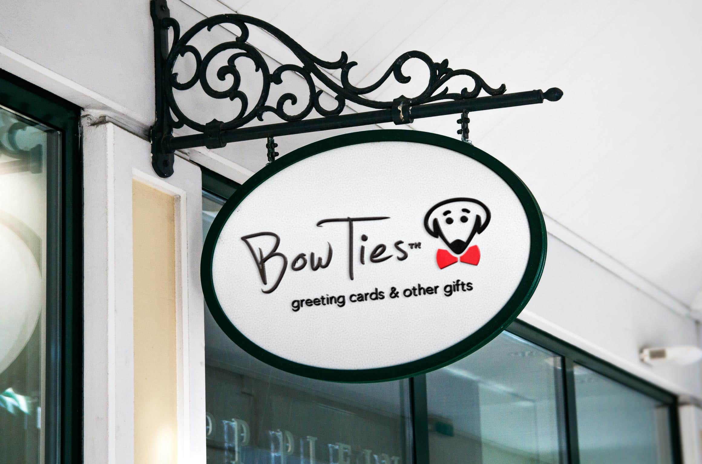
Across the many applications you may be using your logo with, one shape isn’t always going to be the most pleasing or useful. You’ll have one version you use most frequently, but I always prepare your logo in both vertical and horizontal arrangements for those times when your “usual” version just doesn’t quite fit.
What you put on the front of a t-shirt may not be the exact same version on your business card or menu, but having multiple arrangements means that you can still present that polished image – with the correct proportions and the perfect font – wherever it needs to go.
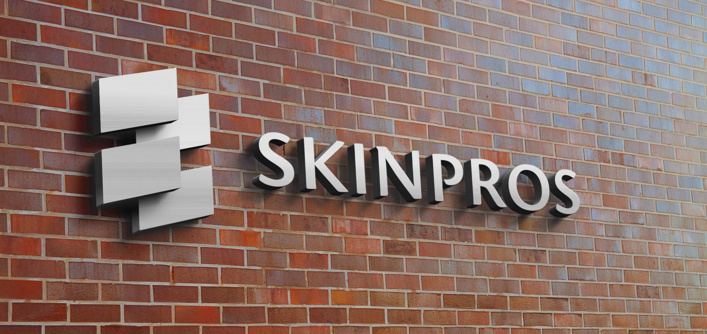
Formats
Different applications require different file formats to best represent your logo in that space. Printers and designers will ask for your logo in these formats and I make sure you have them ready to go.
Formats you’ll receive automatically include:
- PDF, EPS (for commercial print use; infinitely scalable vector format that can be printed on anything from a pen to a building-sized sign)
- PNG, JPG (for social media, online, or desktop publishing use)
- SVG (infinitely scalable vector format to use on your website; this format can “future-proof” your logo)
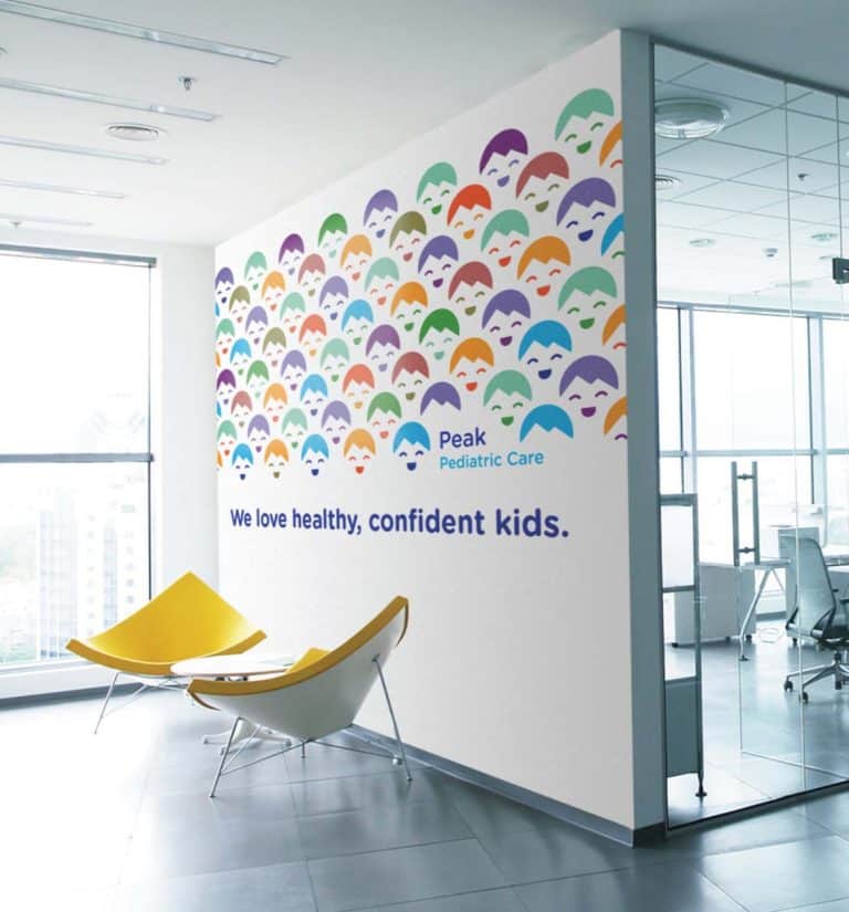
Colors
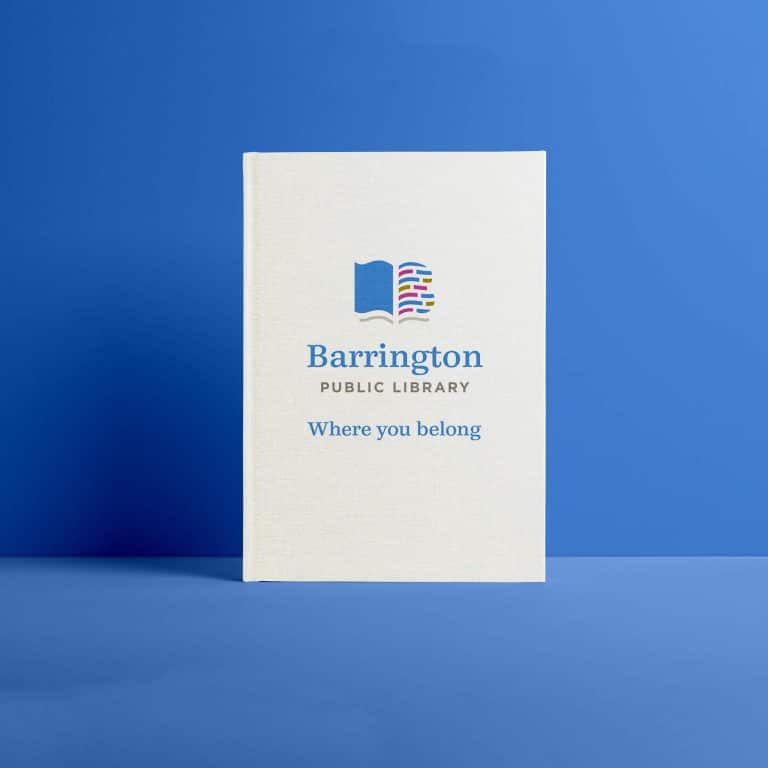
You’ll receive full-color versions of your logo, with all the vibrancy of your brand’s chosen palette standardized so that it looks beautiful wherever it’s printed or used.
These full-color versions include a CMYK format for professional printing and an RGB format for desktop, tablet, and mobile screen use. If needed, I can also create a Pantone color version of your logo to perfectly equalize the brand colors on all your printed pieces.
It’s crucial that your logo also works well in black & white (also known as “greyscale”). There may be instances where your logo is printed without color, and you want it to consistently replicate the polished confidence of your brand in those spaces as well.
I make sure that your logo has a no-fail color mix that works well and looks great if it’s printed in black & white.
In addition, you’ll get an all-white version of your logo to be used in a reversed out context for when you want to display your logo on a dark or richly-colored background.
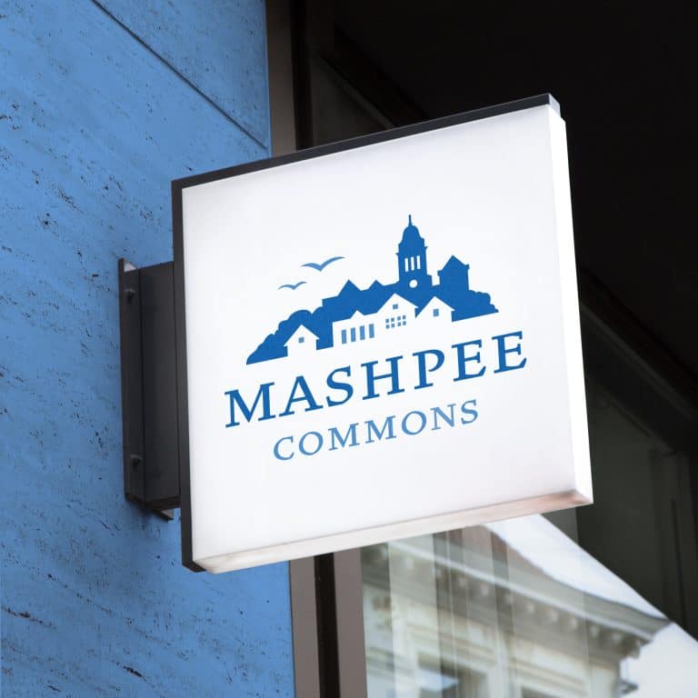
For example: if your main logo color is a rich orange, you may want to get polo shirts for your team in that same orange color. However, putting an orange logo on an orange background would result in just… a hazy bunch of orange. You need maximum contrast for your logo to be clearly seen, and reversing out your logo in white is almost always the best way to achieve that.
To infinity… and beyond!
While these formats, arrangements, and sizes will cover 99.9% of what you may use your logo for, you may come across a need for a different format.
You have only to ask! I want to make sure your logo looks awesome however and wherever it appears, and I’m glad to help.
A true quality logo design includes everything you need to present your beautiful brand to the world.
When I’m done with a logo project, your business will be prepared not only for the present but for anywhere it goes in the future.
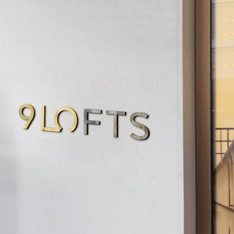
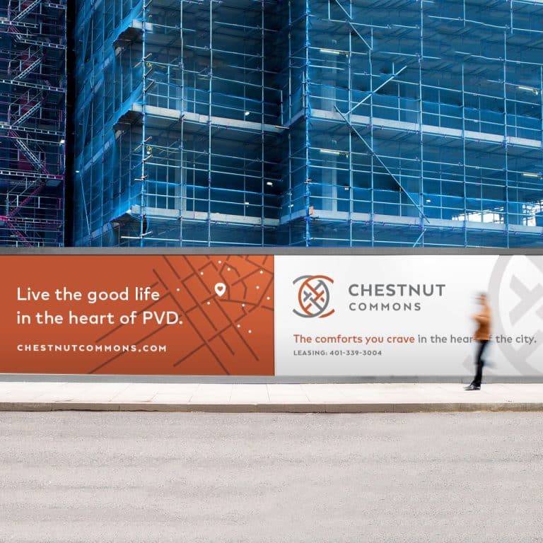
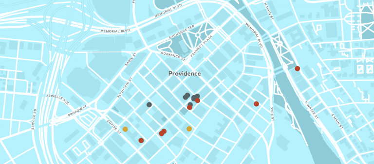
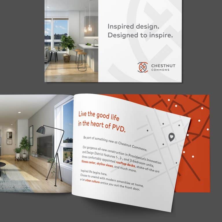
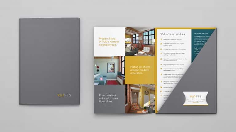
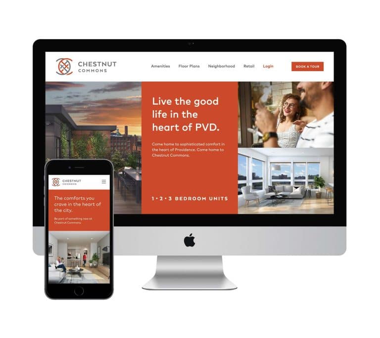
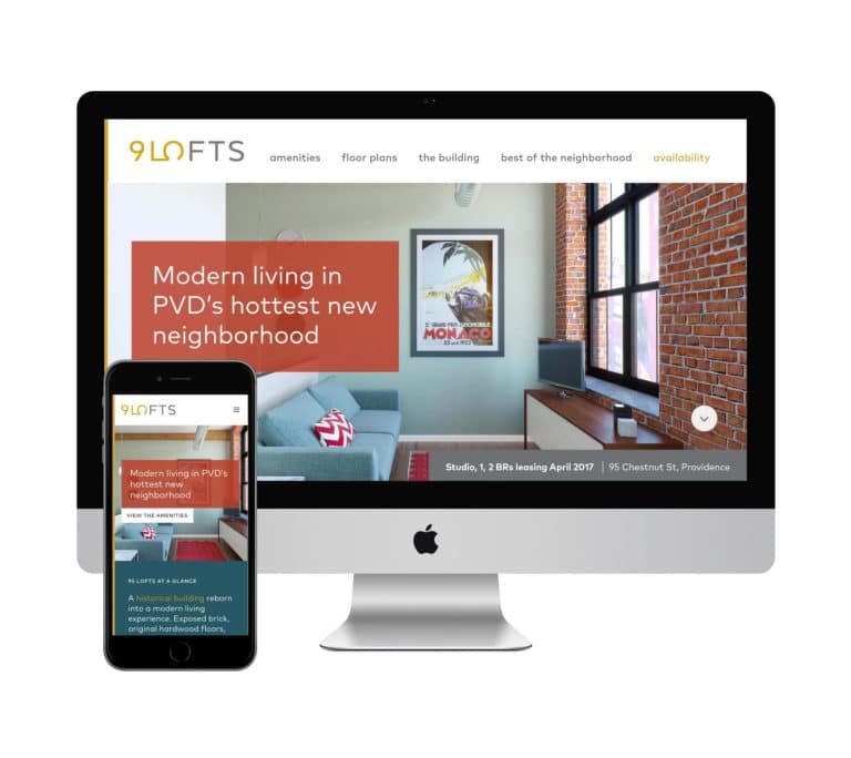
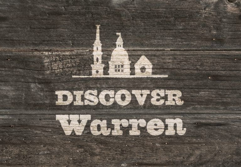
FYI, the logo I used in these examples is a recent design for a sophisticated new set of lofts being built in downtown Providence. Craving the good life in the heart of PVD? Check out the site I created for them and book a tour!
It's hard to market an unfocused brand.
Your business must tell a powerful story with strong optics and a persuasive storyline so you can stand out from the crowd and change more minds. Get a brilliant visual framework tailor-made for you.


