What’s Your Graphic Design IQ?
My quick quiz tests your knowledge of common graphic design terms. If you’ve ever wondered what goes into designing the perfect logo for your brand, and ensuring that your visual message is represented professionally and consistently, take my quiz to test your savvy.
- ‘RGB’ denotes a system computers use to determine what color to display on a screen.
TRUE!
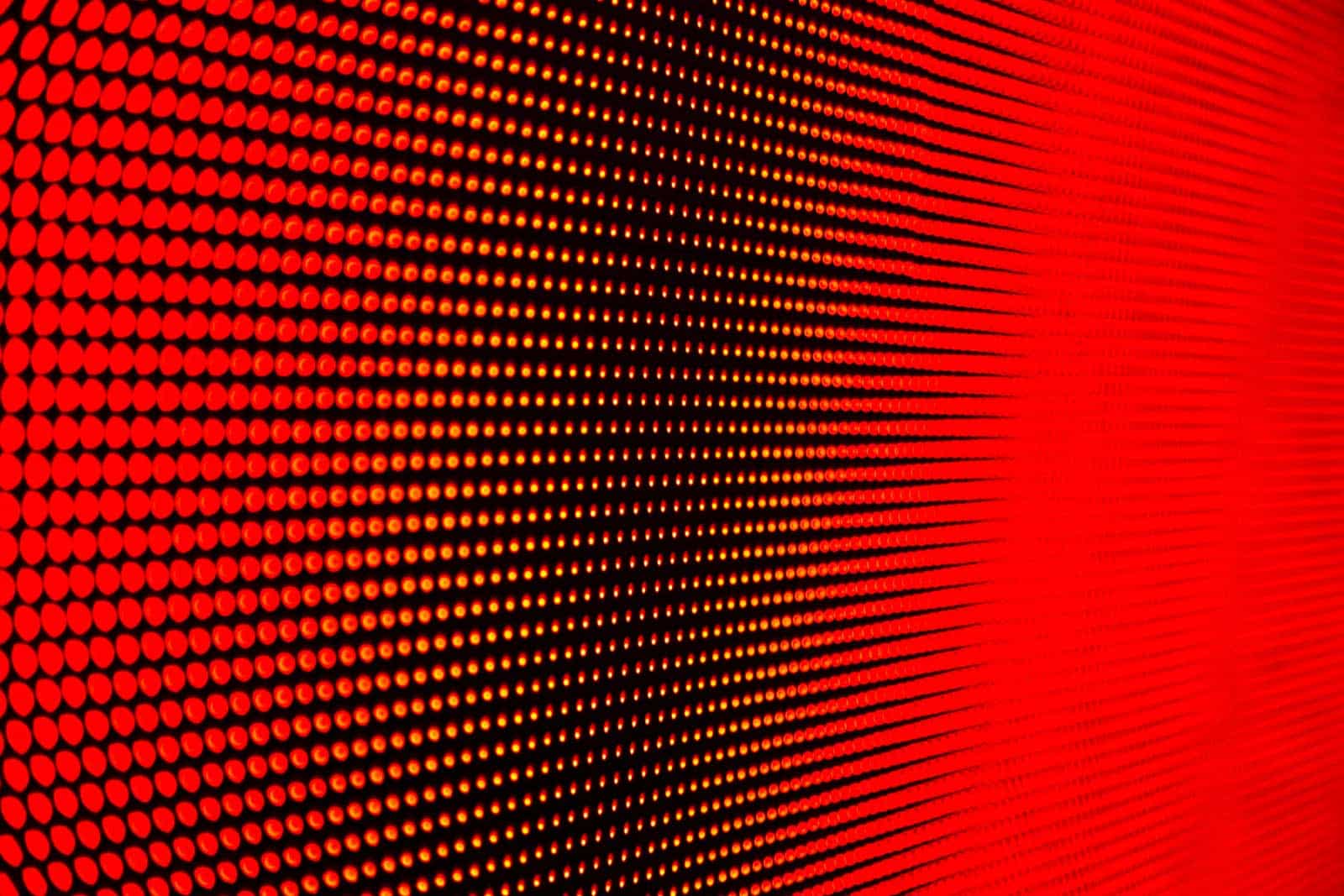
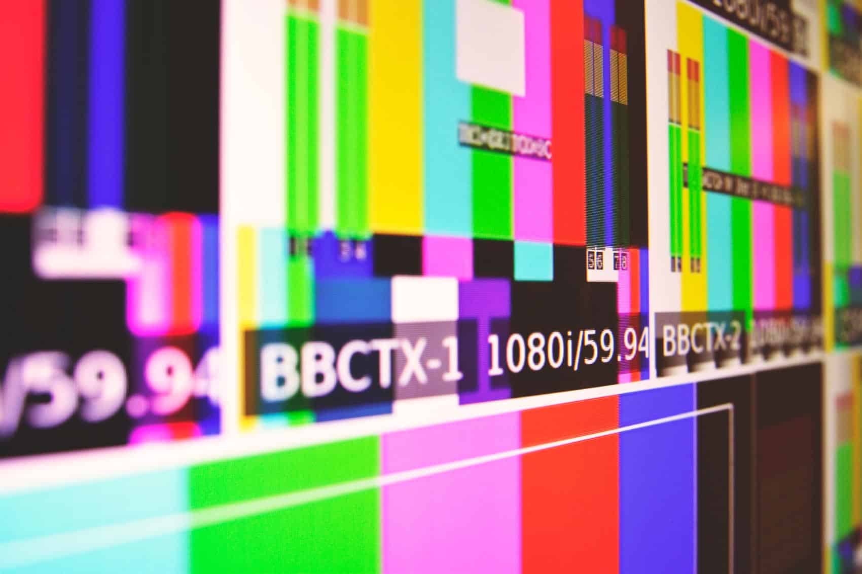
RGB refers to the colors red, green, and blue, which are the possible colors that a computer screen can display in each pixel. Each color in the visible spectrum can be made up of varying, specific combinations of each of these colors. If you’ve ever tried getting really close to an older TV screen, you could see the picture broken up into visible red, green, and blue dots. Computer monitors operate the same way – but luckily technology has advanced to the point where high enough resolution renders them as blended colors to the naked eye.
RGB tells the computer which specific color to display on the screen by giving each of the three components a value that ranges from 0 to 255. RGB is an additive color system, meaning that when all three colors are fully present (255, 255, 255) the displayed color is white, and when all three colors are absent (0, 0, 0) you get black. All other combinations create their own precise color. Why does this matter? Designers use these “codes” to identify the very specific colors in your brand so that they are replicated the same every time.
- Hex color is used for printed works.
FALSE!
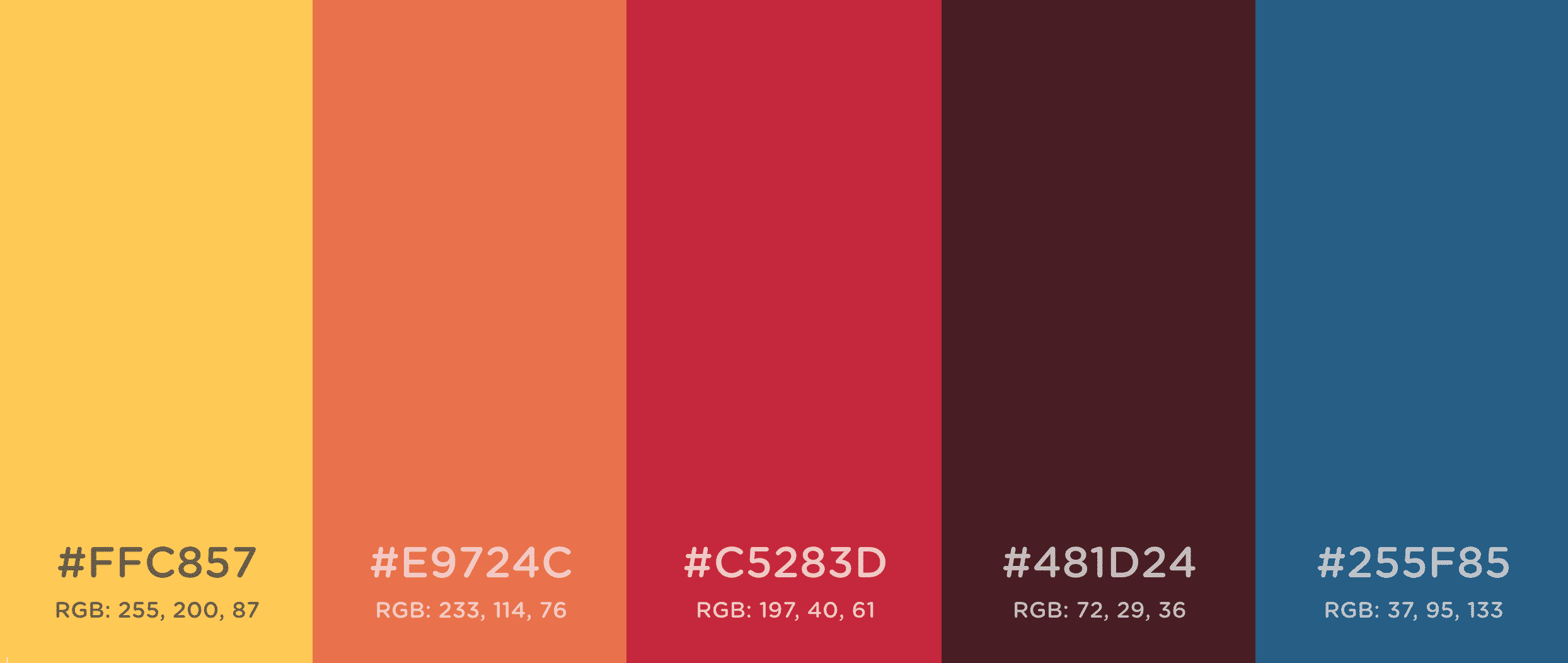
Like RGB, hex color is additive and refers to how colors are displayed on a computer screen (vs. printed materials). Corresponding to a color’s RGB designation, hex color is a type of shorthand. It contains a string of six characters following a hashtag. The name comes from “hexadecimal,” which is a base-16 counting system that includes both numbers and letters for identifying specific colors, so that Coca-Cola red – and your brand colors – are always rendered the same. For example, while this shade of gold is designated in RGB as (255, 200, 87), it would be translated in hex color as #ffc857. Pure black is #000000 and pure white is #FFFFFF. Online color translators make it easy for designers to switch between RGB and hex color as needed.
Generate your own palette at Coolors.co
- ‘CMYK’ stands for cyan, magenta, yellow, and black.
TRUE!
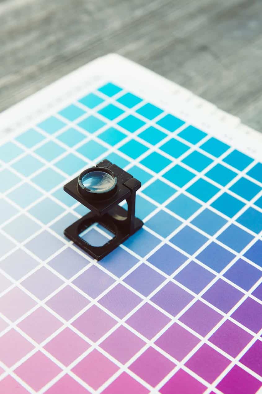
While RGB and hex color are used to specify colors on a screen, CMYK is a method for specifying colors for printing. In contrast to RGB and hex color systems, they represent a subtractive process, whereby the paper absorbs a certain pattern and mix of four inks to display each color in a design (more ink = darker/richer colors).
Those four inks are cyan, magenta, yellow, and black (hence ‘CMYK’ – black is represented by the ‘K’) and are used by most professional printers (and most home and laserjet printers). All printed colors are constructed of specific combinations of these four inks, blended to create precise colors using a CMYK profile (specifying values for each element, like in RGB) that tells the printing machine how much of each color to use in each area of the print. Close inspection with a magnifying glass will reveal very tiny overlapping dots of the individual colors that the eye blends together at distance. However, each printer interprets the color slightly differently.
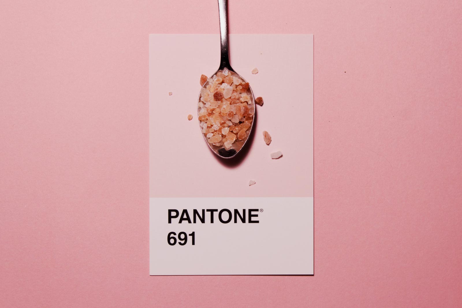
- Pantone Matching System (PMS) was created by a Hofstra University graduate named Lawrence Herbert.
TRUE!
Herbert was working part-time in the 1950s for the commercial printing company of M&J Levine Advertising when he used his knowledge of chemistry knowledge to codify the company’s stock of pigments and colored inks. He later purchased the technological assets from them and renamed them Pantone.
PMS is another form of subtractive color; a convention used for printing, like CMYK. Where it differs from CMYK is that Pantone is a universal printing system used by professional printers to ensure that color is rendered exactly the same no matter where it is printed, anywhere in the world. Colors like Coca-Cola red, or the deep purple-blue and fluorescent orange of FedEx, are so recognizable because PMS printing ensures that there is never any variation in how their brand colors are represented on boxes, ads, cans, and more. Pantone ink is also one solid color throughout, unlike the blended system of tiny dots that make up CMYK color.
- ‘Bleed off the page’ references the common injuries designers endured on the job before the invention of computers.
FALSE!
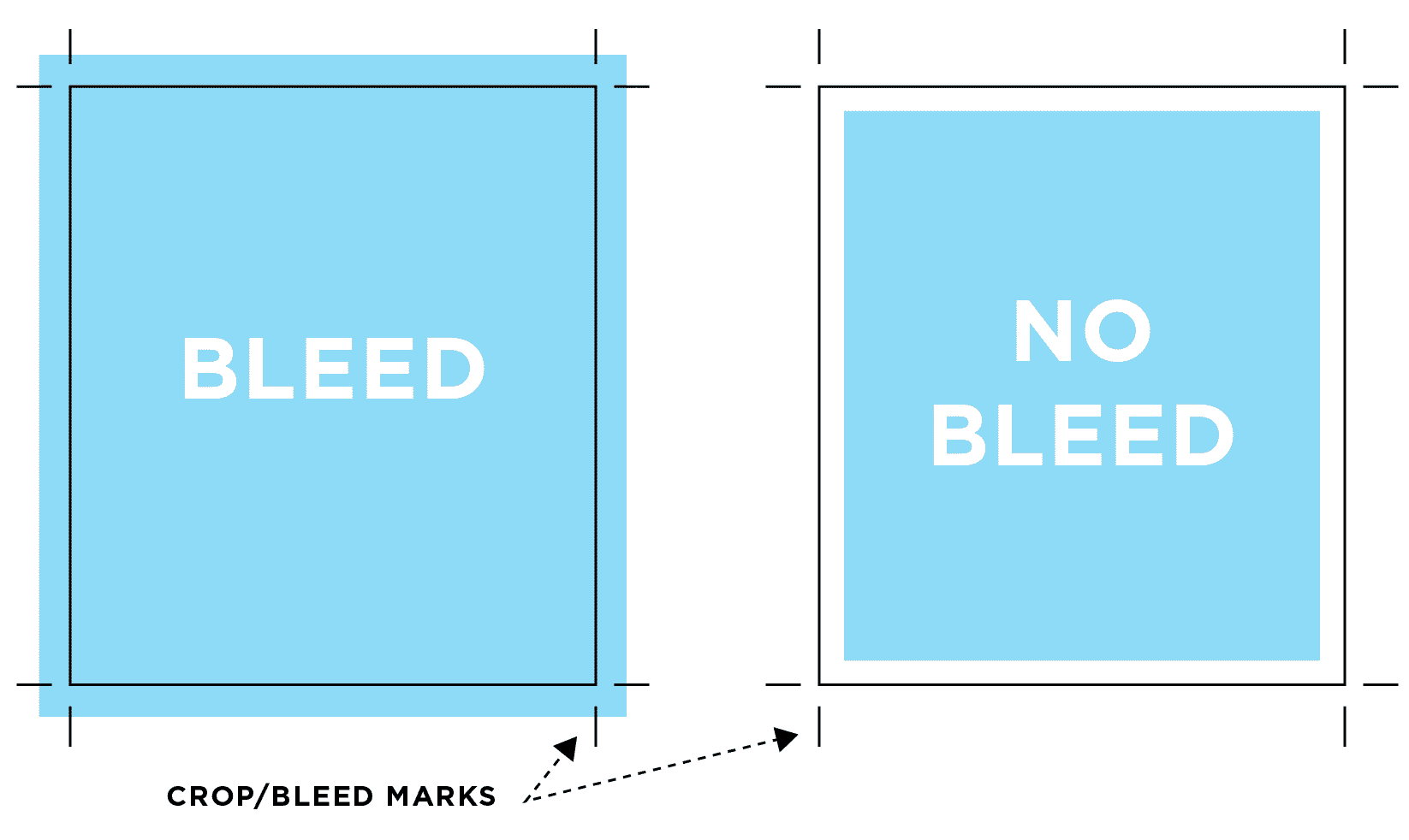
‘Bleed’ is another print term that refers to how the artwork on a printed piece goes right up to the edge, with no margin. You may hear your designer ask if you want something to bleed off the page, or hear a printer say, “is the artwork supposed to bleed off the sheet?” If so, the print file will need to have “bleed marks,” or crop marks in the artwork file that tell the printer where the page should be cut. Crop marks are generally placed slightly inside the edge of the print area (causing the ink to “bleed” past the edge) so that when a slicer comes down on a stack of 1000 postcards, it can accommodate a tiny bit of being off to either side.
- ‘Leading’ is an old world way of saying ‘line spacing.’
TRUE!
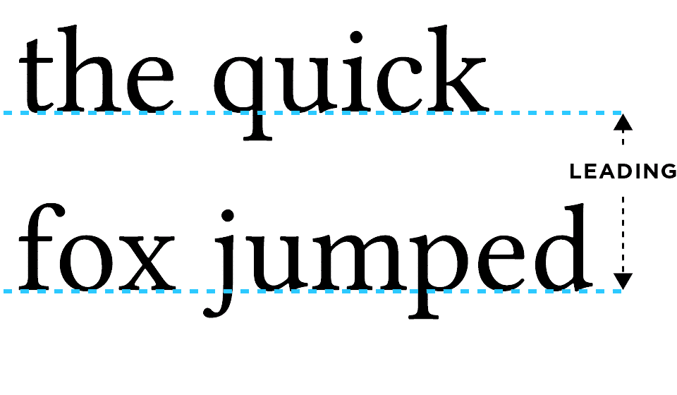
It rhymes with ‘bedding’, and it’s an old world way of saying ‘line spacing.’ It comes from the days of the printing press when a printer wanting to put more space between lines of text would actually put pieces of lead in between the lines of type before printing. Most fonts don’t actually look great single spaced – it presents a crowded, dense block of text to read and letters may actually touch from one line to the next. Nice spacing is like a breath of fresh air. I prefer at least 1.3 to 1.6 leading (or ‘line-height’) for most fonts. This creates a breathable space between lines, making it easier to read each line of text, while still maintaining a nice cohesiveness to the paragraph.
- ‘Kerning’ is the horizontal version of leading – it refers to the spacing in between letters.
TRUE!
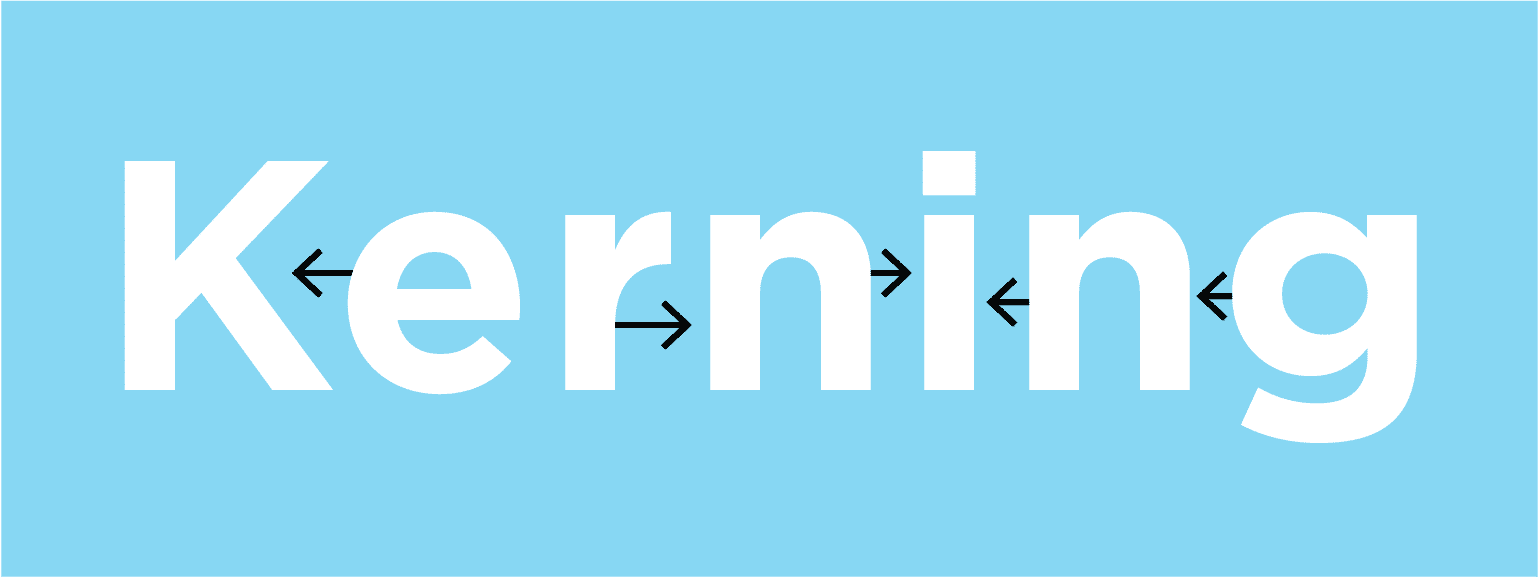
Kerning is the horizontal version of leading – it refers to spacing in between letters on one line and the character spacing within a word. I don’t frequently use excessive kerning in paragraph text, but it’s a handy tool to, say, make a short all-caps title more pleasant to digest. Uppercase can be hard to read, so depending on the font, upping the kerning gives just the right amount of space between characters.
- ‘Resolution’ refers to the density of points of light on a screen, or the density of dots of ink on a page.
TRUE!
Resolution refers to the density of points of light on a screen, or the density of dots of ink on a page. Higher resolution means there are more dots in a smaller space, which renders a color more smoothly to the naked eye (remember those old TVs that you could see broken up into red, green, and blue dots from a few feet away? That’s low resolution). High resolution also renders lines and edges more crisply, so that images – on a screen or on a page – look sharp and clear, rather than soft.
Now that you’ve mastered these design terms, you may want to make sure you’re not making one of these 8 business-killing web design mistakes.
P.S. I sourced some of these photos from Unsplash, one of my handy biz resources.
It's hard to market an unfocused brand.
Your business must tell a powerful story with strong optics and a persuasive storyline so you can stand out from the crowd and change more minds. Get a brilliant visual framework tailor-made for you.


 While RGB and hex color are used to specify colors on a screen, CMYK is a method for specifying colors for printing. In contrast to RGB and hex color systems, they represent a subtractive process, whereby the paper absorbs a certain pattern and mix of four inks to display each color in a design (more ink = darker/richer colors).