5 Biggest Design Mistakes on Your Business Signage or Billboard Ad
As a veteran graphic designer, I have a sharp eye for great design, as well as for bad, all-too-common design mistakes on business signage or billboard ads. There are a lot of them, my friends. But the happy news is that most of them are easy to fix.
- Too Busy
I know it’s tempting to cram everything about how great your business is on your storefront sign or billboard ad. Your name! Address! Phone number! Your big news! A picture of yourself! Pictures of your business! And the list never ends. This is truly one of the biggest design mistakes.
The problem with drowning your signage or billboard ad with too much information is that people get lost. If the focus isn’t obvious, their brain may quickly ignore the ad or sign and move onto something more pleasing or memorable. It’s hard to remember a lot of things, especially if you’ve never heard of the business before. Keep in mind, people may be driving by at high speeds or talking on their cell phones, and already distracted when they chance upon your ad or sign.
Instead of overstuffing, ask yourself: “What is the one piece of information I want a future customer to remember?”
Is it your business name? Is it your new website? Is it a special sale? Build the signage or billboard ad around that, and be brutal cutting out (almost) everything else.
- Mistakes
Nothing like an embarrassing grammatical error to sink your ad. Misspellings, missing commas, and too many commas are all too prevalent. Even if a future customer warms to everything else about your ad, a typo sends the message that your business is sloppy, unprofessional, and that the people in charge are perhaps not very well educated. Hire a copy editor or professional writer to compose your ad copy and edit it. Grammar “misnakes” are certainly the most embarrassing of the biggest design mistakes I’m listing in this post.
- Unreadable
Carefully consider where the ad will be placed and how people will “consume” it. Will they whiz past at 65 miles per hour? Will they balance with a latte and a petulant toddler on the sidewalk? Will they be nose deep in their smartphones on the bus? The font size needs to be big enough to very easily read, and the color scheme needs to be readable at all hours of the day.
If your sign or billboard will be constructed of special material, consider how lighting and shading will optimize the readability of your signage. If you can, make a mock up and walk, bike, or drive by just as your customers will, then incorporate your own feedback.
- Design flubs
The style and feel of your ad should carry a cohesiveness among all the elements (the graphics, font, color scheme and message). Design cohesiveness may be hard to size up if you’re not a professional designer, so invest in hiring one.
tipOne indication that you are settling for “good enough” is if you are using clip art or other desktop publishing tools to create your ad or signage.
Another sign of mediocrity is if your ad or signage doesn’t scale up very well. Are the graphics fuzzy or pixellated? You may need a higher resolution photo or vector artwork for maximum scalability. Extra points: make sure you’re not using one of my fonts to avoid.If your signage is the first contact you have with customers, it’s arguably the most important part of your business.
Another way to think about your design investment is to ask yourself, “Why am I spending a ton of cash on a billboard if it’s not going to look the best it can?”
- Missing a call to action
For billboards, what action do you want an interested customer to take after seeing your billboard? Unless your ad is for general exposure, ask yourself what you want people to do when they see your billboard. Call your business? Email you? Visit a new store? Establish a single “call to action” then build the message around that action.
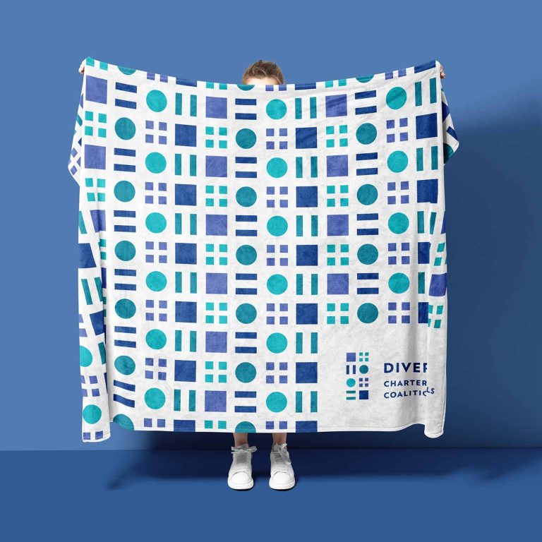
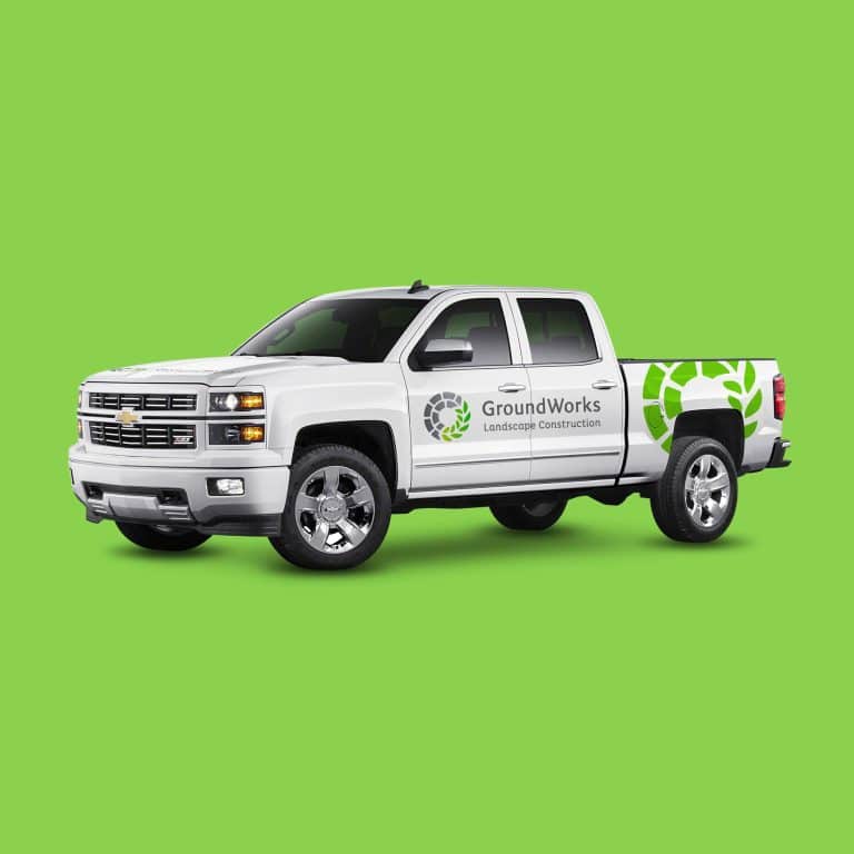
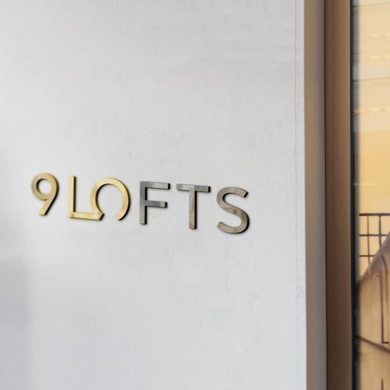
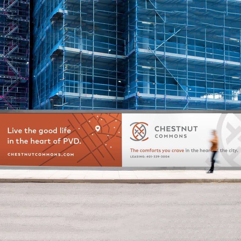
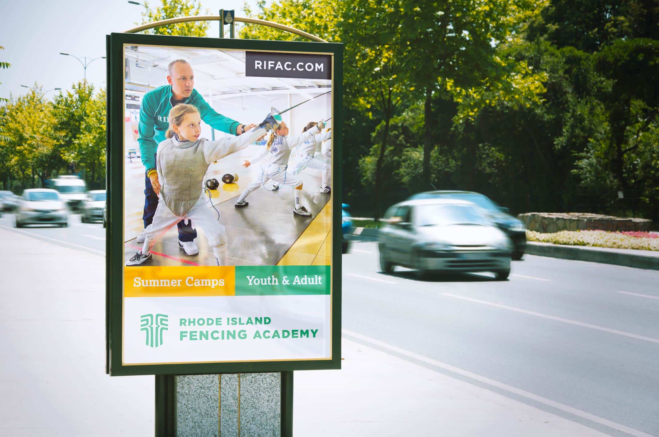
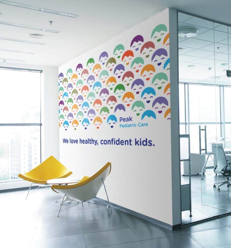
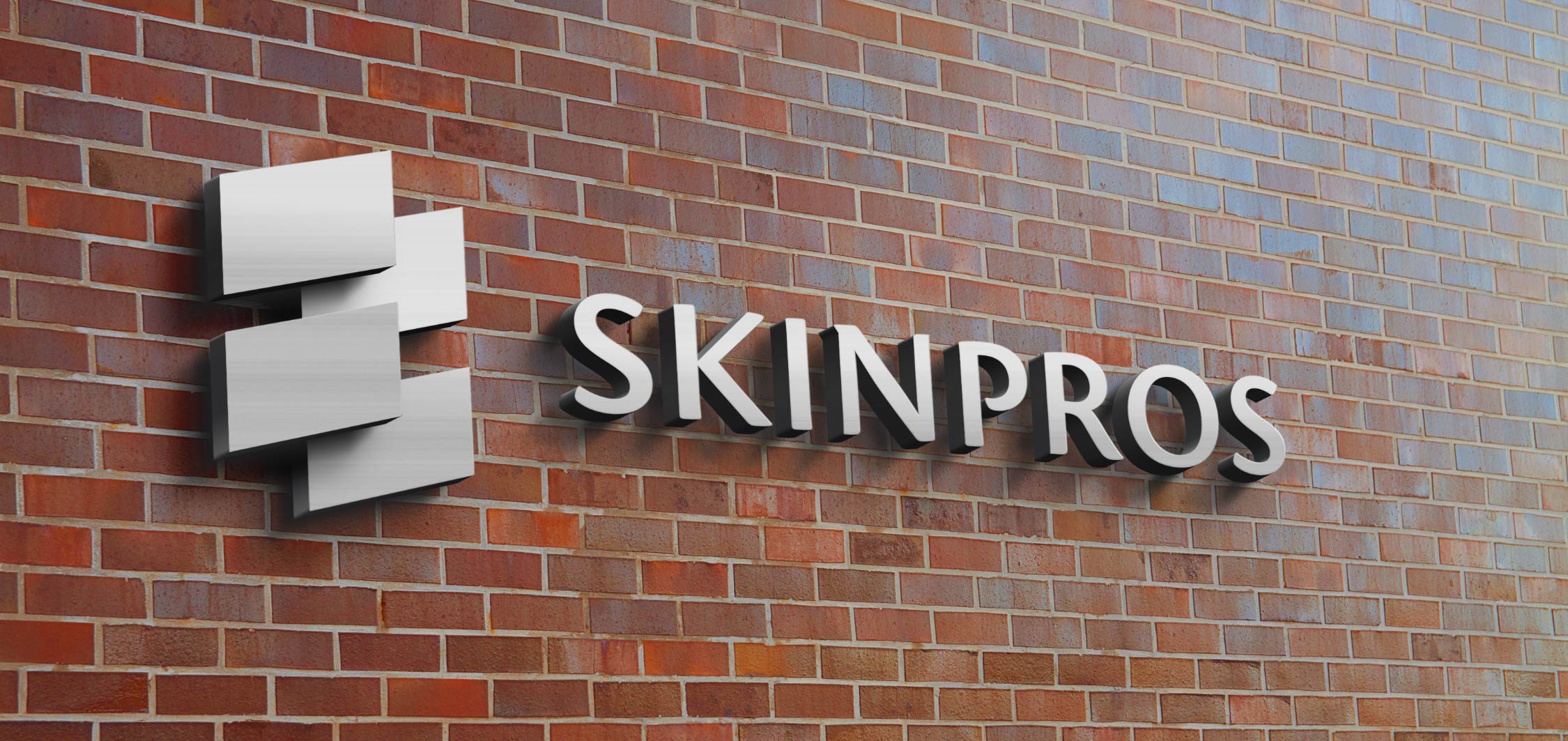
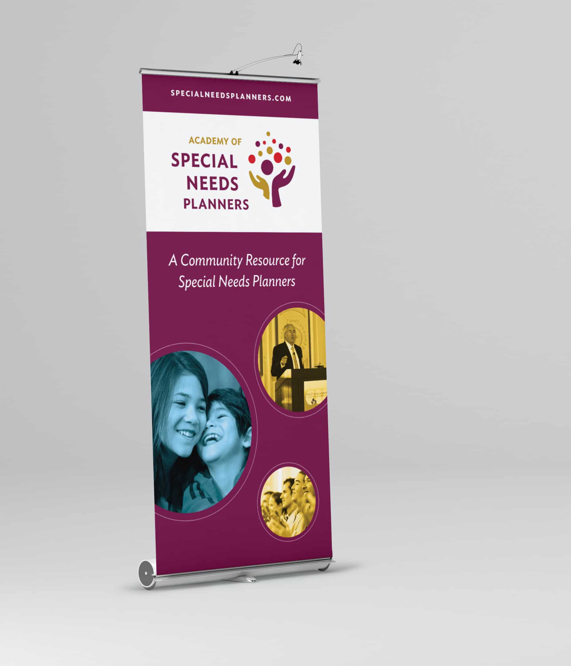
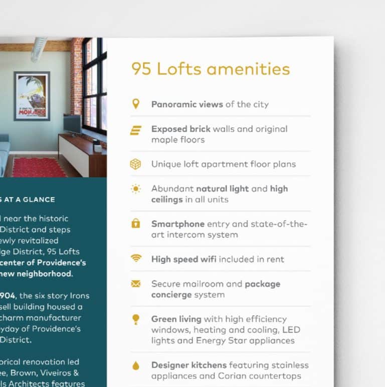
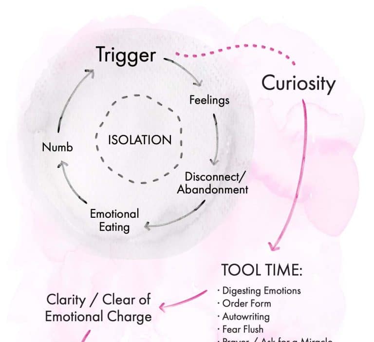
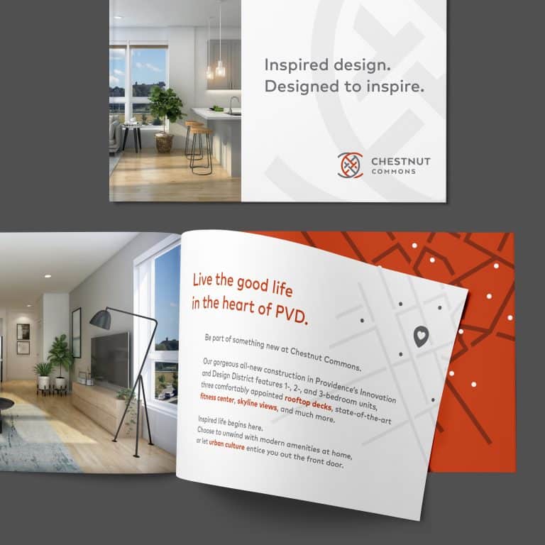
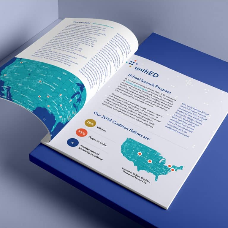
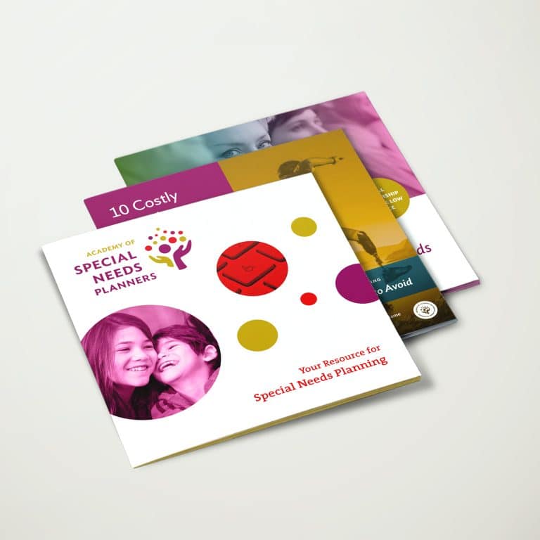
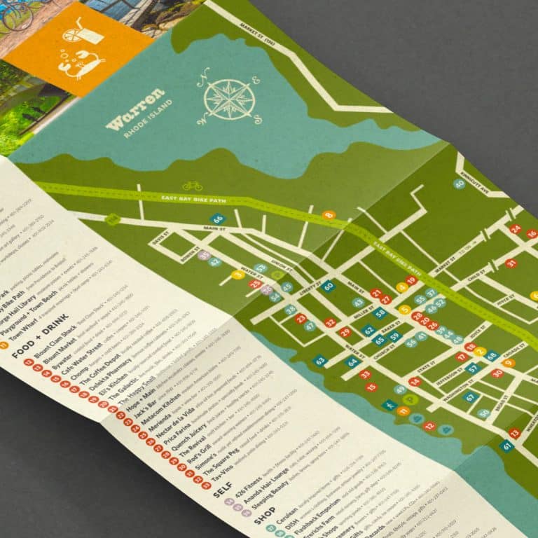
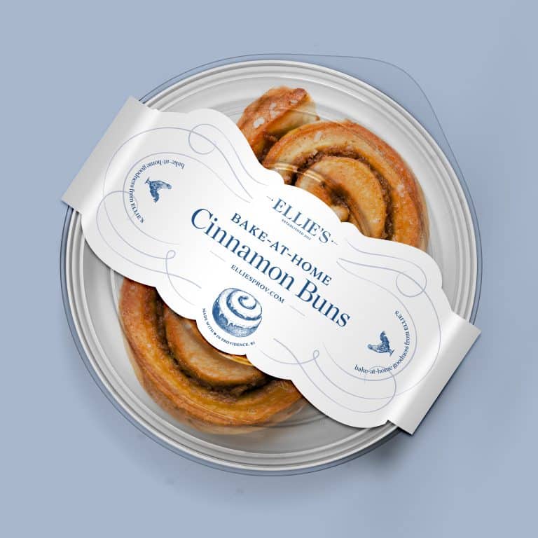
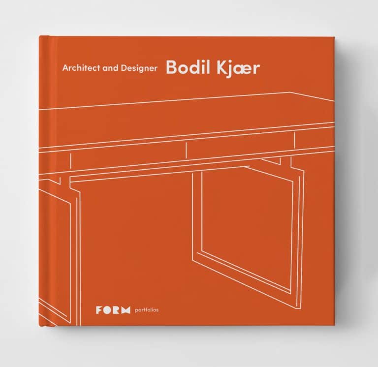
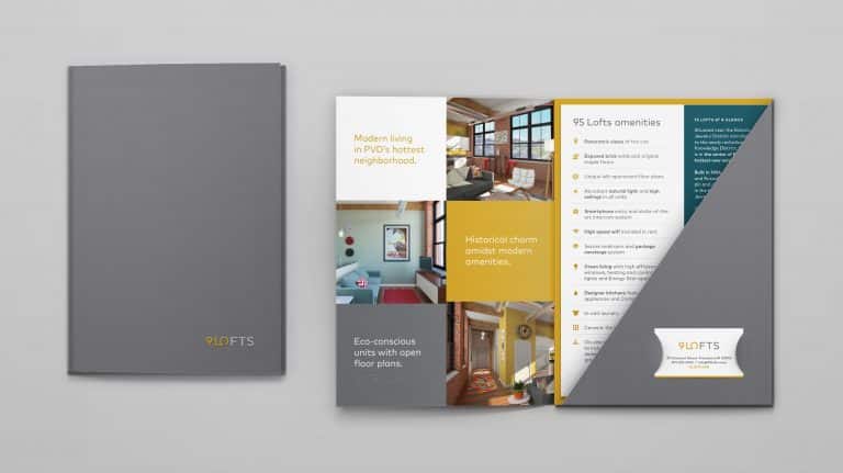
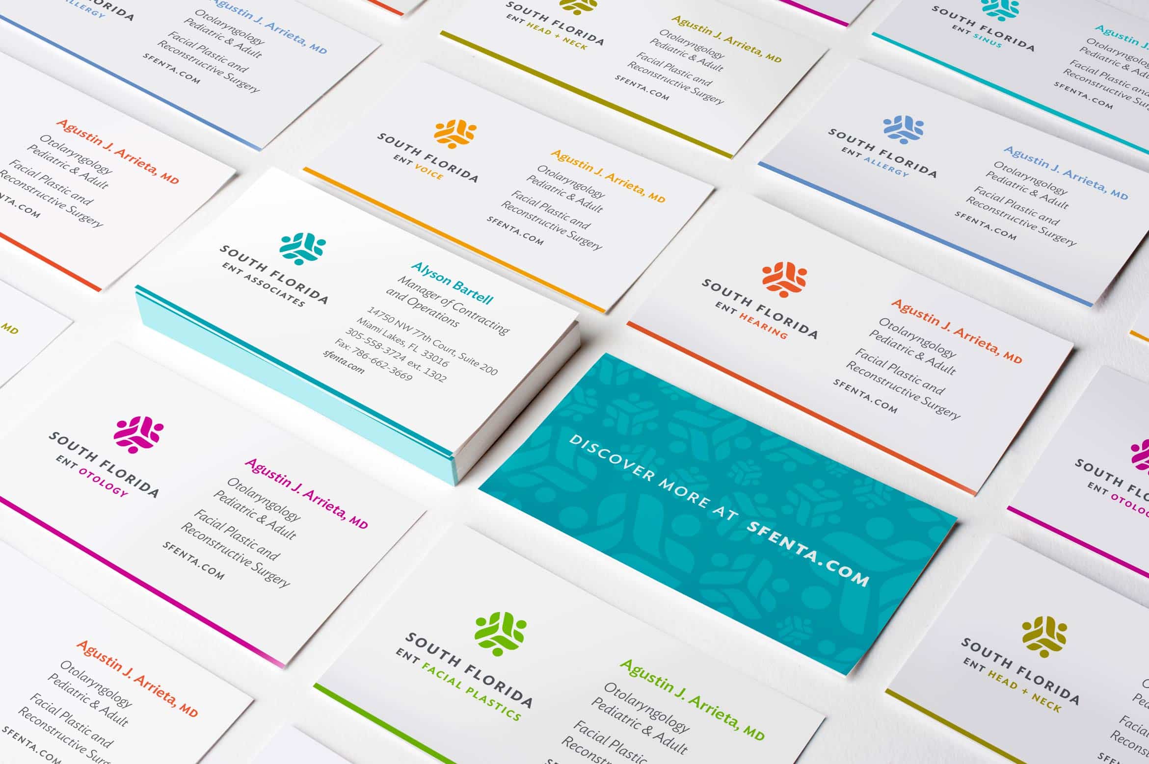
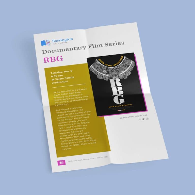
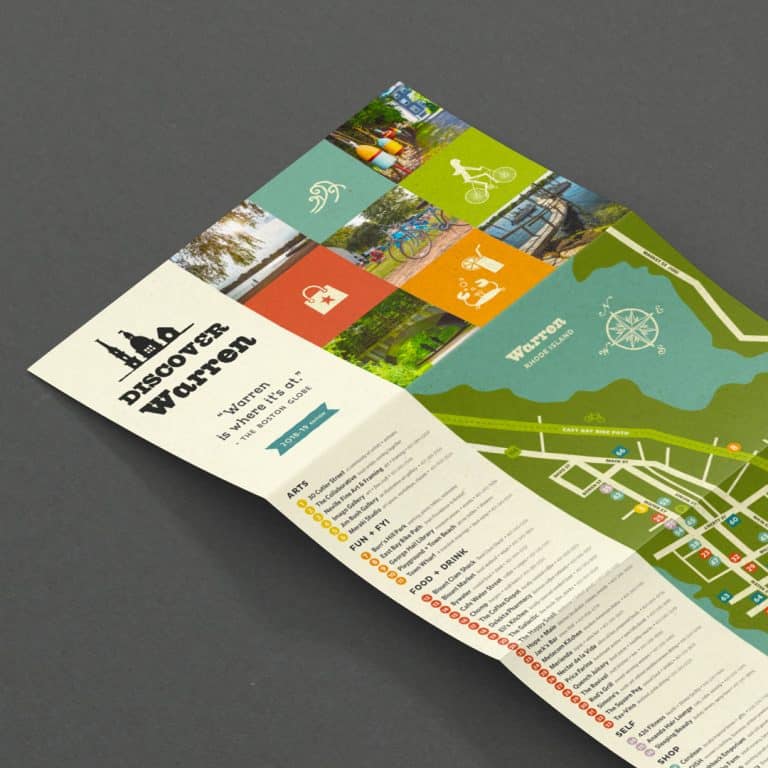
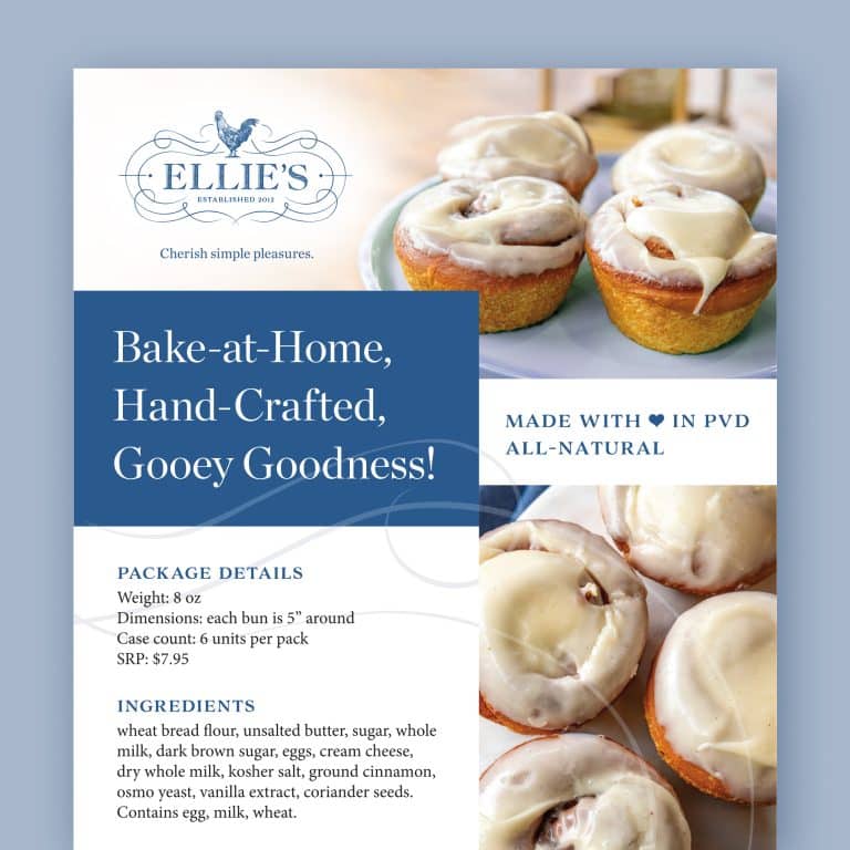
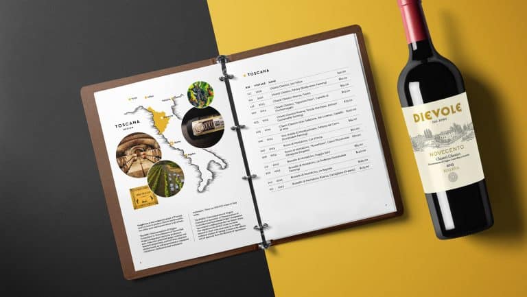
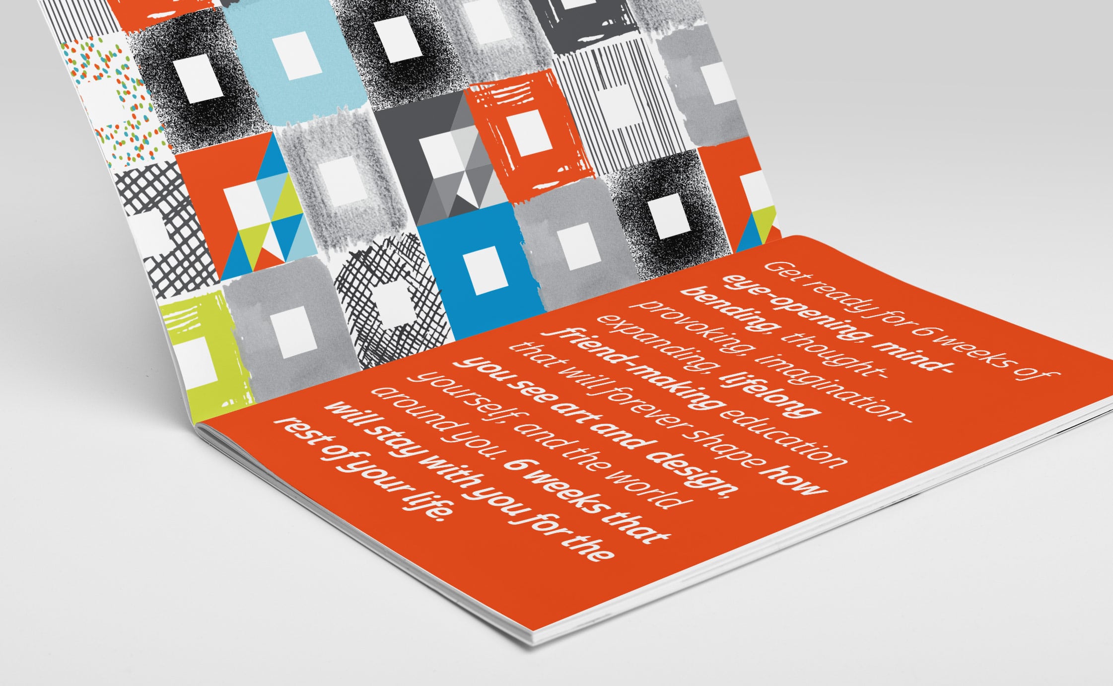
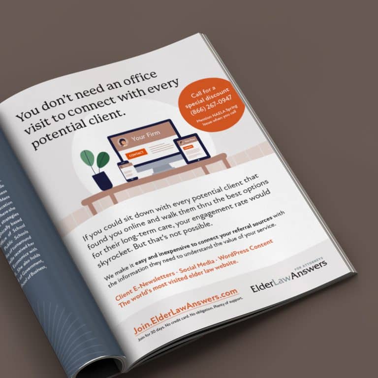
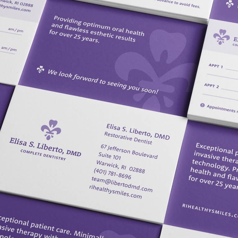
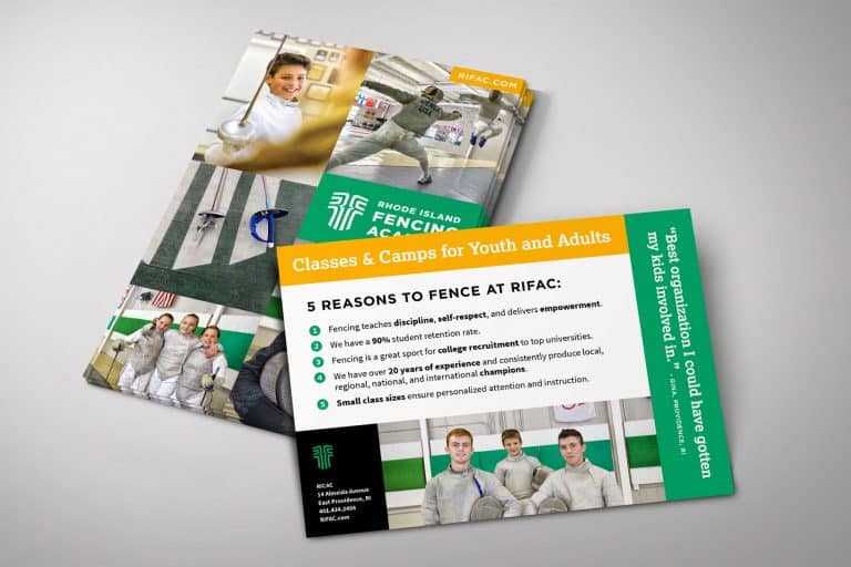
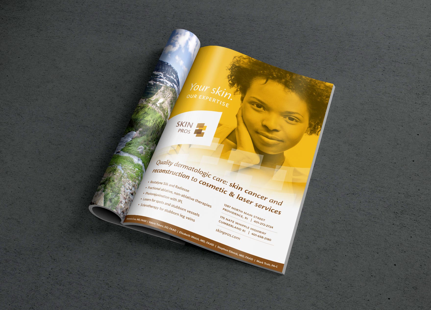
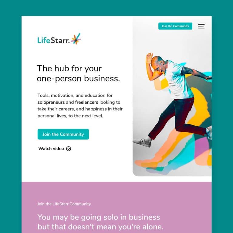
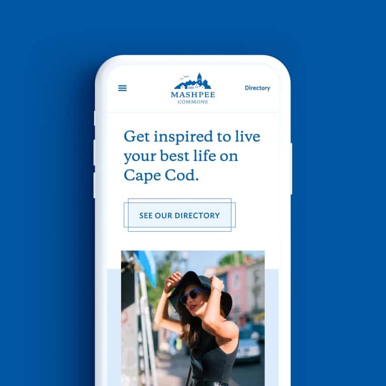
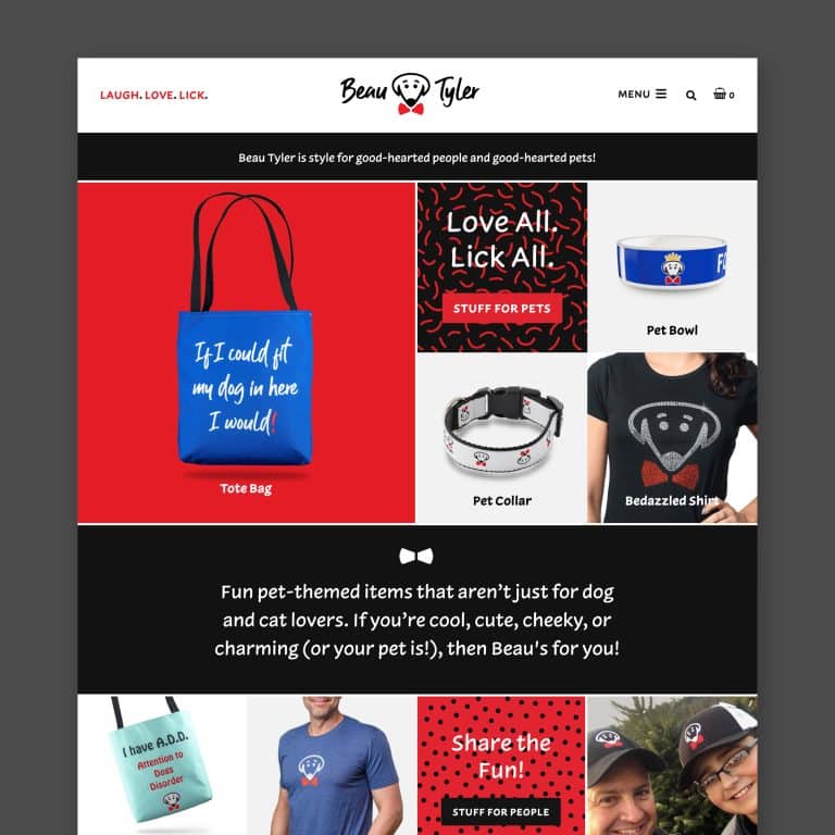
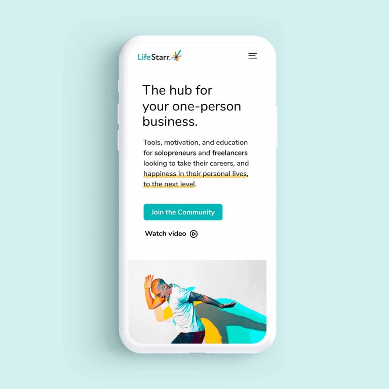
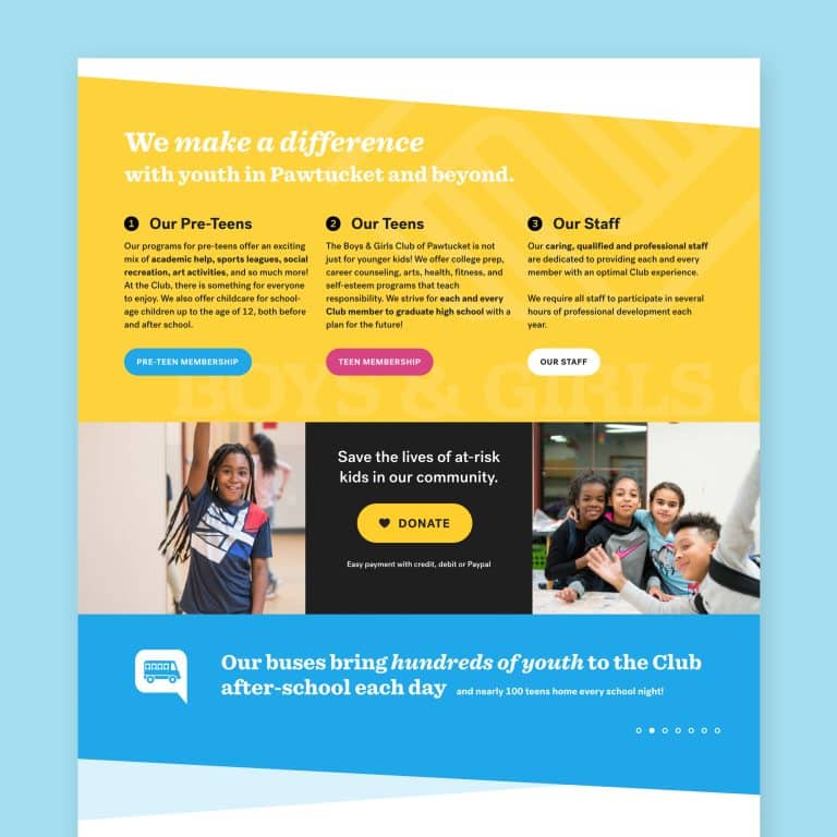
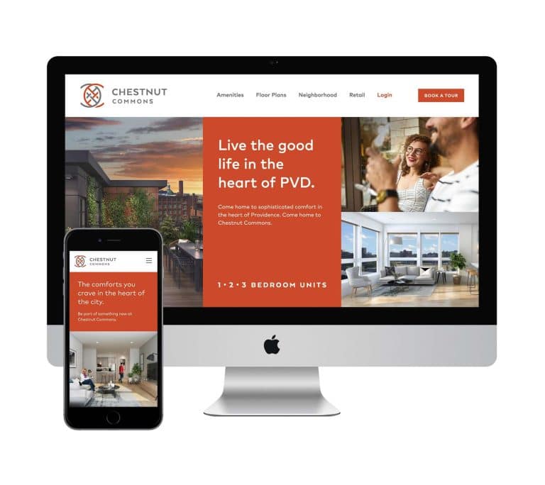
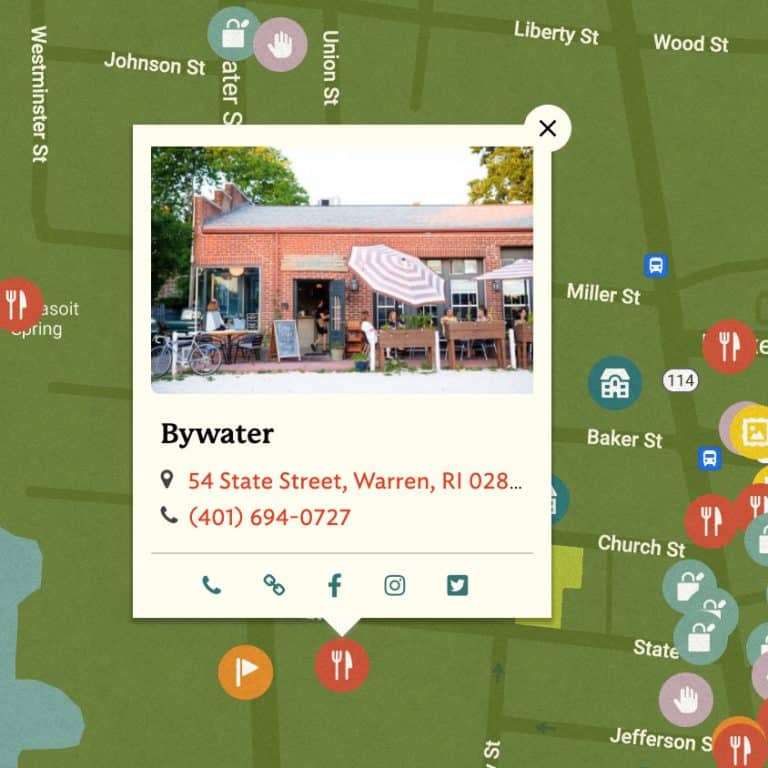
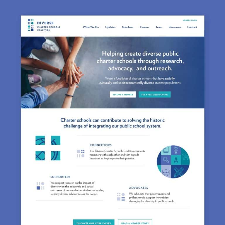
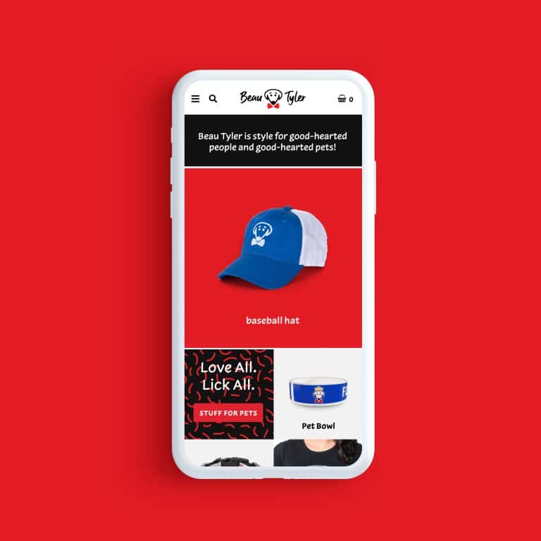
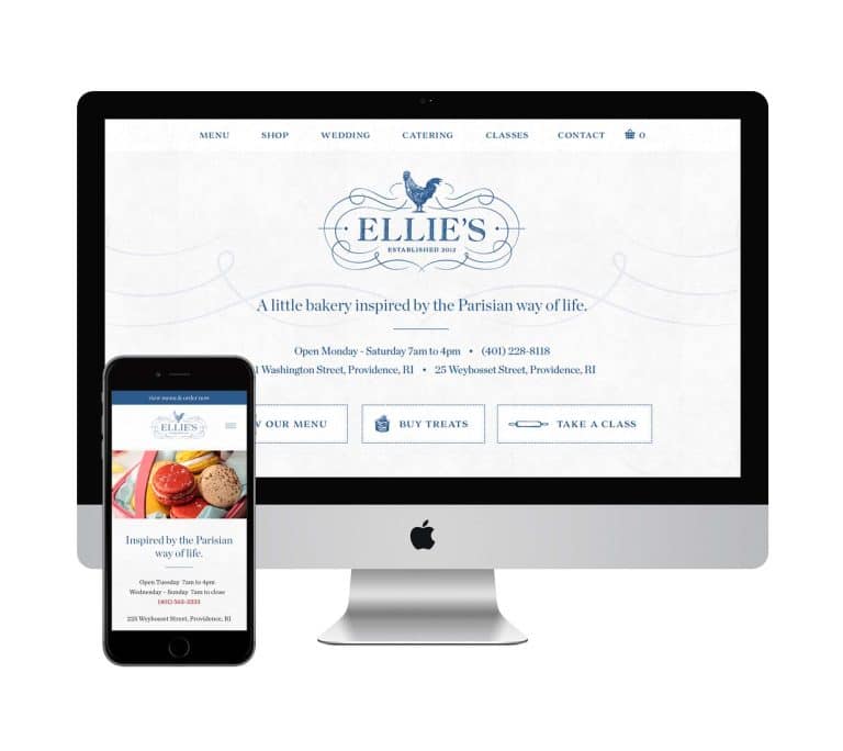
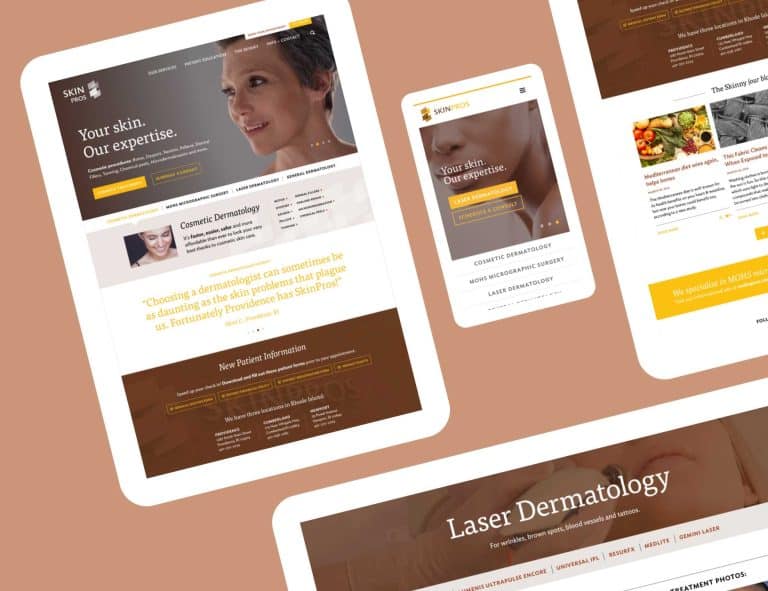
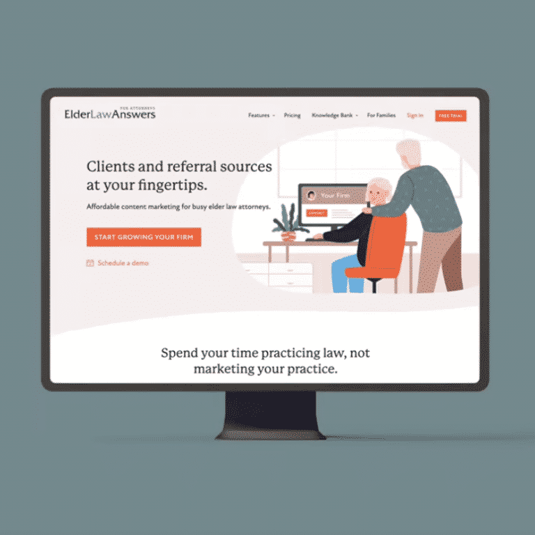
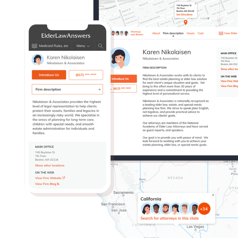
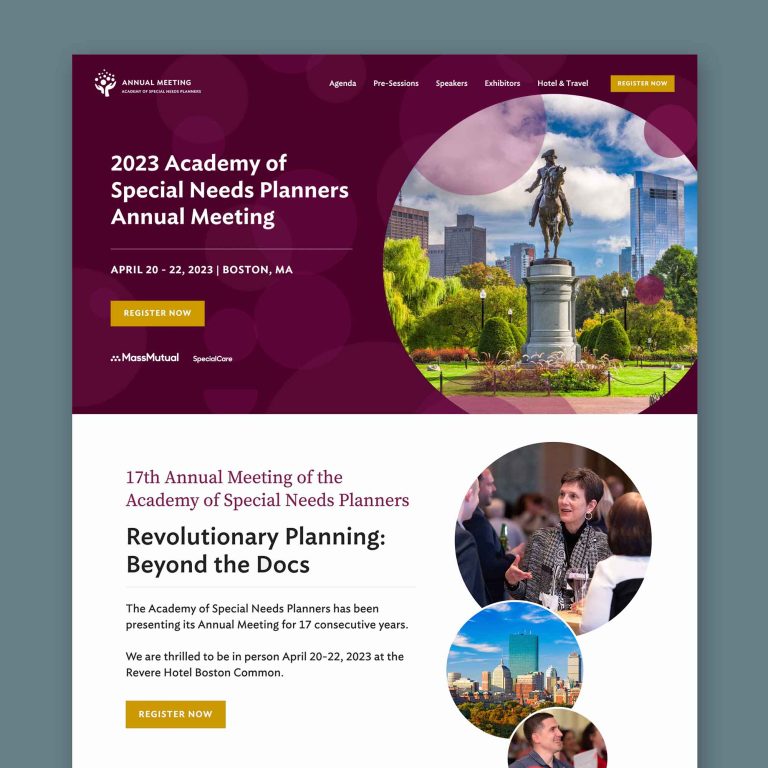
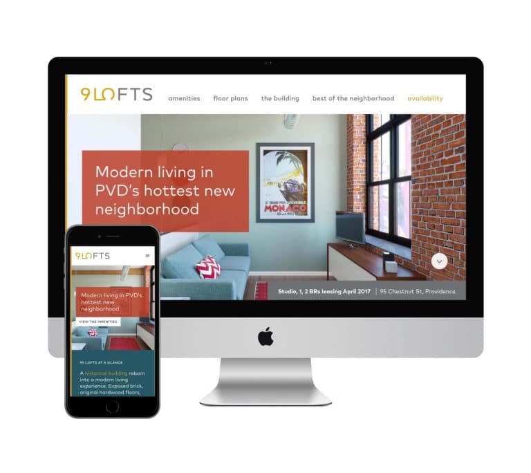
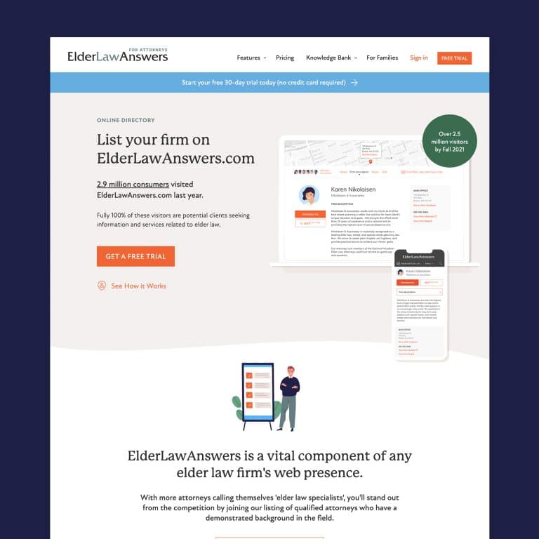
Here are a few examples of signage I’ve done for my own clients. Contact me today to get started – and avoid the biggest design mistakes listed above.
It's hard to market an unfocused brand.
Your business must tell a powerful story with strong optics and a persuasive storyline so you can stand out from the crowd and change more minds. Get a brilliant visual framework tailor-made for you.


