9 Common Branding Mistakes – And How to Fix Them
When you start a company, the initial decision to name your entity and pick a logo is often done quickly. There is so much to do, after all! I’ve witnessed a preoccupation with jumping to branding conclusions early on, as eager entrepreneurs want/need to jump onto the next big thing. But selecting a company name based on your initial business concept and a “gut feeling” could turn out to be a huge mistake.
Naming your company may be the most important step you take as an entrepreneur. Revenue streams, SEO (search engine optimization), market research, and visual branding must be carefully weighed for each name you’re considering. If nothing else, remember that you cannot easily or cheaply change your company name later.
Avoid these 9 common branding mistakes:
- Too Long
like ‘From the Land and the Sea’ or ‘Elegant & Sophisticated Catering’
A drawn out company name may feel heavy or burdensome to customers. It’s harder to remember. It lacks the punch of a shorter name. And that all adds up to less “stickiness” with a customer. And clunky names just don’t come to mind easily.
- Inside Joke
like ‘Ninth Try Chocolates’
I have lost track of how many company names make no sense to anyone but the founder and his/her closest friends. It may be fun for them, but everyone else is back in high school feeling left out of the cool kids’ group. How am I supposed to connect with a company when I don’t understand its name?
- Abstract or Cryptic
like ‘Tasteful Cuisine’, ‘Johnny’s Culinary Concoctions’
Unless you’re a postmodern artist living in a garret, abstract or cryptic business names don’t fly. Your business name should feel tangible – so people have a decent idea of what your company does with no other information aside from the company name. Names that “don’t make sense” don’t stick in customers’ heads.
- Generic Wording
like ‘The Supply Store’ or ‘Bob’s Goods’
A broadly named company may be so general as to confuse customers about what your company provides or sells. You see a sign for “China Food” – is it a restaurant? An importer of food products from China? On the other hand, “A1 Chinese Restaurant,” is specific enough to tell you exactly what you need to know. Eggrolls, anyone?
- Disconnected
like ‘Uncle Snoozer’s Happy Sauce’
You don’t have a lot of space to work with, so each word has got to have maximum impact – and a connection to your product or brand qualities. If a word doesn’t fully deliver, keep searching for a better one. For kicks, you can try a business name generator if your idea well has run dry (see more at the end of the post).
- Generic Appearance
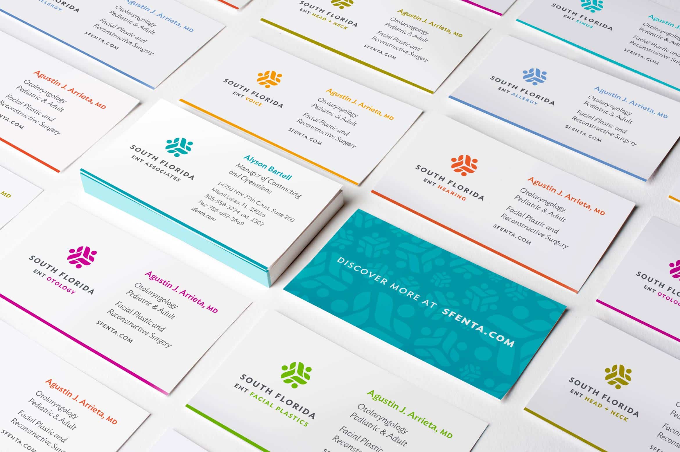
Using a unique typeface makes your brand stand out from all the masses of other ‘just ok’ logos out there. There are some household brands whose fonts have become so distinctive that you can recognize them from just one letter. Take this logo letter quiz and you may see what I mean. You can purchase a professional font from a type foundry like FontShop, source a suitable free font from Google fonts, or work with your designer to find a font that’s timely, unique and appropriate for your messaging. At the very least, avoid Trajan Pro, Comic Sans, and Papyrus, which are all over-used.
- Bland
like ‘Good Enough Catering’ or ‘Okay Souvenir Shop’
What’s the personality of your business? Is your product wacky? Elegant and sophisticated? Is your approach or style seriously meticulous and detailed? Reveal or speak to some aspect of your personality or the personality of your business in your company name. Even if it’s not overly direct, you’ll give your customers a sense of your price points and the degree to which you are a turnkey solution. How do the following names strike you?
Jane’s Pant Store
Blue’s Demin Boutique - Unreadable
Say what? There’s nothing worse than a great company that’s chosen a squirrelly font for their logo. You’d need a magnifying glass to read it in newsprint, let alone make it out on a billboard as you drive by. Work with your designer to find a font and logo that is readable at small sizes, appears sharp in black and white (also called grayscale), and is easily reproducible (use defined shapes, no busy textures or gradients). Your logo also needs to fit easily in a variety of contexts (square, letterbox, rectangle). See more helpful logo tips here.
- Unemotional
How do you want your customer to feel when they experience your product? Relieved? Confident? Satisfied? What words can you use in your company name to resonate on an emotional level with your customers? Pinpoint which emotional experiences you want customers to have when engaging with your brand, then work backwards from there. For example, how do these names make you feel?
Sally’s Pools & Polish
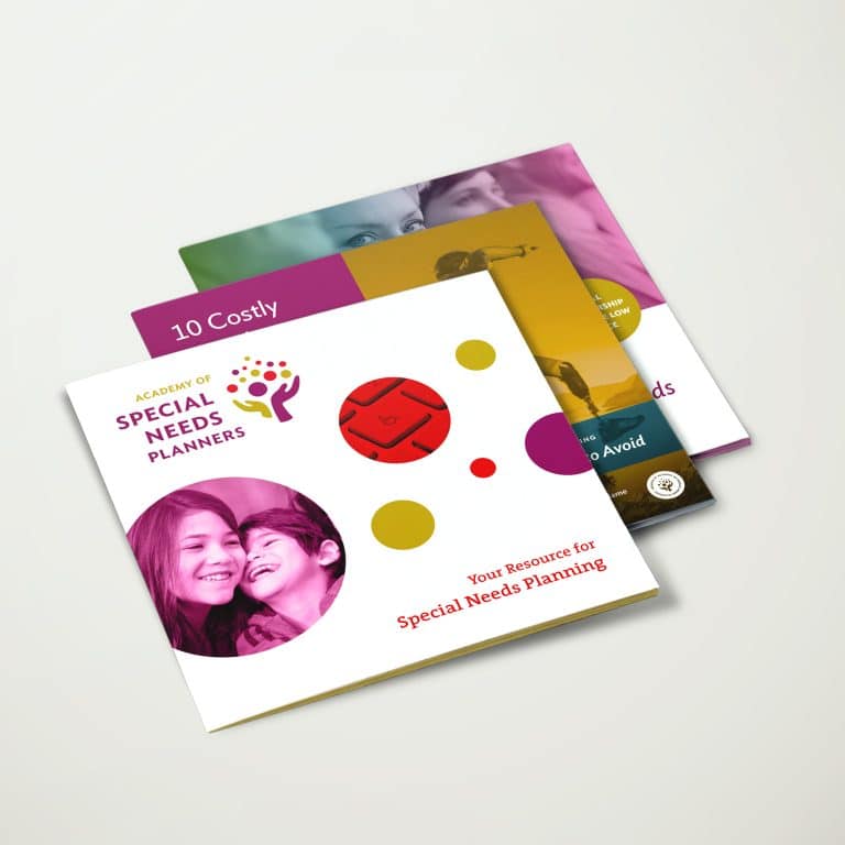
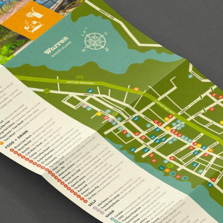
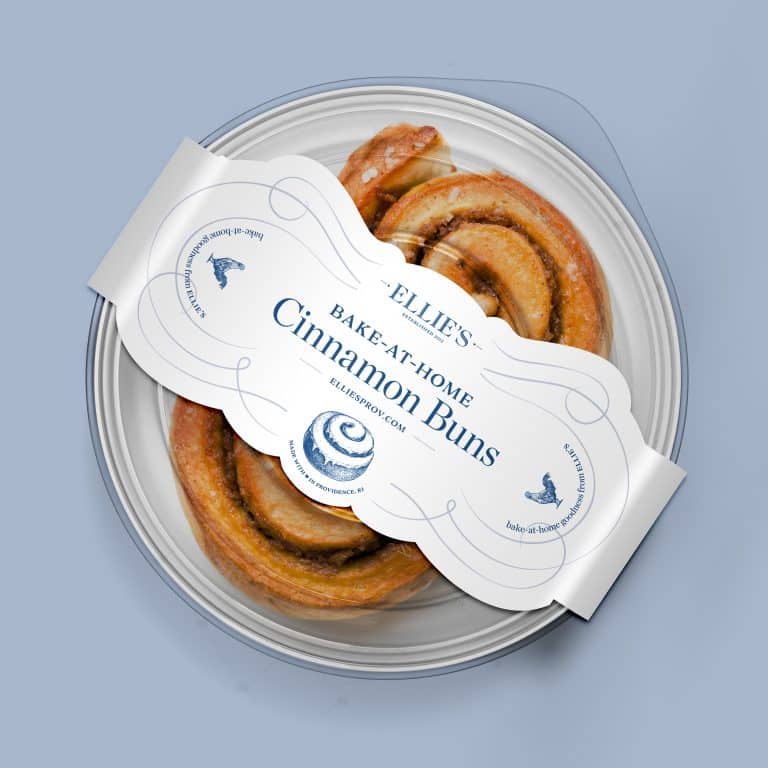
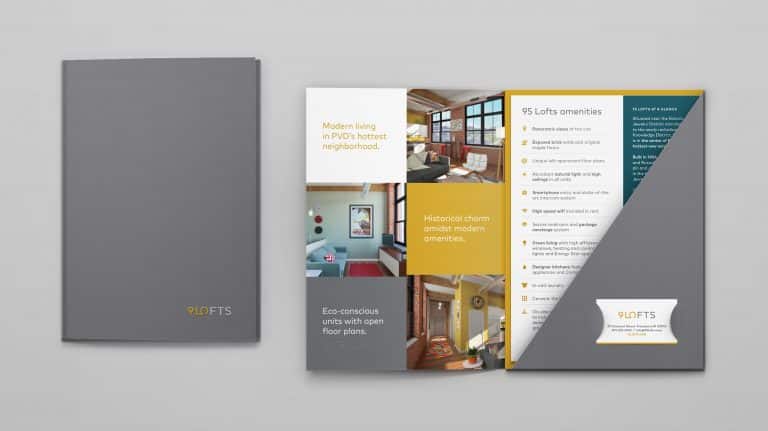
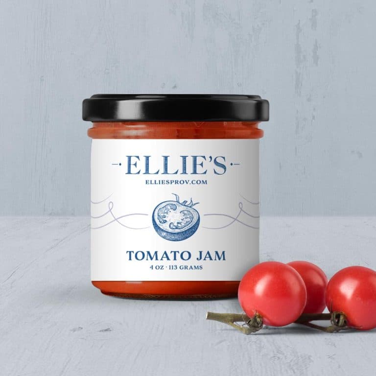
Mama’s Relaxin’ Day SpaNot feeling too jazzed about these, huh? Find ways to make your customers or clients aware of how you’ll change their lives. When you’re ready for a designer like me to help with the branding design, check out some branding work to whet your appetite.
Still feeling stuck? Try a business name generator.
Drill down to details:
naming.net
netsubstance.com
wordoid
Specify a keyword:
naminum.com
cool name ideas
View random names:
biz name generatordot-o-mator
It's hard to market an unfocused brand.
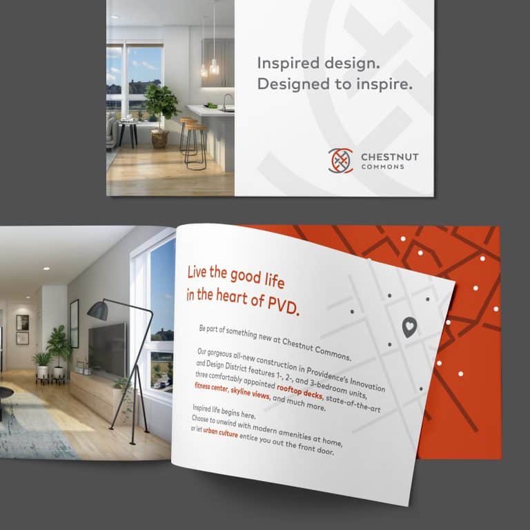
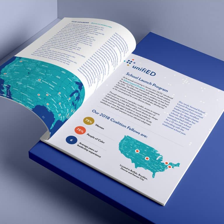
Your business should tell a powerful story to attract loyal customers. Get a brilliant visual framework tailor-made to help you build trust.


