3 Surprising Places You Need Good Visual Design
Design is everywhere – and chances are if you’re not noticing it, it’s because it’s done really well.
Good design – in all forms and fields – slips seamlessly into creating a great experience for you, whether you are browsing a website, navigating your doctor’s office, or taking in a rock concert.
But design is one of those things that often gets noticed by the layperson when it’s bad. Poor design is often at the root of those moments when you can’t find what you need, when your senses feel bombarded, or when something just seems out of place. Those jarring, unsettled feelings are not something you want to be associated with your brand!
Yes, interior design, architecture, and lighting design are outside our scope. But visual design is our bread and butter. And we’d wager a guess that there are some visual design opportunities you may not be aware of. Let’s uncover them!
Three surprising places that you need good visual design:
- Printed materials

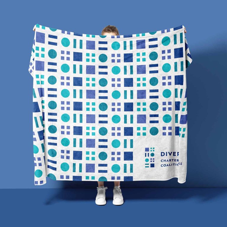
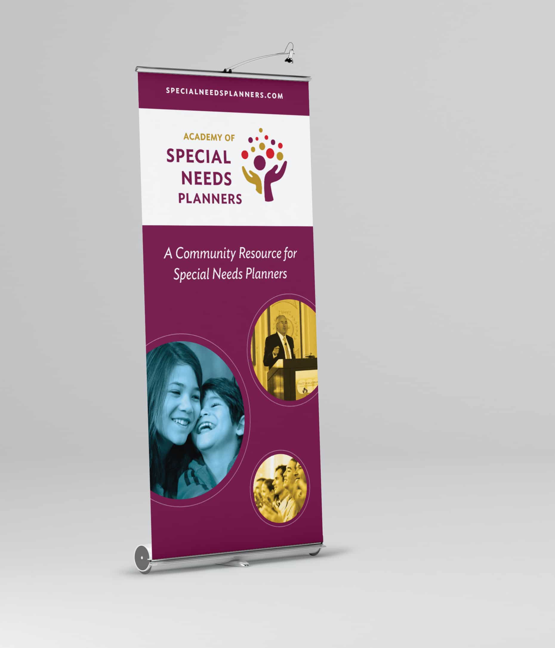
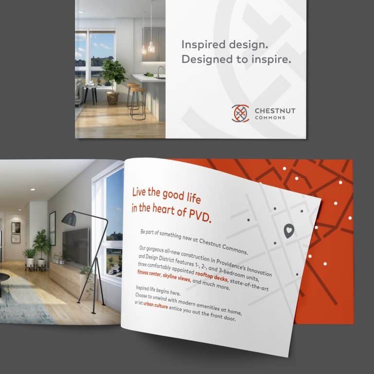
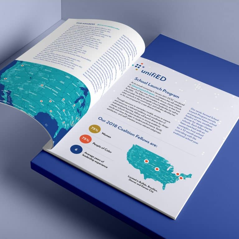
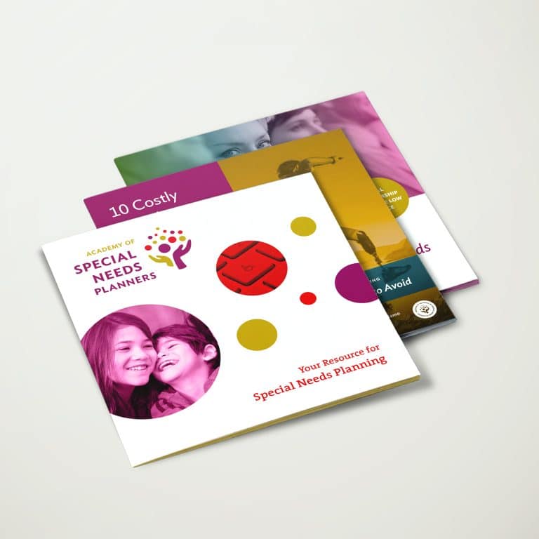
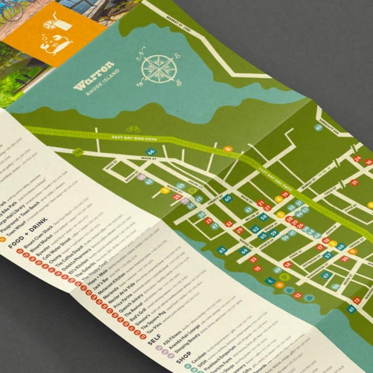
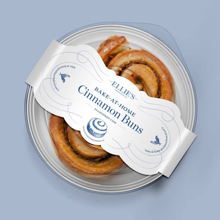
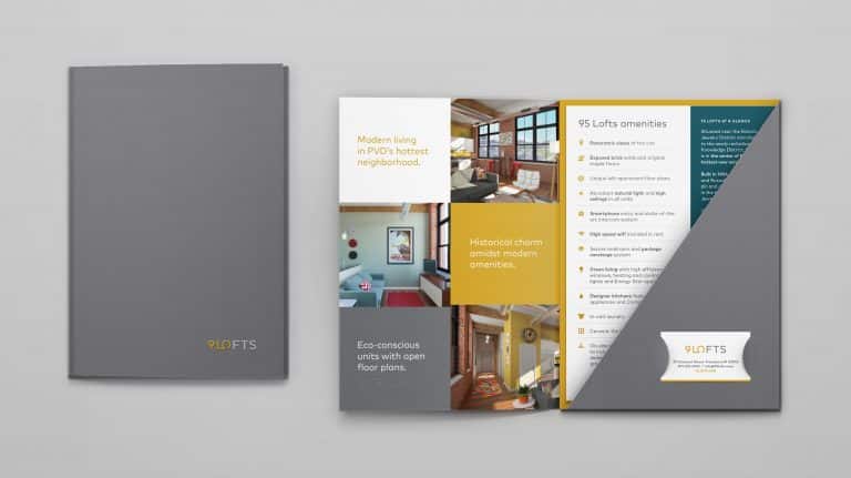
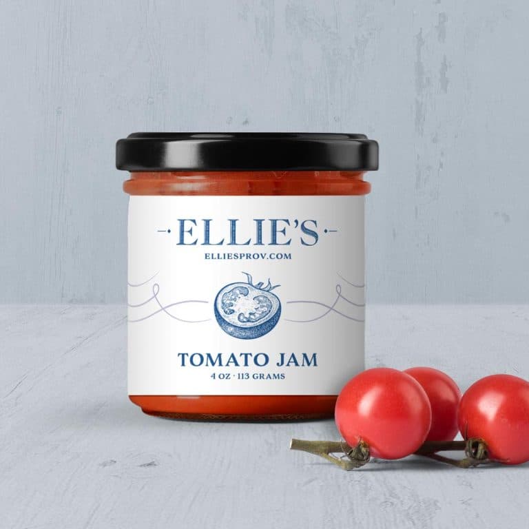
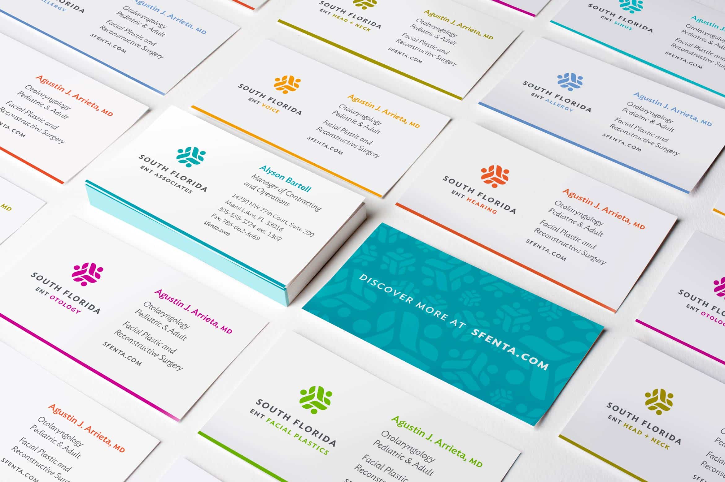
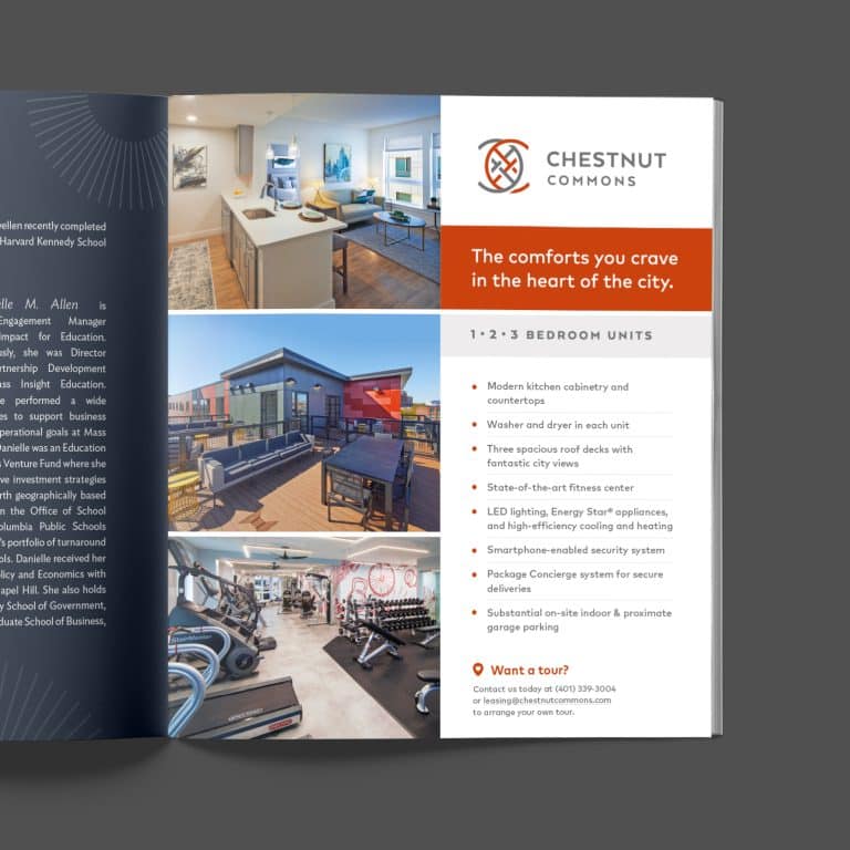
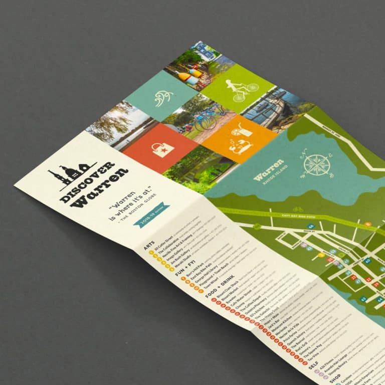
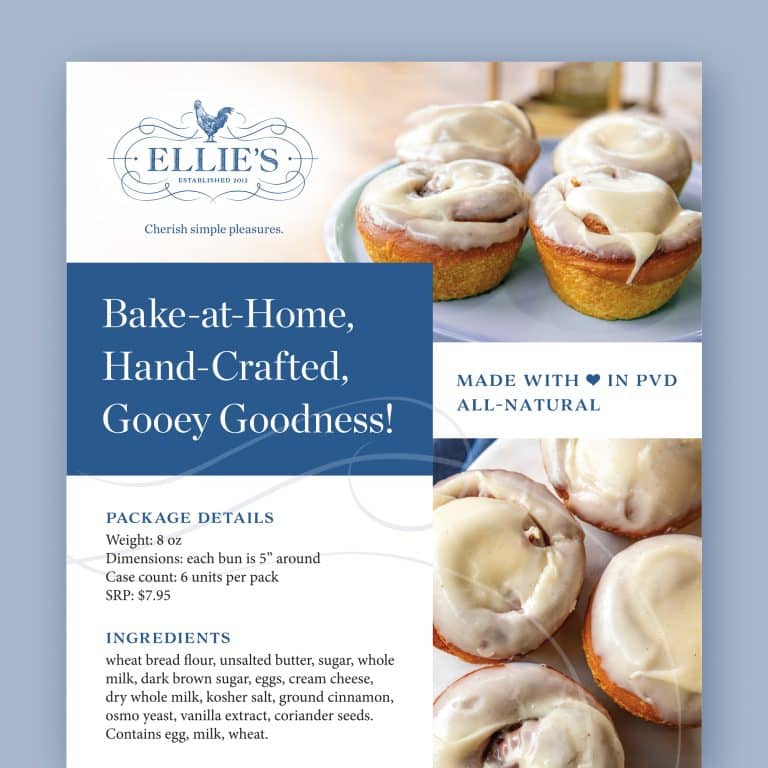
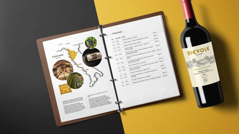
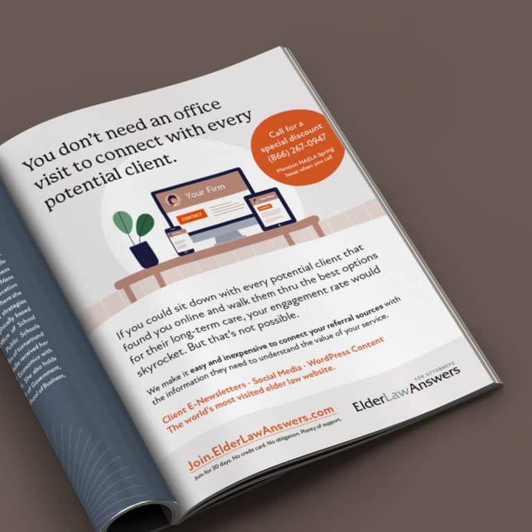
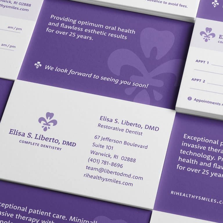
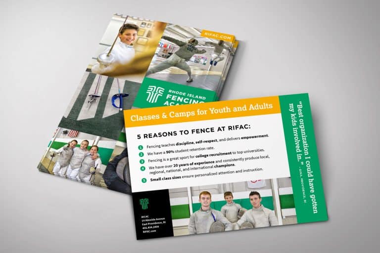
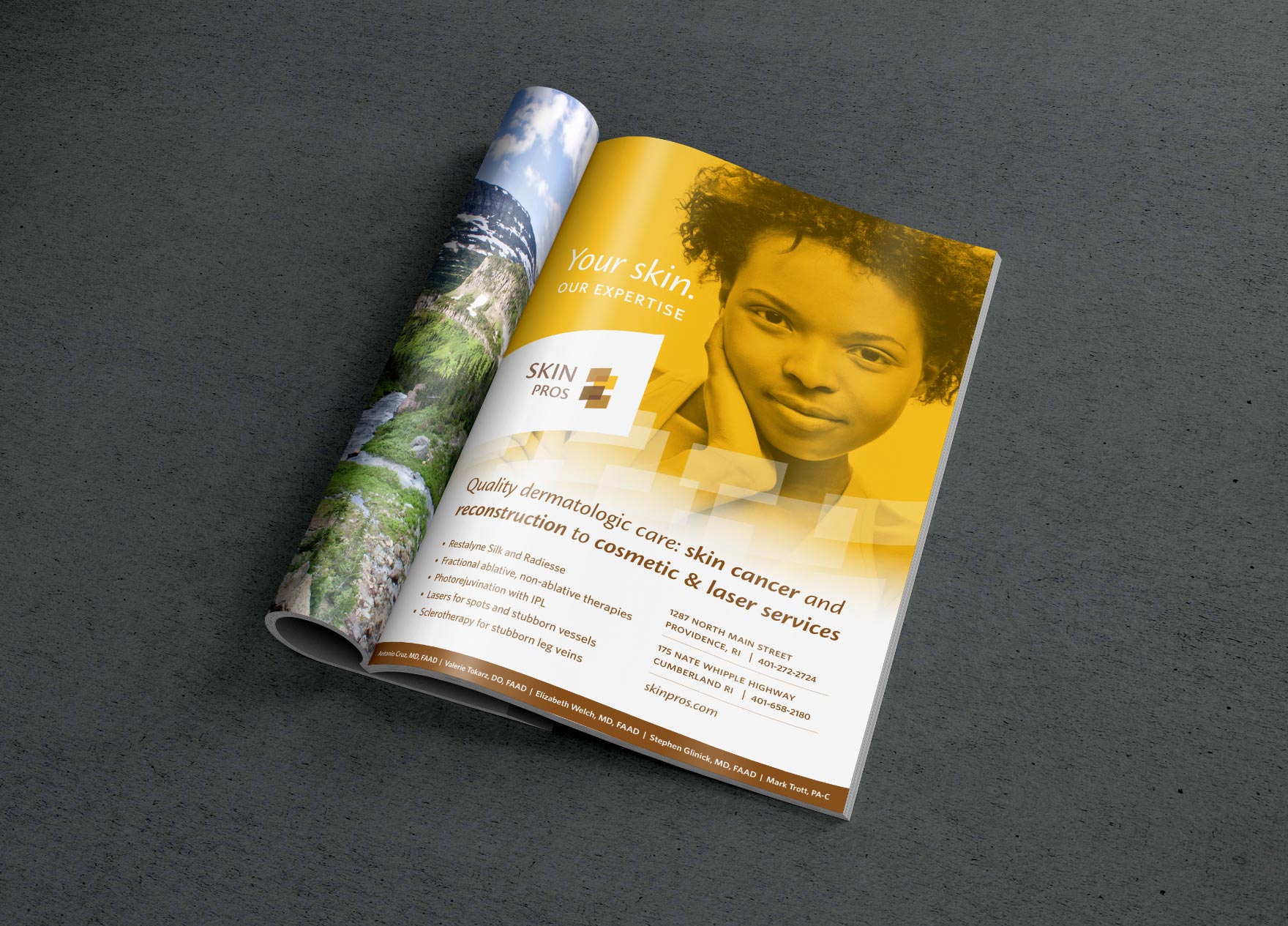
While many people would have guessed that your printed materials (such as business cards, menus, brochures, holiday cards or promotional cards) need good design, their definition of “well-designed” pieces might simply include clean lines and readable fonts. But these pieces often wind up with a generic feel.
Truly good design, as printed materials go, can go so much further.
A well-designed printed piece can really pull together all the elements of your brand visuals and your brand’s personality, and make sharp messaging sing your praises.
A medical manufacturing client of mine who specializes in surgical needles contacted me recently to design a memorable holiday card. I had a blast creating an image featuring a 3D version of one of their suture needles, hanging like a tree ornament.
It was 1) super-specific to their business, 2) just plain fun, and 3) served as a soft reminder, reinforcing their core products and services. The whimsical final product felt right to the company, and their personality definitely sparkled for their customers.
- Physical space

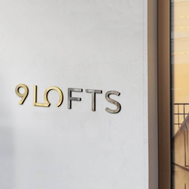
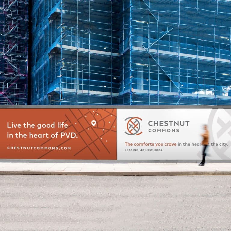
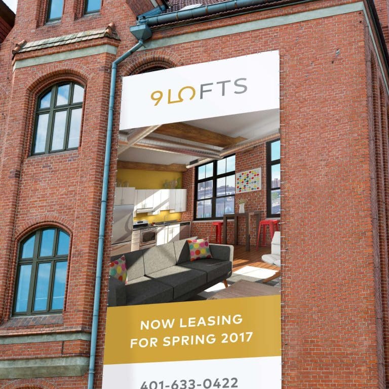
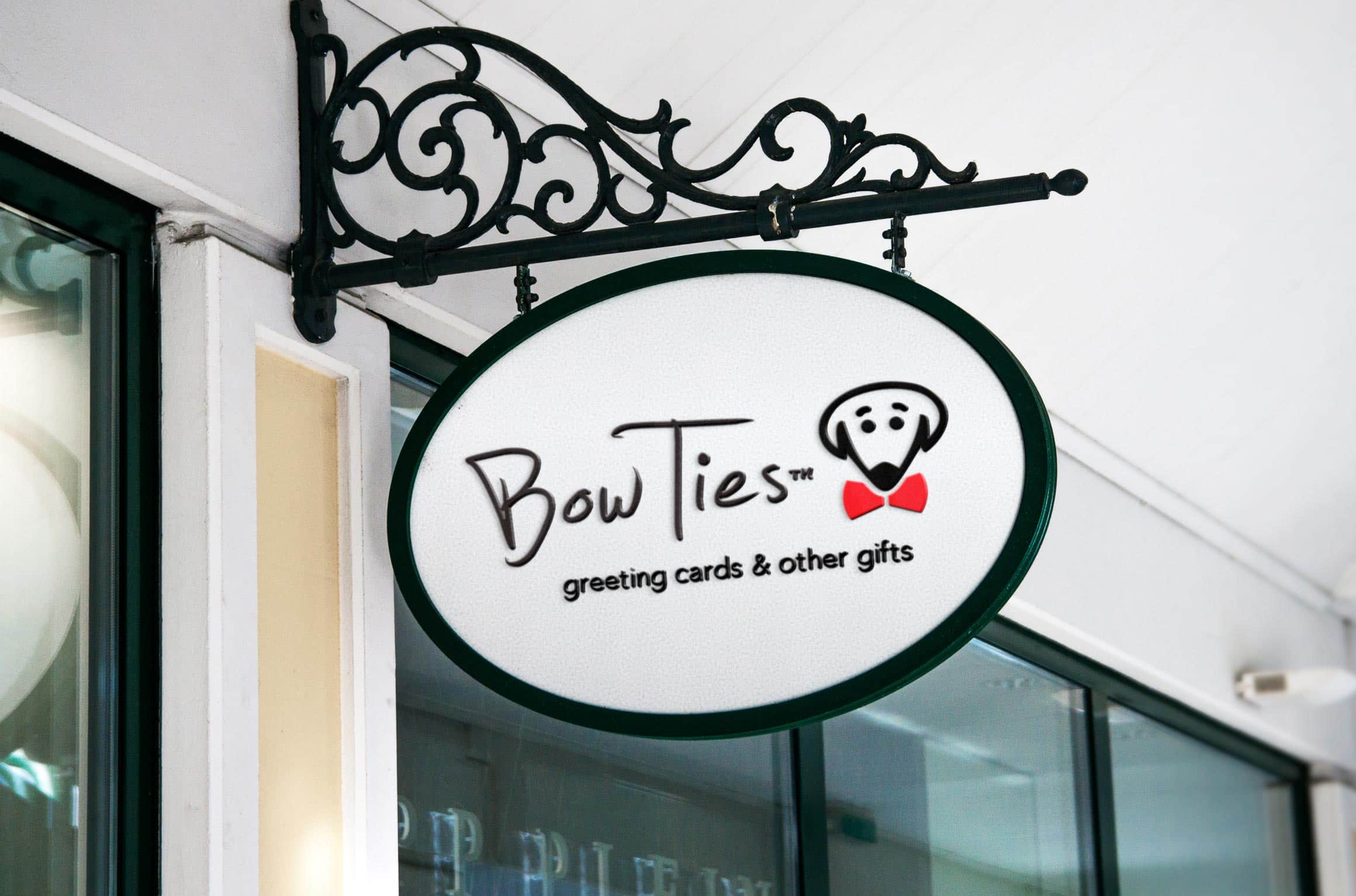
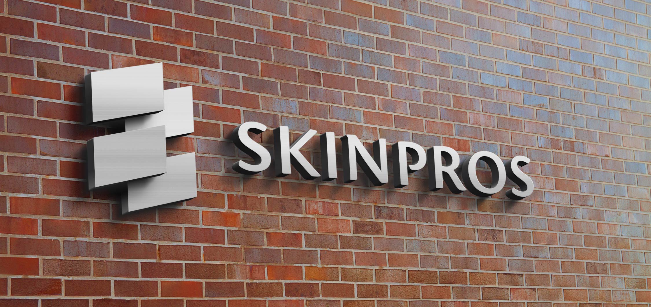
Major areas where visual design affects your physical space include the exterior of your building and what your sign looks like.
Is your sign large enough for people to find you? Does it feature your logo and your exact brand colors for instant visual recognition? What about the exterior of your building – does it speak to your brand?
If you have design control over what the exterior of your building, does its style somehow speak to your brand? Painted bricks (in a brand color or complementary color), curtains or window treatments that match the style & feel of your brand, and exterior details (such as REI’s use of pickaxes as door handles!) helpfully consolidate your brand messaging.
- Email templates
With the ubiquity of MailChimp and Constant Contact, it’s now quite easy for small businesses to send out email campaigns generated in-house.
These email services make it really easy to slap together a pre-formatted template, add your logo at the top, swap in some brand colors, and bam! You’re good to go, right?
But think about how many promotional emails you get each day – and how many go straight into the trash. Good design will actually increase the number of people who read and act on your message. Having your logo really big at the top isn’t the answer to this question – your readers already know it’s from you!
You want a well-designed intuitive layout that’s mobile-friendly, shares just the right amount of content (with a link to your website for more), and is displayed in a way that helps your content get absorbed and your links clicked on.
And a well-designed, personalized email template can be integrated right in your MailChimp or Constant Contact account so that you don’t have to start from scratch – each new batch of content will continue putting your brand’s best foot forward.
Where could your brand benefit from a little extra attention to good design?
Key takeaways:
Design is everywhere. Since poor design can reflect negatively on your brand, it’s important to attend to and invest in good design in a variety of ways, including these places you may not have considered yet:
- Marketing collateral such as brochures, menus, postcards, and promotional materials
- The outside and inside of buildings that represent your brand
- Through targeted design of email marketing blasts
It's hard to market an unfocused brand.
Your business should tell a powerful story to attract loyal customers. Get a brilliant visual framework tailor-made to help you build trust.


