Quiz: Can you spot what’s wrong with these logos?
Coming off the heels of logos I love, this month we make a quick stop at the Logo Hall of Shame, in which we find three poorly designed logos in the public space and pick them apart. Not, of course, to make fun of the companies, but to gain some more insight into logo design through a lens of “what NOT to do!”
Without further ado, here are three poorly designed logos:
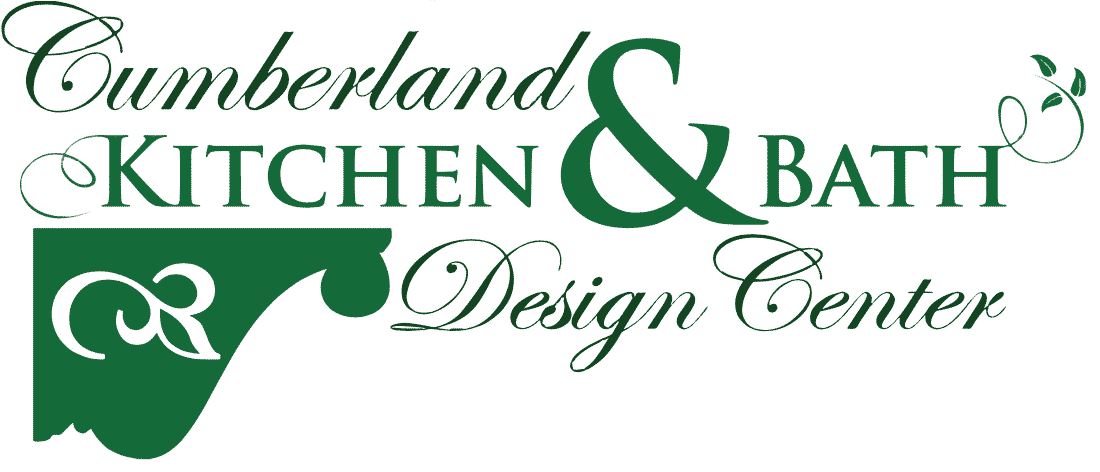
For starters, this logo for this kitchen & bath design center has too many decorative elements.
They’re using an attractive, but showy, script font for their name, but it is already so decorative and visually intense that the logo really doesn’t really need additional ornate elements. Adding more is rather like gilding the lily. The result is a busy landscape where there is no clear visual hierarchy. The eye is actually first drawn to the giant ampersand, which they most likely enlarged in order to fill the space, but it doesn’t serve a helpful, storytelling purpose.
Next, you notice the logomark in the bottom left corner, which is ambiguous in itself.
Is it a shelf? A new state? A nose turned sideways? This logo represents a missed opportunity because the primary elements in their logo don’t help the viewer understand what they do. It’s OK if your logo piques curiosity, or reveals itself on multiple viewings – but it should never confuse.
At a very basic level, curiosity is a positive emotion, while confusion is a negative emotion. Because these two emotions sit on either side of a very fine line, I think it’s worth spending time and money on a logo that lands on the right side of that line.
Let’s assume we can deduce that the logo image is a mantlepiece or counter edge. Even if we can match the logomark up with the business, there’s a certain style to this logo that is likely to alienate a giant swath of their potential customer base.
Their logo screams “old-fashioned lace curtains in the kitchen” – and most customers looking for a modern, minimal, or midcentury-inspired design would instinctively move away from this company.
Another design mishap with the logo is the ornate leaf image within the icon, which doesn’t match the stroke style of the scripted leaf swirl attached to the letter “H” in the text.
I’d be slightly less fazed if this were an accountant’s logo, but a company that touts its design services yet doesn’t utilize good design principles in its own logo is truly shooting itself in the foot.

The first time I saw this logo, I assumed they used a piece of Microsoft Office clipart for the logo visual.
The image is closer to a graphic you might use as a background image or see as a tacky piece of inspiration art in a doctor’s office. Along with being generic, it has some significant problems with representation across media.
With so much detail, it fails the “can I embroider it on a polo shirt?” test. The logomark would also cause problems with a printer: it can’t be printed in four solid colors, so it would be quite difficult to put on a banner or other advertising or would cost the company significantly more money for full-color printing. And there is no way to reproduce it in black and white or to invert it for printing on a dark background. This severely limits the way their logo can be used.
One major problem with the generic art (and a generic business name) is that it doesn’t help potential customers know what they actually do and why they’re good at it.
It turns out that they don’t actually maintain properties – they just do the landscaping. This would have been an opportunity for the logo to represent the business and the brand in a way that not only informs their customers but also really sets themselves apart and lets customers know how much intention and care they put into their work.
At the heart of good design, a clear statement is made: I care enough about my business to build my brand and logo. If you don’t care enough about that, it will be harder to convince me to give you my money and believe you care deeply about the success of your product or service.
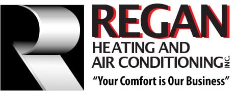
This company’s logo has one thing going for it: simplicity. Simple is almost always better.
But the bold “R” of the logomark makes the “R” in “Regan” redundant. And the red outline of their name doesn’t give it a power punch; rather, it makes the letters look fuzzy. As with the other subpar logos, this logo doesn’t say anything about what they do: heating and air conditioning.
There’s no special “wow factor” that draws me in, piques my curiosity, and makes me want to know more.
If the pieces forming the “R” are meant to be part of heating or cooling equipment, then this logo may be aiming higher than the HVAC knowledge level possessed by their average customer.
It’s almost never a good idea to prominently use a shape or element unique to your business type that would almost certainly confuse the customer.
To me the shape is unappealing, although logos can definitely be subjective – and out of the three logos featured here, this is the “most OK.” But that’s also what is wrong with it. It’s just OK. It doesn’t tell me more about what they do, and it doesn’t feel special. It doesn’t visually convey or reinforce their tagline of “Your comfort is our business.”
Abstraction
You may have noticed that one of the big common logo design mistakes I keep coming back to is the issue of abstraction: how to convey the nugget of an idea within a logo, that perfectly encapsulates what the business does, without being overly generic or overly obvious.
Why is this so important? Because when we look at anything, we’re subconsciously gathering information about everything associated with that object. Without knowing it, we’re making judgments about the size, the shapes, the layout, and making meaning out of the images we see all the time.
I know I say it all the time: your logo represents your brand, and represents your business!
The value of a professional designer lies in their ability to remain one step removed from your business and help with nailing this abstraction.
As a business owner, it’s incredibly hard to divorce yourself from the standpoint of knowing every intimate detail of your business. You can’t necessarily see it in a fresh and abstract way; you can’t pretend you’re an outsider happening upon your business for the very first time.
As a designer, I always proceed from the vantage point of knowing nothing about my clients’ businesses. I spend a very long time talking with clients, really digging down into what they want customers to understand about why they’re special and why they’re different.
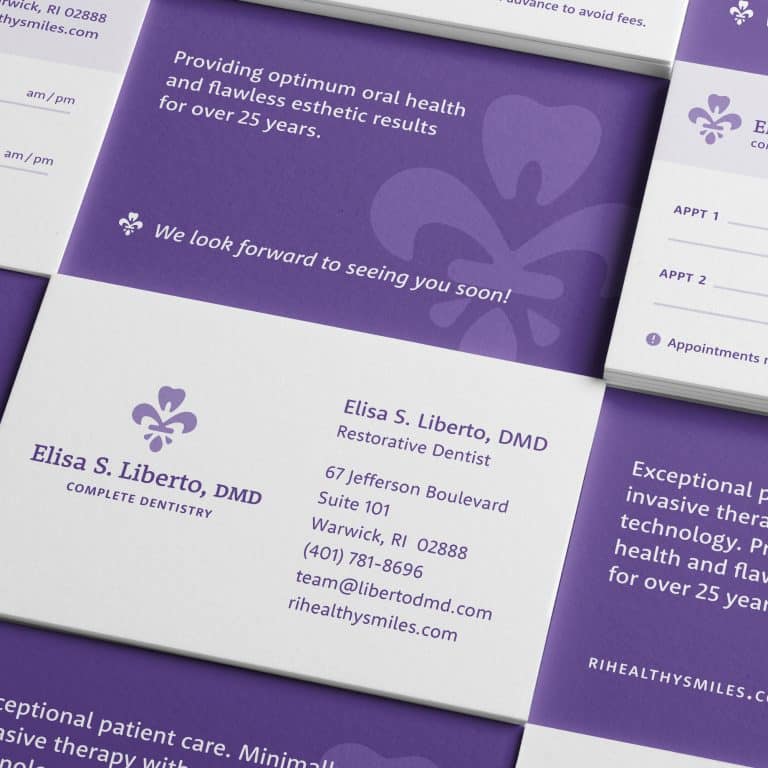
I get to be the honest friend who’s also a really good designer, maintaining the emotional separation required to work the core of an idea into starting logo concepts I present, and to whittle down the concepts and design a great logo. By way of an example, I had a recent client, a cosmetic dentist, who loves a great smile and also, as part of her personality, loves the classic lines of the fleur-de-lis motif. My initial response was to wonder how to make the fleur-de-lis unique, and also not tacky or overly girly. Tackling it in a totally abstract way, I found a way to make part of the fleur-de-lis into a tooth – to work in the core concept of her brand in a personalized, non-obvious, and original way. It represents a perfect blend of what she does, her detailed approach to her work, with a bit of her own style thrown in.
All good design should strive to showcase the business in a unique and engaging way. Your logo and your business are worth it!
It's hard to market an unfocused brand.
Your business should tell a powerful story to attract loyal customers. Get a brilliant visual framework tailor-made to help you build trust.


