What’s Wrong With This Business Card?
What’s the difference between a well-designed business card and one with poor, ineffective design?
Let’s play a fun game that will answer this question! (The game starts with a lame business card and ends with a totally transformed business card.) Along the way, you’ll pick up several practical tips you can use immediately to evaluate your own business card.
Let’s start by taking a look at the business card below (this was a real card from one of my clients, btw). Can you tell me what’s wrong with it? Psst – study the card’s use of fonts, white space, the flow of information, and the messaging.

Now, it’s not that awful – after, all, you can read the important information. But it definitely doesn’t get me excited enough to pick up the phone and call when I have a problem they could help with. So let’s talk through all the ways we can make this business card better by pointing out the mistakes.
1. Too many fonts
This one business card uses five fonts (to be fair, it uses 4 fonts total, 3 of which are used by the affiliation logo at the bottom left, and 1 in regular, italics, bold and uppercase – agh!). For uncluttered reading and effective communication, use no more than two fonts (2 fonts with one of the fonts using regular & bold weights or bold & italic styles can also work). Bonus points if you use non-standard typography (make sure you avoid these fonts – they’re overused). Google fonts and MyFonts is a great place to start looking for professionally-designed free fonts. Standard fonts = boring (as is any font you’re used to seeing in the ‘Fonts’ dropdown menu in Microsoft Word).
2. Poor use of white space
Don’t try to fill the space. Organize the information well, allowing for elegance and legibility.
tipWhite space doesn’t have to be white. And real men and women aren’t afraid of a little white space!
3. Where do I look first?
My eyes don’t know where to land, because the same priority is given to the upper left address, the center business name and contact name, and the bottom left logo. My eyes buzz around the card with little to latch onto because the hierarchy of information isn’t clearly defined.
Give each element a logical and visual hierarchy. Help the recipient of your card know where to look first. Group contact information together. It’s just easier for the ‘end user’.
tipAvoid giving items equal prominence if they’re visually separated. In other words, assuming your pieces of information are properly grouped together, establish a hierarchy so that each group has a distinctive ranking or clear visual importance. Your logo may rank above the contact’s name, which may rank above the contact’s email and phone number. Sometimes it may work better to give the person’s name a bit more prominence – there are no specific rules about which should come first. Just be smart what can hang back a bit and what should be front and center.
4. No explanation of the product or service
So… what can this guy actually do for me? If your business card doesn’t explain what you do or offer, it won’t be very useful if the recipient forgets your name and it tumbles out of his wallet or her purse 6 months from now. Even a business as obviously named as ‘NYC Hair & Nails’ could use a great description to make them stand out from all the other hair and nail salons out there – ‘Making New Yorkers beautiful for over 25 years’ is a great place to start!
It certainly helps to have solid branding for your business and a logo that really works, too.
5. No color
A black and white card may not be as powerful and in some cases, and even may create an impression that you are frugal (is frugality part of your brand?). On the other hand, a black and white layout – if used in a particularly smart or bold way – can be quite effective at delivering information. Color is more expensive, but if your card makes a lasting impression via a savvy use of color, isn’t the extra investment worth it?
tipAlways use the exact color tints utilized by your logo, and don’t go overboard with multiple colors if they’re not already part of your brand. A good rule of thumb is to use black (or grey) and 1 to 3 accent colors (so 4 colors max).
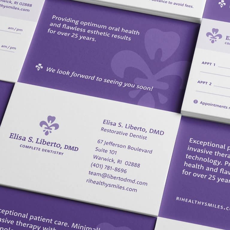
Now, let’s look at how pretty this business card can be!

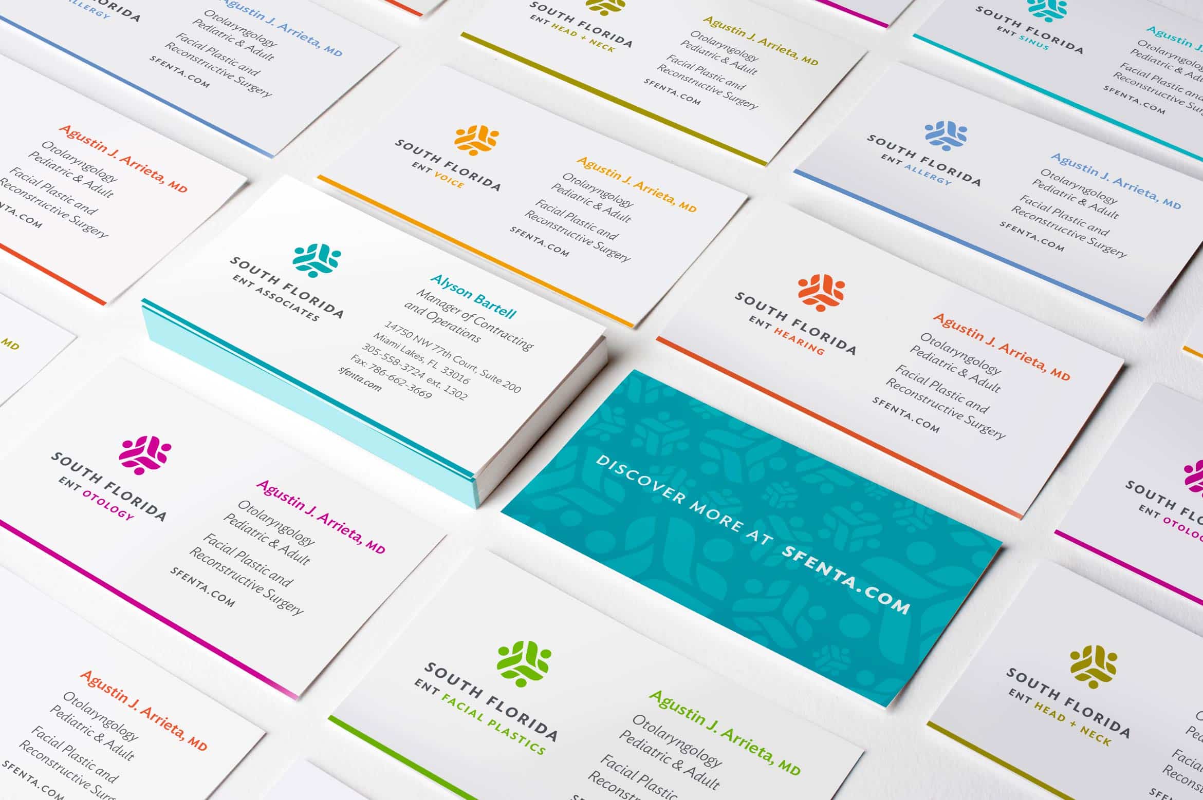
Huge difference, right?
By grouping the contact information together, we create room for:
- the new logo to shine
- the contact’s name and title to stand out
- the same amount of contact information – nothing is lost
- There is also room for brand messaging (“heating, cooling, indoor air quality”) that didn’t exist before
tipDon’t forget to use the back side!

Now grab your business card and run through this blog post again, measuring your own card. How did it do?
It's hard to market an unfocused brand.
Your business should tell a powerful story to attract loyal customers. Get a brilliant visual framework tailor-made to help you build trust.


