
Three design pieces that have stood the test of time
Fads will always come and go. If you’re tempted to think otherwise, a quick flip through your high school yearbook will likely set you straight.
As a designer, it’s a constant balancing act. I need to create fresh, compelling visuals that are modern and pleasing to current sensibilities.
But they also need to be rooted in the perennial tenets of good design and hold steady through those fickle fashions.
Here are three of my design pieces that have stood the test of time:
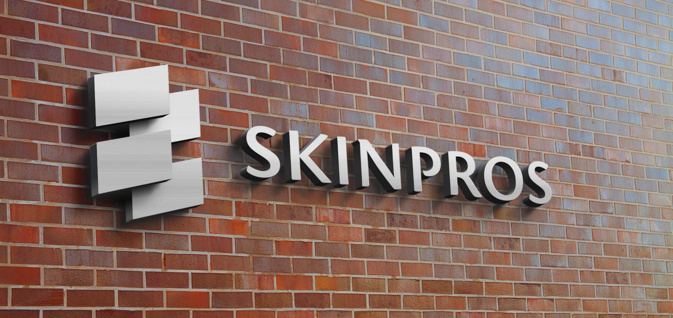
SkinPros building signage

The store signage for SkinPros, a popular dermatology practice in Providence, translated their logo (originally in four colors) into a striking single color three-dimensional piece that welcomes customers as it reaffirms the care, dedication, and attention to detail of Dr. Antonio Cruz, the practice owner.
Created in 2013, the piece is a result of my collaboration with the signmaker to find the perfect balance that would be visually striking, represent the brand forcefully, and come in at a price point favorable to the client.
Using a plastic or resin to represent the logo colors exactly would likely have been cost prohibitive, and would also have clashed with the brick wall it would be displayed on. The brushed silver used in the piece is a pleasing counterpoint to the roughness of the brick.
To ensure the design worked well, it was important to steer clear of a narrow usage context where a singular logo (with its layout and colors) is simply used as-is in every situation.
I took into account where it would be displayed, how large it would be in proportion to the facade and its doors and windows, the texture and character of the building, and how the sunlight hits it.
Keeping in step with the modern shift toward pairing rustic textures with sleek, modern ones, the pristine stainless steel material contrasts nicely with the old brick on the building’s exterior.
Even the placement on the building was informed by the logo design itself: not front and center but off to the left, mirroring the sensibility of the logomark placement.
Six years later it still has a really pleasing contrast with the facade and stands out quite nicely.
Scope out SkinPros reviews on Yelp
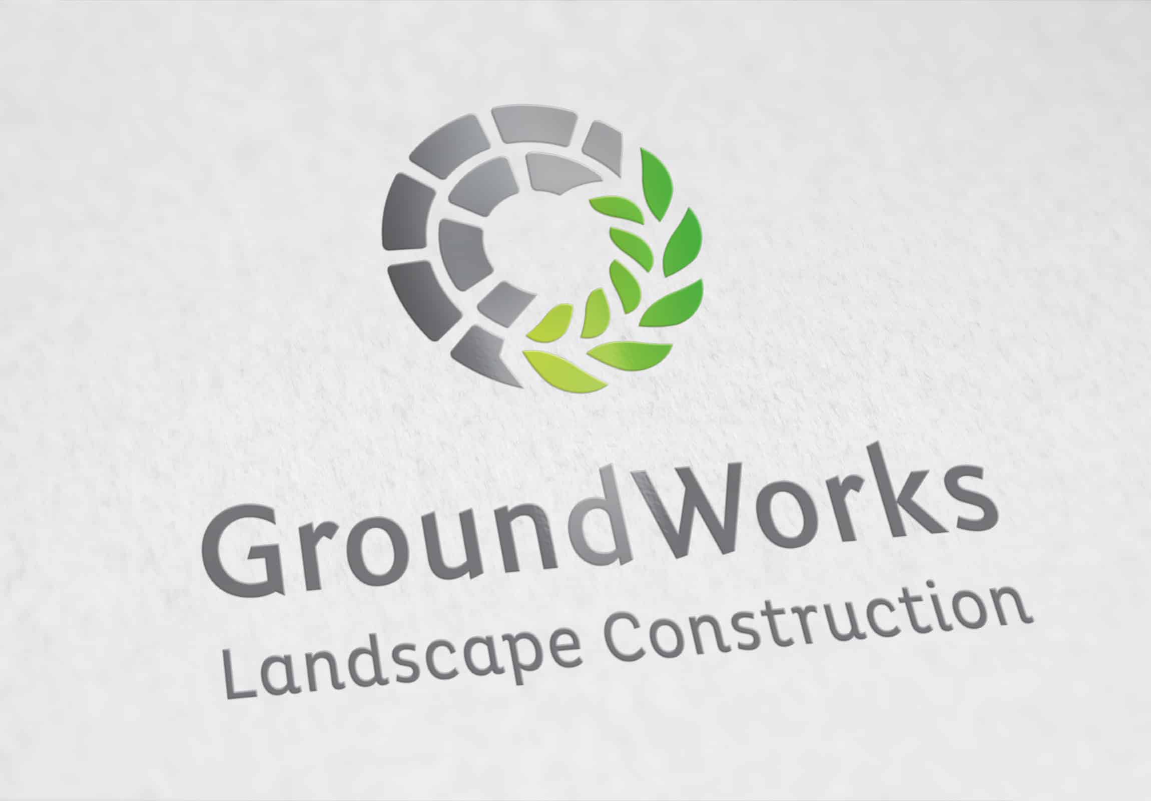
GroundWorks Landscape Construction logo

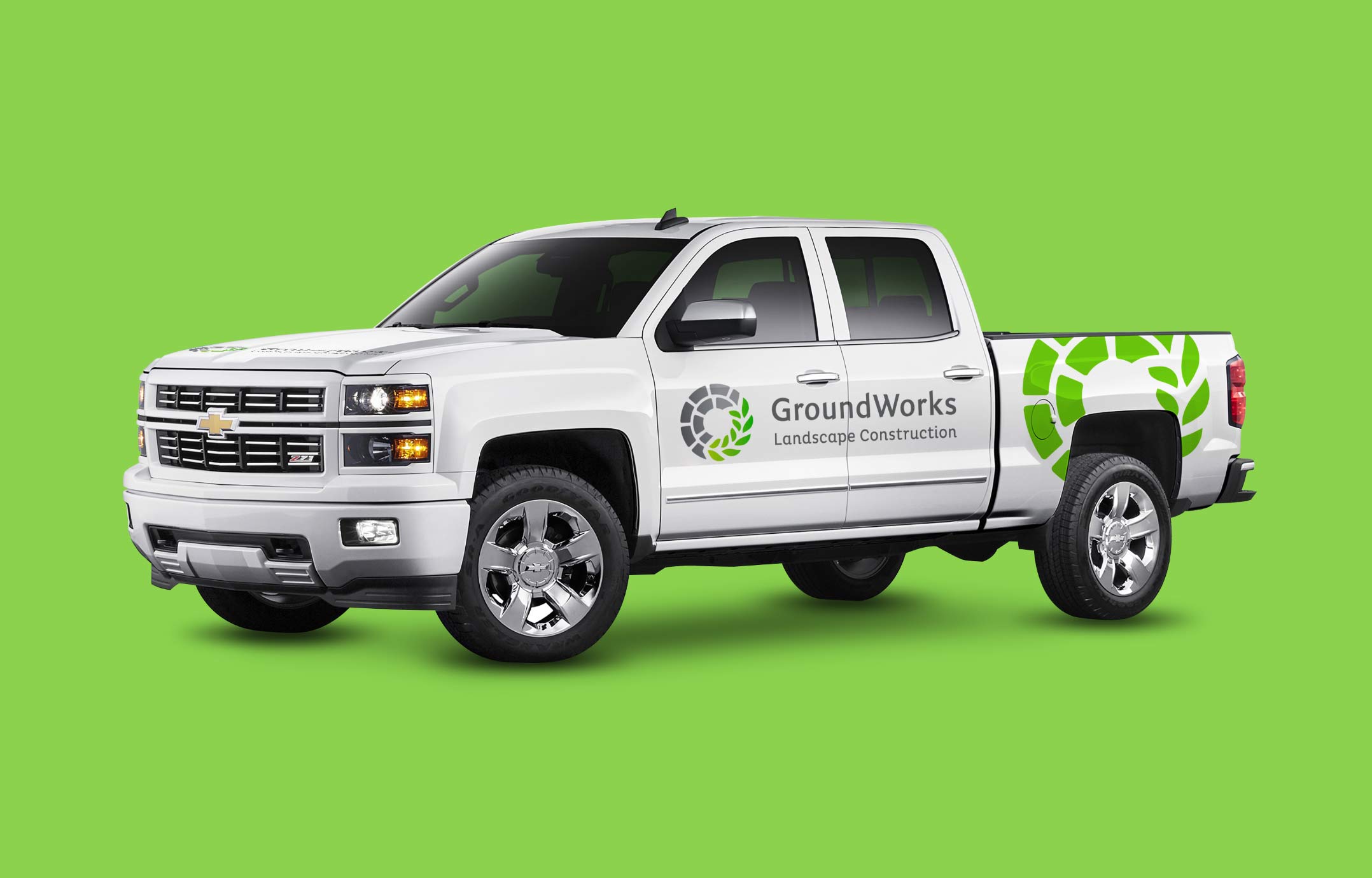
This 2013 logo update is an example of how refreshing your logo when your business changes can reap huge dividends.
The owner of GroundWorks Landscape Construction was expanding his landscaping business to include hardscaping and needed to tell that story through his logo.
This successful logo update, now adorning a fleet of vans, brochures, business cards, estimate sheets, billing and invoicing, and more, helped his business expand considerably – even internationally into Canada.
Years later, he now hears often from clients that they are proud to have a truck bearing his logo parked outside their home or place of business.
The perfect circle within a square shape is a naturally pleasing arrangement whose proportions stand the test of time. Even unconsciously, our brains are attuned to appreciate this mathematical simplicity and balance.
In terms of the style and colors used, the slight color gradient of the green leaves (shifting from lighter to darker green) illustrates the broad spectrum of projects and specialties within his purview. It can help people understand, wordlessly, that a brand is capable of many different things.
The design of the paver and leaf shapes also enables the logo to look great in greyscale, but it really pops and has an extra sophistication with color.
Nature-inspired tones lend an additional air of durability to the logo, as opposed to popular colors that may go out of style.
See Groundworks Construction on Houzz
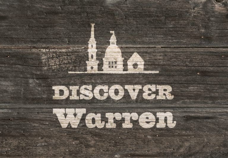
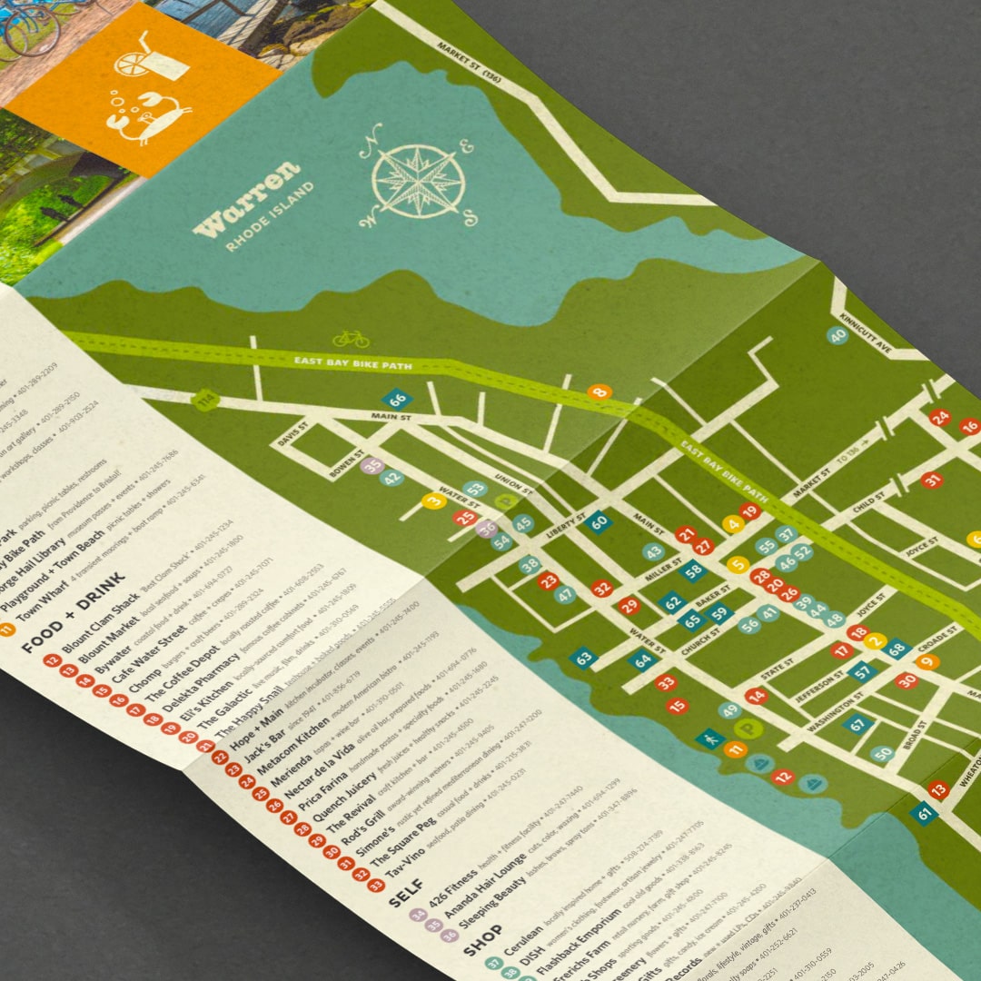
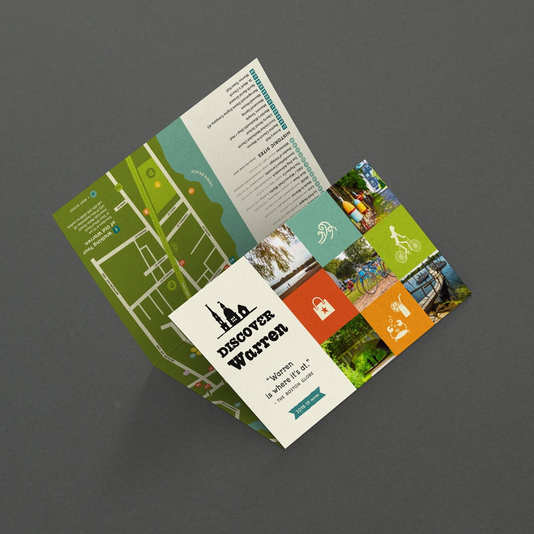
Town of Warren map brochure


The layout of this piece, advertising many of the businesses in one of my favorite towns, Warren, RI, has served their needs beautifully and consistently since 2012.
The original design allowed for easy updates each season as listed businesses open, go out of business, or change their membership status within the business group that publishes the map.
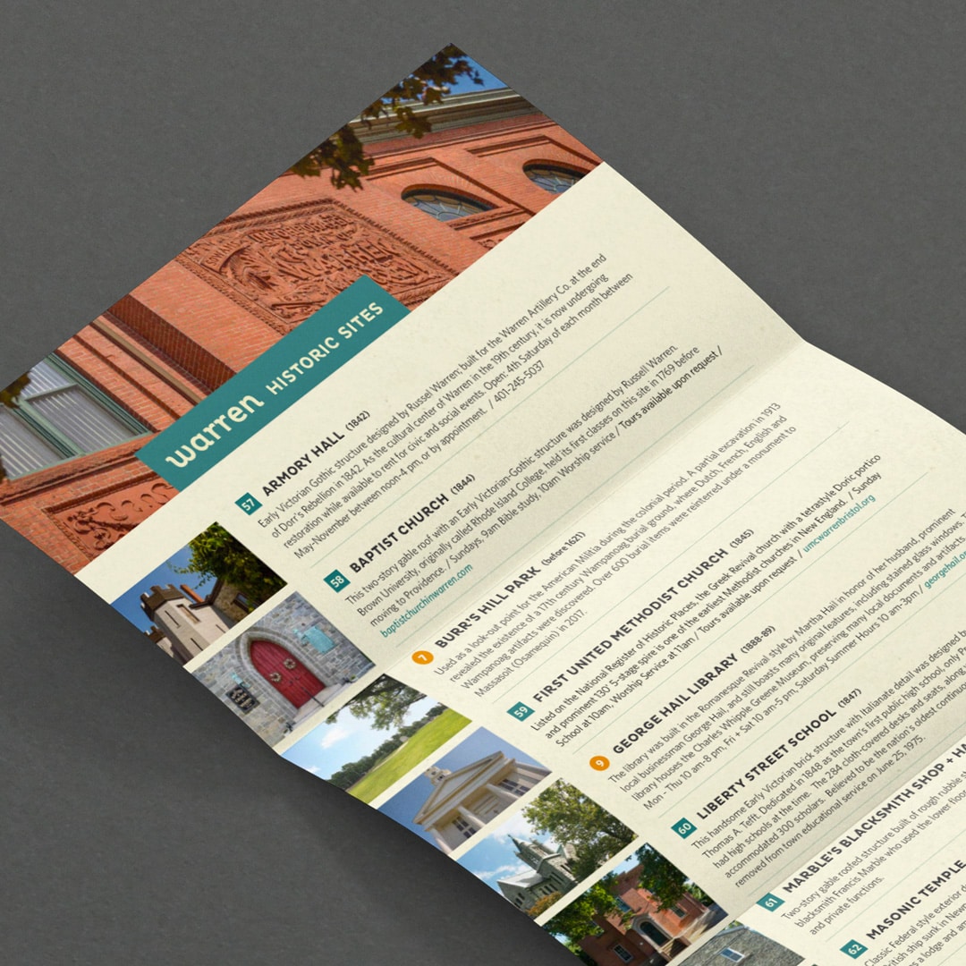
Graphics and color schemes contribute to easy readability for map users and stay on brand with the website I developed for the town. The flip side features historical spots in Warren.
This is an example of a simple piece that eschews some of the bells and whistles popular with other local tourist map publications.
Nestled between the bustling cities of Bristol and Barrington, and near Newport with its tony-yet-historical feel, Warren has a more quirky, fun, unpretentious feel than its neighbors.
While many city or tourist maps are printed on fancy, textured papers, have many pages, or feature glossy ads, the Warren map is printed on modest, sturdy paper, features no ads, and is comprised of one folded sheet of paper.
This simpler design, with a hand-illustrated map, works really well for what my client needs.
Distributed around town, the maps are incredibly useful for visitors and stock runs out quickly each time a new run is printed!
See what’s cooking @DiscoverWarren
A slice of design heaven
It’s so gratifying to be able to design projects that help a business shine and expand. Or to be part of a project keeping up the interest in the history of a wonderful town and its amazing businesses.
Hitting on a piece that works for years, that holds the course as fads come and go, is a sweet little slice of design heaven.
It's hard to market an unfocused brand.
Your business must tell a powerful story with strong optics and a persuasive storyline so you can stand out from the crowd and change more minds. Get a brilliant visual framework tailor-made for you.


