How to Create a Killer Specialized Contact Form and Save Oodles of Time
Great design is so much more than making things look pretty.
When done well, it can do your work for you.
Take, for example, the humble contact form. You probably have one, and you probably haven’t spent much time thinking outside the box to maximize its potential for moving your business forward.
By adding some personal details, integrating it with your overall brand, and nudging your prospects to invest a little more deeply when they reach out, a specialized contact form leaves a favorable impression and begins a relationship before you’ve even lifted a finger.
Last month we looked at how a specialized contact form revolutionizes your pipeline by:
- screening your clients,
- setting you apart,
- increasing your value in your prospect’s eyes, and
- preparing you to hit the ground running.
Now that you know what the perfect contact form can do for you, I’m going to show you a few simple tips and best practices to get you started.
Four Tips to Craft the Perfect Contact Form
- Make it conversational.
Forms are everywhere. We fill them out all the time.
And what happens when you fill out a boilerplate form? When you get beyond the name and email questions, your mind can go as blank as the blanks you’re filling in.
Some thoughtful tweaks to your copy, though, can make your prospects feel like they’re having a real conversation instead.
I was filling out a booking form recently where I was asked, “Is our discussion going to be TED Talk or Buzzfeed worthy? If it’s only Buzzfeed worthy, I reserve the right to cancel this appointment.”
Hah! It was witty & funny and it led the way for a more inspired response on my part (and made me excited to talk with the person).
You have to be pretty confident with this tactic and take care with your phrasing. But depending on the personality of your brand, it’s a great thing to explore. It’s good to get deep into the work of knowing your brand and what it sounds like.
A boring contact form masks your personality.
Being conversational lifts that mask for a moment and makes you instantly stand out. Your target audience will see you’ve put thought into connecting with them and they’ll light up when they see early hints that they’ve found a good match.
- Dig into their pain points.
One of the best ways to begin a relationship with a prospective client is to gather key information about their unique problems, challenges, and pain points.
You gain valuable intel when they tell you a little bit about what issue they need you to resolve — and the first time you make contact, you’ll be ready to tell them how you can make their design project a smashing success.
On my intake form, I ask, “What problem will this design work solve for you?”
It’s open-ended, leading clients to answer in many different ways, all of which give me more information about their needs and where they are starting from.
That’s far more valuable than just having their contact information – or worse, a booked consultation with no key details to prep me for the call.
Your personalized form can go one step further and let prospects know about services they aren’t yet aware of.
After asking, “What’s bothering you about your mouth right now?”, a dentist could offer multiple-choice options that include checkups and cleaning, teeth whitening, cosmetic concerns, and more that bring awareness to the many ways you help solve their problems.
Additional questions that draw your clients to invest and think critically include:
- “What could possibly take this project off track?”
- “What hurdles have you encountered so far in trying to solve this problem?”
- “What feels like the hardest part of solving this problem?”
As a sizable bonus to the information you gain from these questions, your customer has now invested and become emotionally open to working with you.
By sharing their problems, they’ve given you a little piece of their heart, and they’ve subconsciously come to feel as if they’re already partnering with you.
- Keep it short and sweet.
And now, the challenge: while striking a conversational tone and gathering details about pain points, you must resist the urge to let your contact form balloon to a size that turns off prospects before they start.
If you have more than a few questions, you have a few options:
- Start with a quick form that gets to their pain points then follow up in an email with more questions for them to answer before your appointment. Once they’re invested in the contact form, they’re likely to complete this second step.
- Break your questions up into multiple pages or sections so your prospect only sees a few questions at a time. Again, once they have invested in the first couple of questions they are more likely to complete a few more.
- Ask one question at a time (this is what I do). Psychologically, we are capable of completing much larger tasks when they are revealed in very manageable chunks that don’t overwhelm us.
- Don’t skimp on design.
Tending to the visual design of your contact form can prevent your hard work from going to waste.
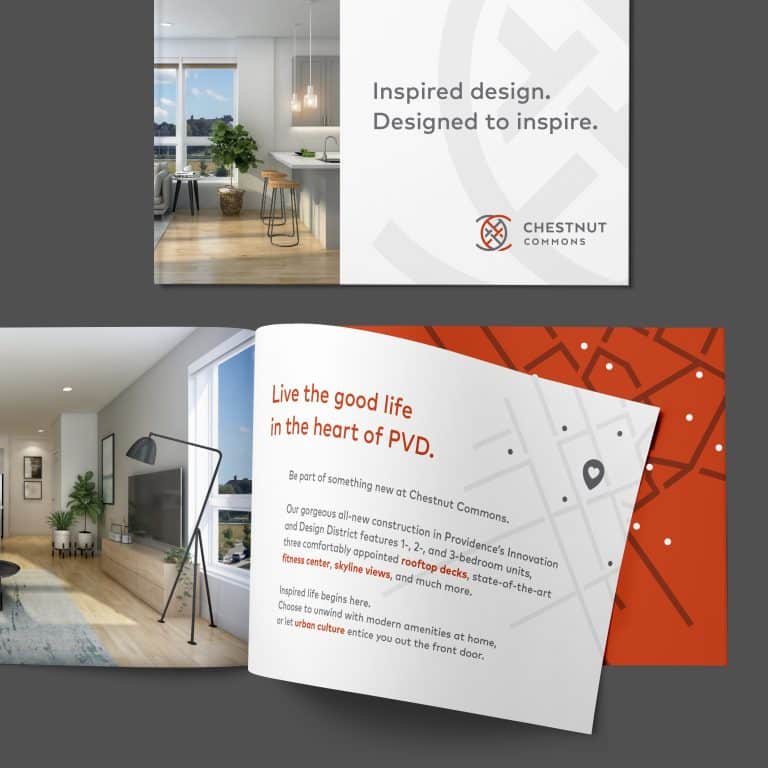
A boilerplate form feels like an afterthought. But incorporating your brand feel, colors, and visual style into your specialized contact form elevates the importance and the experience for your prospective clients.
(Bonus: good marketing enables you to price yourself higher.)
It helps them see that, because you’ve put care & time into these questions, they must be important. This clearly establishes your value in their eyes.
If your business is just getting off the ground, Google Forms is an acceptable place to start when creating a personalized form that gathers the information you need.
As soon as you have the bandwidth to upgrade, however, Gravity Forms and Typeform will expand your options and up your professionalism.
When you’re ready to go top of the line, I recommend Videoask.
With these advanced tools, I recommend working with your favorite designer to create a form that seamlessly integrates function with your brand’s personality.
To be successful, your brand should stand out from the competition.
Your website is your always-on, 24/7 marketing tool and with thoughtful design, every single element can work toward that goal.
Designing a specialized contact form takes advantage of a precious opportunity to get people interested in paying you money before you’ve spent a minute of your time on them.
When your contact form reflects the quality of your brand and a deep interest in your client’s business, it frees you up to do more of the work you love.
Are you interested in visual design that works hard to make your job easier? Grab my Project Start Guide to see if we’d be a good fit.
Key Takeaways:
- A specialized contact form revolutionizes your pipeline. It leaves an impression and begins a relationship before you’ve even lifted a finger.
- A few simple best practices help your contact form do its work to set you up for success.
- To make the most of your contact form:
- Use conversational language
- Gather information about the problems your prospects need to be solved
- Keep it short and sweet, or divide it into manageable chunks
- Make it pretty – and keep it on-brand – by utilizing powerful tools and partnering with your favorite designer
It's hard to market an unfocused brand.
Your business should tell a powerful story to attract loyal customers. Get a brilliant visual framework tailor-made to help you build trust.


