Before & after: What the perfect logo can do for your brand
Whether you’re creating a logo for the first time or considering a redesign, I want to help you think of your logo as so much more. It’s not just about pretty colors or a trendy piece of clipart related to what your business does. Think of it as a complete representation of your brand that contains all the information your potential customers need in order to form an opinion – at first glance – about your products or services.
Your logo is both omnipresent (all over your website and marketing materials), yet singular — it should stand out and call your business and its personality to mind instantly, even out of context.
No pressure, right?
Instead of being daunted by this idea, consider it an opportunity! When else do you get to say so much with so little? And if you attend carefully to the process of creating the perfect logo, it will go forth and be your ambassador for years to come.
Don’t rush it.
Go into the process with the expectation that creating a logo really is a process of trial and error. Like dating, it’s important to give yourself time to sit with a logo and learn more about it, to try out different logos, and to wait until you’ve found the best “perfect package” (the “one”) that combines the best elements of all the options you’ve reviewed before. A great logo will be created in iterations, and you may even change your mind about your top qualities along the way. A great designer will travel this journey with you every step of the way, and like a good matchmaker, will probably suggest some options that you hadn’t thought about.
Keep the big picture in mind.
Your logo represents your brand as a whole. And every single element of that logo should get the attention and consideration it deserves. Each element’s color, style, and texture – individually and together – should explain the value of your products or services to someone who knows nothing about you.
- Color
Do the colors speak for your business? Does the color scheme match, clash, or is so common as to be forgettable? Does your logo leverage color psychology? The best logos use color effectively to communicate the nucleus of your business without saying a word. - Logomark
A logomark, or the “picture” that customers conjure up when they think of the “logo” itself, should be both incredibly simple and perfectly complex. While the icon should represent who your brand is, it doesn’t need to be an all-encompassing depiction of everything your business does. More importantly, it conveys a theme. Your logomark doesn’t need to be (and often, shouldn’t be) obvious: Apple’s logo doesn’t even hint at computers, and Nike isn’t represented by an icon of a shoe. A great logo is not so complicated to confuse people but creates a curiosity that engages them to want to know more. - Typography
Does your typography have uniformly pleasing strokes and lines? Does the style of the font support the style of the logomark? Do they go together or contrast very nicely? Is your font easily readable, memorable, and consistent with your brand image? Did you remember to avoid Papyrus and those other over-used fonts? - Magical process
The process of distilling down the perfect logo isn’t a formula, but there are some big logo mistakes to avoid. A great designer knows which questions to ask, then works with you to combine and refine the elements, to take risks and consider new possibilities, and to arrive at a visual representation of the business you’ve worked so hard to create.
Before and After
Here are three examples of “before and after” logo redesigns to illustrate the power of a great logo.
Mashpee Commons
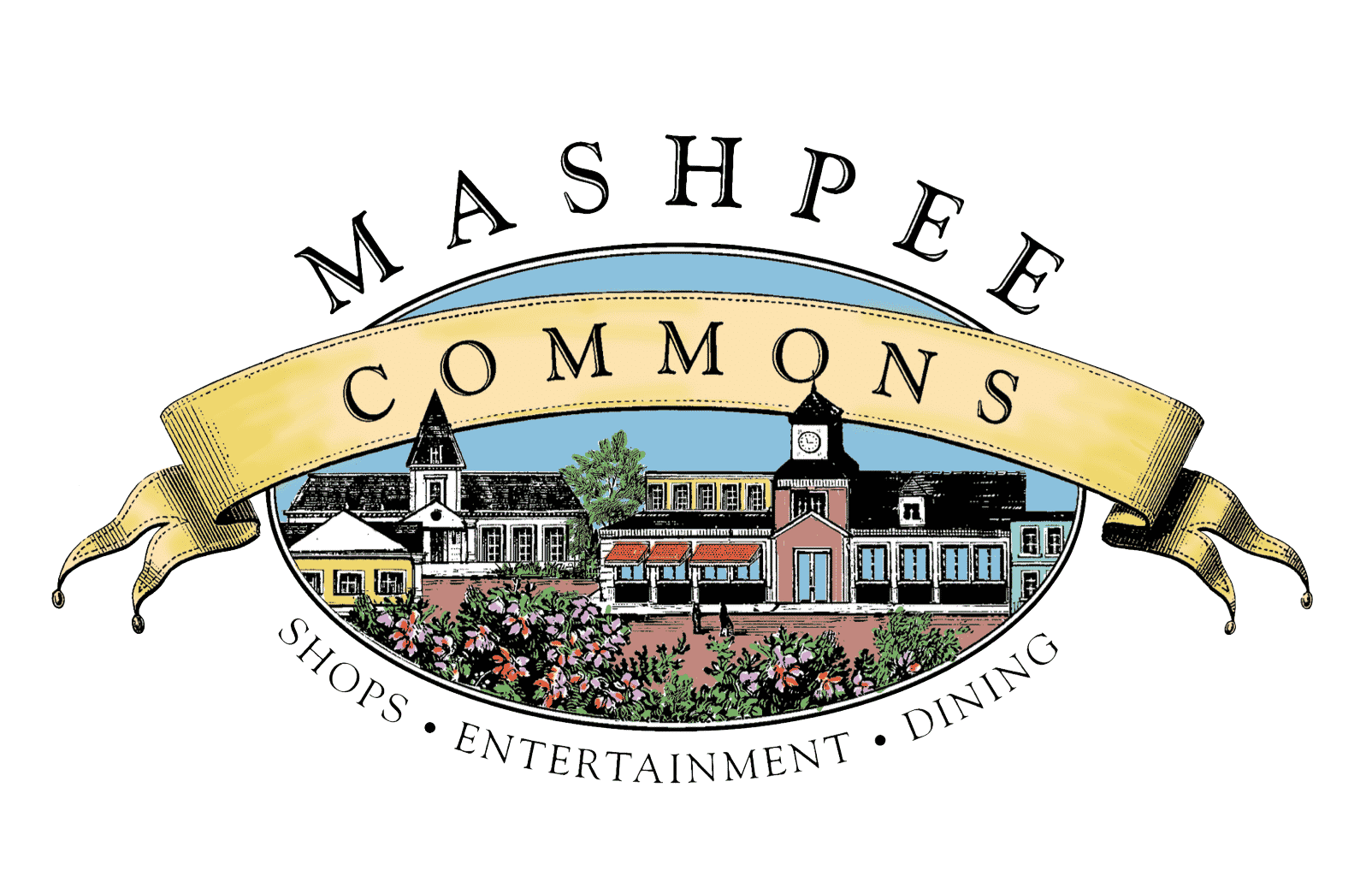

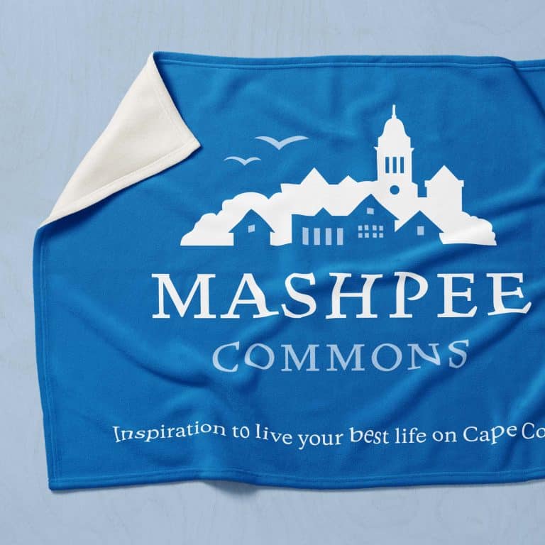
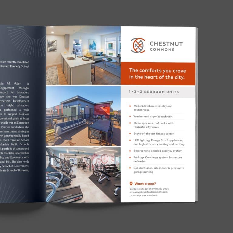
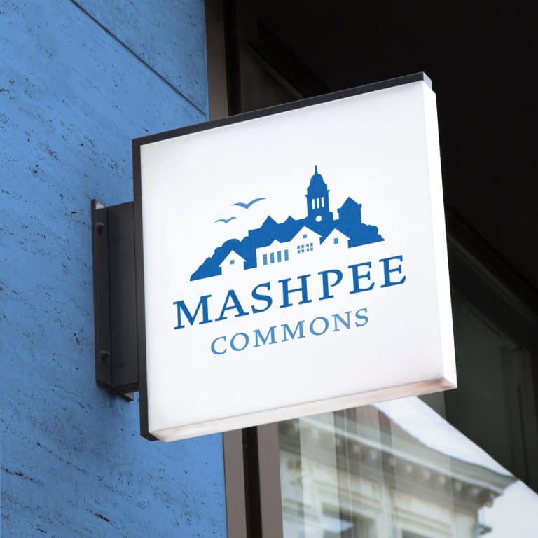
While the illustrator did a fabulous job rendering the skyline in the original logo, there were just too many details. My rule of thumb is if you can’t embroider your logo in miniature (say 1.5” tall and 3” wide) on a polo shirt and be able to easily recognize what it is, your logo is too busy. The original Mashpee Commons logo would have looked great on a book or a large poster, but a great logo works in every context.
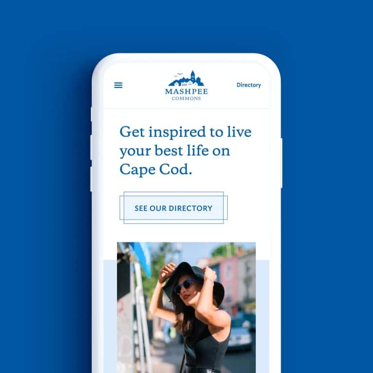
My goal for the new logo was elegant simplicity while retaining the highly identifiable skyline that was the hallmark of their brand. The simple, solid colors also helped establish a palette that could be used on the website and any printed materials, so they don’t have to reinvent the wheel every time they generate a new ad.
See the new logo in use:
Photo by Gene M. Marchand / CapeNews
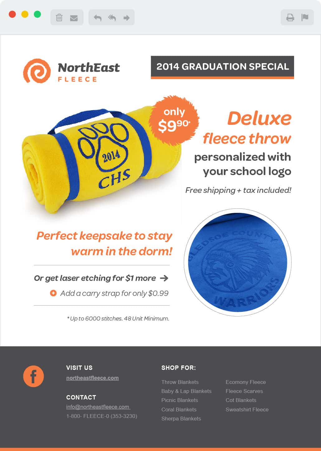
NorthEast Fleece

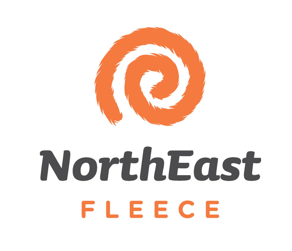
This “before” logo is an example of a logomark that was too literal. It simply reiterated the “NorthEast” of the business name without adding any context or information about the brand. It also screams “clip art”! When I think of fleece, I think of cozy and warm and texture. The cold, clean-cut lines definitely don’t warm me up. I wanted to establish a feeling of coziness and lushness, throughout both the logomark and the type.
While working through concepts, my initial designs represented fleece folded up on a shelf, and through our back-and-forth, we kept coming back to the way they like to photograph their fleece: rolled up. That’s the beauty of iteration – narrowing down the right concept through conversation and trial. The bright, non-primary orange speaks to the personality of the business owner, so friendly and open and excited. And its warmth conveys another element of the product personality.
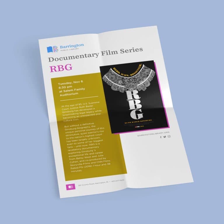
See the new logo in use:
JScott Marketing & PR

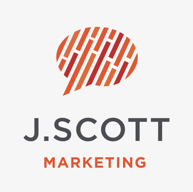
As part of this redesign, the owner decided that even the business name was a tad problematic, and we undertook a larger (and much rarer) rebranding effort. Through our process, she decided to find a name that infused some personality into her brand and also rolled off the tongue a bit easier. The original logo was clean, clear, and simple, but a little too serious — it didn’t showcase the personality of the owner or the brand and didn’t say much about what she does. The new logo continues to use all caps to lend gravitas and professionalism but initiates both more attention and also curiosity. The brighter colors hint at the owner’s bold, fun personality, inviting clients to work with someone who is a joy to work with, and seriously good at what they do.
Even a great logo can only tell part of the story. The design should give your logo a personality and make people curious because curiosity elicits a positive emotional response. In the end, someone is going to buy a product or engage your services because what they see makes them feel a certain way. In the end, your logo has to do a lot of heavy lifting and it’s worth the investment to make it shine.
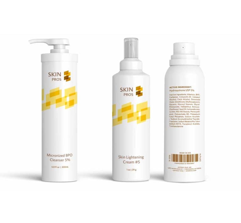
See the new logo in use:

It's hard to market an unfocused brand.
Your business should tell a powerful story to attract loyal customers. Get a brilliant visual framework tailor-made to help you build trust.


