Six signs that your logo needs a refresh
A striking, professionally designed logo should stand the test of time.
And certainly, you wouldn’t want to frequently or prematurely change up a logo that’s working, because it could confuse or alienate your customers.
But as styles and needs change, and as businesses evolve, there are a few strong reasons you may one day need to undertake a logo refresh to keep your brand strong, professional, and consistent.
Let’s dive right into these six signs that it’s time to refresh or overhaul your logo.
- Your logo is soulless or superficial
OK, so “soulless” sounds a little heavy.
But consider that simply to mean that your logo does not embody and convey the personality of your brand.
Many business owners starting out don’t believe they have the funds to hire a professional designer.
Or in the avalanche of tasks it takes to launch a business, they don’t fully grasp the value of being visually distinct. They choose a logo that feels “cool” or “trendy” without truly being tied to the business in either an abstract or concrete way.
If you find yourself in those shoes, but now at a point where you have more cash flow and a deeper understanding ofwhat the perfect logo can do for your brand, it’s time to invest in one that speaks to your mission.
If your logo has meaning and is tied to your business, you’re going to love it, and that excitement will filter down through employees and your customers.
- Your logo is generic.
Does your logo contain a swoosh?
Spheres and stick figures?
Any quasi-human shape that’s dancing or leaping?
These forms are basically all popular repetitions that might look pretty, but that don’t stand out or represent your brand uniquely. In fact, they may have the undesired effect of making your brand, and therefore your offerings, seem rather mediocre.
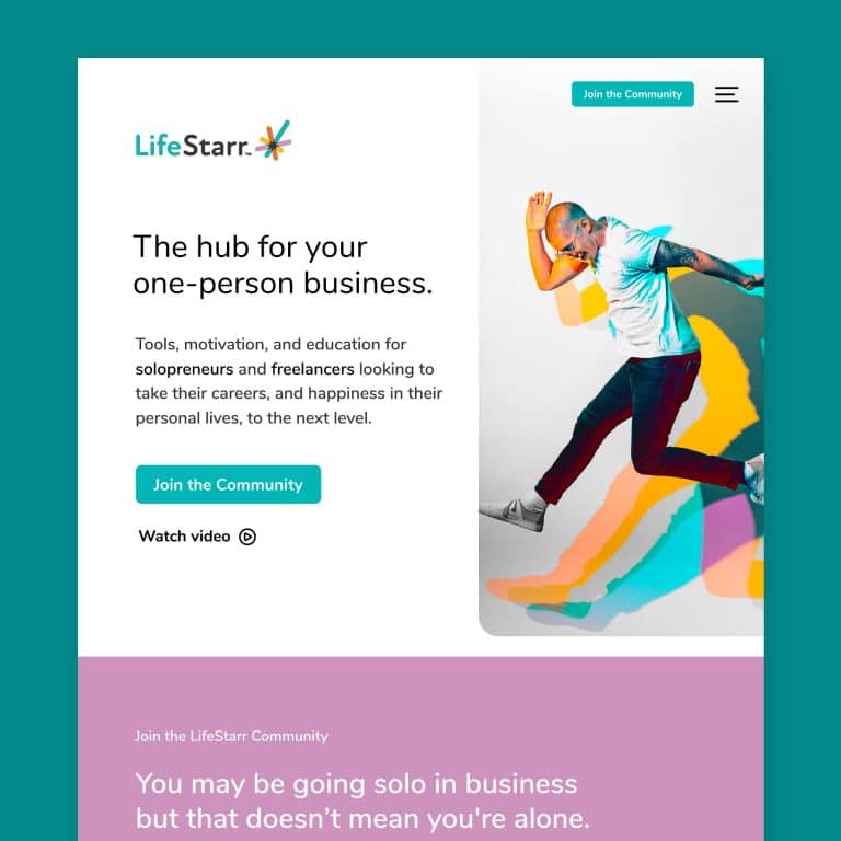
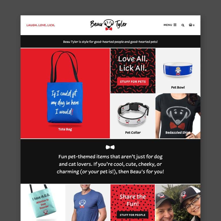
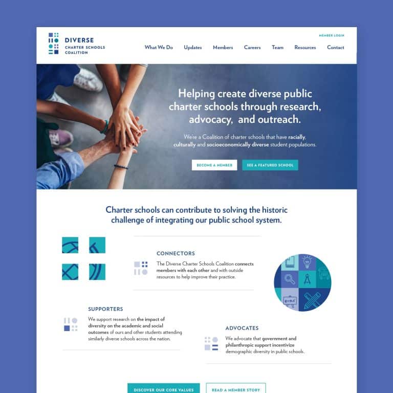
Check out these examples of fake and generic logos and consider how much more could be conveyed with a little time and attention.
- It’s outdated.
Logo colors like cranberry and olive were really popular back in the 90s. Very cool and understated for the time.
Now they conjure up visuals of a great retro find from Savers (that will maybe get worn once on Halloween).
Either color on its own or paired with a bright shade might work, but together they suggest musty hand-me-downs better left in the past. Putting these two super serious, grave colors together – unless you’re a mortician – feels too serious for most businesses.
If your logo feels stuck in your “glory days,” in style or color, it’s time to bring it into this century.
- Your customers are confused.
Say you’re a bakery, specializing in wedding or celebration cakes, but your logo features florals.
This might make perfect sense to you because beautiful flowers speak to fancy celebrations.
But then you find your phone often rings or your inbox keeps fills up with inquiries about flower arrangements.
If there’s consistent, routine confusion from potential customers and clients about what you do or don’t offer, it quite possibly stems from logo or tagline confusion.
These things should be so closely tied together and speak directly to your services, just like perfectly fitting pieces in a puzzle that’s all your own.
- Your mission, products, or services have changed.
Even if your old logo was perfect for what you used to do, moving in a new business direction is the perfect time to refresh your logo and promote your business anew to the world.
As an example, I worked with a landscaping company whose owner was pivoting to focus more on hardscaping, which includes things like driveways, walkways, and commercial pathways that most landscapers don’t offer.
A logo refresh helped him quickly make an impression in this new field and to easily explain his full mission to prospective customers, enabling exponential growth in his business – even internationally, into Canada!
- If you can’t print your logo on a pen.
Your logo may look great, be contemporary, and completely embody your brand – but can it appear beautifully on every tangible and digital surface you want it to?
Or can it only be printed at five times the cost to use all 10 Pantone colors?
Or does it contain too much detail that it looks like a black blob when it’s printed small?
A logo refresh may help you move past these barriers.
A professional designer will make sure that your logo comes in black and white (also called grayscale), as well as in full-color versions and versions requiring fewer inks that print easily on promotional items for a reasonable cost.
They will also provide alternate versions for when your logo needs to be printed or published in varying size contexts, such as a horizontal orientation or a vertical version.
Whatever the reason you decide to do one, a logo refresh – when called for – can be just the thing to breathe new life into your brand and pave a smooth road to business growth.
Key takeaways:
Refreshing your logo lets great visual design propel your business forward. A logo refresh or redesign isn’t something that you’ll undertake often, but if any of these reasons apply, it’s worth considering:
- Your logo needs to be better aligned with your brand because it is superficial, generic or causes confusion for your customers.
- Your logo is outdated in color or style.
- Your mission, products, or services have changed.
- Your logo causes logistical headaches when printing, publishing, or replicating.
It's hard to market an unfocused brand.
Your business should tell a powerful story to attract loyal customers. Get a brilliant visual framework tailor-made to help you build trust.


