How Good Design Promotes Business Growth: Three Examples
Good design, if it’s backed up by a deep knowledge of effective design practices and by a solid experience in creating visuals that engage users, can actually promote the growth of your brand and your business.
Creating a professional persona, showcasing your brand’s personality, and helping your brand connect with users to subtly move them toward conversion are all ways that good design can start a chain reaction that impacts your business’s bottom line.
Without further ado, and in their own words, here are three examples of ways that my visual design partnerships with unique brands promoted the growth of their business.
1. Massimo
Business: Italian eatery on Federal Hill in Providence, RI
How I helped tell their story:
I translated their vision for a classy, sophisticated Italian experience that wouldn’t break the bank, with a friendly, open energy, accessible to everyone.
The elegant logo combines a classic feel with a modern sensibility. Site design made it easy for visitors to get a true sense of the food and the vibe, and to access menus, reservations, and gift cards, as well as clear information about catering and private events.
I also worked with their interior design to match the colors and styling, so that the core brand style runs through all elements of the business, from learning about the restaurant to enjoying a meal. It all fits together perfectly.
Work I completed for Massimo:
Signage for the restaurant building
Paper menu design
Business cards
Plastic gift cards
Advertising in local print magazines
Online advertising
Table/tent cards
Website design & development
Online event ticketing
The Bottom Line:
- Awarded ‘Best New Italian Restaurant’ by RI Monthly in 2017
- Designated ‘Best Providence Lunch’ and overall ‘Best Restaurant in 2018’
- Winners of ‘Best Restaurant’, ‘Best Brunch’, and ‘Best Lunch’ awards in the RI Monthly’s 2018 Readers’ Poll
- Expanded to a second location in Dedham, MA in 2018
“You have created a consistent, unified voice about who we are. As we grow, our new audience needs to quickly figure out what we are and what we offer. A clear brand will be extremely beneficial as we expand beyond the restaurant into retail and catering.”
– Esther DeQuattro, owner
2. Barrington Public Library
Business: Community library in Barrington, RI
How I helped tell their story:
The Barrington Public Library provides services to more than 16,000 residents of Barrington, RI.
They offer classes and workshops weekly to children and adults of all ages, and support the Barrington community at a grassroots level.
When they first approached me, the team at BPL was looking to improve their brand to attract both more donors and more community involvement. They also wanted to give their library logo a new, fresh coat of paint.
I helped them understand that, in order to breathe more life into their library, they had to begin with the logo.
Work I completed for the Library:
Business cards
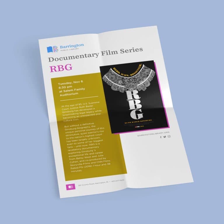
Announcement/event templates
Magnets
Library cards
Interior office design concepts
The Bottom Line:
- An accessible, inviting logo and a comprehensive brand strategy invited more engagement at the library itself.
- The new brand and visuals helped the library and its staff convey the importance of their place at the center of the Barrington community.
- Through the new collateral I’ve worked on with them, they’re able to speak more clearly to potential donors and supporters.
“Working with Laura helped our library come together with a unifying message. With brand-recognition in the community and polished professional communications, we know these efforts will continue to speak to future donors about the importance of a public library in our community.”
– Jessica D’Avanza, Community Engagement Librarian
3. SkinPros
Business: Comprehensive dermatology practice in Providence, RI
How I helped tell their story:
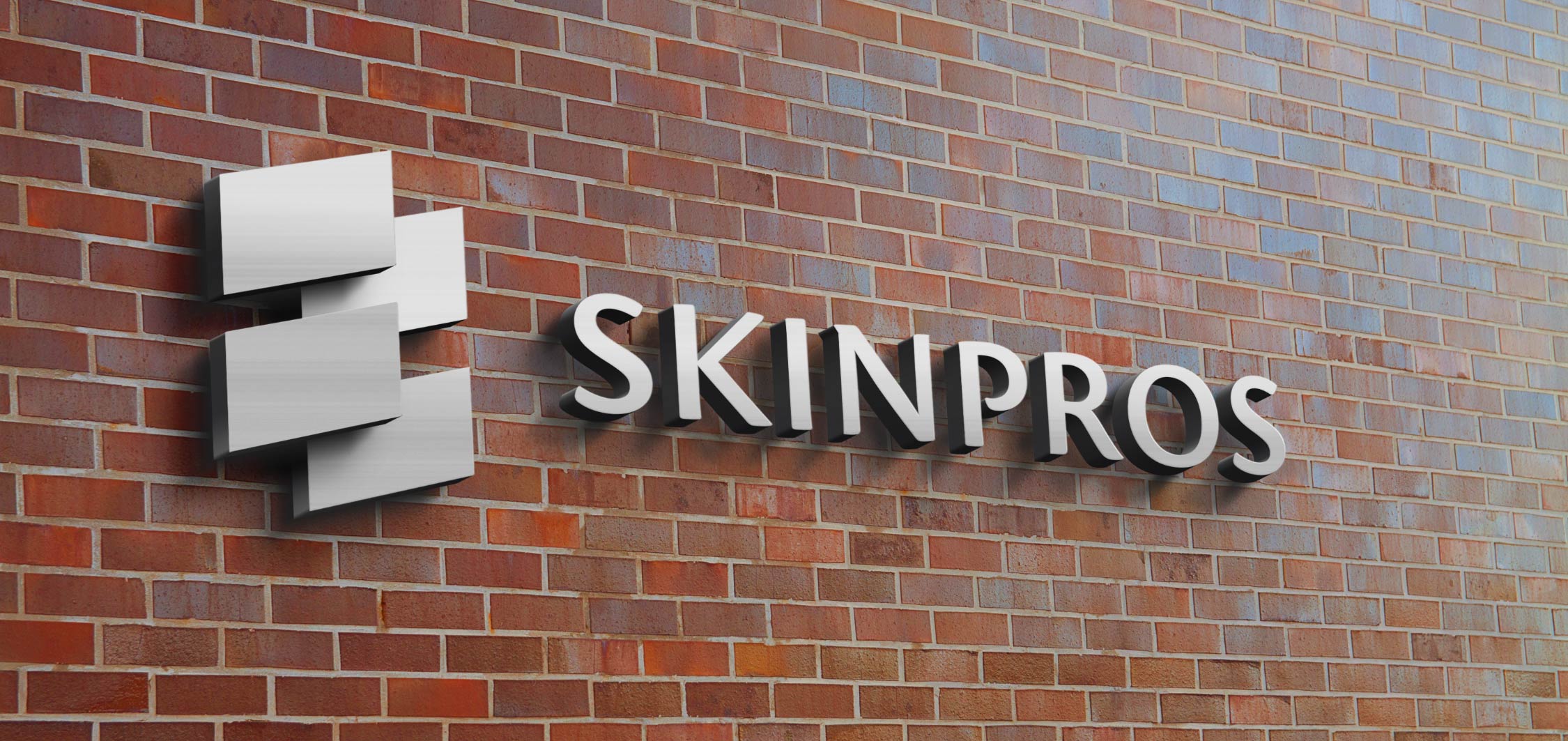
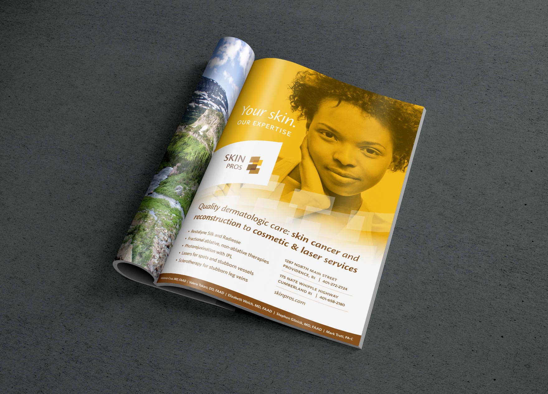
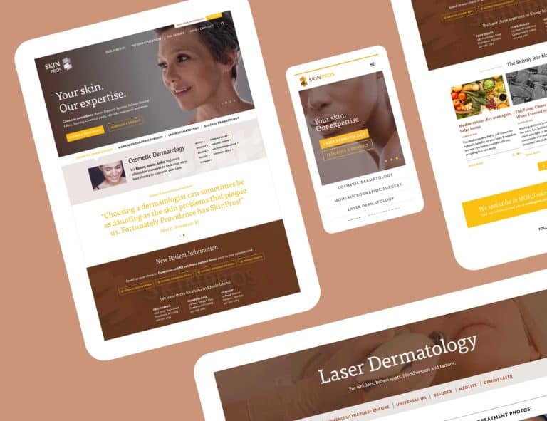
Starting with logo design, I created a warm, inviting, professional brand image that we then wove through additional materials to ensure continuity.
From the moment clients walk in the building, even down to filling out their forms, they can tell that they’re dealing with an incredibly professional business that takes care of every detail of their care.
While maintaining the brand feel, I designed a responsive website that made it hassle-free for clients to book appointments quickly on the website and pay their bills online.
Work I completed for SkinPros:
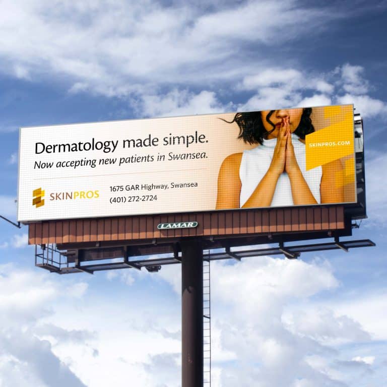
Outdoor facade signage
Responsive website
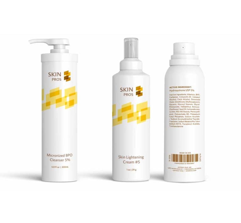
Product packaging artwork
Patient forms
T-shirts
Print advertising
Letterhead & business cards
Gift cards
Welcome postcards
The Bottom Line:
- Potential clients immediately trust that if they reach out with any type of skin issue, they are in capable hands.
- The cohesive look and feel of a well-designed logo and color palette throughout all materials speak to my client’s attention to detail.
- Since opening their first location in Providence, SkinPros has expanded to two more locations (Cumberland and Newport).
“Your work has solidified our brand identity. Our materials all share the same feel – a professional, warm, clean look across our media. At this point, I feel like you can almost read our minds and know what we are looking for!”
– Antonio Cruz, MD, owner
How much growth are you hoping for with your business? Good design can help.
Key Takeaways:
- I enjoy working with my clients on multiple projects (like these) over the long-term and, if needed, serve as their brand ‘shepherd,’ ensuring their visual voice stays strong and cohesive long into the future.
- Even though I’ve provided a great branding platform for these clients, each one of them continues to consult with me on important visual messaging for their organization.
It's hard to market an unfocused brand.
Your business should tell a powerful story to attract loyal customers. Get a brilliant visual framework tailor-made to help you build trust.


