How to Choose the Perfect Font for your Brand
When you’re developing cohesive, top-notch brand visuals, you want to make sure everything – down to the font – is exactly right for your business and brand.
Now, most people don’t lie awake at night considering the finer points of fonts, but I love to geek out on this topic, so bear with me. As a designer, when I come to you the client with ideas and make font selections to present to you, this is what I’m thinking about!
This blog post may also explain why some fonts will “feel right” and others will “feel wrong.” I think fonts are truly amazing and hope this post can share some of my own joy as well as provide a little education.
For starters, there are two areas where a font is critical in setting the tone for your brand. First, you’ll want to pick the right font for your perfect logo (unless you have a savvy, knowledgeable designer like me creating one for you – in that case, know that all of this research should be done for you!). Once your logo is set, you’ll select a font (or font family) for the rest of your business materials (think website, business cards, brochures, etc). These two font specifications can actually be the same – more on that later.
Complementary style
You want all the visuals for your brand to look as if they’re meant to fit perfectly together. This is an overarching design principal for all brand elements. This means the fonts need to match well or contrast nicely with other design elements.
In my own brand work, I look for a font that complements the style of your logomark (the picture or icon in your logo), if you have one. Is it rustic? Fancy? Graphic? Whimsical? Mod? Simple & sophisticated? Your logomark should be able to stand on its own (and, in time, be recognizable even without the company name), with the typography playing a supporting role, rather than diminishing from the unique recognizability of the icon. You may have a favorite font you’ve always loved, but if it distracts from your logomark (rather than supports it), then it’s not the right font.
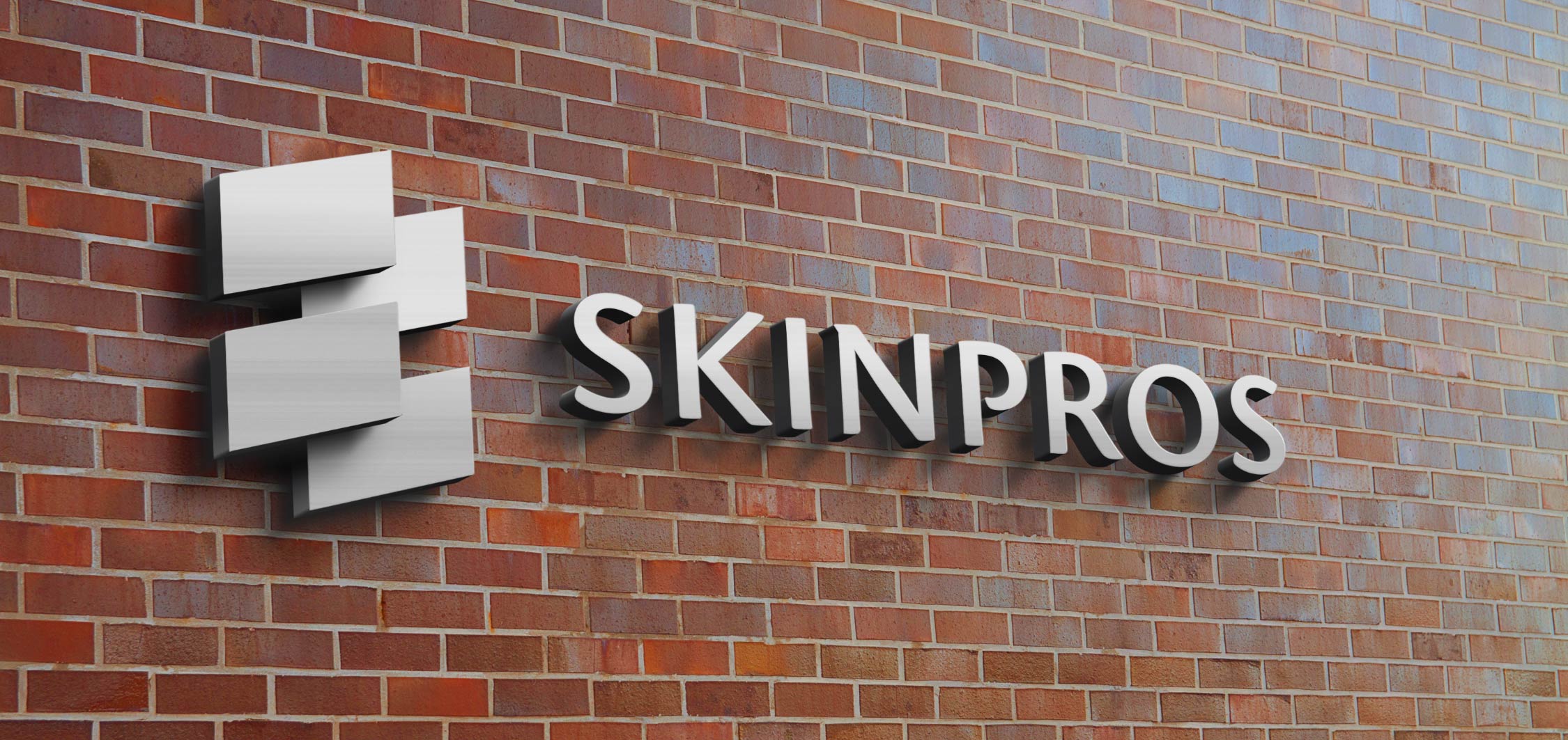
Let’s take a look at an example of supporting typography:
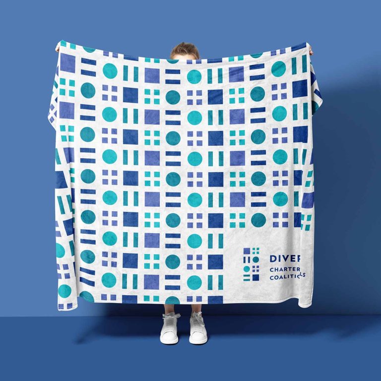
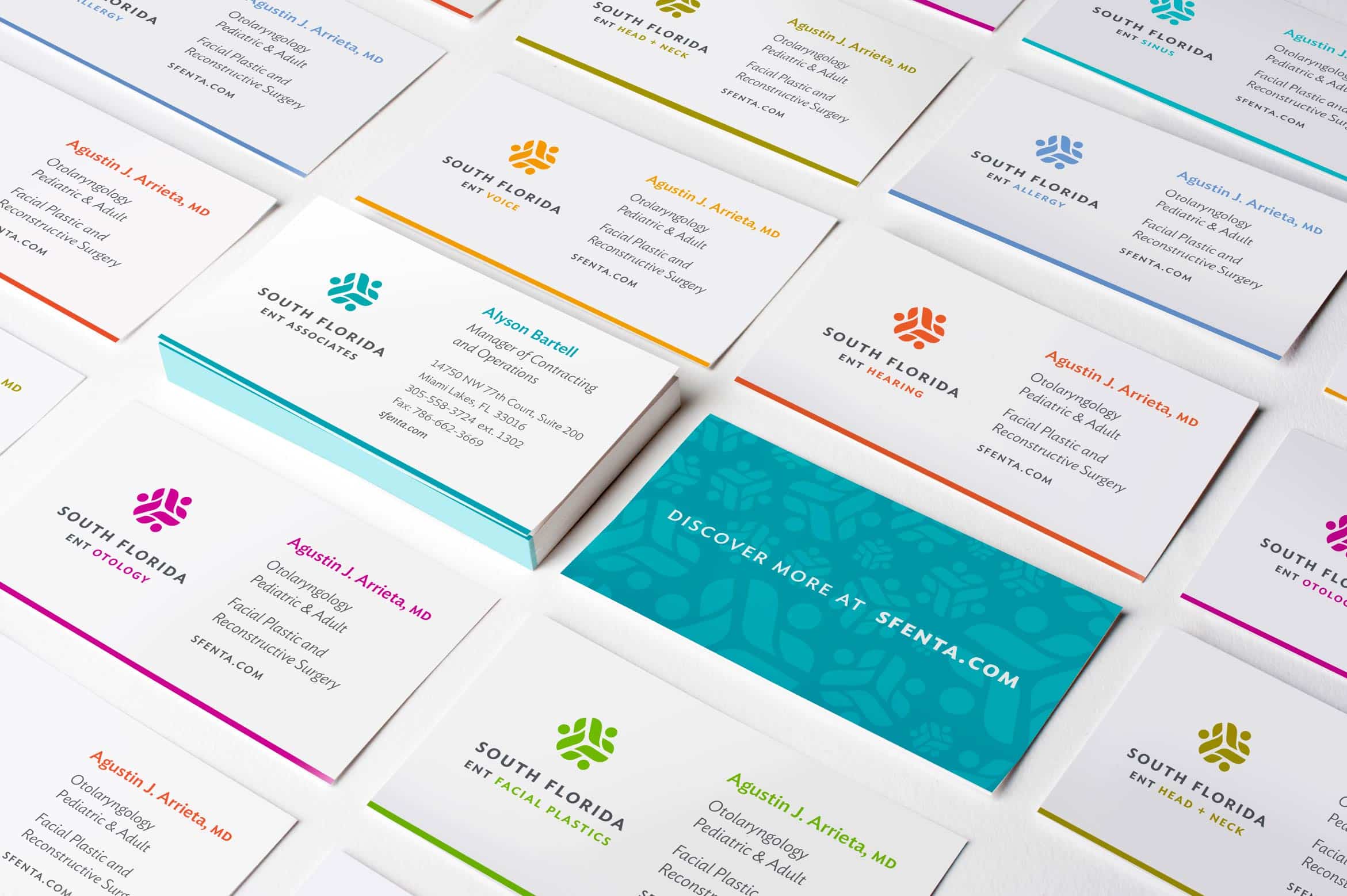
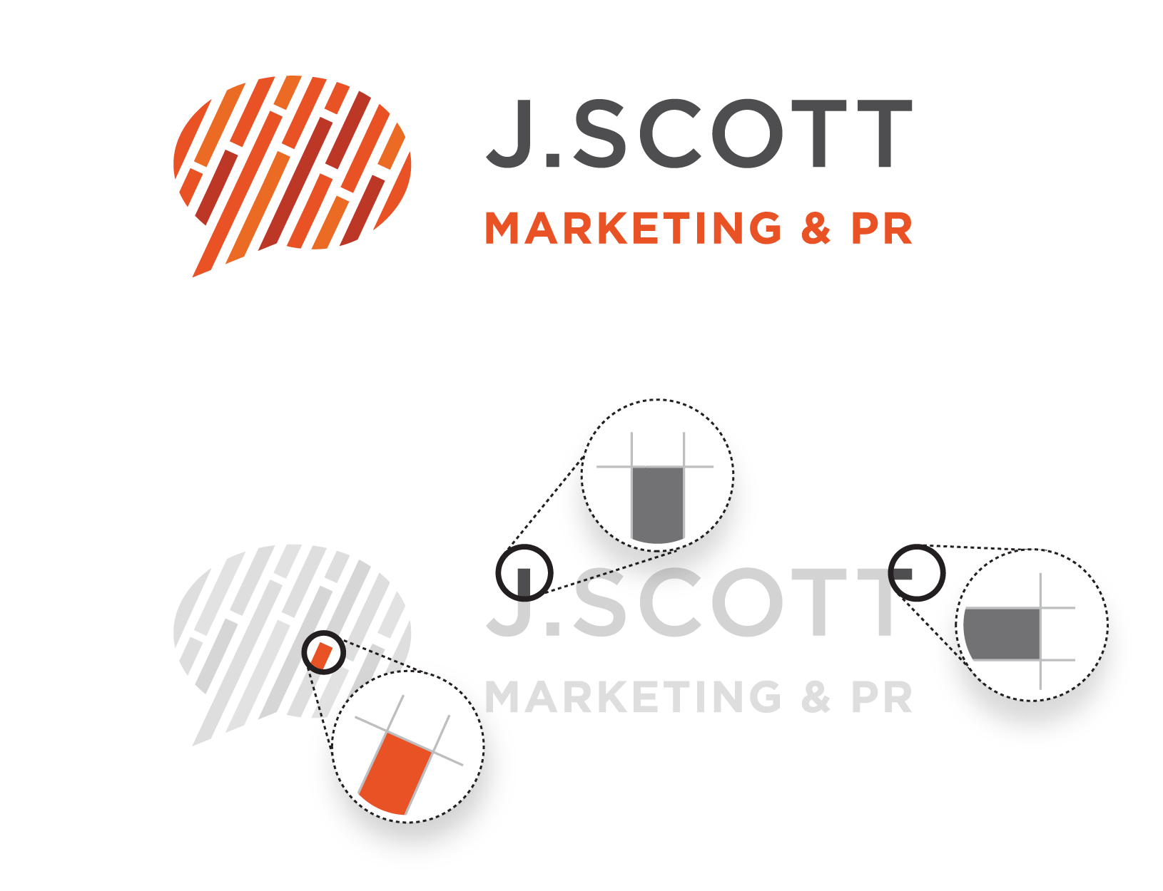 Notice how the line endings in the logomark and the stroke style of the font all match and use right angles.
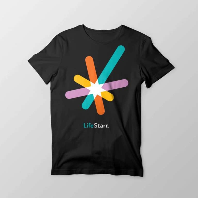
This logomark I designed for my client features simple sticks of color. The lines themselves aren’t thick, but they’re not too thin, either. Note that the line endings are at right angles (within the zoom bubbles), or at sharp angles on the edges, as opposed to soft or curved. A complementary font uses strokes that mimic the style & angles of shapes within the logomark. Curved lines or rounded edges would feel out of place. This may seem unimportant (like I’m splitting hairs, right?), but it’s actually these minute details that add up to a logo that works really well and looks professional. If your logo icon is a solid shape (as opposed to a grouping of solid shapes or lines) this advice still applies, but you may have a little bit more wiggle room because there’s less to “match.”
Serif vs. Sans-serif Fonts
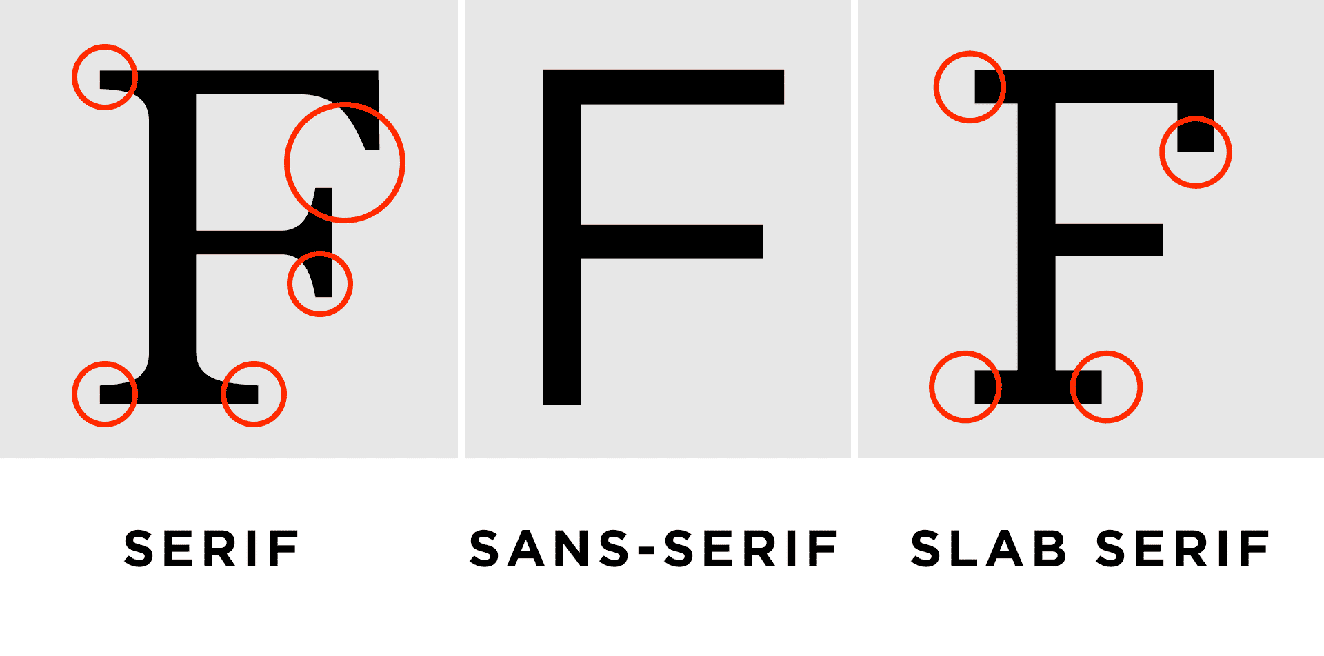 A serif is a projection, or “foot,” finishing off a letter stroke in certain typefaces. Fonts without this projection are sans serif. Some serifs are curved; if the little feet are flat, the font is considered a slab serif.
See examples of serif, sans serif, and slab serif on Google Fonts.
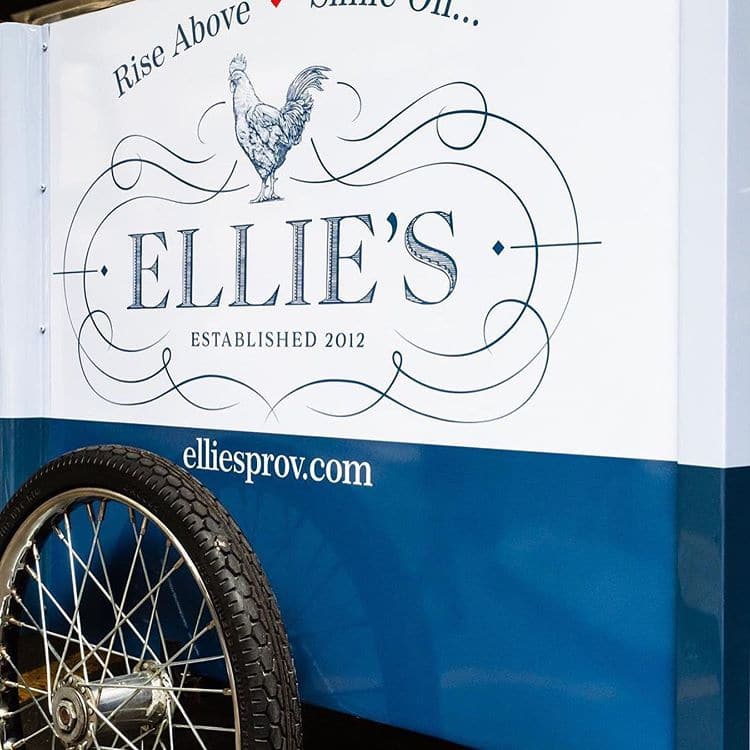
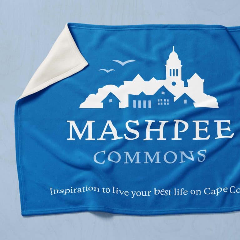
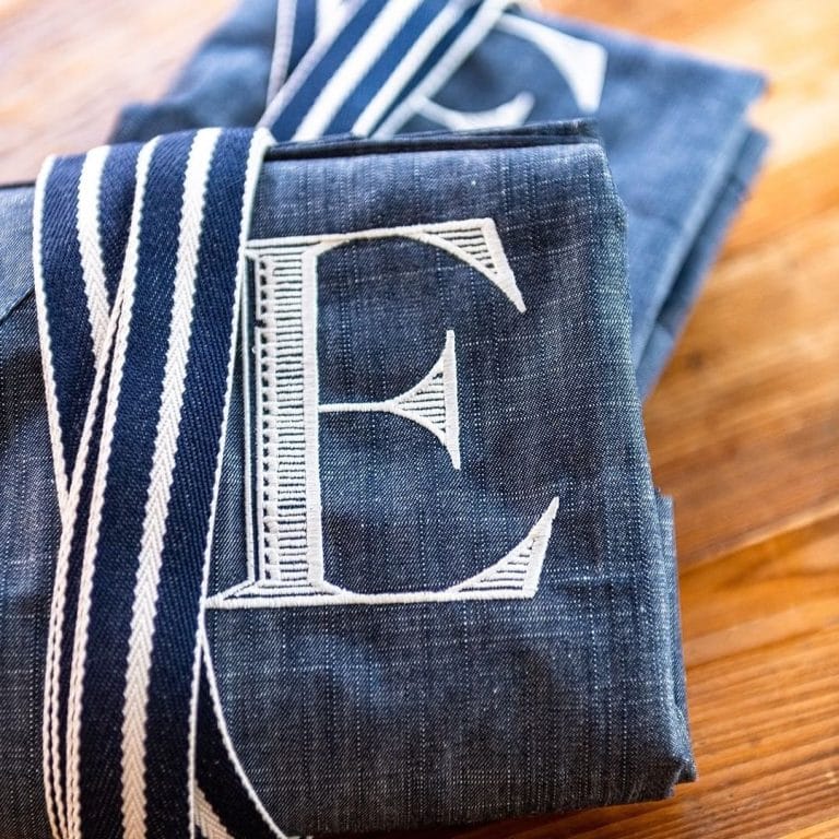
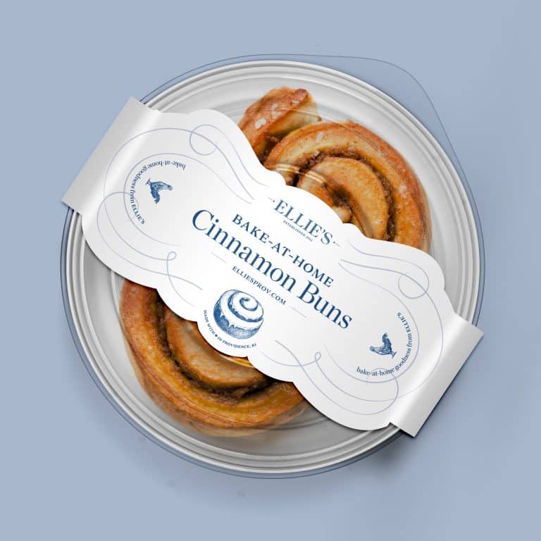
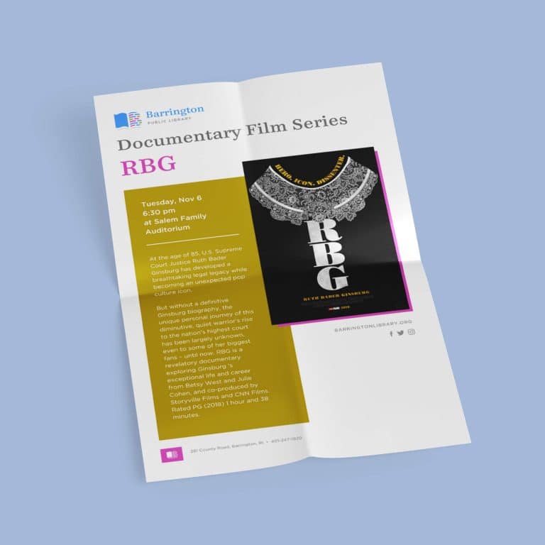
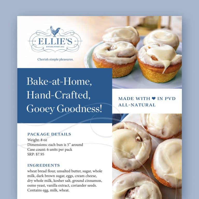
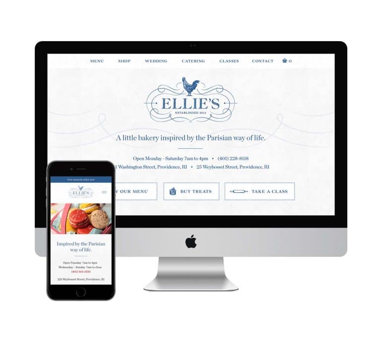
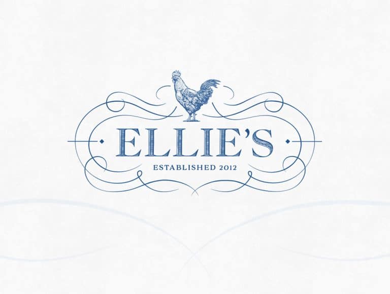
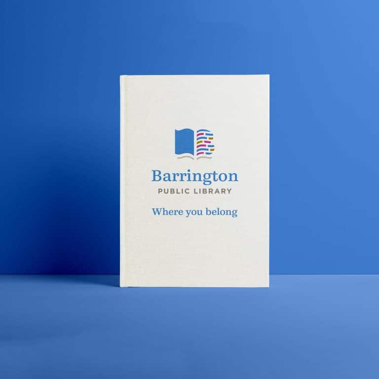
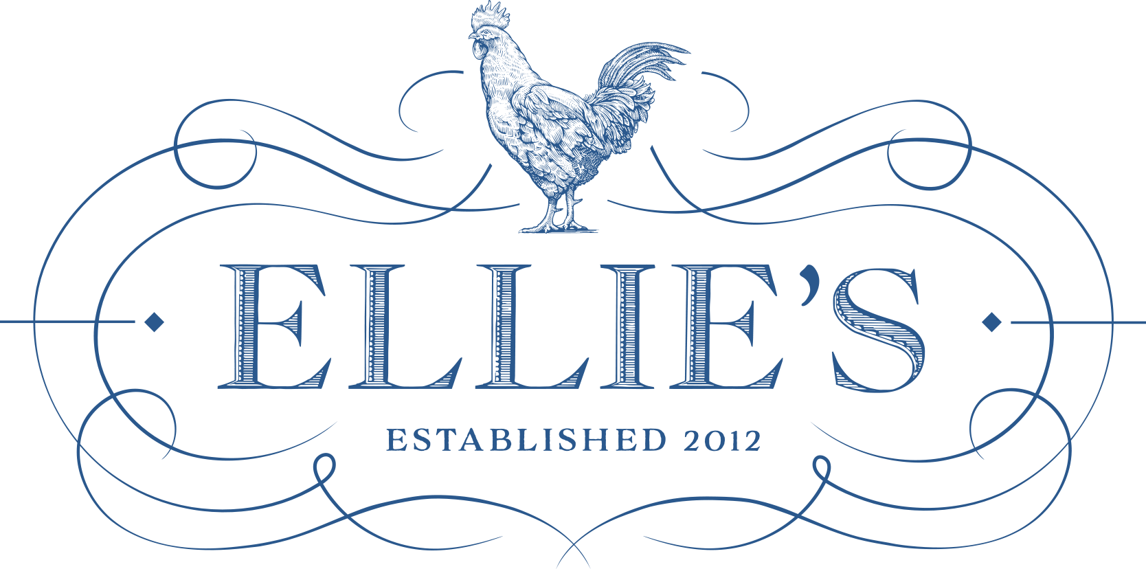
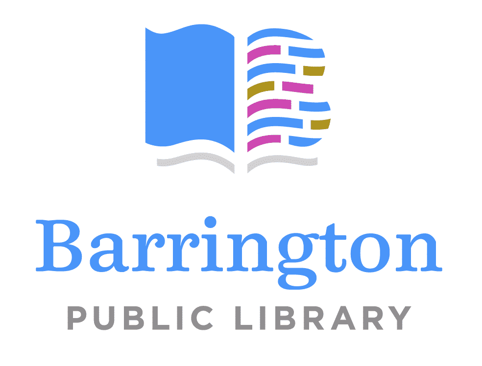
Times New Roman is the most recognizable example of a serif font. Can you spot the serifs in the logo fonts for Ellie’s Bakery and the Barrington Public Library?
It's hard to market an unfocused brand.
Your business should tell a powerful story to attract loyal customers. Get a brilliant visual framework tailor-made to help you build trust.
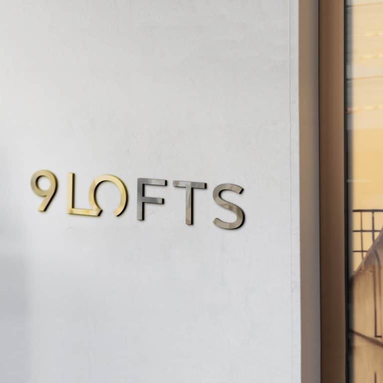
Second, I look for fonts with a weight or “heaviness” that complement the width of spaces and shapes in the logo. Common weights include bold, semibold, medium, regular and light.
In this example, the logo I designed features a grouping of angular solid shapes that create negative (white) space in between.
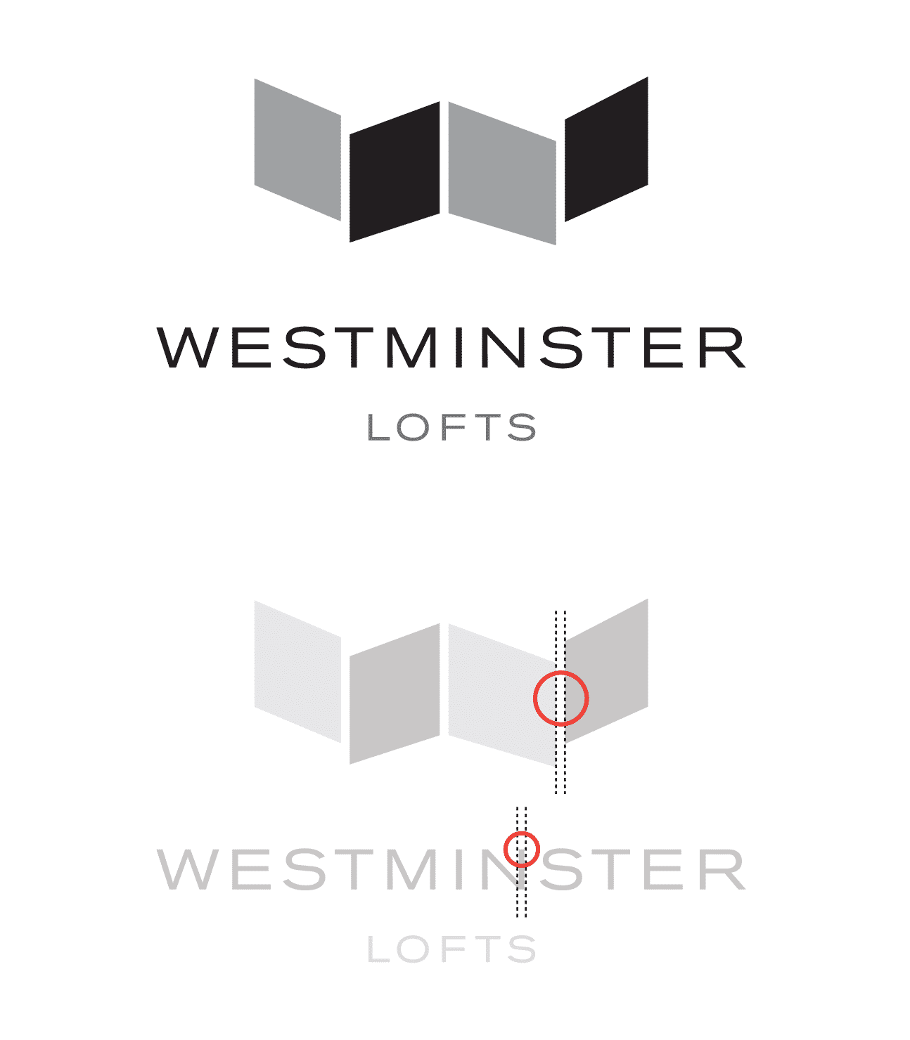 See how the negative space in the logomark visually matches the stroke width of the lettering.
Each of the shapes within the logomark is separated by a very small line of negative (white) space. Going for a solid, sophisticated look, I chose to go with a simpler font with a similar stroke heaviness to the negative space in the logo. When you look at it, you may not know why it works, but there’s just something about the stroke and the icon that feel right.
The beauty is, you don’t have to follow every “rule” of choosing the right font! But it’s best to pay attention to at least one rule. And you need to know the rules before you can break them, right? Using shape and weight, try to match or complement the negative space, the shapes included, and/or the angles created in the logo icon.
Font-only logo
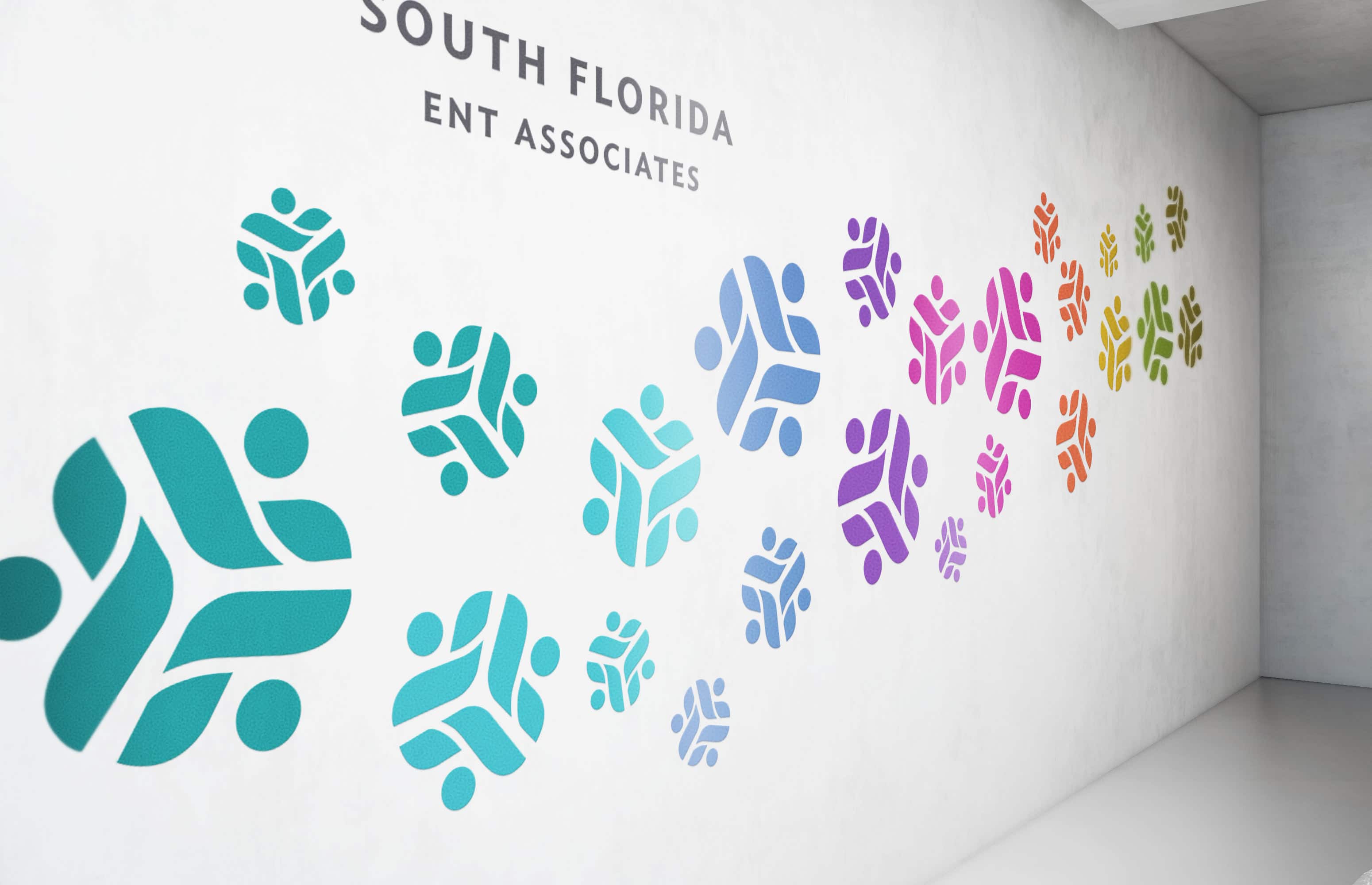
Typography plays a strong supporting role in most logos. In rare instances, a highly stylized font can be matched well with an icon, but most often a logo icon and a decorative font tend to appear at odds with each other. So if you really love a script or calligraphy typeface, and the style of it speaks to your business brand, then you may be a candidate for a font-only logo with no logomark.


In these examples of my logo work, the script font I used for my client’s name makes up the entire logo. The chosen font is distinctive enough on its own. It perfectly represents the style and feel of the brand while eliminating the need for a separate logomark. In most cases, I prefer to tweak and customize the lines of a font-only logo shape, so that the logo really is unique and can’t be recreated by someone else who downloads the font and types the characters into a Word doc – remember, your logo is special!
Fonts for everything else
Now that you’ve selected the perfect font for your logo, you’ll want to choose complementary fonts for the rest of your business-related items, like business cards, brochures, website text, and more. It’s best not to use the exact font used in your logo because that could cheapen its ‘specialness’ through overexposure. A good alternative here is to use the same font but in a different weight (see below), in order to preserve your logo font as special and exclusive.
The goal for additional business materials is a cohesive look that can handle many types of text, such as headlines, lists, and long chunks of text. For this, you’ll need a flexible font or family of fonts. Here’s a quick visual on the weights and styles of one of my favorite fonts, Galaxie Copernicus:
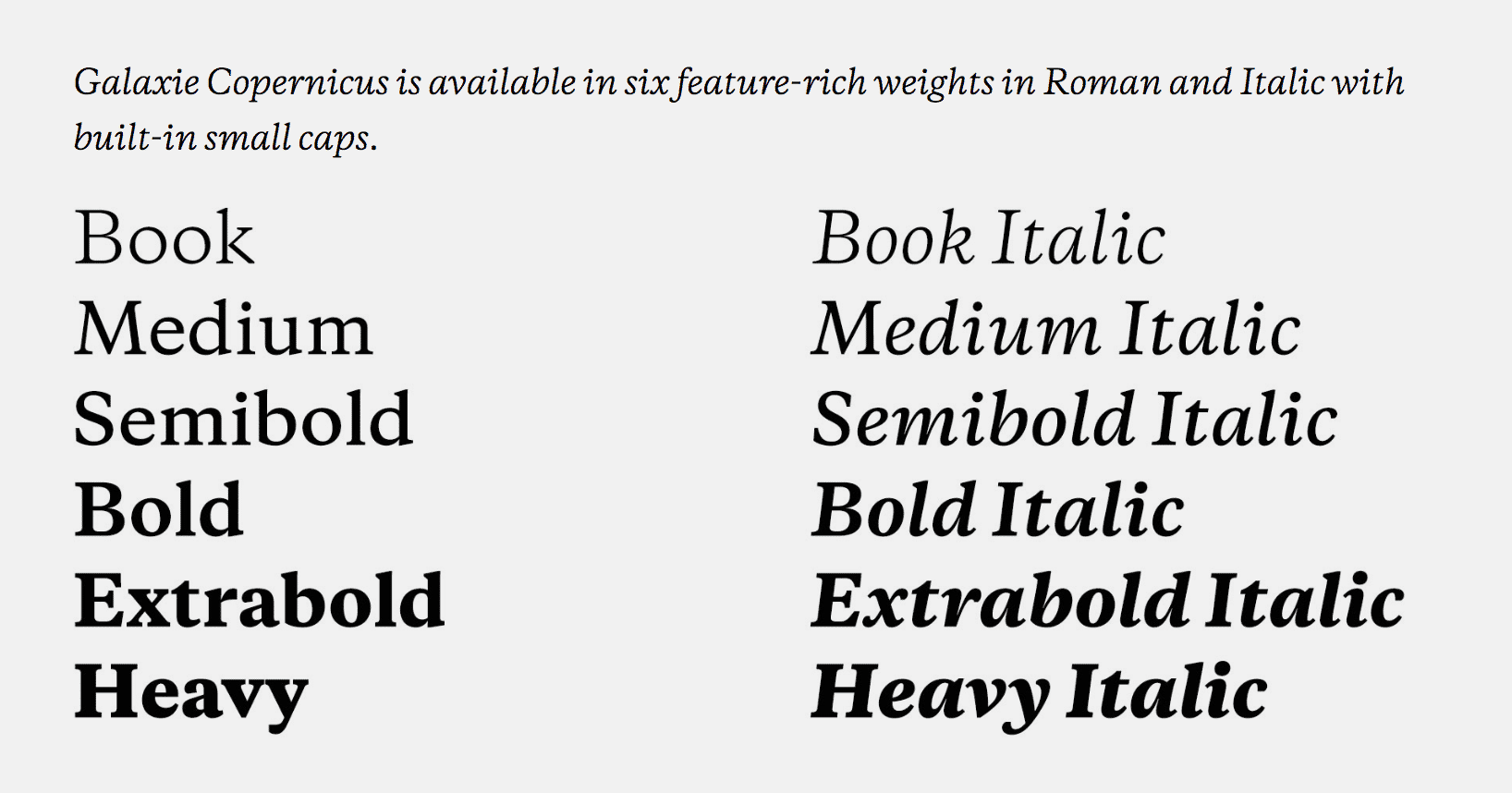 One of my favorite fonts and all the styles & weights in the font family
A flexible font usually has multiple weights (e.g. light, medium, semibold, bold, black, all of which together are called a ‘font family’) for various applications, and will be versatile in italics, all caps, small caps, fractions, non-English characters, dingbats and more. A flexible font will also have italic styles that are designed separately – if italics aren’t part of the font family, then some applications like Microsoft Word will manually slant the letters if you italicize content (this often looks tacky).
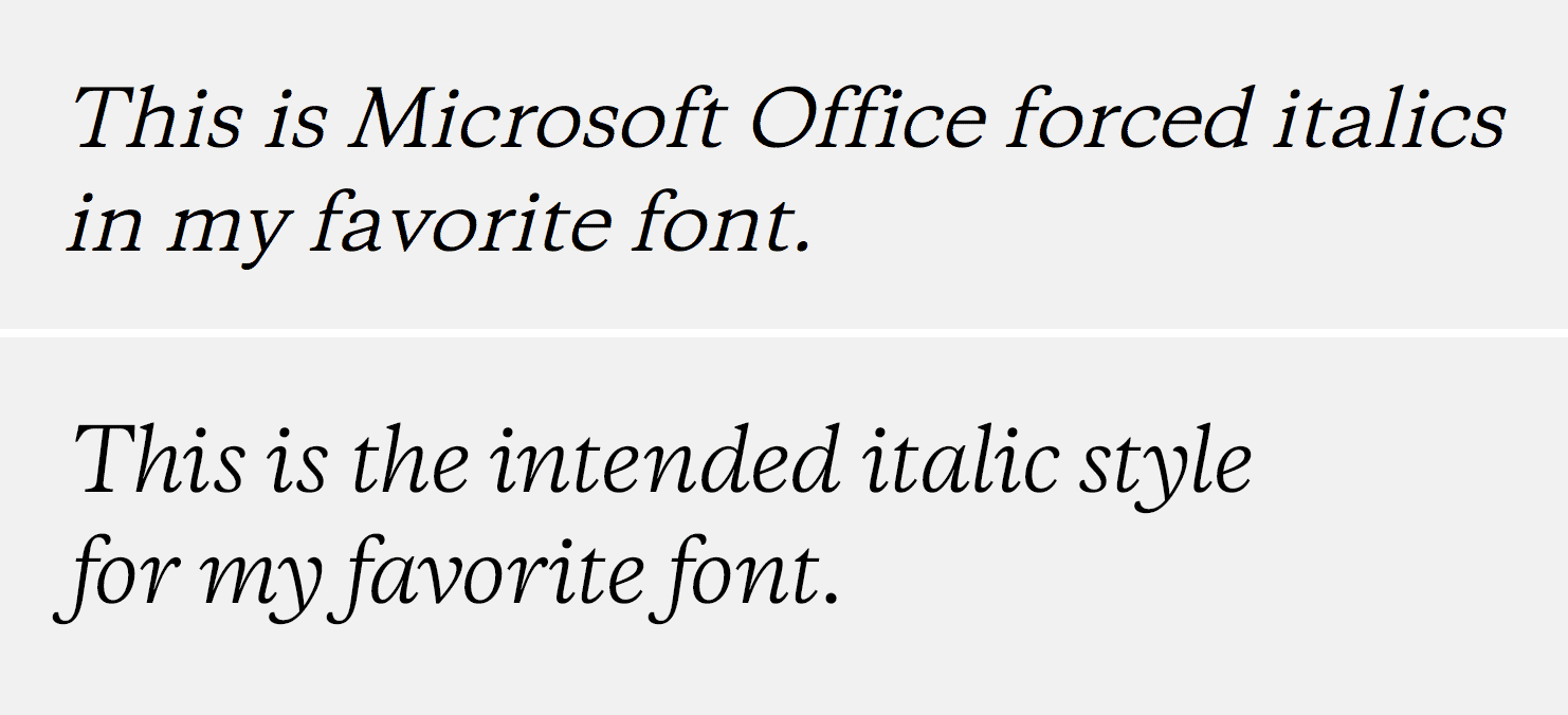 An example of Microsoft Office forced italics using Galaxie Copernicus Book vs. the way the type designer intended the italics style
In order to ensure your business font is easy on the eyes in paragraph form, avoid fancy or display fonts. A popular example of a fancy font – that can but fun, but isn’t very flexible – is Yeseva from Google fonts. It reads beautifully as a headline, title or font-only logo, but is difficult to read in paragraph form, and would quickly tire a reader.
What’s a font foundry?
A font foundry is a company that designs and distributes typefaces. Many of their typefaces are often designed by the same font designer and especially created to complement each other. My all-time favorite foundry is Hoefler & Co. Another one of my favorites is Vllg Fonts, which is co-op of multiple type foundries.
It's hard to market an unfocused brand.
Your business should tell a powerful story to attract loyal customers. Get a brilliant visual framework tailor-made to help you build trust.
Show me the money
Some fonts are free! But free fonts aren’t always super flexible, because many have been designed with only one type of application in mind or with little attention to detail. What you’ll often find is a font that looks great for a specific application (such as a headline), but looks less than stellar when bolded, italicized, or in paragraph form. But great type designers put LOTS of time and effort into crafting gorgeous fonts for sale, and they’re worth every penny.
A great font or font family can cost anywhere from $25 to $500. As a designer, it’s definitely worth my money, because each of these professionally designed fonts involved months and months of construction and perfection. Nearly all of the fonts I use for clients are fonts that I’ve purchased, because they’re super flexible, and have many weights and features to choose from in order to support the different kinds of content my clients give me.
Want to try your hand at free fonts? If you want to check out the free font market, Google Fonts is a great place to start. Make sure you’re choosing a font that has several weights if you plan to use it as your business brand font. You can also apply filters to search specifically for serif, slab, sans-serif or display fonts, all of which can be super-helpful in narrowing down your choices.
Yes, at Atelier LKS, I geek out over fonts a little! Want to see if I’m the right designer to help you pick out just the right font for your brand?


