13 Elements of Good Website Design That I Take Care of When I Build Your Website
DIY web design is intensely popular right now. Many companies advertise simple design and editing environments that “anyone” can use. And for some people with some design savvy, a bit of tech experience and additional time on their hands, it’s an option – the but the devil is in the details.
Good web design is about so much more than just looking pretty. A first-rate, user-friendly, secure site has many elements and features behind the scenes that help it look fantastic, gain visitors through SEO, and convert visitors to paying clients. I want to make your life easy by driving the right customers to your proverbial door! Here are 13 elements of good website design that I take care of when I build your website so that you don’t have to worry about it.
- Fonts
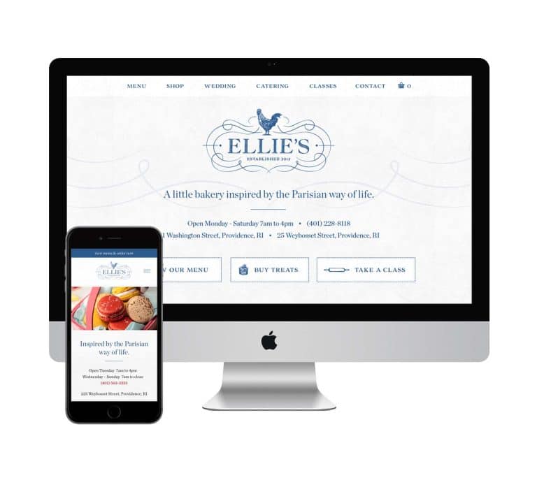
When I design your site, I take a lot of care to choose the perfect font or font combo that really speaks to the style and feel of your brand. One that imitates the strokes of your logo, and the simplicity or sophistication of its form. As a professional designer, I subscribe to several professional font servers and foundries to maintain an extensive library to choose from. Some fonts require a one-time fee and will be stored right on your web server. Others require an ongoing subscription (such as Adobe Typekit or Cloud.Typography) that depends on page views, and I place special code in the header of your site that grabs the right font files.
But the bottom line is that I make these custom fonts available at no extra cost to my clients – it’s part of the package when you work with a professional designer like me.
- Sitemap architecture
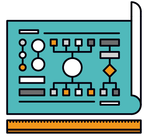
Before I even start on the design of a site, I work with my clients to make sure they’re on board with the way their site content is organized and that each page’s name is clear and useful to site visitors. This step is crucial for making sure there’s not a big piece of content missing, and that all of my client’s services are represented.
This strategic architecture makes sure the site is laid out optimally, and that web visitors can easily flow through the site to get the info they need about my client’s businesses. For example, many clients would put their “About Us” page first, or near the left side of the navbar – but it’s often one of the LAST pieces of information visitors need to make a decision about purchasing or signing up!
Sharing the benefits of your product or service right up front and inviting them to take action is much more important (and it’s what brings in the dough!). From my perspective as a professional site designer, I provide a lot of information to my clients about how their web visitors are likely to actually be using and navigating through their site.
- CTA (call to action)
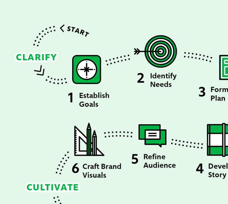
Speaking of inviting site visitors to take action, that’s precisely what a well-designed CTA does. This is one of the first things I talk about with clients as we shape their overall site design – figuring out what they want their visitors to do (e.g. sign up for a mailing list, purchase a product, schedule a consultation) and making it really easy for visitors to do it! When I work with a client, we start with a LOT of conversation that enables me to really get to know their target client: who’s coming to the site, what types of visitors? Who are the most important customers?
I tease the CTA out of all the information I gather about their site and their business’s needs and make sure my site design as a whole supports their website goals.

- Interactive Content Design
Have you ever visited a website and found your eyes kept glazing over? It wasn’t one of mine! I spend a lot of time breaking up the content into fun, bite-sized chunks that help visitors easily read and understand. Rather than leaving them feeling overwhelmed with a wall of text, this kind of content design draws them further into the site. I specialize in making content irresistible!

- Branding
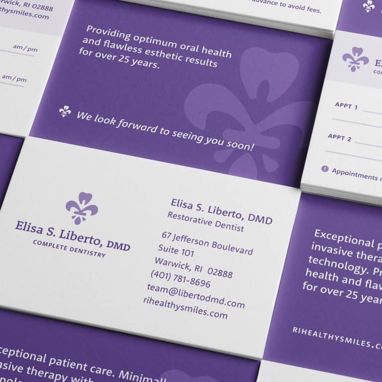
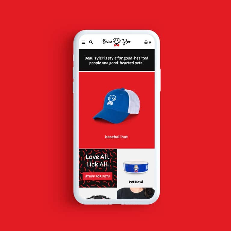
You’ve crafted the perfect logo, and now there’s so much more to be done than just to slap it on a web page. I weave the colors of a client’s logo throughout the site design so it reinforces the brand in both subtle and bold ways. For example, a color from a logo can be used as, say, the hyperlink text color – but if that color turns out to be hard to read against a white background, I might play with the color to make it darker, richer. So the link stands out, but still works visually with the colors that represent a client’s brand.
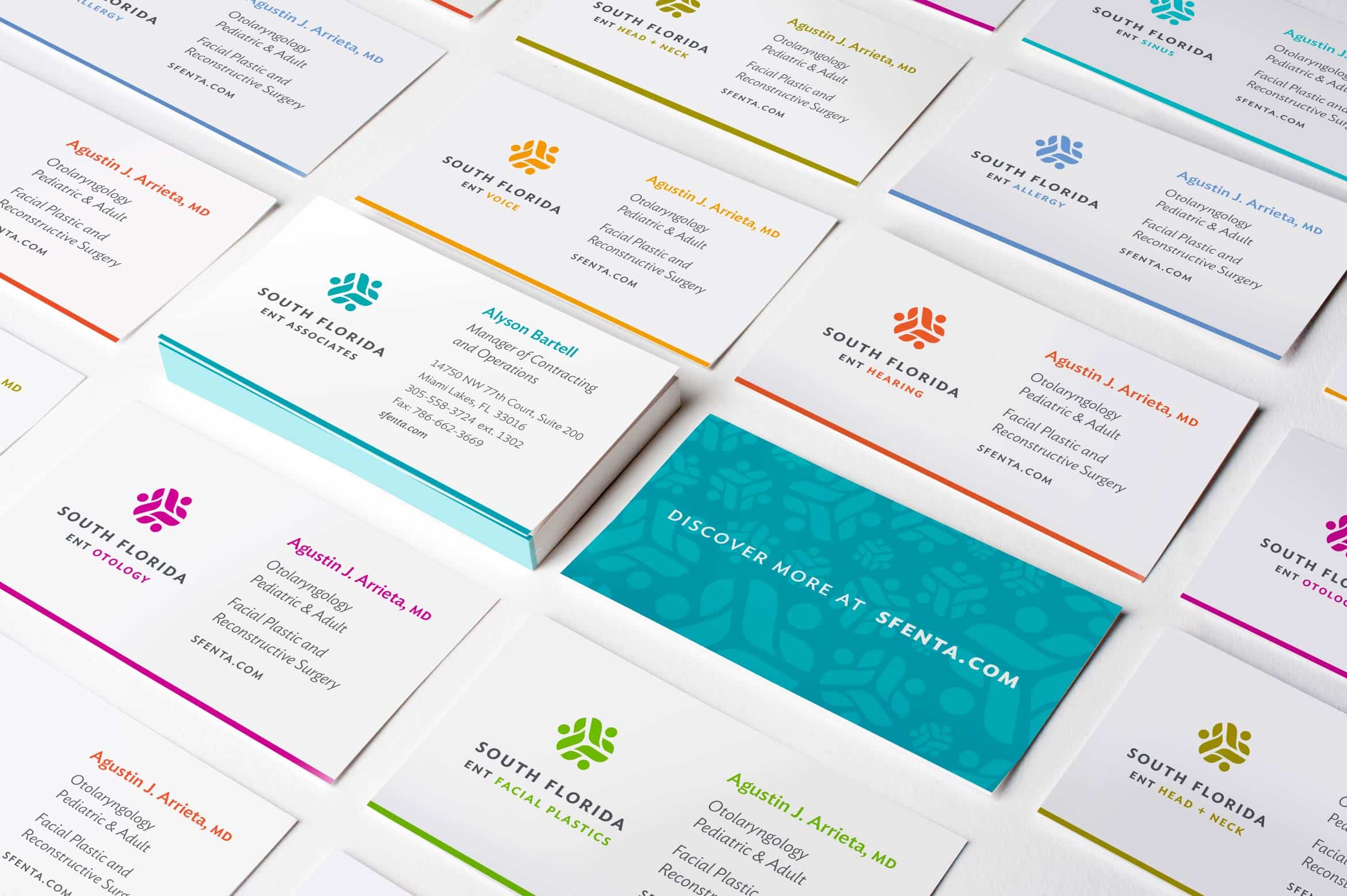
Or, if the project scope allows for it, I’ll construct secondary or sub-logos using your main logo as a guide – these design elements not only create visual appeal for representing various services or business offerings but also provide brand continuity so that it’s quite clear you’re a professional outfit.
- Security
I make sure your website data is locked down tight. A secure website has, at a minimum, a captcha at login or a customized back-end login URL, to reduce the chances your site will get hacked by bots or humans. Even better, and included free with the hosting provider I recommend (Flywheel is great!), is an SSL (secure socket layer) certificate that encrypts any data being sent over the web – like credit card numbers.
Increasingly, it’s becoming important to secure every element of personal data, including contact forms, so that hackers can’t obtain customers’ identifying information for other nefarious purposes. This means that site security is critical even if my clients don’t intend to sell anything on their website.
- Extensions
Also referred to as “plugins,” extensions add to the functionality of a site and make it do all the special things my clients need. It’s another level of site customization for each unique business that I provide. Extensions cover everything from reducing spam comments to perfecting comment forms, from showcasing upcoming events to helping a client boost their site in search engine results. I spend a lot of time sourcing and designing extensions that fit my clients’ particular needs, and I do a lot of work on the front end to make sure that the content displayed by the extension blends seamlessly with the site.
Customized extensions are also one of the ways I help clients set up a robust, secure eCommerce environment that can do just about anything a client needs or wants to transact funds. Powerful extensions customized with great design make it super easy for your site visitors to make a purchase or give a donation.

- SEO
I make sure initial site setup is optimal for SEO. This includes using adequate keywords in the site description, submitting a sitemap for search engines, setting up special files that give instructions to crawlers about what to index, fleshing out site metadata, and ensuring all image files are optimized with images names and alt text that support a client’s key search terms.
- Solid messaging
With years of experience crafting great websites, I know how important messaging and language are. Most clients need a boost in telling their story in a way that is most effective with prospective customers. With a “features vs. benefits” distinction, a lot of the site copy that I’m given often tries to sell why our business is cool, versus telling site visitors why our product or service will make your life better. I can highlight when a client is missing the mark on explaining their business offerings well, and if they need further help with messaging I have trusted copywriters to recommend.
- Images
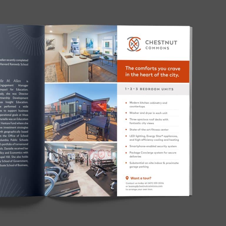
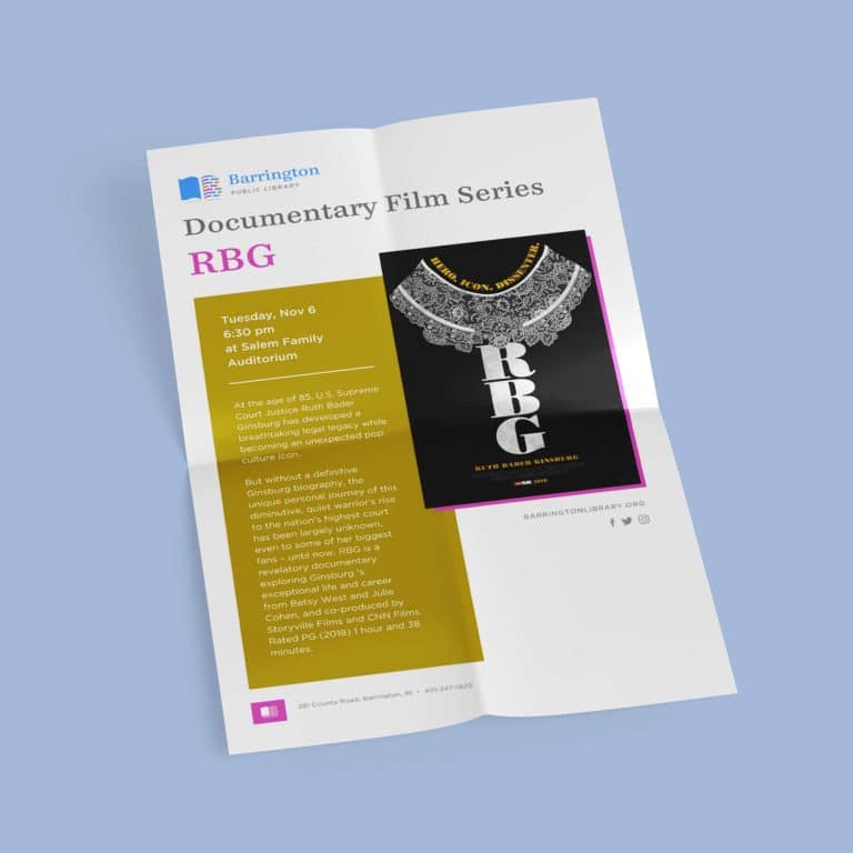
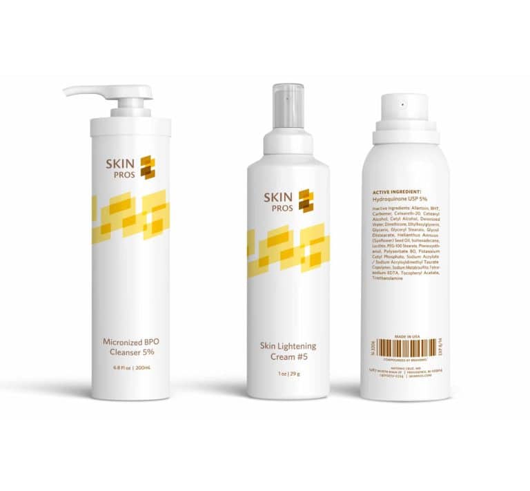
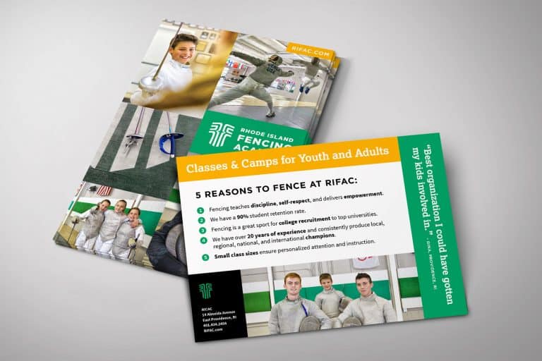
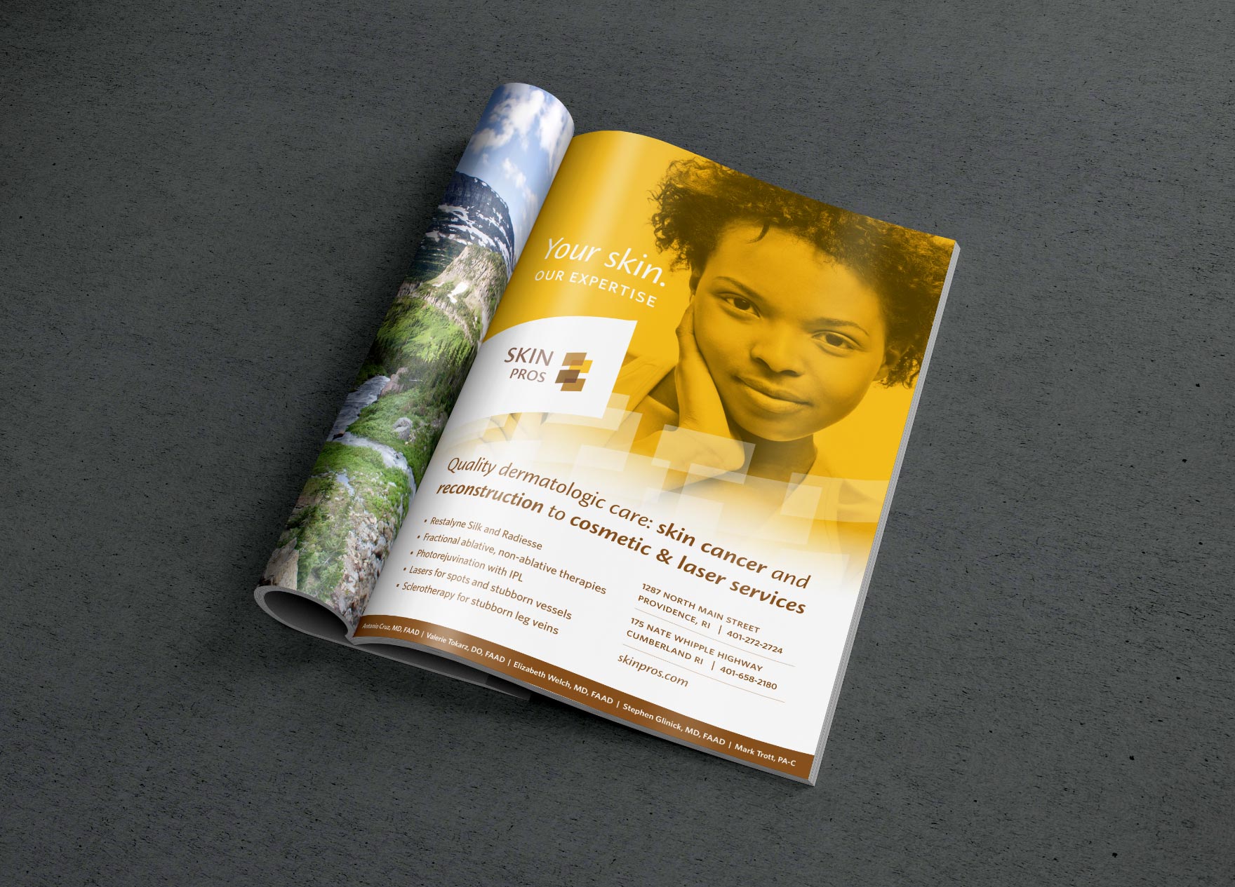
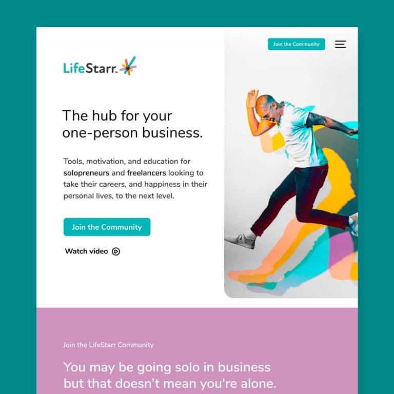
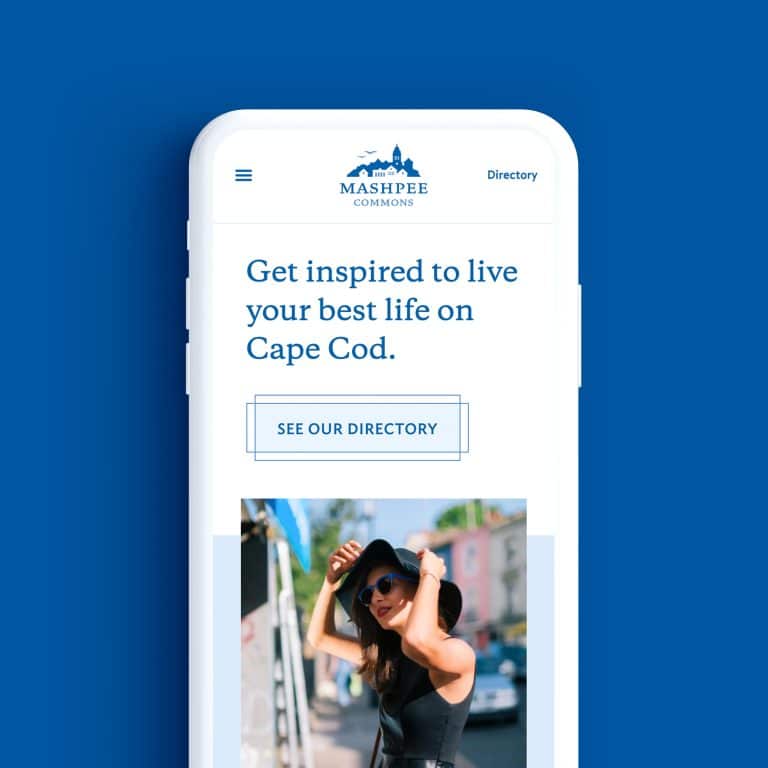
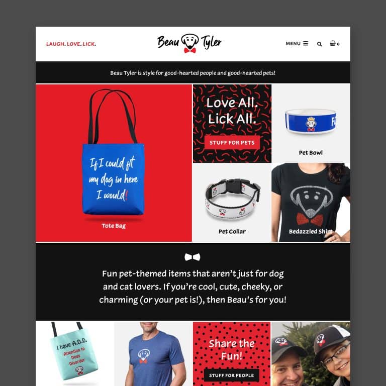
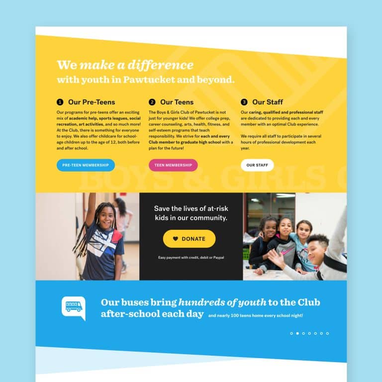
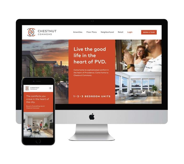
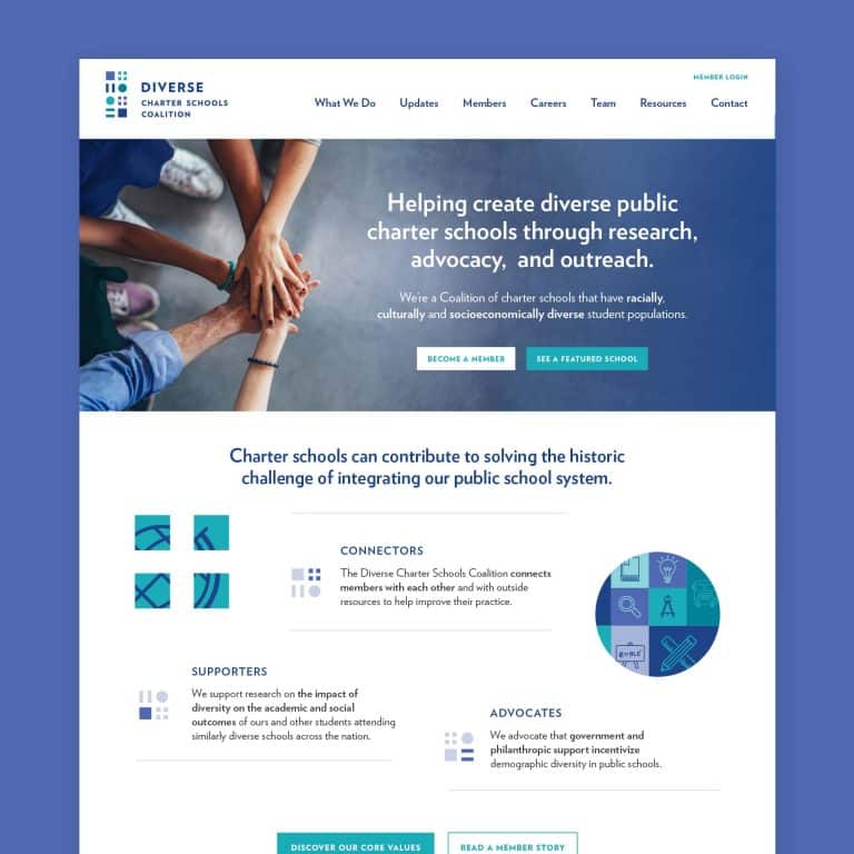
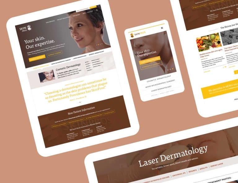
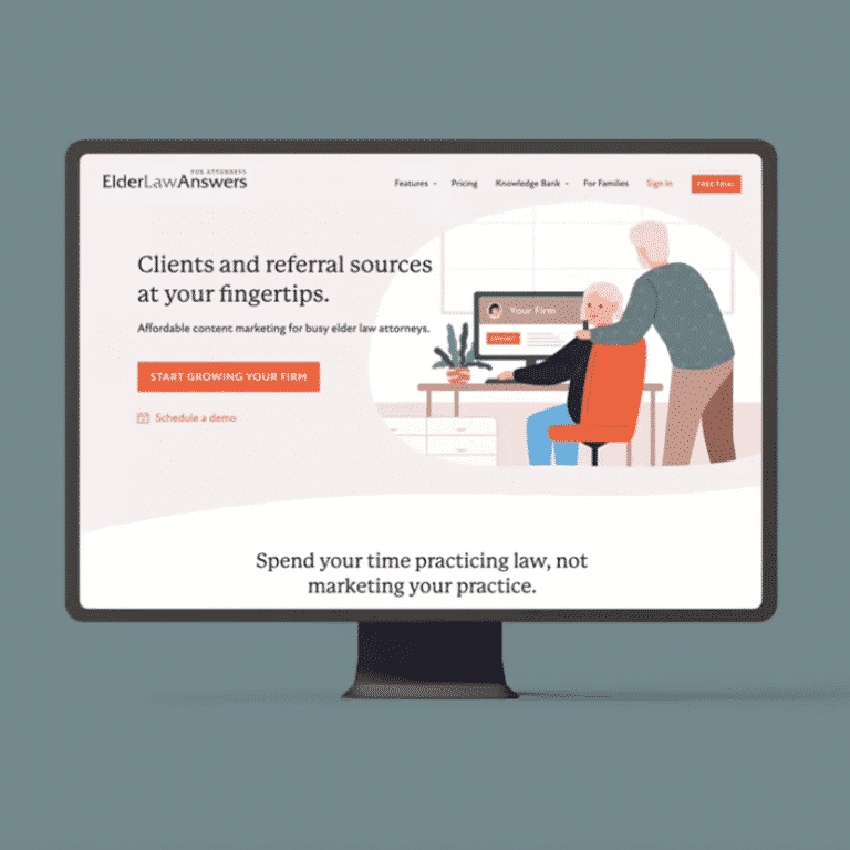
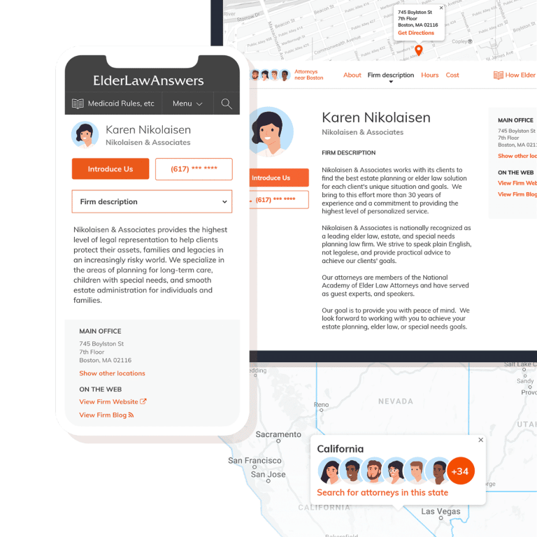
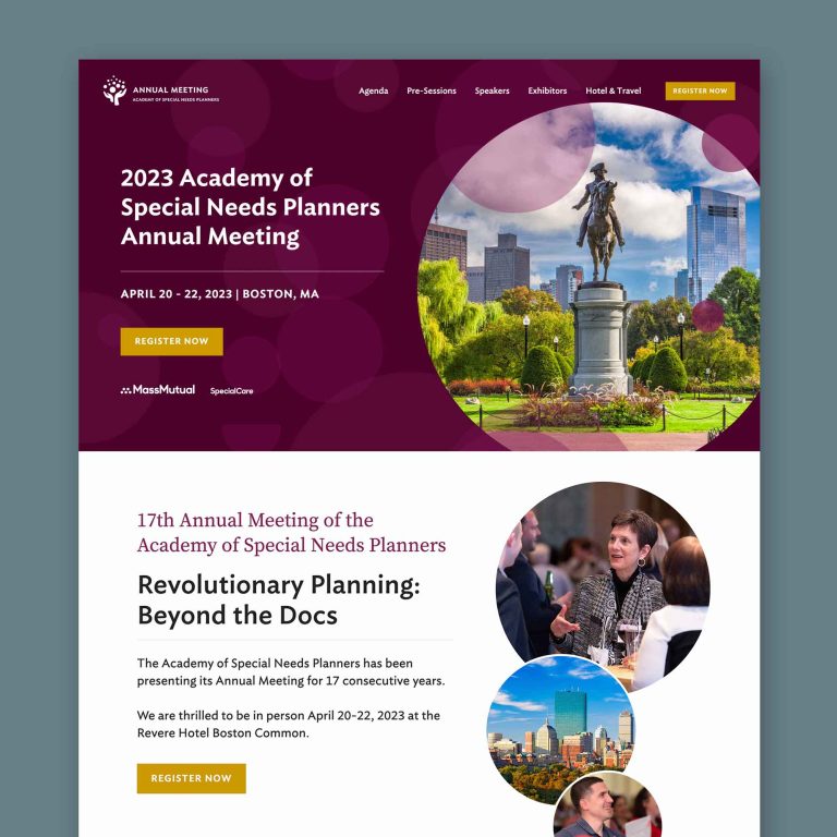
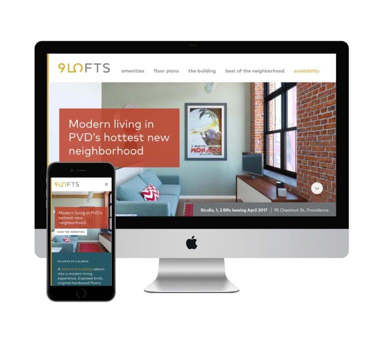
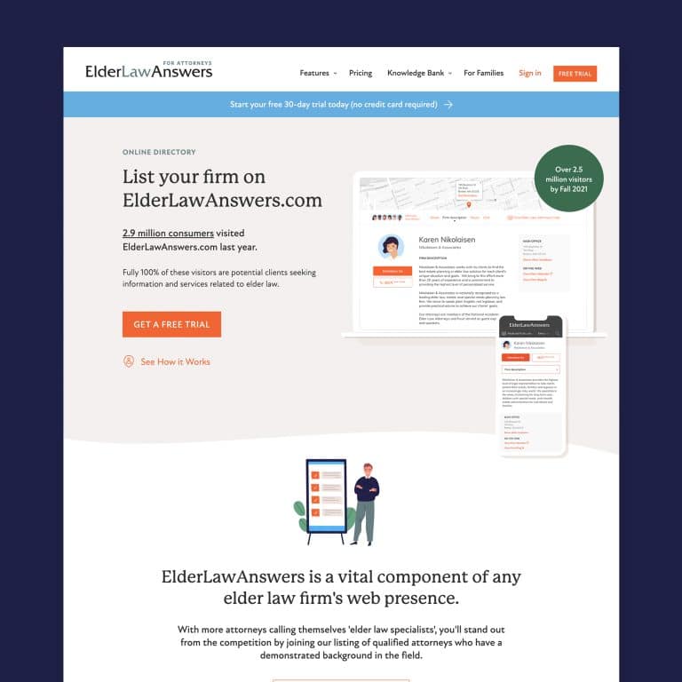
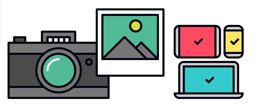
Nope, I can’t take your photos for you. But I do my best to help the images you have shine! I help clients select and optimize their best images available, whether they have access to professional photography or not. And for clients whose images ultimately aren’t strong enough to anchor a page, I can create a site using other design elements for visual appeal (like this one), and I spend a lot of time sourcing really well-done stock photography that speaks to the style of the brand and the business owner’s approach (like this one).
- Analytics
Once you’ve got this great new site, it helps to know how your visitors are using it. I make sure you’ve got Google Analytics installed throughout your site for proper tracking, which will give you a host of information about how users get to your site, how they navigate through it, how long they stay on each page, and more.

- Contact form
Need more than just “name, address, email”? I can design a pretty robust and complex contact form for each client who needs to collect a unique combination of info from their site visitors. Front-end design will make it easy for site visitors to input and back-end design keeps it simple for clients to access and use the information they collect.
- Training
Now that you’ve got this robust, powerful, clean, and visually appealing site that guides site visitors right where they need to be, I make sure you can keep it that way. I provide easy-to-follow guidelines and tips for editing the pieces of content on the site as needed. Particularly for blogs, I want to make it accessible for each client to be able to edit and update their content regularly, which promotes their brand and boosts SEO.
Phew! There’s a lot of work that goes into designing a great site, but I truly love my job of bringing all these pieces together for each and every project to make my clients’ website dreams come true.
Think I might be a good web designer for you?
Find out everything you need to know about working with me by signing up for my Getting Started Guide.
It's hard to market an unfocused brand.
Your business should tell a powerful story to attract loyal customers. Get a brilliant visual framework tailor-made to help you build trust.


