Shocker: The Most Important Thing On Your Website Is…
The most important thing on your site is, perhaps surprisingly, not your logo. Wait a minute, don’t I create logos for a living? Well, yes. I’m not trying to put myself out of business, scouts-honor. But after years of creating websites for my clients, I’ve learned that dumping all your cash on a fancy pants logo is not the way to go if it means you won’t have enough left for a top notch website.
A logo, after all, is not going to seal the deal. But a website can.
7 things your website needs to convert casual users to paying customers
- What you do.
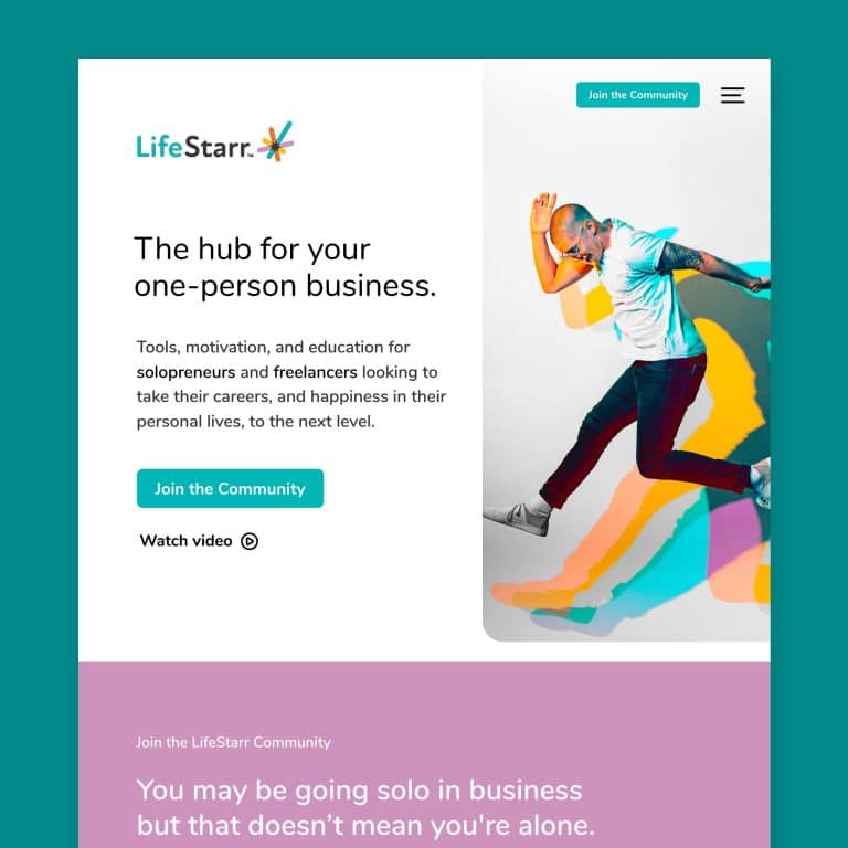
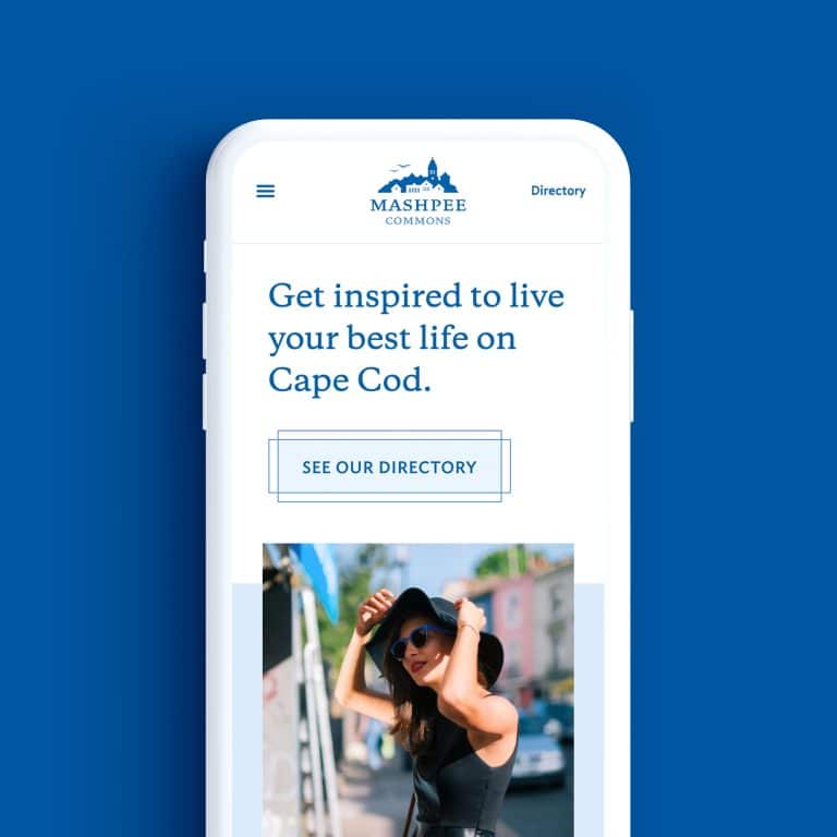
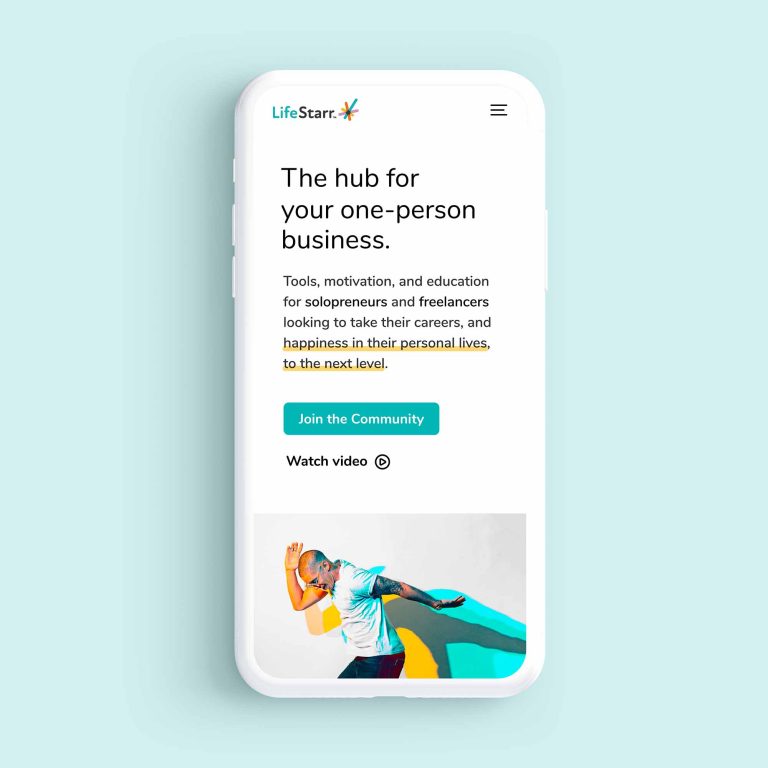
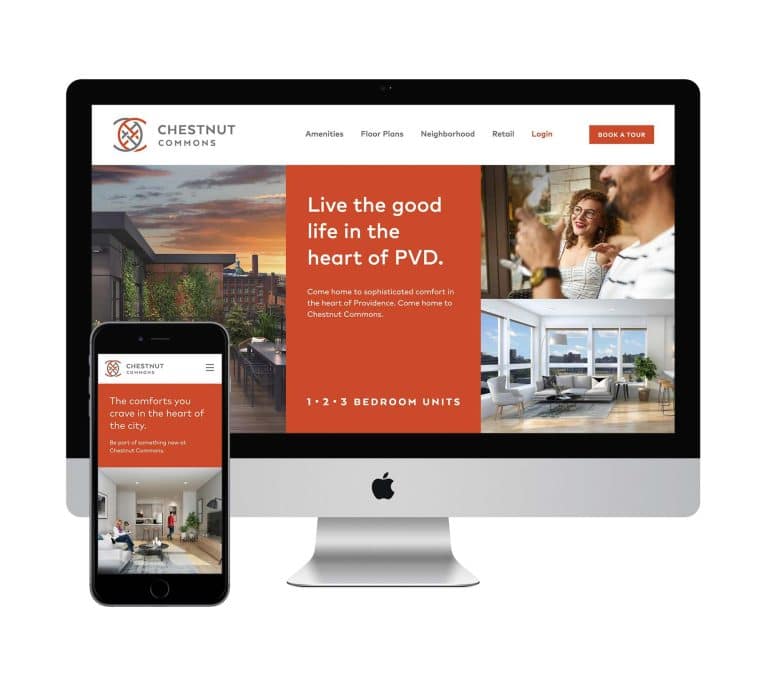
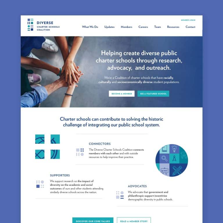
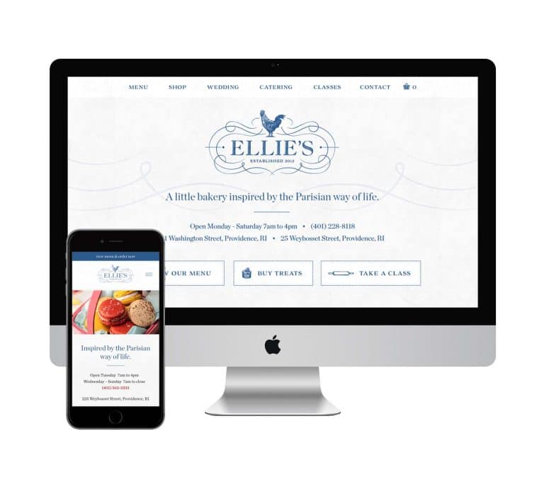
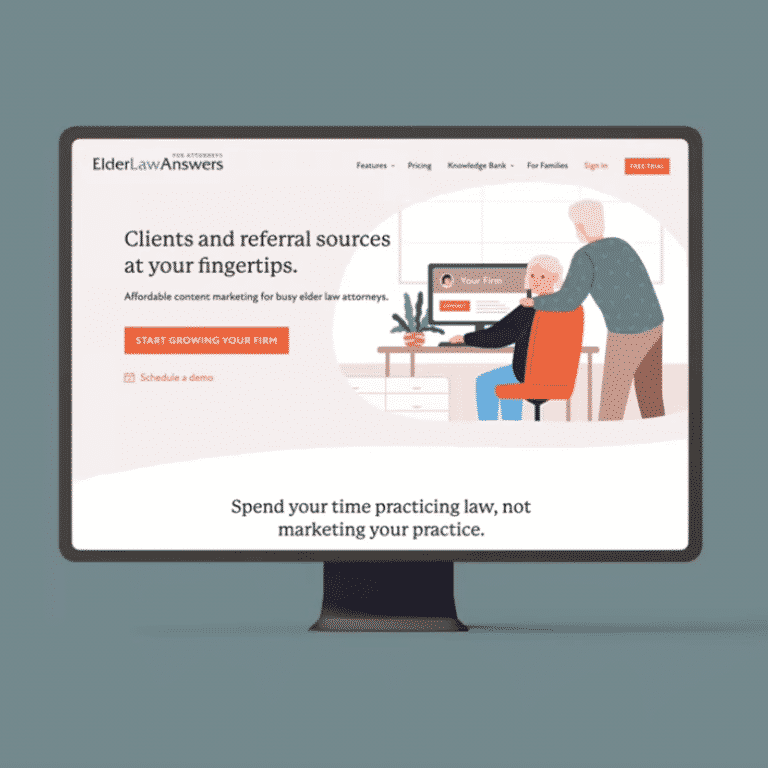
The viewable screen area of your homepage (or ‘the fold’ as we web designers call it) should contain at least one sentence or short phrase explaining what you do. Think it’s obvious? Think again. Explain what you do or sell as you would explain it to a 7th grader. Boil it down to as few words as possible. “Superior roofing + repairs for your home.” “My social media strategy gets you noticed.” “Robust + affordable commercial engineering in Rhode Island.”
- How you solve their problems.
Close your eyes and put yourself in the shoes of your customers or clients. What are their needs, truly? Why are they coming to your website? What do they hope to gain? Take time to identify and describe what specific problems they may have. Then speak directly to their need and how you can solve those problems. This exercise is similar to the difference between features and benefits. A feature is “12-setting nozzle.” A benefit is “Sprays with exactly the force you need.”
- How you Visualize it.
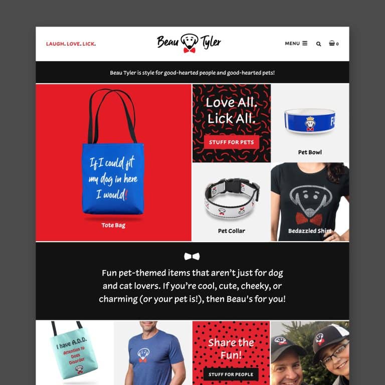
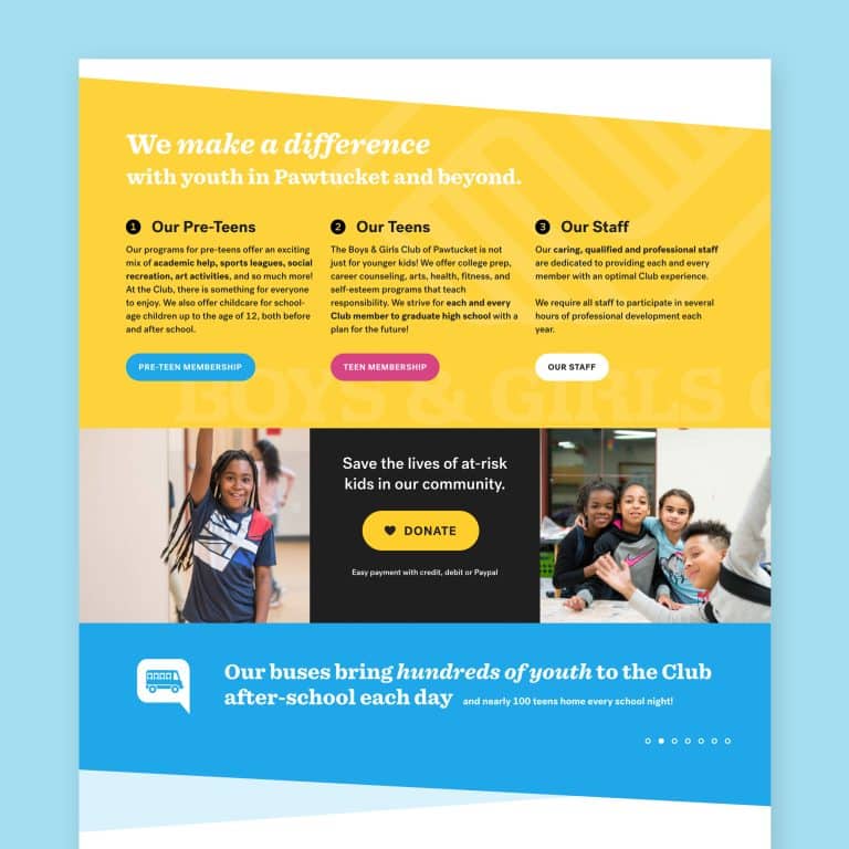
Photos and videos engage readers at many, many times the rate of simple written content. We all like pretty pictures, that’s for sure. I’m a fan of a professional shot of you and/or your team because it shows you’re willing to share who you are, and sends a reassuring messages to skittish clients. I’m real! I’m friendly! I’m here to help! Of course, you may want to send a slightly different message with your visual. Chat up your professional photographer or videographer ahead of time so you’re on the same page with the tone you want to strike. Should the picture style be formal or informal? Shot indoors or out? In a suit or T-shirt? Plan it out, because chances are you’ll use that image for a long time, and visuals send a powerful message about who you are and what your business represents.
- How you ‘Voice’ it.
Voice is one of those abstract concepts that simply translates to the tone and style of your website. Your tone may be formal and reserved, casual and playful, or sophisticated and avant-garde. Your word choice, your topics, and the style of your visuals all add up to the voice on your site. Remember that message you want to send to your clients or customers? Determine the best answer, then reflect it in your website’s voice. A marketing strategist and a copywriter can help with the sometimes overwhelming task of codifying your voice.
- What the call to action is.
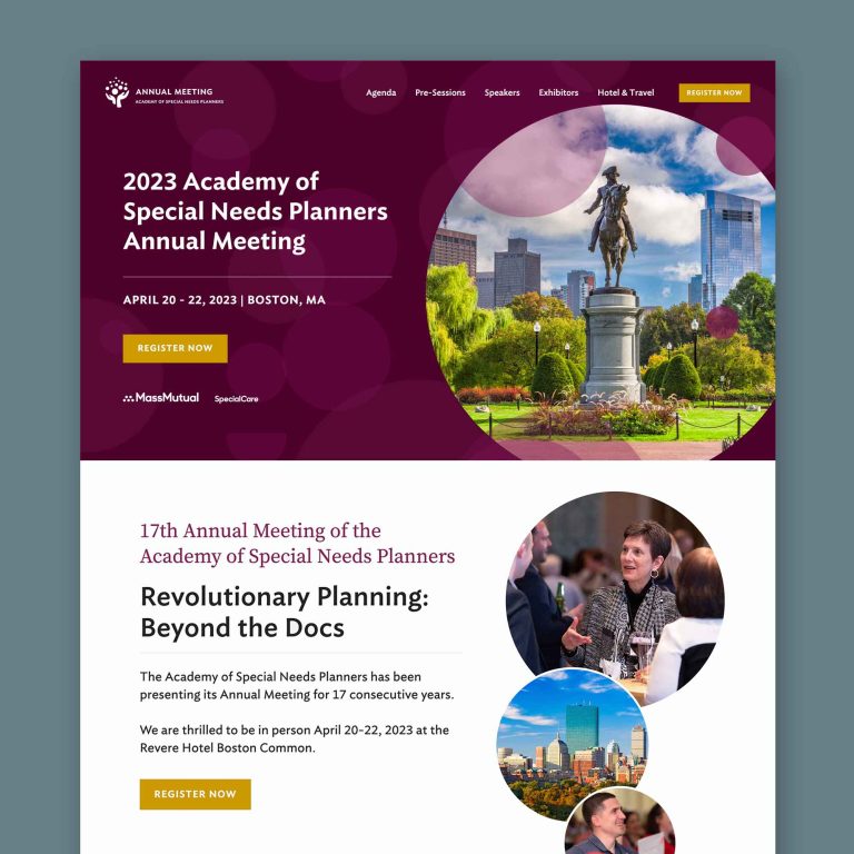
A ‘call to action’ is the main step you want potential clients to take when they come to your site. Do you want them to join your email list? Do you want them to make a purchase? Do you want them to post to your Instagram with a particular hashtag? Sketch out your top call to actions, then be brutal: narrow it down to one (and only one) call to action.
tipWith each additional call to action, you dilute the strength of all your call to actions, making it increasingly likely that no one will act on any of your call to actions.
Make your numero uno call to action easy to spot and easy to act upon. For instance, the fewer clicks involved in completing your call to action, the greater the number of people that will finish the process. Same goes for fields the user has to fill in. Maybe you can settle for just capturing emails, and ask later for demographic info.
- How to contact you.
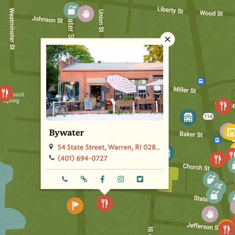
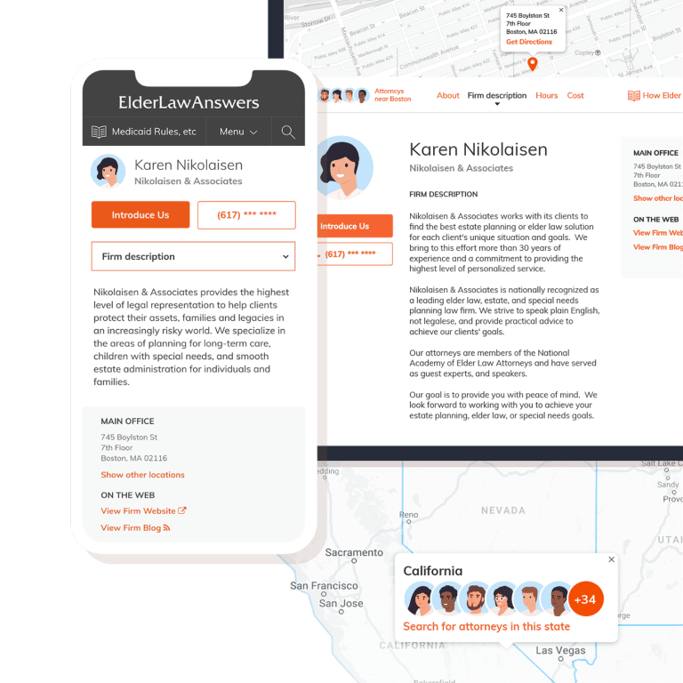
Depending on your business, it may be appropriate to share your phone number. If not, an address or general location is almost always needed. Think of it this way – if you went to a website and all you saw on the contact page was an email, wouldn’t you be a tad skeptical?
- What’s the latest.
If your website is going to be static, meaning you’re not going to add new content regularly, you need a blog for SEO reasons. Google and other search engines like to see fresh content added once a week. If that seems unreasonable, post once a month at the minimum, 600-900 words preferably. Long term, you’ll see more traffic with regular blog posts. If this seems daunting (and I know, I’ve been there!), consider hiring a marketing strategist or a copywriter to help write and shape new content for you.
It's hard to market an unfocused brand.
Your business should tell a powerful story to attract loyal customers. Get a brilliant visual framework tailor-made to help you build trust.


