7 Elements of Good Website Design
Of course, anyone spending good money on a website wants it done well! But with good web design being more of an art than a science, it’s important to know what foundational elements to look for and build your site around. The “art” part of the equation should create desire, and build a web user’s interest in your product or service from the moment the page loads.
So once a potential customer lands on your site, you need to make it clear exactly what you want them to do and make that action super easy to complete. Good web design both “hooks” a website visitor and then makes the path to becoming a customer or client easy and straightforward.
These seven elements of a well-designed, attractive website pave the way to nabbing clients hook, line, and sinker.
- Good photography
I don’t care if your cousin has a nice camera or your aunt once took pictures at a bar mitzvah. Hire a pro. Quality, well-lit photography not only showcases your products or the smiling faces of your team, but it also provides a subliminal emotional tone that informs how clients feel about your brand. And it shows you care enough about your business to invest in showing it off at its best. No amount of perfect website design that can overcome the visual stain of low-quality, poorly lit, out-of-focus images. Investing in quality visual images will ensure you reap benefits for years to come.
If your business isn’t visual in nature, carefully curated stock photography (no cheesy businessmen shaking hands!) can fill this need, but make sure to invest in professional headshots for your core team.
- Clear, clean navbar design
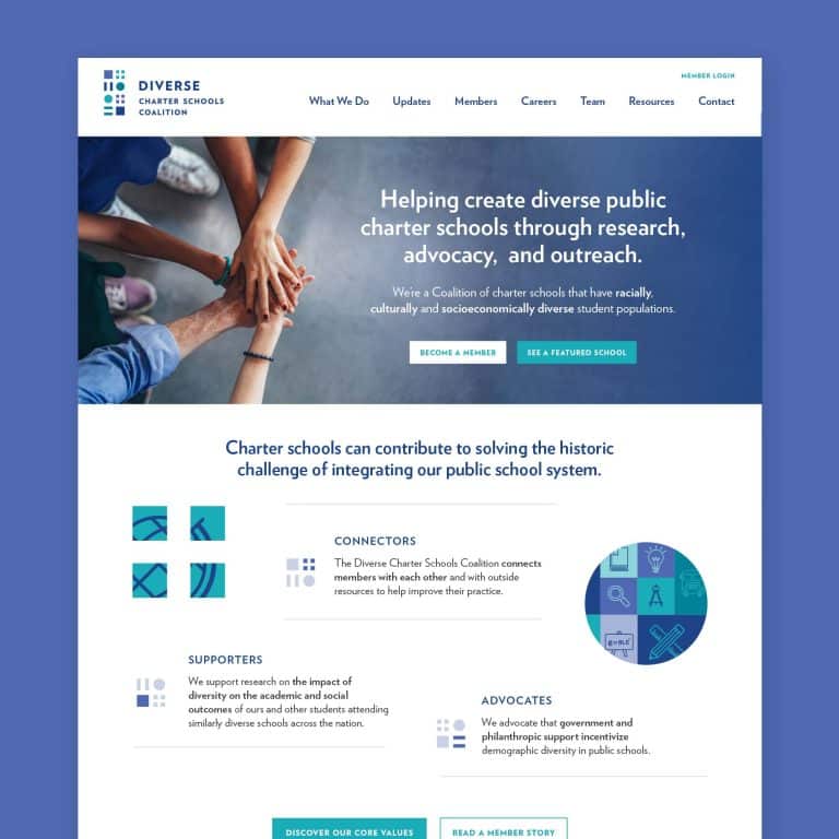
Ideally, a navbar will have six or fewer items across the top (four to five items is ideal), even if they do have drop-down menus for related additional pages. More than six menu options can overwhelm site visitors and make them less apt to stay on your website. Each menu item should contain no more than three words, and should pretty clearly indicate what information users will find on that page. This isn’t the place to be too witty or creative — again, the goal is to intrigue site users and show some brand personality, but not confuse them.
- Clear Call to Action
This is the part where you get to tell your site visitors exactly what you want them to do. Buy now! Sign up for an email list. Leave your contact details! Request more information. Your CTA (call to action) should provide a clear funnel for users to take the next steps through your site. It should be a simple action that is easy to see, understand, and execute with a single click.
- Solid “above the fold” content
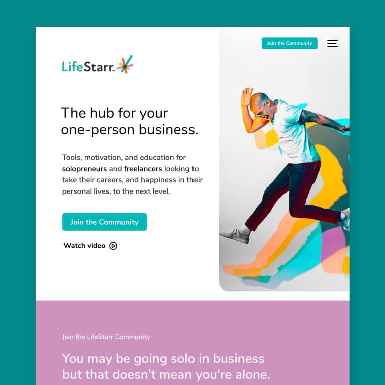
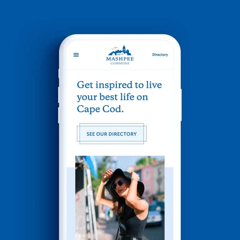
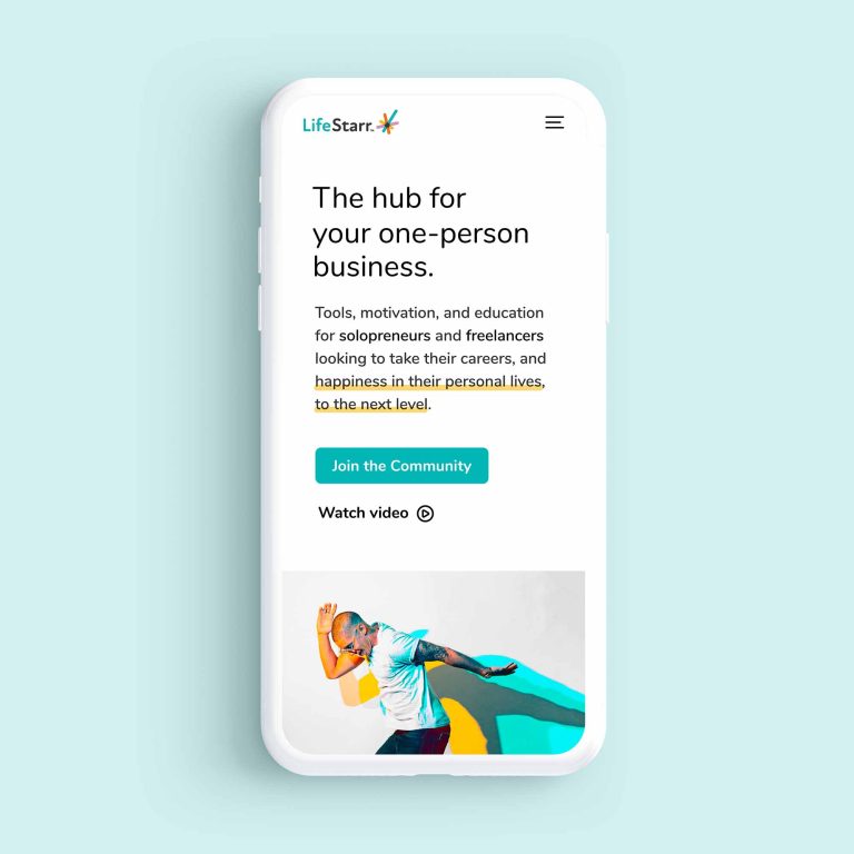
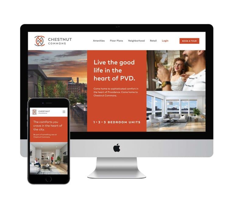
Like a newspaper sitting on a table, “above the fold” for a website refers to the parts of a web page that can be seen as soon as the page loads – before any clicking or scrolling. This is the prime real estate that brands need to be most strategic about. It’s not necessarily even about making sure there’s lots of information above the fold, but that the elements presented give the most important information, and perhaps a tease or sneak peak of what comes below, to invite the user to keep going. Perhaps it’s an image with a statement, or customer testimonial, and a 1-2 sentence description of your business or brand.
Imagine showing only the above-the-fold portion of your homepage to any potential client over the age of 10 — without seeing anything else, they should be able to answer a few basic questions about who you are, what you’re selling, and why what you’re selling is going to rock their world.
- Good content
Content is still king, and good website design supports good copy. Web content needs to be informative and concise at the same time. Each page should feature only as much information as needed, so that site visitors don’t have to wade through five topics to get the answer to one question. Site copy should also be compelling, engaging and pleasant to read. While you may know the most about your business and brand, this is another area where investing in a professional is worth the money. A copywriter can shape your story, highlighting the important elements, and weaving a lot of information into digestible nuggets that both pique and resolve your customers’ curiosity.
If you’re in the market for a good copywriter (or a photographer), check out my recommendations on my list of favorite resources.
- An inviting homepage
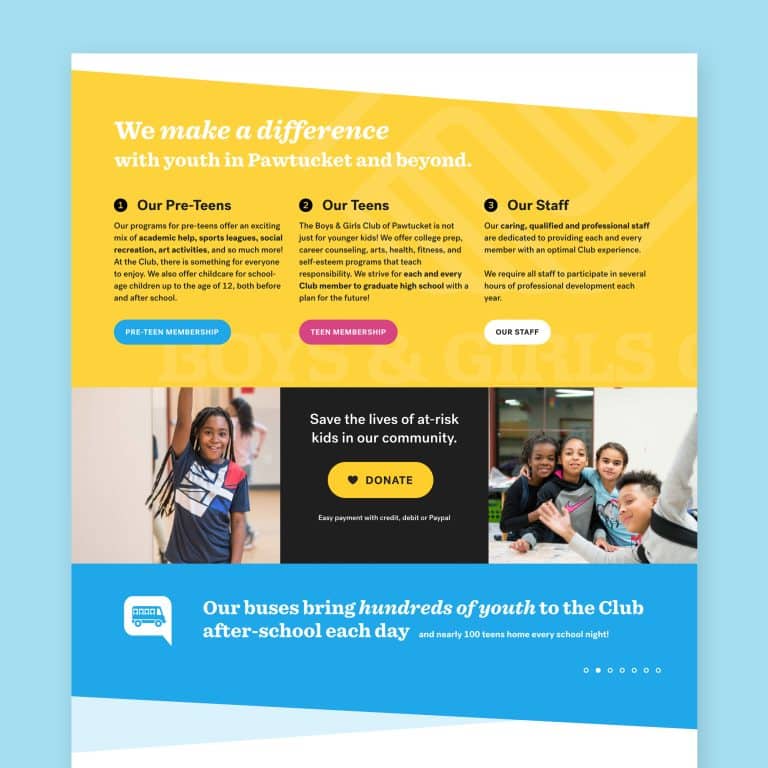
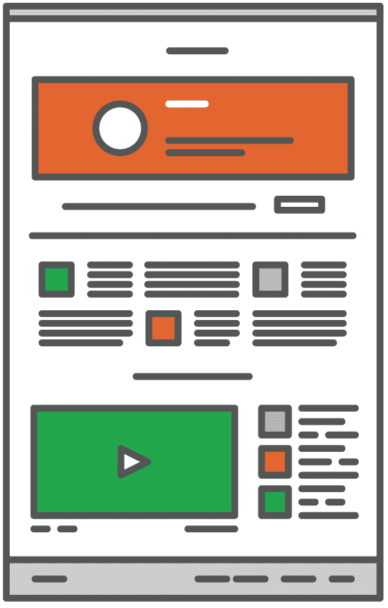
Like the foyer of your actual home, a homepage should immediately make the user comfortable, give them a taste of what lies beyond, and invite them to look around for a while. A good homepage presents just the right amount of content to let your users know they’re arrived at the correct site, leave a good first impression, and make them want to know more. The content should be broken up so that it’s readable in short snippets — large chunks of homepage content tend to scare users away, so I like to pull out a few short statements from the copy to big titles, call outs or blockquotes, and perhaps some content to make a punchy bulleted list.
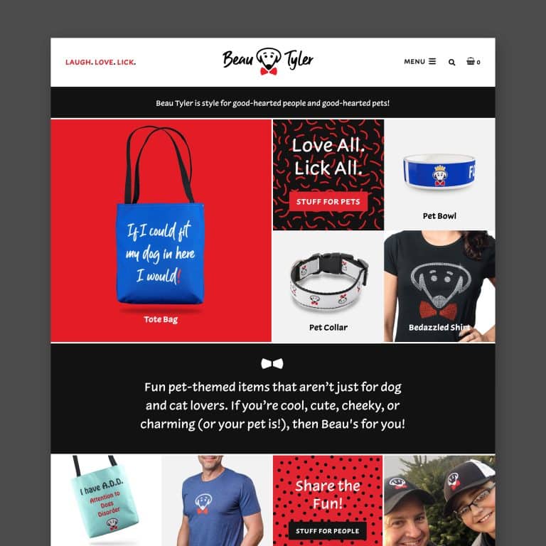
A mix of content types, paired with graphics and photos brings visual variety to the page and lets the user absorb the information in small chunks. A block of color, for contrast, or a full-width blockquote with a light gray background, are some other ideas for visually breaking up homepage monotony, and also help to highlight that all-important CTA. Caveat: a blog page, on the other hand, doesn’t need this level of visual variety since users usually arrive intending reading a large, uninterrupted block of content.
- Killer SEO
Think of SEO as the online version of “location, location, location.” Your customers can’t shop you if they can’t find you. SEO (search engine optimization) is the part of web design that makes sure your potential customers find your site when they’re using a web search tool like Google. While this component can’t really be seen on the front end, what’s going on behind the curtain can make or break your business. Optimized image names, XML sitemaps, and keyword-rich URLs are just a few of the behind the scenes tricks critical to getting your site higher in web search results.
I make sure every site I design incorporates each of these elements: to get a client’s website found, hook visitors from the first look, and guide them where my clients want them to go. For more on this topic, download my free ebook, The Only Web Design Guide You’ll Ever Need. It’s got a ton of great information, with some pointed questions for a chance to reflect on how your own site might be begging for some these elements of good website design!
It's hard to market an unfocused brand.
Your business should tell a powerful story to attract loyal customers. Get a brilliant visual framework tailor-made to help you build trust.


 I don’t care if your cousin has a nice camera or your aunt once took pictures at a bar mitzvah. Hire a pro. Quality, well-lit photography not only showcases your products or the smiling faces of your team, but it also provides a subliminal emotional tone that informs how clients feel about your brand. And it shows you care enough about your business to invest in showing it off at its best. No amount of perfect website design that can overcome the visual stain of low-quality, poorly lit, out-of-focus images. Investing in quality visual images will ensure you reap benefits for years to come.
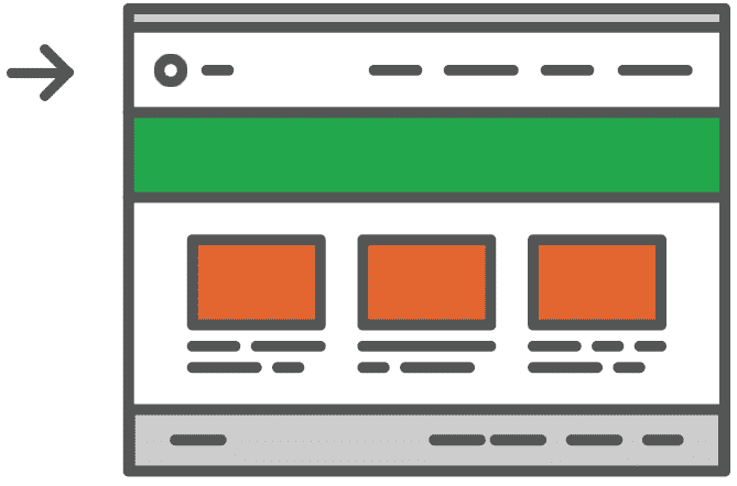 Ideally, a navbar will have six or fewer items across the top (four to five items is ideal), even if they do have drop-down menus for related additional pages. More than six menu options can overwhelm site visitors and make them less apt to stay on your website. Each menu item should contain no more than three words, and should pretty clearly indicate what information users will find on that page. This isn’t the place to be too witty or creative — again, the goal is to intrigue site users and show some brand personality, but not confuse them.
 This is the part where you get to tell your site visitors exactly what you want them to do. Buy now! Sign up for an email list. Leave your contact details! Request more information. Your CTA (call to action) should provide a clear funnel for users to take the next steps through your site. It should be a simple action that is easy to see, understand, and execute with a single click.
 Like a newspaper sitting on a table, “above the fold” for a website refers to the parts of a web page that can be seen as soon as the page loads – before any clicking or scrolling. This is the prime real estate that brands need to be most strategic about. It’s not necessarily even about making sure there’s lots of information above the fold, but that the elements presented give the most important information, and perhaps a tease or sneak peak of what comes below, to invite the user to keep going. Perhaps it’s an image with a statement, or customer testimonial, and a 1-2 sentence description of your business or brand.
 Content is still king, and good website design supports good copy. Web content needs to be informative and concise at the same time. Each page should feature only as much information as needed, so that site visitors don’t have to wade through five topics to get the answer to one question. Site copy should also be compelling, engaging and pleasant to read. While you may know the most about your business and brand, this is another area where investing in a professional is worth the money. A copywriter can shape your story, highlighting the important elements, and weaving a lot of information into digestible nuggets that both pique and resolve your customers’ curiosity.
 Like the foyer of your actual home, a homepage should immediately make the user comfortable, give them a taste of what lies beyond, and invite them to look around for a while. A good homepage presents just the right amount of content to let your users know they’re arrived at the correct site, leave a good first impression, and make them want to know more. The content should be broken up so that it’s readable in short snippets — large chunks of homepage content tend to scare users away, so I like to pull out a few short statements from the copy to big titles, call outs or blockquotes, and perhaps some content to make a punchy bulleted list.


