
Three trends in web design that you don’t want to miss
Like everything else under the sun, design trends come and go.
For this reason, I usually avoid things that feel “trendy,” in favor of a more nuanced design sensibility that is modern but individual with lasting appeal.
But recently I’ve come across a few trends in web design that are pretty cool and I’d love to share them with you.
Creative uses of color, images, and effects that – when done well and in keeping with the brand’s existing visual voice and messaging – manage to be modern and individual even while flaunting their fashionability.
Three web design trends to keep an eye on:
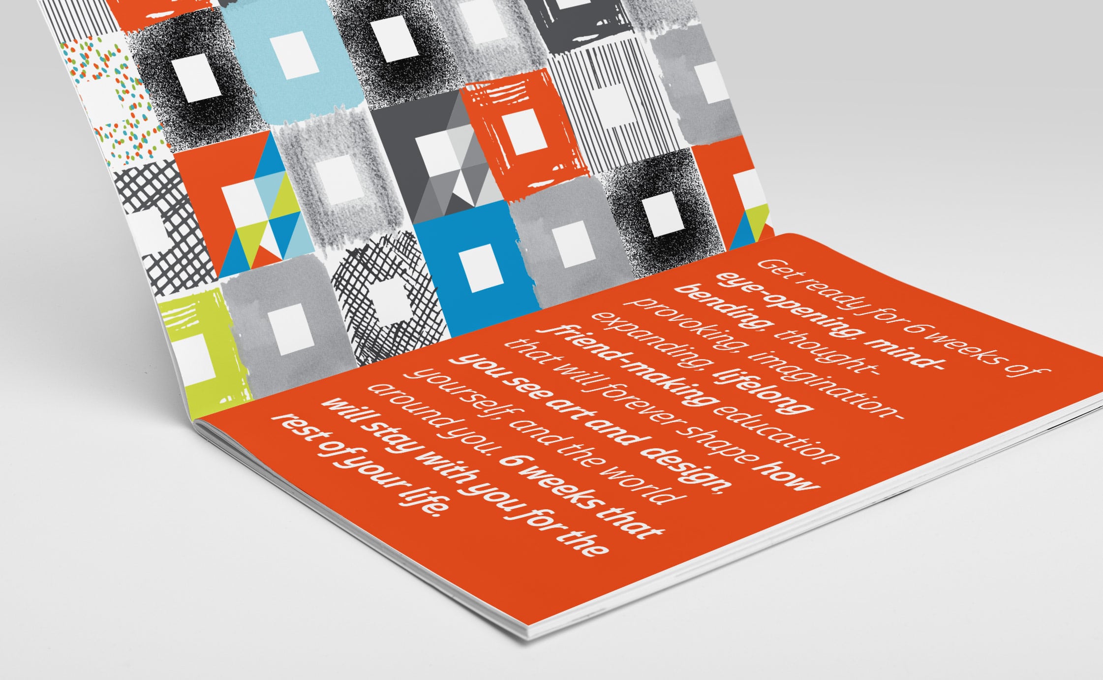
1. Cool Colorways
Bold, bright, saturated colors are making a comeback (think 1980’s with a dash of subtlety).
Credit card processing vendor Stripe does a great job of branding themselves with gorgeous bright colors. It’s an excellent example of going beyond “plain purple” into both bright and deep shades. In certain areas of their site, Stripes use a nice muted gold color to offset any girliness with the purple.
What Stripe does really well is to associate each product or service with a specific color.
This visually helps the reader separate and retain a larger volume of information, while still presenting an overall fun and strong “rainbow” that brings everything together.


Self-driving car service Waymo also uses a combination of colors not often seen together: two bright colors with a blue slightly deeper than the green.


Color use has been moving back in this direction for a while now, but Waymo’s logo refreshingly invokes a retro vibe from the 80s.
It’s refreshing and different; combinations that haven’t been seen in such a long time border on feeling “new.”
In both of these examples, instead of plastering the page with these bright saturated colors, the design pulls back in many places, then allows the colors to pop in strategic and impactful ways. A splash of text here, a color block there.
tipThe challenge of these brighter colors, though, is that they don’t translate perfectly to print pieces.
They’ll still be blue or purple or green, but they might not have that fluorescence that pops off a desktop or phone screen. While that’s not a complete barrier to using them, it’s something to be aware of.
When I use some of these exceptionally bright colors in a logo I’m designing, I begin by specifying Pantone ink colors for print pieces that will actually achieve the richness and brightness of a true color match, as close as possible to what you see on a screen.
Because these fresh colorways are merely a trend, it’s certainly not a requirement for brands who want to stay current. It’s just fun to note and consider incorporating.
Bright colors, if you would like to incorporate them, should be used sparingly – they’ll be much more effective this way.
For example, in a logo, you might use it in a particular letter, or say, the dot over an ‘i’. That is one way of incorporating this trend to provide depth to an established, well-liked brand.
2. Deconstructed grids
The colored content boxes at consider.co not only utilize some of the retro colors from above, but the simplicity of the design feels happily undecorated.
Although this is not exactly a flat website, it has a flat design that really allows the messaging to snap, crackle, and pop – in a good way.


This type of site layout requires close work with a copywriter to make sure every single bit of text on your website is impactful and that you have a clear hierarchy of messaging.
Then it requires working with a designer who can take that crisp, precise copy and give it true visual power.
The site layout for custom printmaker Happy Prints is another great example of these blocks of color that impart a deconstructed feel, breaking up that “grid-y” feel many sites can have.
I think the designer was going for the effect of pieces of paper laid on a table, an idea which dovetails perfectly with their product offering.
Depending on what you might be selling and the tone of your brand’s visual voice, a simple, deconstructed look could speak directly to what you’re trying to convey to your customers.


Layouts that take your thoughts in interesting and even unexpected directions is a sign of good, intuitive design.
3. Custom illustrations
Custom illustrations are a trend I’m seeing more and more.
Hand-crafted illustrations are quite common in marketing visuals created for massive companies like Coca-Cola or Starbucks, but they’re thankfully making their way into wider use.
There’s a handmade, personable element to custom illustrations that you simply can’t get from a photograph.
Personal investment firm Wealthfront uses custom illustrations for a hand-drawn, friendly, whimsical style paired with tightly styled typography to bring a sense of personality to an industry famous for being straightforward and buttoned-up.


Each page on the Wealthfront site has its own set of custom illustrations around a theme, with each image speaking abstractly to the messaging directly to its left or right.
A good illustrator will visually articulate what concepts your brand needs to convey while working with established copy and a deep sense of who the target customers are.
Virtual accountability service Focusmate uses custom illustrations for entirely different purposes.
While Wealthfront uses it to distinguish themselves as providers of a common service, Focusmate uses it to explain their unique service.


The illustration and typography style in this example really works well for this client, conveying a sense of professionalism just short of perfection – like many of their clients (people who could use some motivation to buckle down and complete a task).
Key Takeaway
From exciting colors to brave new grids, to bespoke illustrations and well-matched typography, these three design trends show off just a few of the many creative possibilities in the world of professional design.
With some clever application by a capable designer, trends can be personalized to capture and convey the essence of a brand and leave a lasting impression.
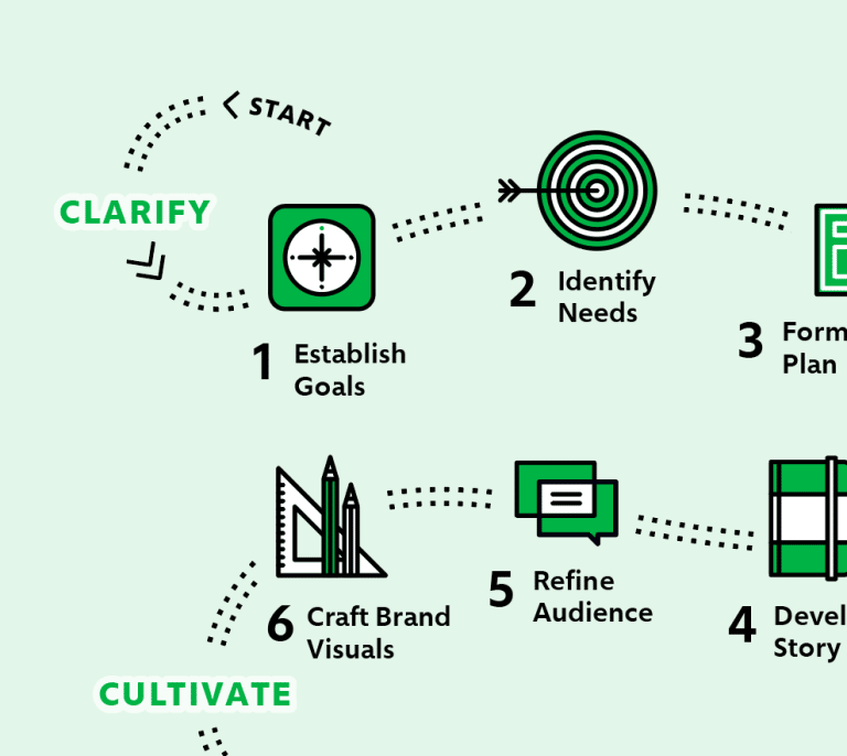
It's hard to market an unfocused brand.
Your business must tell a powerful story with strong optics and a persuasive storyline so you can stand out from the crowd and change more minds. Get a brilliant visual framework tailor-made for you.


