
8 Website Design Mistakes That Will Kill Your Business
No matter how much inner beauty your business has going for it, you’re going to need some outer beauty – in the form of good website practices – to make sure all your potential customers stick around long enough to get to know you (and spend their money!). After you’ve worked so hard to craft that perfect product or establish a stellar reputation through impeccable customer service, don’t let these simple web design mistakes send clients into the arms of your competitor.
- “Click Here”
That phrase should be banished from your website completely. Not only does it look unprofessional, but it makes it much harder for readers, who are scanning your pages for easily identifiable highlighted content and colorful buttons. When your highlighted or linked copy says “click here,” users must commit to reading through a chunk of surrounding text to understand the context and where the link will take them. Don’t ask your visitors to do any more work than necessary to navigate through your site. Instead, populate your site with eye-catching buttons and a clear menu, and clearly let a user know exactly what will happen when they click on a link within text.
BAD LINKS: GOOD LINKS: To sign up for my newsletter, click here Sign up for my newsletter Click here to read a blog post about good website design. Check out my corresponding post on seven elements of good web design. - Too many colors
Brightly colored text that stands out in the middle of a sentence typically signifies a hyperlink – this lets users know there’s an important action to take or that there’s more info to be discovered on another page. This text can be underlined to make it super obvious that it’s clickable, but it doesn’t have to be. A short title or pull-quote can pop effectively if used in another color, too.
But when another color beside your main text color (like black or dark grey) is used repeatedly in order to provide emphasis, it not only looks tacky and unprofessional, but it confuses your users: “Am I supposed to click on this? Maybe something’s wrong with this site… or me.” The last thing you want users to feel is confused or stupid. This confusion is only compounded when you use multiple colors to achieve emphasis in several areas of your content. Stick to two colors: one for your text, and one for hyperlinks (and avoid re-using the hyperlink color for text that’s not clickable). To create more emphasis, you can bold important phrases in your content. This will ensure that your content looks clean, elegant and professional (and more importantly, actually gets read by your users!)
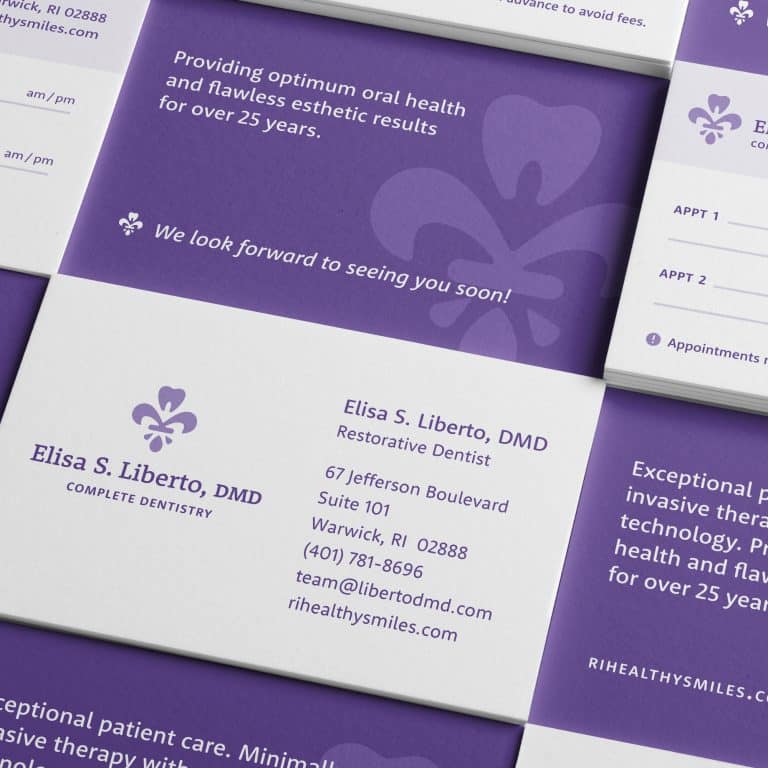
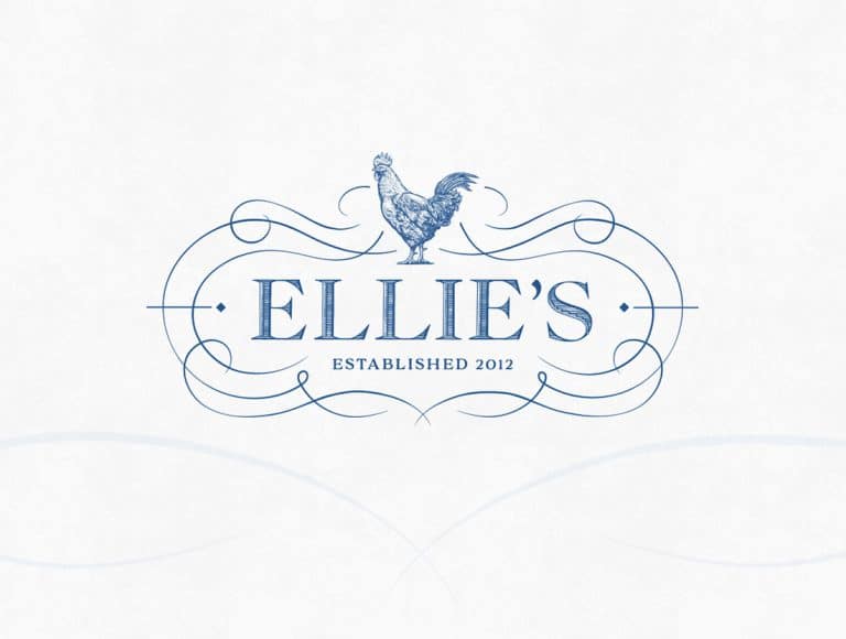
TOO MANY COLORS: TWO COLORS: Get a stand out logo
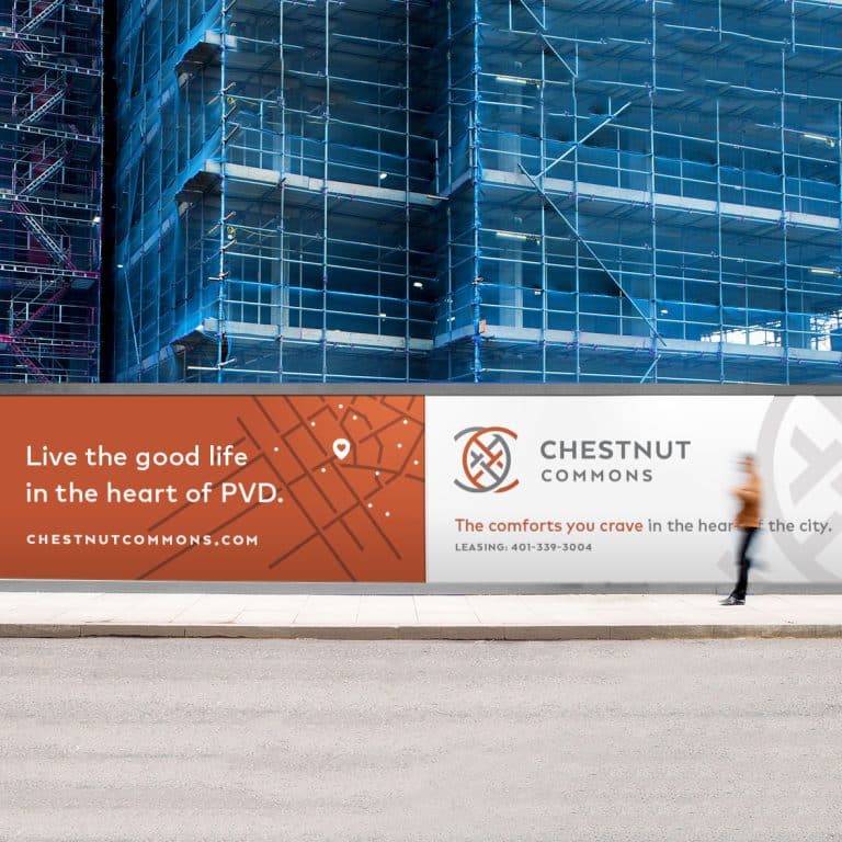
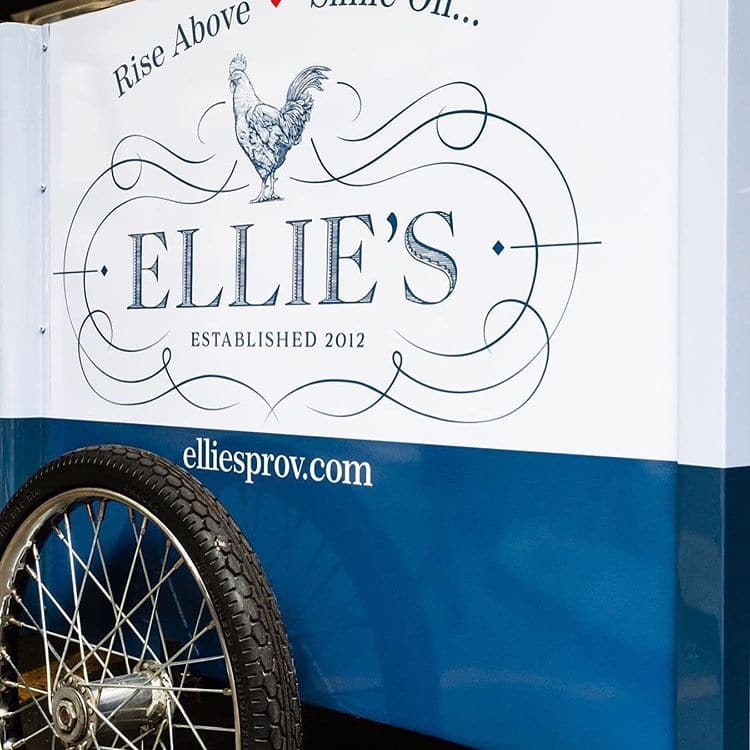
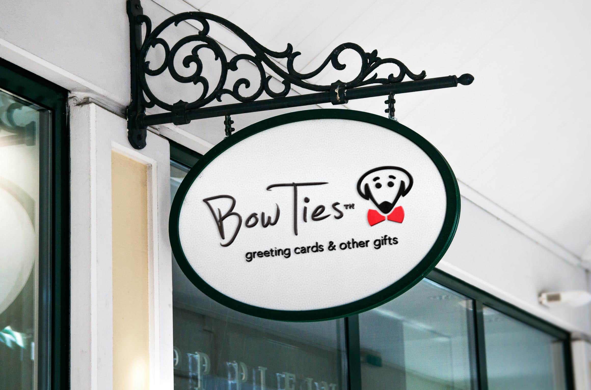
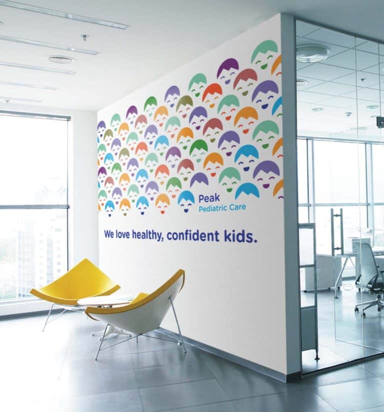
You want your logo to stand out, be memorable, and pleasing to your potential clients – but also to convey concepts and feelings that reflect and cement your brand image.
Color psychology is the study of how hues affect our behavior and choices – and that makes it an important component of branding and marketing. Beyond the words used, your color gives your logo a chance to leave the viewer with emotions and perceptions about your product, service, and brand personality.
Get a stand out logo
You want your logo to stand out, be memorable, and pleasing to your potential clients – but also to convey concepts and feelings that reflect and cement your brand image.
Color psychology is the study of how hues affect our behavior and choices – and that makes it animportant component of branding and marketing. Beyond the words used, your color gives your logo a chance to leave the viewer with emotions and perceptions about your product, service, and brand personality.
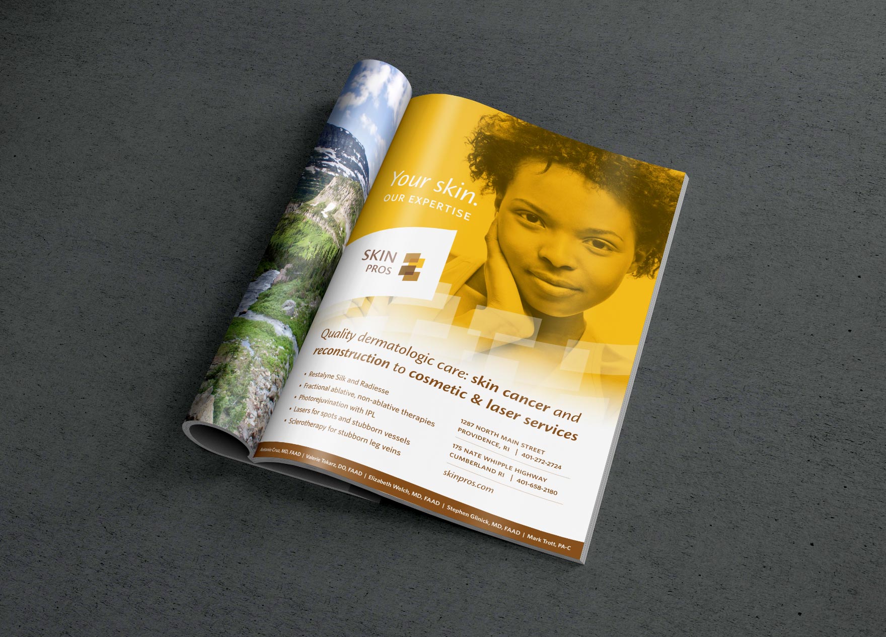
- Bad stock photography
It’s not the end of the world if you don’t have access to reams of high quality, professional photography of your own business. But if you don’t have a great image for a particular space, don’t fill it with a stock image that is cheesy, unrelated, or bland. Create compelling visual variety in other ways. Pull out strong quotes in a bigger font, with a box around them, in a different color. Use color blocks in your color scheme to add interest and cement your brand at the same time.

Avoid stock photos of handshakes or posed smiley people
- Poor text formatting
Large blocks of text overwhelm readers and immediately signal that the page will require hard work to skim or find relevant information. If site visitors start getting lost quickly, and see more of the same as they look down the page, they’ll leave. Some examples of poor text formatting include:
Too wide:
A block of text the full width of a desktop browser makes it hard for the human eye to track from line to line. As a designer, I try to keep text on a desktop view to no more than 960 pixels wide maximum. See a comparison:

How to fix paragraphs that are too wide
Too long:
Break up large blocks of text into digestible paragraphs, and use headings and subheadings to call out new sections. Intersperse strong quotes and testimonials in a different font, and turn long sentences into bullet points when applicable. A blog post is the only place where a longer block of text is acceptable, as readers are intending to digest more textual content there. See how it works:

How to fix content that’s too long
Small font:
If a site visitor can’t read the text standing a few feet away, it’s too small. While different fonts have different sizing and there aren’t always hard and fast rules, a good guideline is that anything below 14 point is a little hard to read. Anything over 16 point is good for paragraph text. Try to find the sweet spot between making text readable without making it look like it’s one big headline. See the comparison:

How to fix type that’s too small
Centered or justified content:
Large titles and subtitles are frequently appropriate for center or justified formatting, but numbered lists, bullet points, and regular paragraphs should be left justified. The human eye naturally tracks to the same starting point on the next line. See the solution:

How to fix incorrectly centered or justified content
ALL CAPS and exclamation points!!!!
Uppercase formatting works well with headlines that are one to five words long. But a whole paragraph (or even more than one line of text) in uppercase letters is hard to read, and makes the reader feel like they’re being yelled at. If your text merits an exclamation point, use one! But one is plenty. Emphasis is a powerful, effective way to call out text or features, but only when used sparingly. See a comparison:

How to fix too many caps and exclamation marks
As always, many design problems that are created by having too much text can also be solved by reducing the overall text on your site! No matter how well it’s visually styled, low quality or wordy copy will never send a clear, concise message about your product or service. A good copywriter can be a critical investment to tell the right (short!) story and help your business shine (see my resources if you’re on the hunt for a good one).
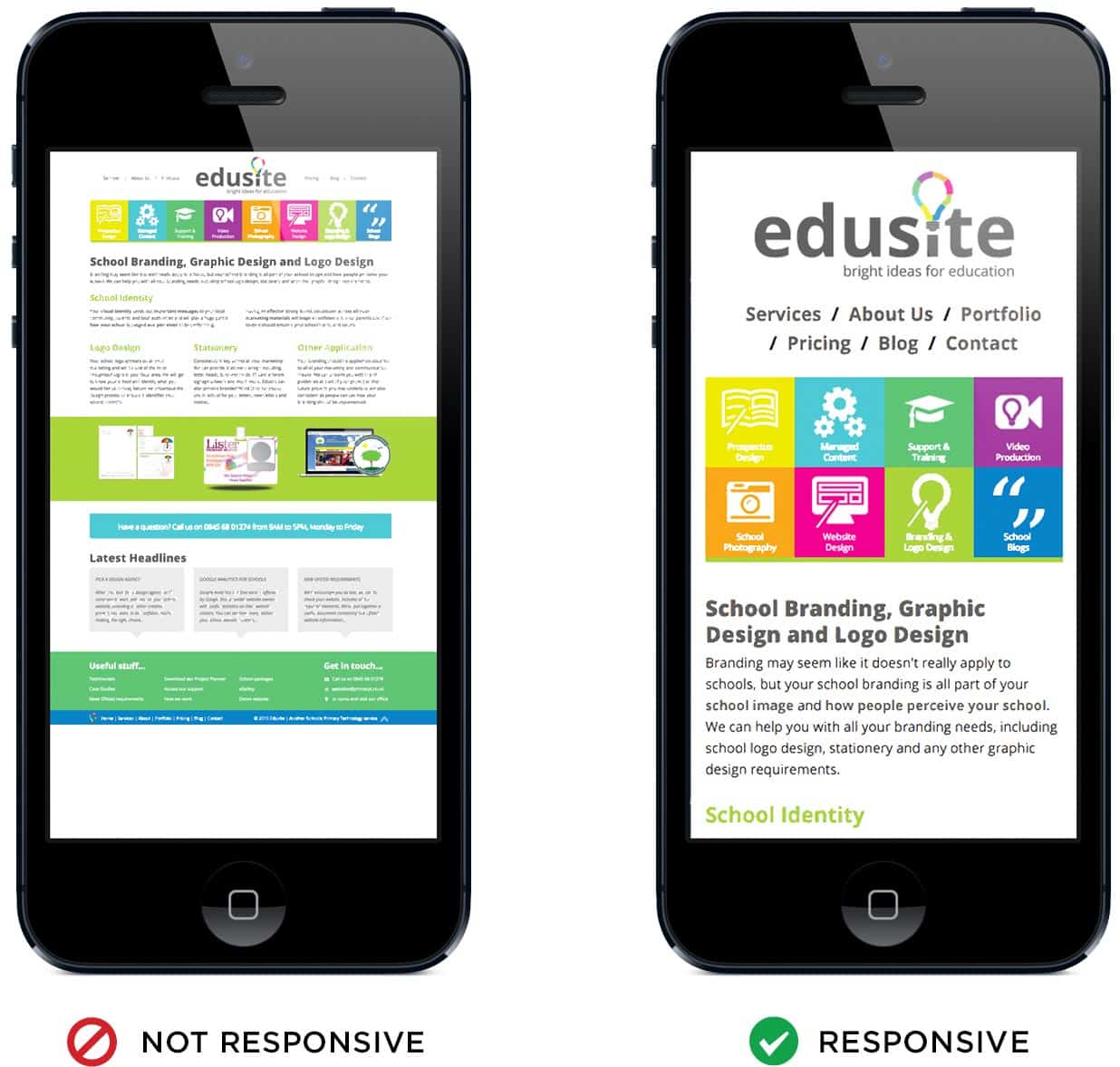
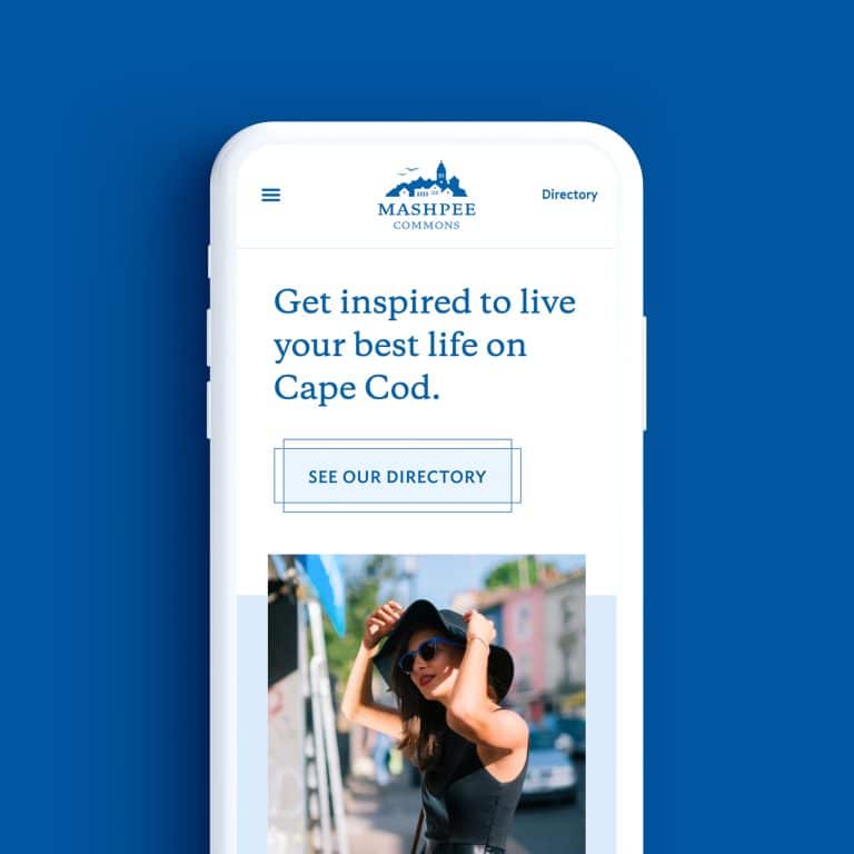
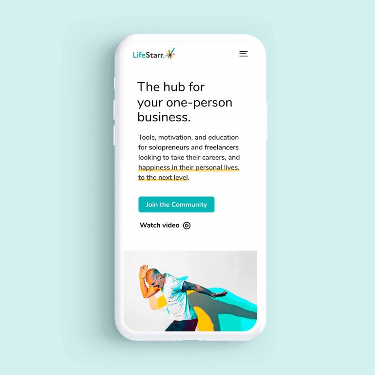
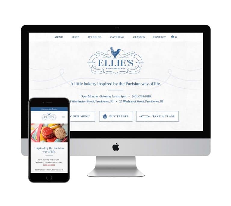
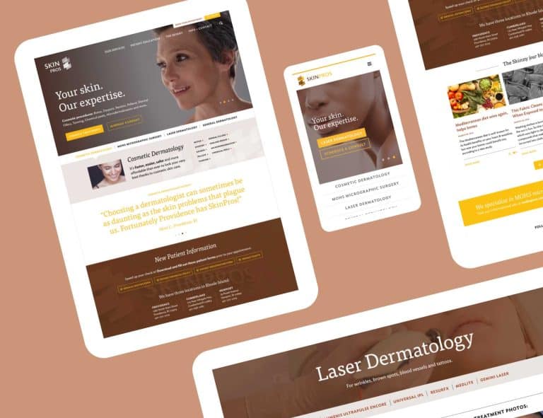
- Not mobile responsive
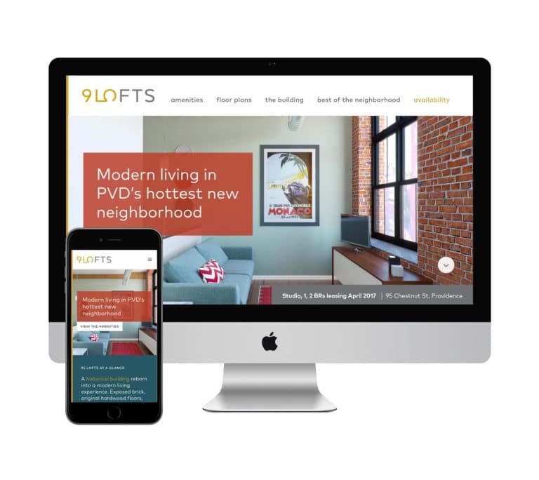
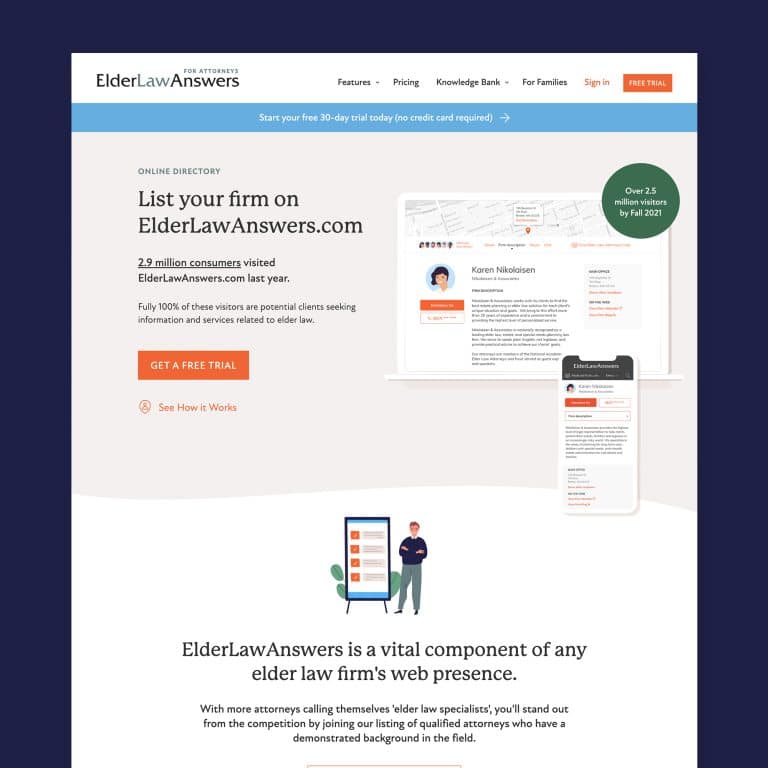
 Not only is viewing a desktop-optimized website on a small mobile device annoying, but Google is now penalizing sites that are not responsive by listing them further down in search results, so this is more than a user experience issue. It also signals to users that you’re not very savvy. Bottom line: if you’re not mobile responsive, you’re going to go out of business.
Not sure if your website is responsive? Whip out your phone and bring up your website. Does it look exactly the same on your device as it does on your desktop? Is it difficult to read text, scroll, and use your fingers to navigate on a tiny menu? A responsive website will display a different (and much more touchscreen-user-friendly) version of your site depending on what device is being used to access it. If you don’t have a smartphone, resize the browser window on your desktop down to a few inches wide to check that the site changes “in response” to the new size it’s being asked to display at.
If your site isn’t responsive, it doesn’t mean you need an entirely separate site designed for mobile (an outdated practice), but you do need to switch to a responsive template. In the meantime, you may be better off sending mobile users to your business’s Facebook page.
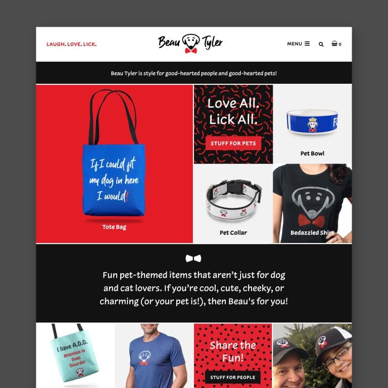
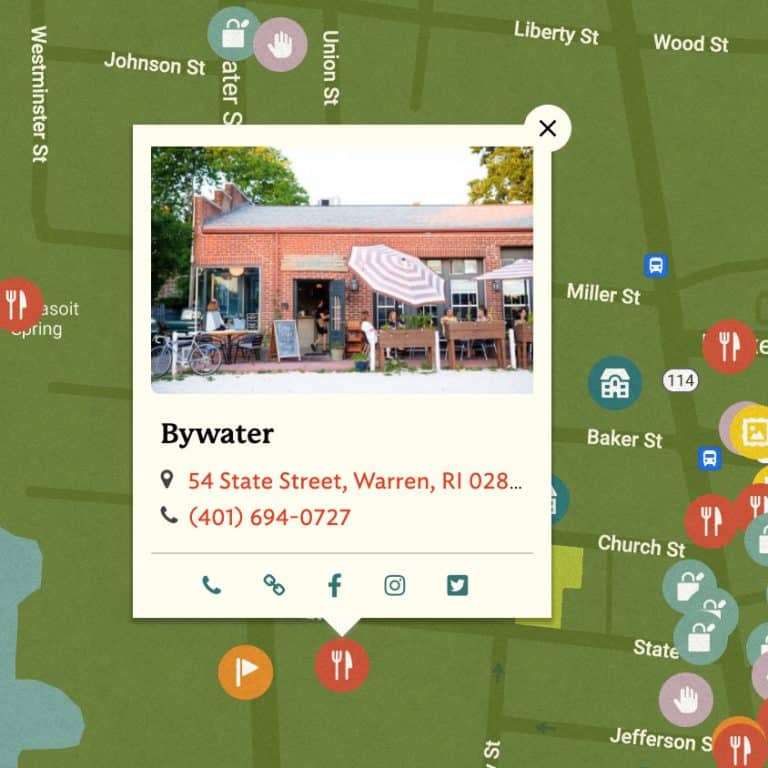
- Too much “above the fold”
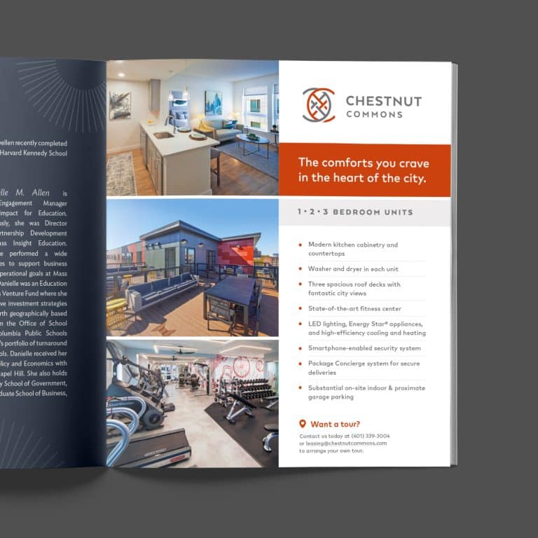
This refers to the part of your website that visitors see on their screen before scrolling or clicking – it’s an important consideration, especially on the layout of your homepage, where most visitors to your site will enter. The phrase ‘above the fold’ is a throwback to the concept of what can be seen on a newspaper that’s folded on a rack or counter. You don’t need to tell the whole story and pull out all the bells and whistles right away — you just need to hook the reader and make them stay and look around. Less is more here. Beyond your header and menu, stick to one great image, a solid testimonial quote, a tagline that tells people in one or two sentences what you do, and a call to action that invites them to do exactly what you want them to do next.

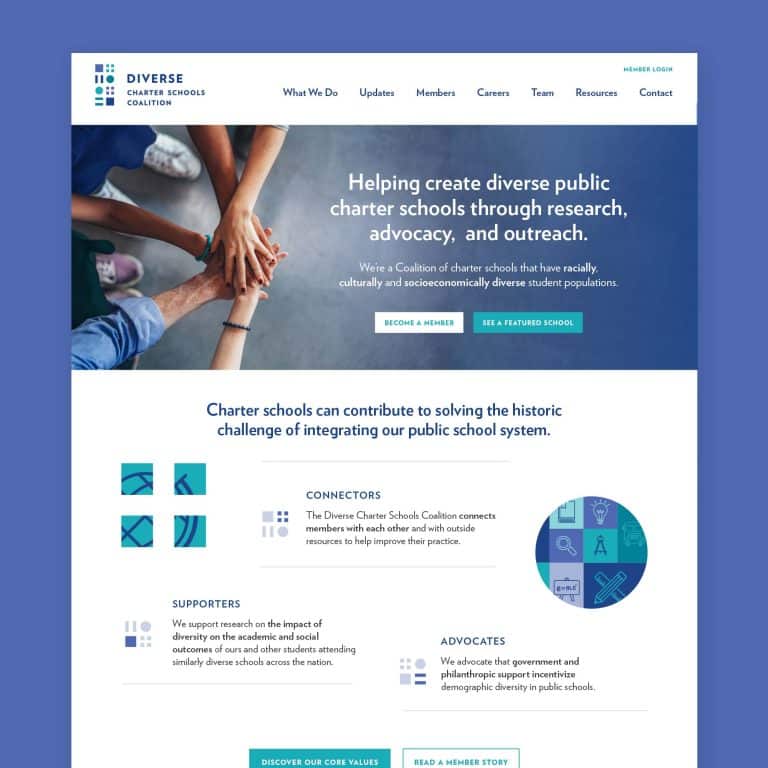
- Hidden contact info
It’s crucial that your site visitors can quickly and easily see where you are and how to get in touch. Users don’t want to have to hunt for this, and many are looking for it to ensure they’ve found the right website (and not the website for some other AAA Plumbing in another state). Plus, having prominent contact information on your homepage is critical to good SEO.
To avoid issues, have your address, phone number, and email in the site’s footer (and repeat relevant contact info in the header, if needed). If you don’t have a brick and mortar store and prefer not to include your physical address there, include a link to your contact page. For businesses with multiple locations, include a main address in the footer and a link for users to find their nearest location.
- Missing social links
Are you on Facebook? Twitter? Don’t assume your potential customers will search for you on social media. Put links to all of your active social accounts in the header or footer of your site for instant access, and if one social media account is a strong suit for your business, consider embedding a feed on your homepage that displays a few of the most recent posts, to tempt users to follow you.


 Not only is viewing a desktop-optimized website on a small mobile device annoying, but Google is now penalizing sites that are not responsive by listing them further down in search results, so this is more than a user experience issue. It also signals to users that you’re not very savvy. Bottom line: if you’re not mobile responsive, you’re going to go out of business.
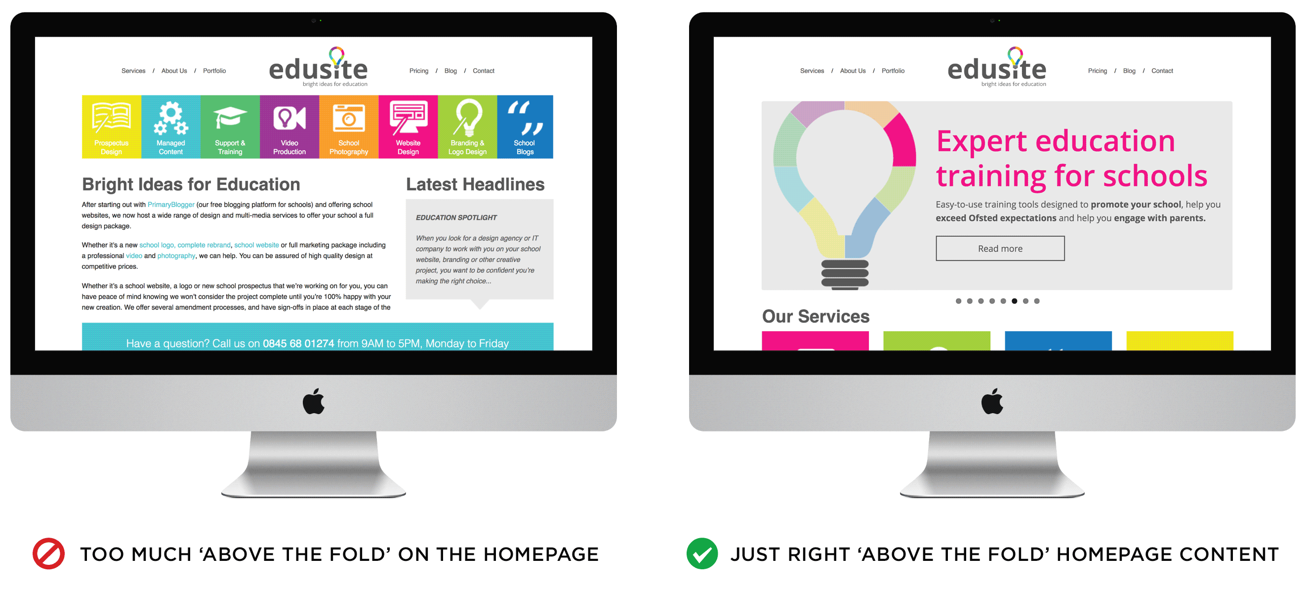

Does your website suffer from these website design mistakes? I can help you steer clear of these pitfalls and get on the road to clean, functional site that shows off your brand and makes it easy for website visitors to become customers. Check out my Getting Started Guide to see if we’d be a good match!
Responsive image found at 47links.com
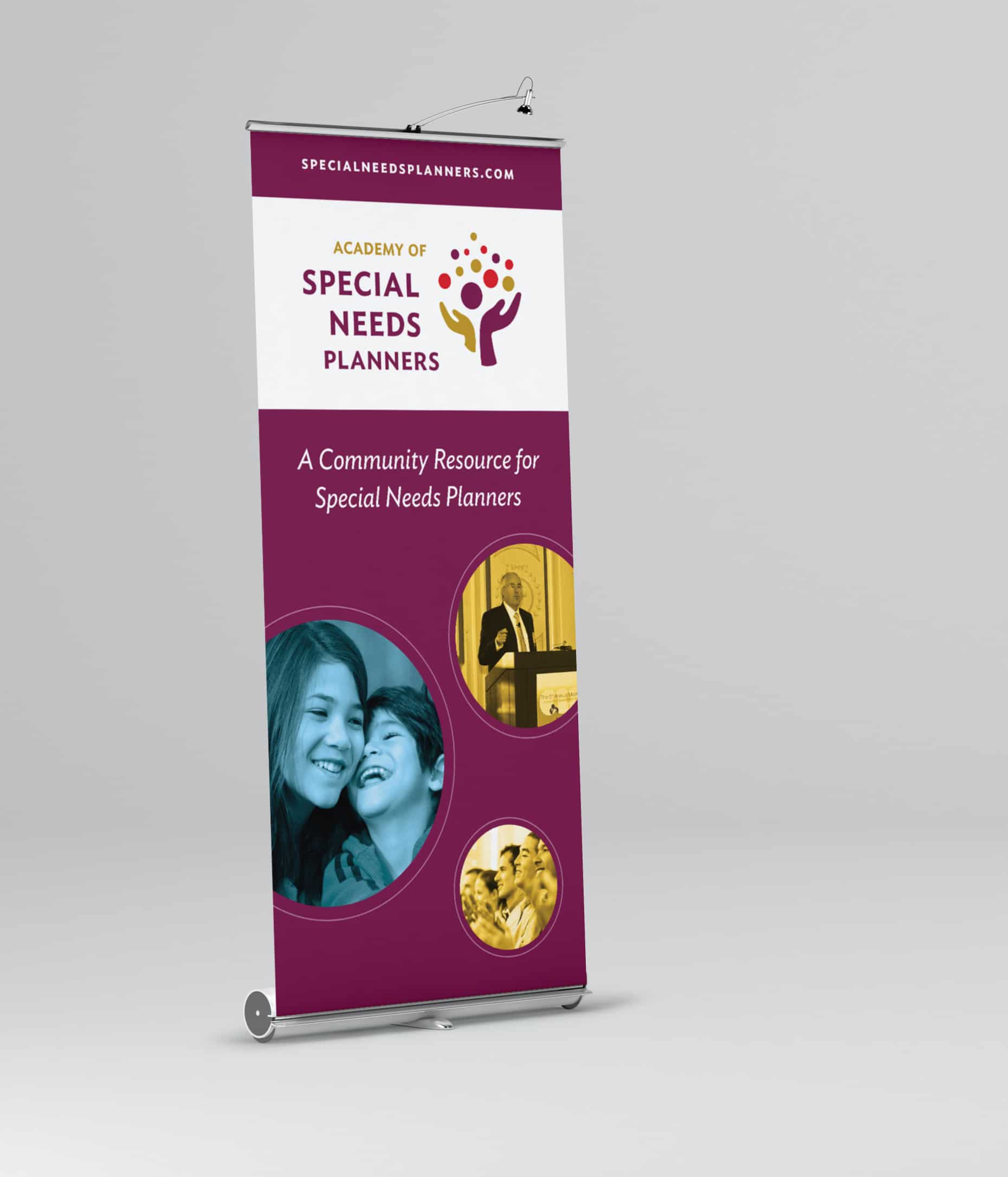
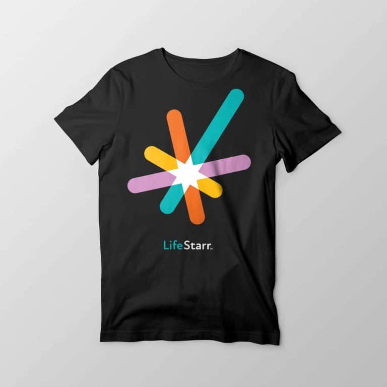
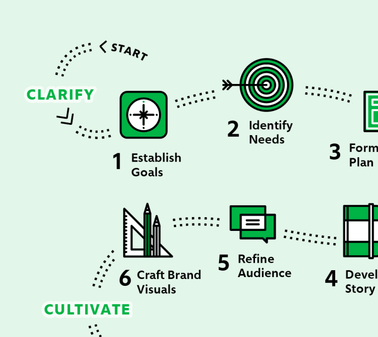
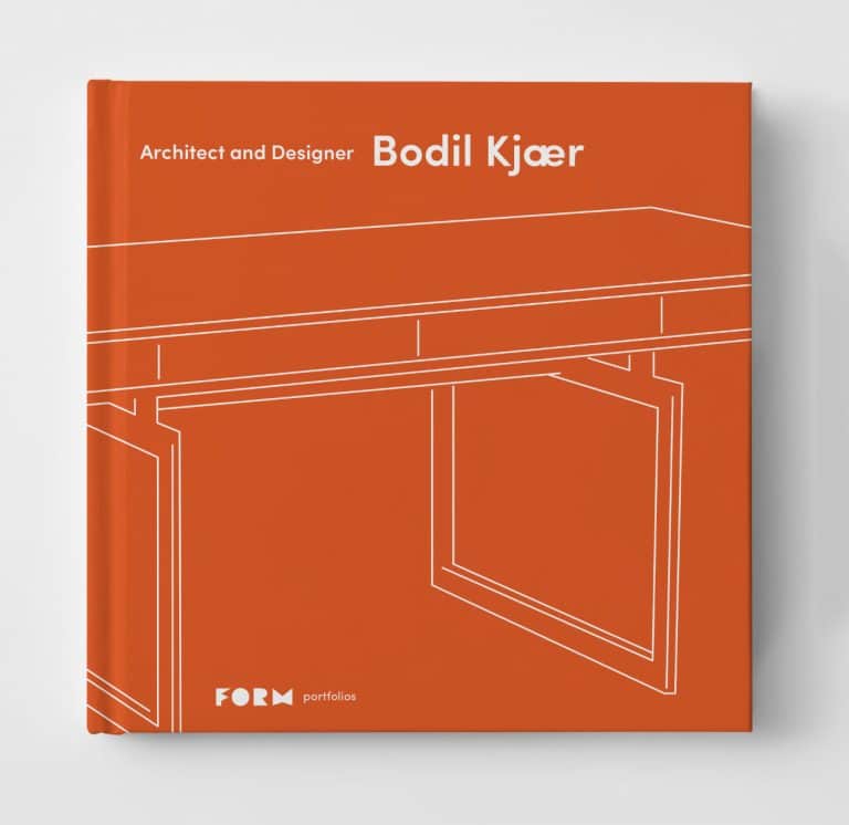
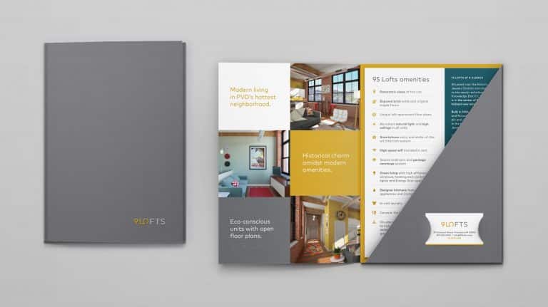
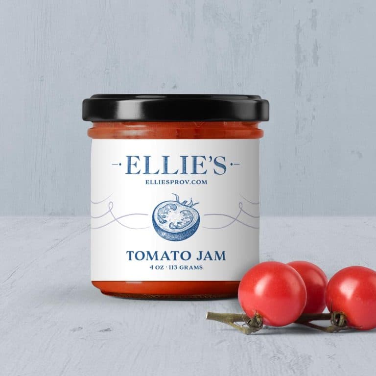
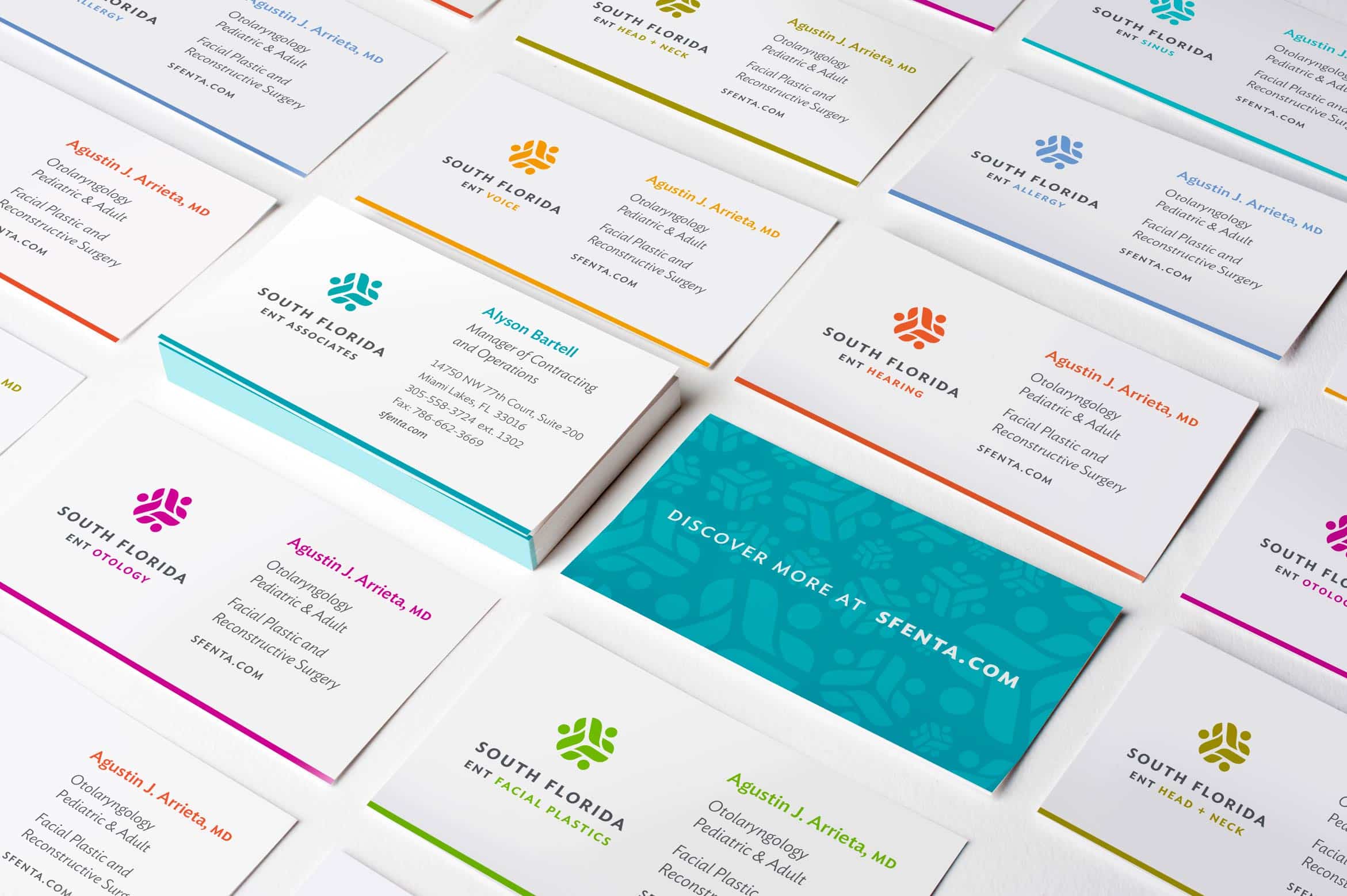
It's hard to market an unfocused brand.
Your business must tell a powerful story with strong optics and a persuasive storyline so you can stand out from the crowd and change more minds. Get a brilliant visual framework tailor-made for you.


