
Seven Tips to Increase Website Conversions
When customers connect with you, they stay with you.
Relationship building is a central part of converting leads into clients.
One key way to strengthen client-brand relationships? A well-designed website.
Attracting website traffic is an achievement in and of itself. Don’t waste the opportunity to connect with potential customers once they land on your page.
Design your website so leads can engage and take action seamlessly. Here’s how.
- Know your prospect’s pain points.
What does your prospective customer struggle with? Is it stress? Isolation? Physical pain? Do they feel overwhelmed, or sleep-deprived? Maybe they feel stagnant in their business, directionless in their personal life, or frustrated with a certain task.
Regardless of what struggles characterize your target audience, people are on your site because they’re looking for a solution.
This is where you come in.
You’re the answer to your customer’s problem. This means that if they don’t take you up on your offer, their problems will persist. By focusing on what is at stake for your client, you can tap into your customer’s emotions, explain your value in the process, and more easily get them on board.

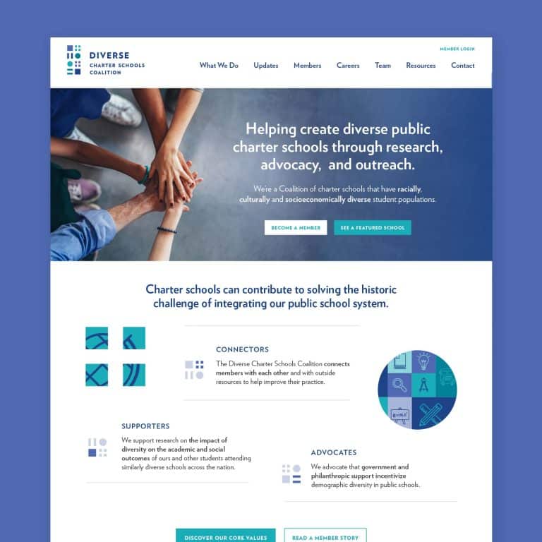
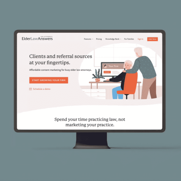
- Create a compelling opening statement.
Once you can articulate their pain points, design your messaging around them.
The first thing that prospects want to know when they land on your website is what you do. Next, they’ll ask “how does this connect to my needs?”
Don’t leave your leads guessing; instead, craft a clear opening statement that includes both what you do and how you can make their lives easier.
By showing up as their solution, you’re one giant step closer to making the sale.

- Nudge people towards action.
If you want people to take action, be as specific as possible with what you want them to do next.
Avoid the most common call to action (CTA): “learn more.” Though this phrase is a catch-all, it’s passive and vague, and it leaves visitors unsure of what the next step is. And uncertainty is lethal.
There are many strong, clear CTAs that you can incorporate on your website. Some common examples of effective CTAs include:
- Book now
- Get the guide
- Schedule your free consultation
- Get access
- Join the waitlist
- Get certified now
- Buy a membership
Be sure that your larger plan for customer onboarding (the steps they’ll take once they click that CTA button) describes exactly what you’d like your customer to do, when they should do it, and how to go about doing so.

- Repeat, repeat, repeat.
Captivating a prospect’s attention takes time, effort, and persistence. In order to capture someone’s attention and drive them to action, you’ll need to share your call to action consistently.
Here are a few tips:
- State your CTA at the top of the page and at the bottom of each webpage.
- Weave your CTA into the content several times with a catchy offer or title.
- Leave a gap in between each CTA mention so it doesn’t seem too repetitive.
- As you lead into the final CTA, add some descriptive language directly connecting the action item to your customer’s pain point.
An effective CTA takes strategic thought. But if all else fails, remember this: any CTA is better than no CTA (your website will be more useful than most if you have one!).

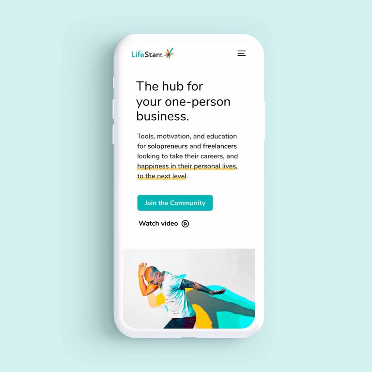
- Go easy on the eyes.
Winning over clients online isn’t just about what you say. The visual experience that accompanies your offer, all the way down to the super-small details of how your text is spaced on the page can make the difference between you looking like a distant possibility and a sure bet.
Some tips:
- DON’T include long paragraphs or blocks of text on the homepage.
- DO break your copy up into shorter, more digestible chunks.
- DON’T center large blocks of text.
- DO left-align your content.
Even by making these small adjustments, your content will become much easier on your visitors’ eyes. This will allow them to digest your content with some healthy mental space. And they’ll associate your brand with clarity, trustworthiness, and refinement.

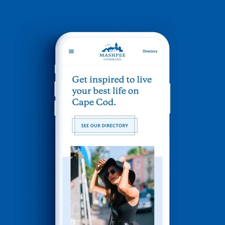
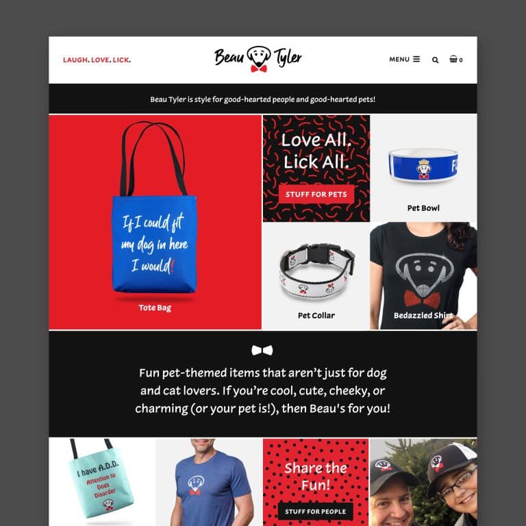
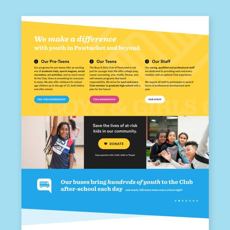
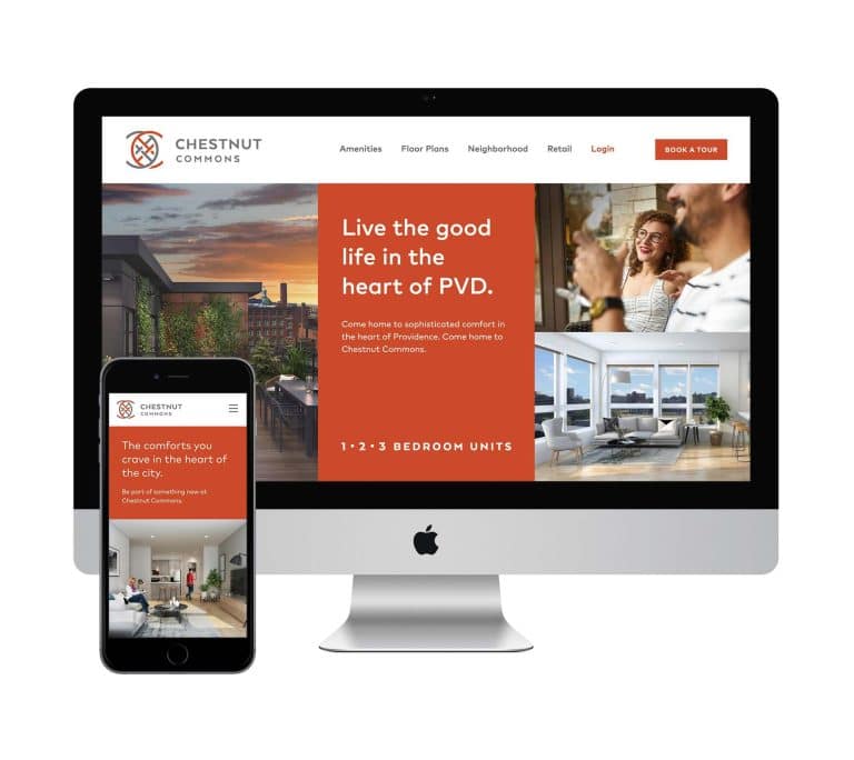
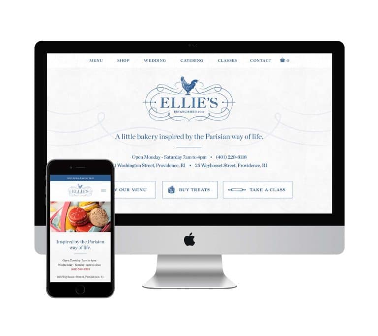
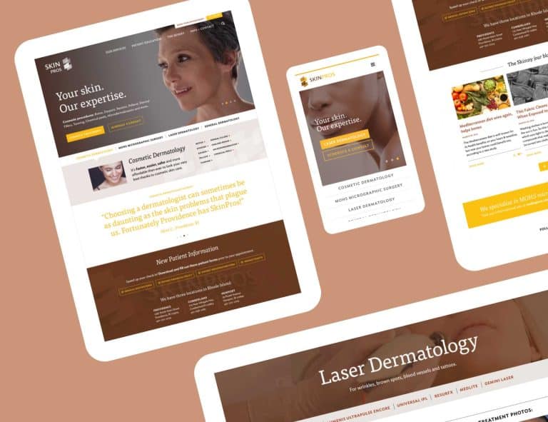
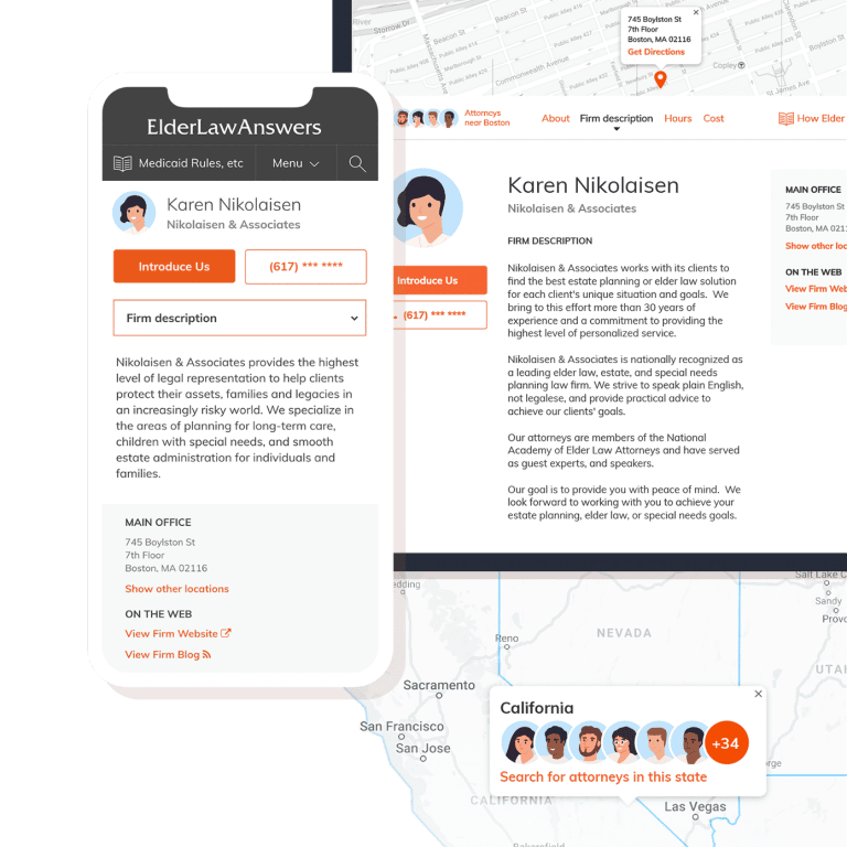
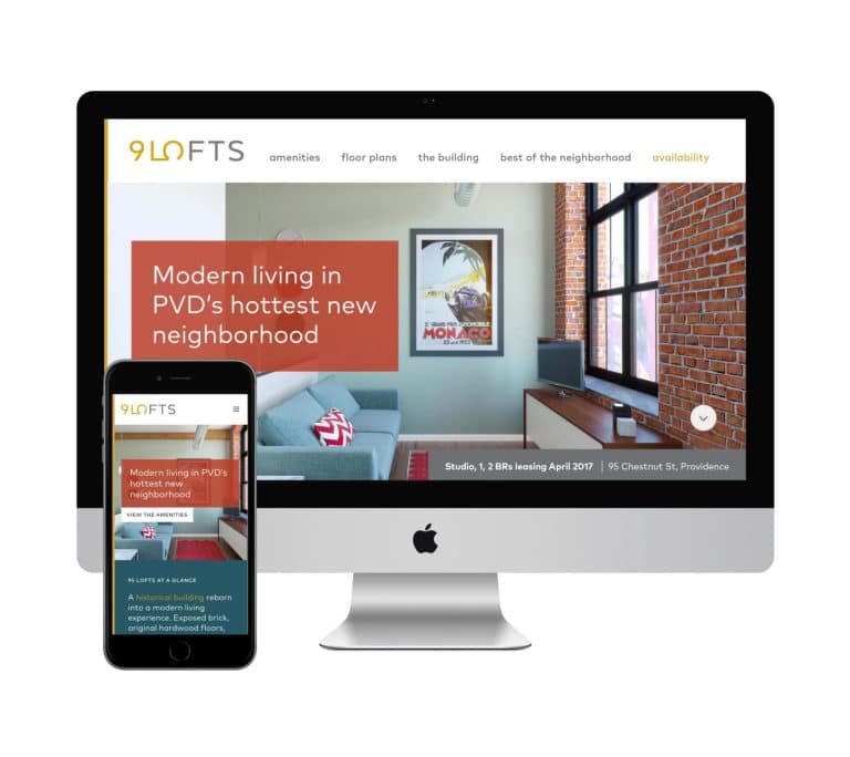
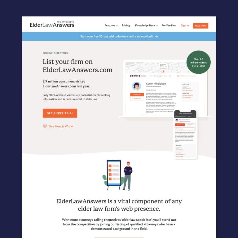
- Use an effective visual layout.
In addition to how your copy is formatted, your visual layout is critical to your visitors’ website experience. The execution of these design elements either pulls someone closer to your brand or pushes them away.
My recommendations:
- Focus on light and dark contrast in all aspects of your design: your colors, how you arrange different sections, and where large images are placed.
- Ensure that, while varied in their layout, each section connects style-wise in a small or obvious way with the other areas of the site.
- Divide up paragraphs and lists with images, short testimonials, and other visual elements.
When someone lands on your website, studies suggest that you have 3 to 5 seconds to get their attention.
Designing your website effectively means visitors will stay on your website, read and appreciate your value proposition, and ultimately decide to work with you over the next guy or gal that has a busy, unclear, or cool-but-confusing website.

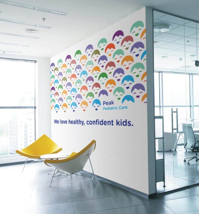
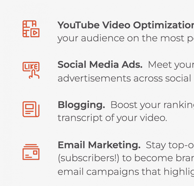
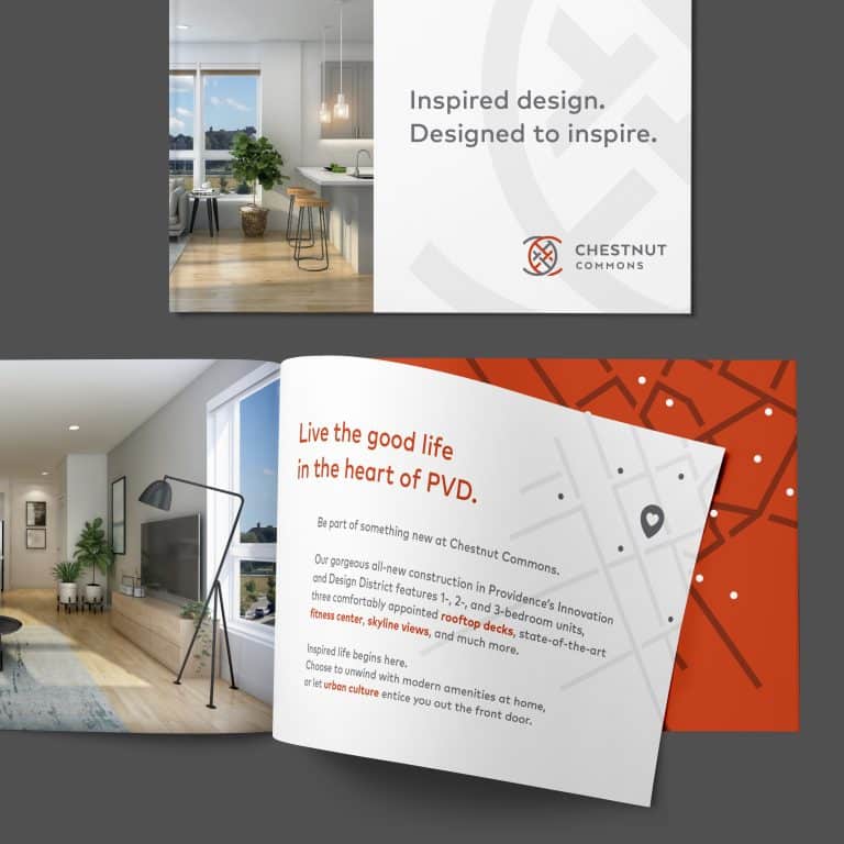
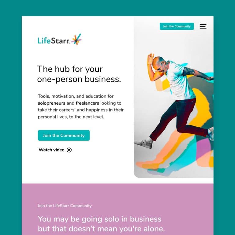
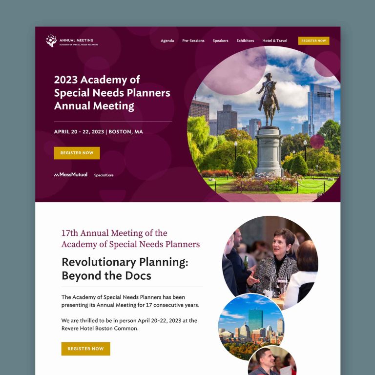
- Brand-enhancing graphics.
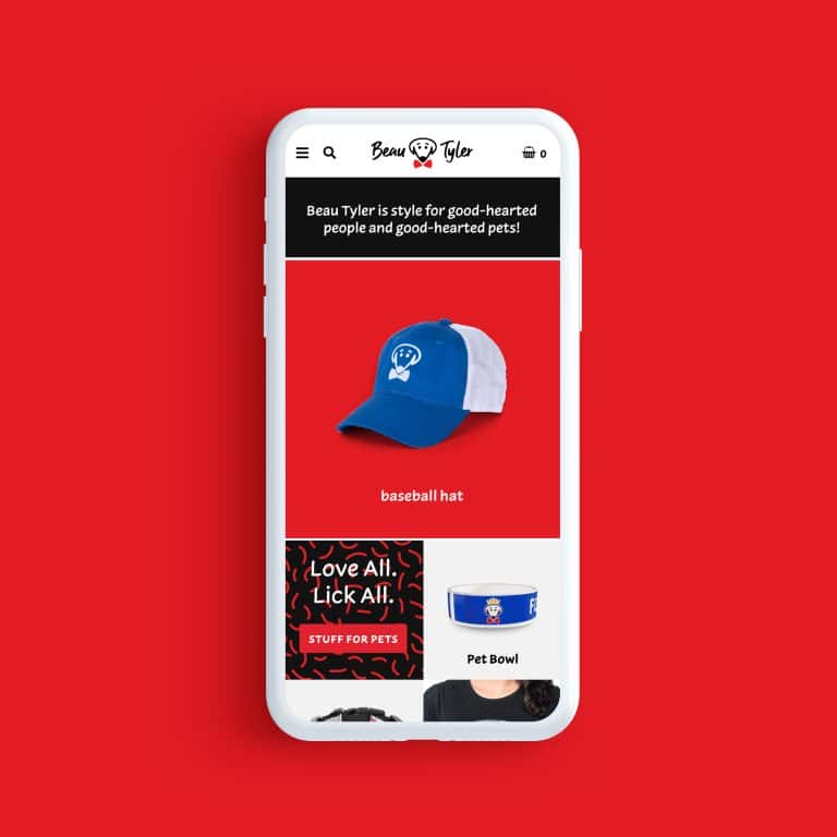
Authenticity is vital with the images you choose for your website. Rather than using generic stock photos, take time to curate images that enhance your brand’s color palette, style, and personality.
Details like matching color in your stock photos to your brand color may feel trivial, but they aren’t. In fact, the small things that you pay attention to send a subtle message to your audience about your value: you clearly care about every detail of their need and have invested in showing up in an authentic and polished way for them.
Once your audience knows this, they’ll begin to trust you, and ultimately want to work with you.


A website design that’s backed by a well-thought-out strategy leads to conversions. While the average website might land you the occasional connection, an exceptional one will get you ahead of the competition and result in a consistent flow of clients: today, tomorrow, and every day.
Do you want to work with a visual design partner who’s committed to helping you increase conversions with just the right nuance?
Grab my start guide to see if we might be a good fit.
Key Takeaways:
- A well-designed website leads to conversions. By implementing a well-considered design strategy, your prospects can easily understand what you can help them with and how they can take action.
- Focus on how you can make your customer’s life easier. Above all else, your customer is looking for their needs to be met. Use your website design to show how you can solve the problem at hand.
- Repetition leads to results. A well-designed site consistently speaks to your call to action, both in your copy and visuals.
- Create a sense of ease. Make sure that your website is easy on your customers’ eyes – and their brains. Prioritize clarity.
- Most brands have average websites. Don’t let that be you! Get out ahead of your competition by working with a design partner to take your brand to the next level.

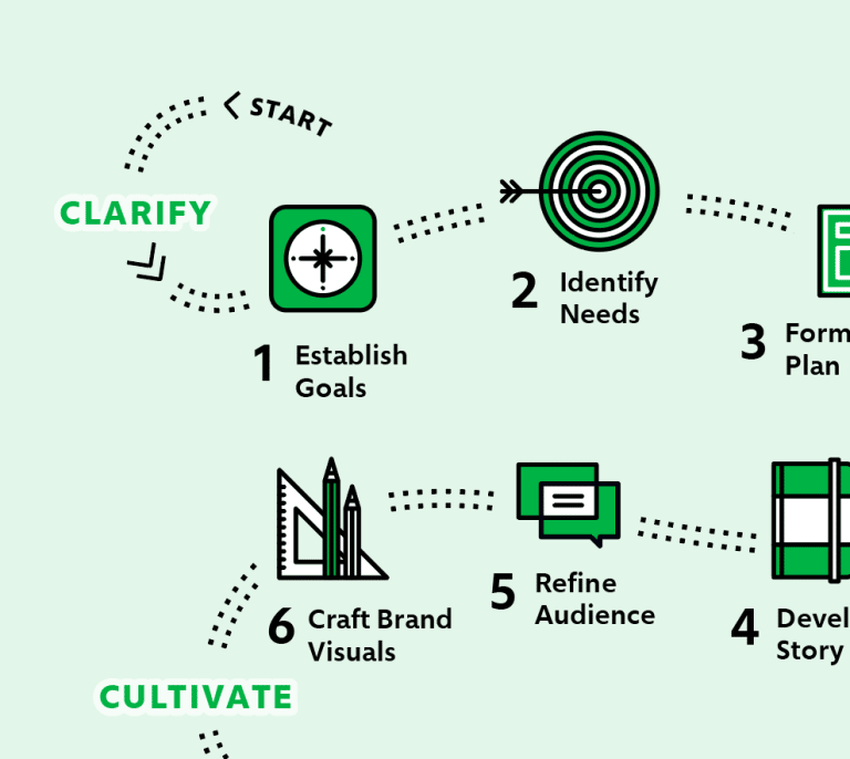
It's hard to market an unfocused brand.
Your business must tell a powerful story with strong optics and a persuasive storyline so you can stand out from the crowd and change more minds. Get a brilliant visual framework tailor-made for you.


