
3 Above the Fold Examples that Convert Visitors into Customers
Even in a search-driven world, your homepage is still king.
That means the content visitors see first on your homepage before they scroll, also known as the ‘above the fold’ area, is the most important for you to get right.
A first-time visitor to your website should almost feel like they’re being ushered into a gorgeous house by a host with a plate of mouth-watering appetizers. Then, they’re taken deeper into your site and toward your call to action (CTA).
If you strike out with your above the fold content, potential customers will just search somewhere else for a solution to their problem.
If you hit it out of the park, though, they’ll spend more time on your site and click your CTA – whether it’s to make a purchase or sign up for a free trial, download an e-book, or book a consultation.
{Go deeper: See my post on what makes an awesome above the fold area on your website.}
Here are three examples of websites that use their above the fold space effectively to drive visitors to their CTA (and make more money as a result).
Bright colors and bold text inspire confidence
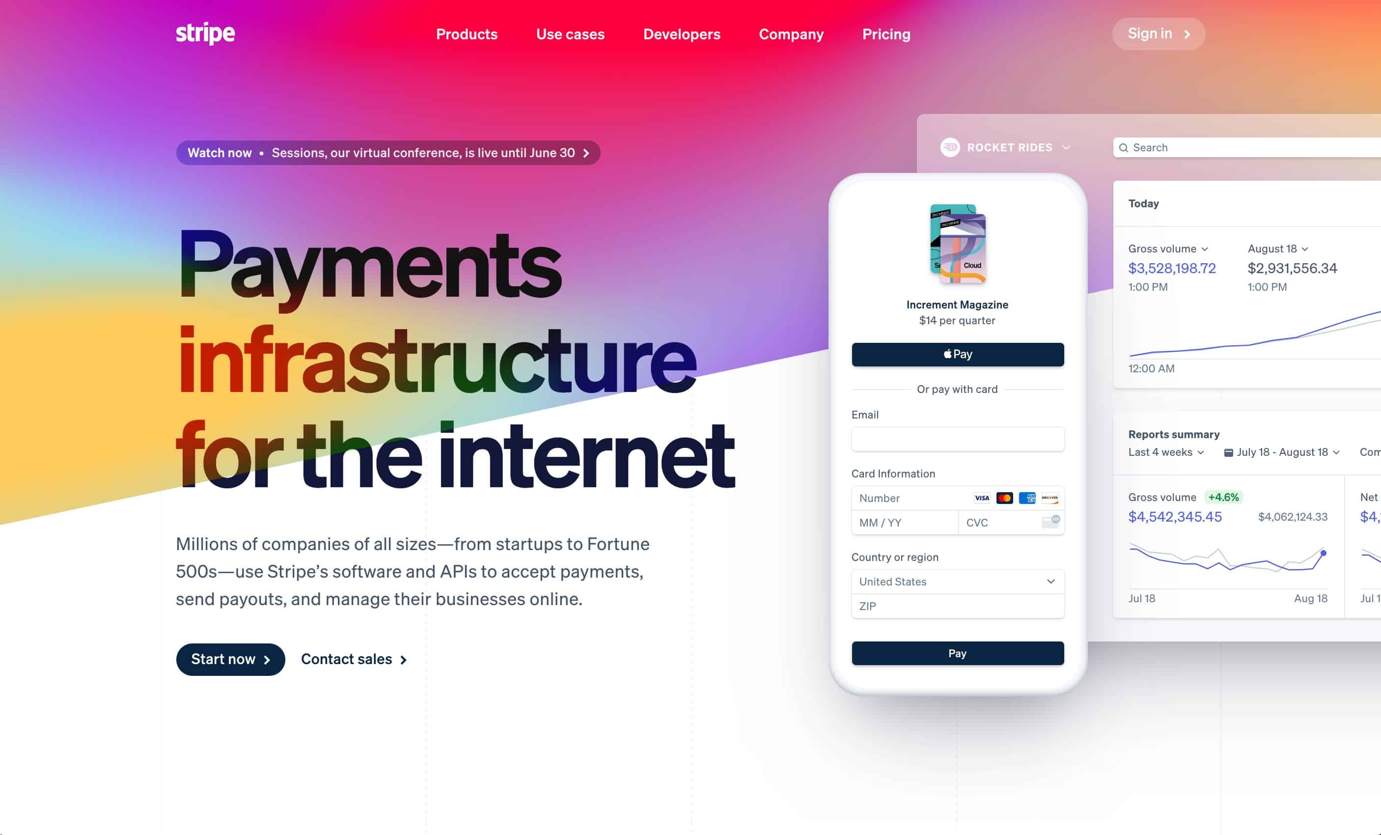
Stripe.com immediately lets you know exactly what they do and how they do it.
The use of bright colors together with a short, sizable headline creates an engaging and calming experience that directs your eye toward the product and then toward the call to action.
Sidebar: How people scan your website
When visitors land on your desktop website, studies show their eyes read your page in either a ‘Z’ pattern or an ‘F’ pattern. It’s important to keep these patterns in mind when placing content above the fold.
![]()
![]()
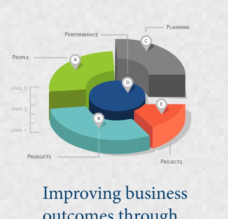
It's hard to market an unfocused brand.
Your business must tell a powerful story with strong optics and a persuasive storyline so you can stand out from the crowd and change more minds. Get a brilliant visual framework tailor-made for you.
Get my best tips every month.
Generally, it’s best to have only one CTA, but Stripe shows that it’s possible to have a primary CTA (Start now) and secondary call to action (Contact sales) to meet the needs of customers in different parts of the sales journey.
Why this design is a winner:
- The clear headline leaves no question about what the service is.
- One short sentence below the headline keeps the reader moving to the CTA.
- There’s a primary call to action with a subtle secondary call to action.
- Simplicity lets the product speak for itself (no tacky or trendy stock photos here).
Messaging and video spotlight customer experience
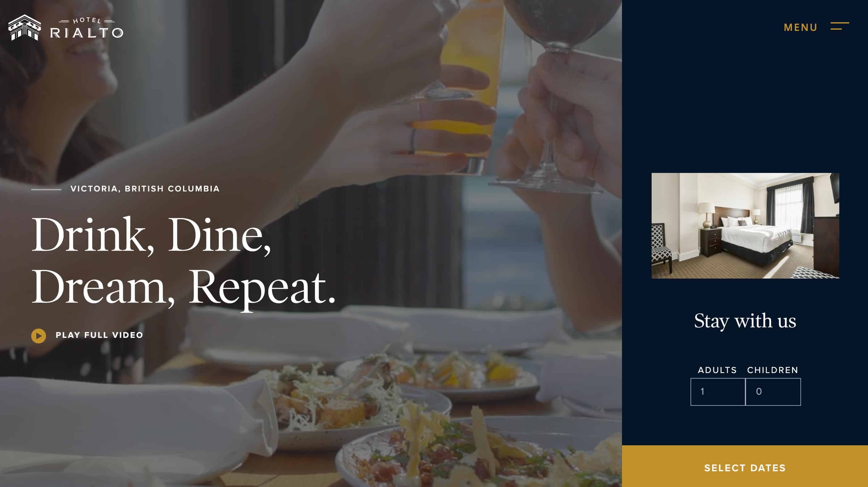
Rialto Hotel speaks directly to the customer benefits right in their headline (you can relax here).
The wording is playful but effective, and the video does the heavy lifting of showing this is a hotel where you’ll receive top-notch service.
The CTA invites you to book immediately without having to scroll or leave the page. This ‘get it done in one shot’ approach works well with general consumer services where the product and the buying process are already familiar to the customer.
For a niche product or service that requires a bit of showcasing and explaining, however, this ‘all in one’ setup may prove ineffective because the customer will need to discover more before they can commit.
Why this design is a winner:
- A headline with clear customer benefits.
- The primary CTA to book a stay (select your dates) is in a color that stands out on the page. The secondary CTA is to watch the video, and this captures customers not yet ready to book.
- The video is experiential and helps customers imagine themselves at the hotel. This might not be as effective with just an image.
- An opaque layer of dark color over the video makes the headline pop beautifully.
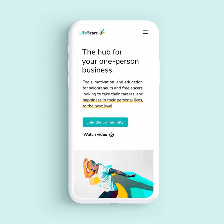
Minimalism and visuals build trust
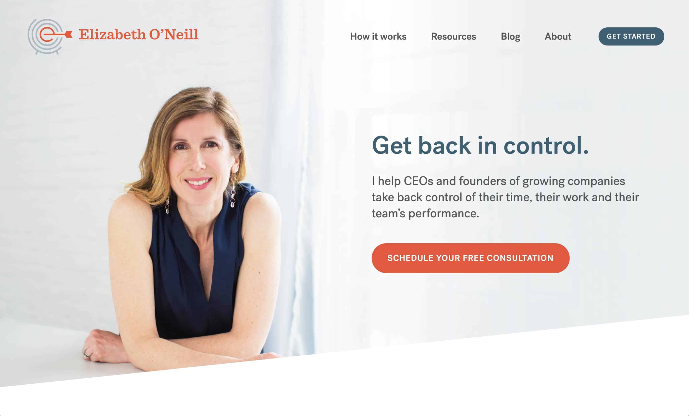
The power of this above the fold design for Elizabeth O’Neill is in its simplicity.
It’s intentionally minimal because it’s meant to reach CEOs and founders who are constantly being pitched and sold to.
The clean style with a simple headline and one-sentence description conveys clear confidence: You get the impression this coach is direct, no-nonsense, and has the ability to get results.
Why this design is a winner:
- Simple design and copy are inviting and helps build trust. This approach works particularly well in the saturated world of business coaching, where some people feel it’s tricky to find a credible coach.
- The photo conveys confidence. Potential clients can imagine themselves feeling at ease with someone who looks at ease themself.
- The singular CTA stands out and takes you to the same place as the ‘get started’ button in the navigation.
Now that you’ve seen above the fold examples that work, think about how you can implement these strategies on your website.
Remember, the elements of the above the fold area (including the headline, subhead, CTA button, navigation, colors, fonts, photos, and overall design) should feel like a cohesive unit. It may seem simple, but this is where a lot of businesses go wrong.
It takes work to make sure your first impression is true to your brand message.
You’ve worked hard to build your business – your digital front door can’t be an afterthought.
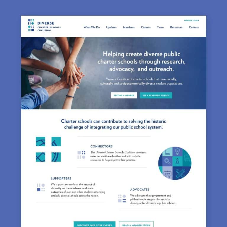
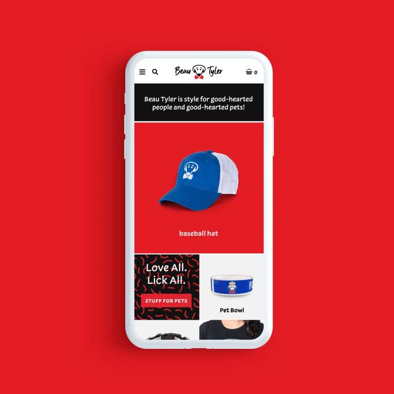
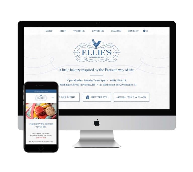
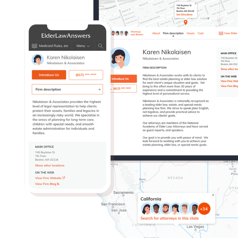
Want to see more examples of solid above the fold web design and effective, compelling visual design in other places? Take a peek at my portfolio.
I take away the homepage guesswork and carefully consider every element required for a homepage experience that delivers on your goals.
Key Takeaways:
- Clarity beats clever in the above the fold area of your homepage. Visitors should know immediately who you are, what you offer, and how you can help them.
- A headline with clear customer benefits should be front and center. Supporting text should be one to two sentences at most.
- Colors, video, photos, and the overall design should subliminally guide visitors on the journey toward the CTA. They must work together and feel connected and synchronized.
- The CTA must be above the fold. A primary CTA should be the focus through good design, with the potential for a secondary CTA.


