Stunning Examples of Fake Logos by Real Companies
As a veteran graphic designer, it is disappointing how many companies opt for “fake” logos. Don’t believe me?
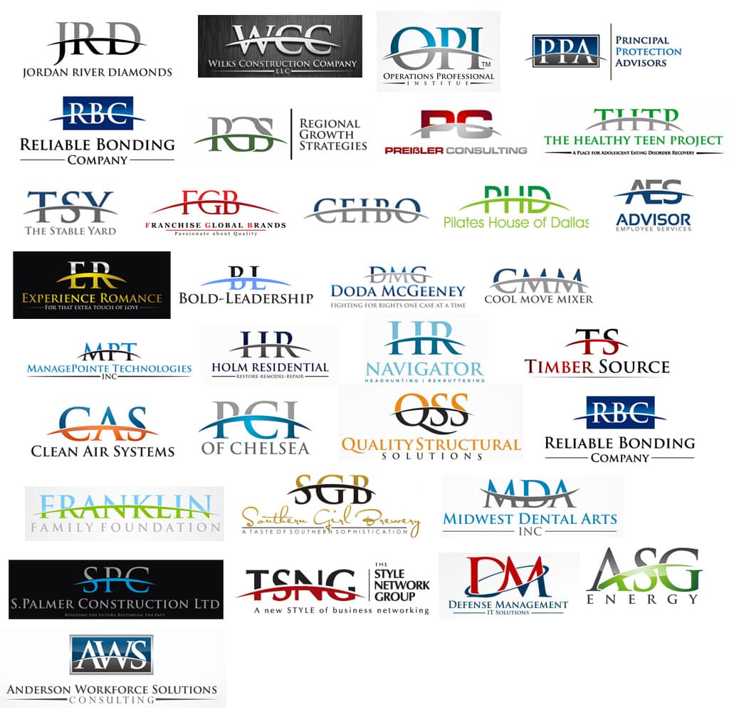
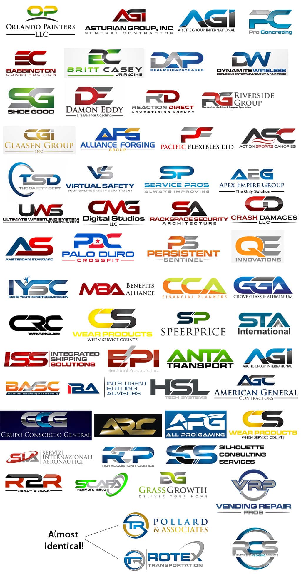
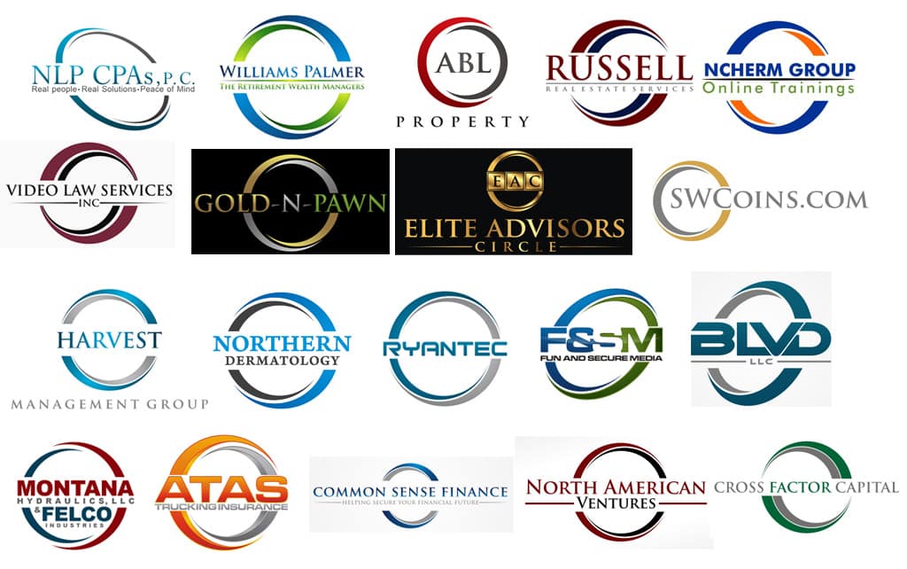
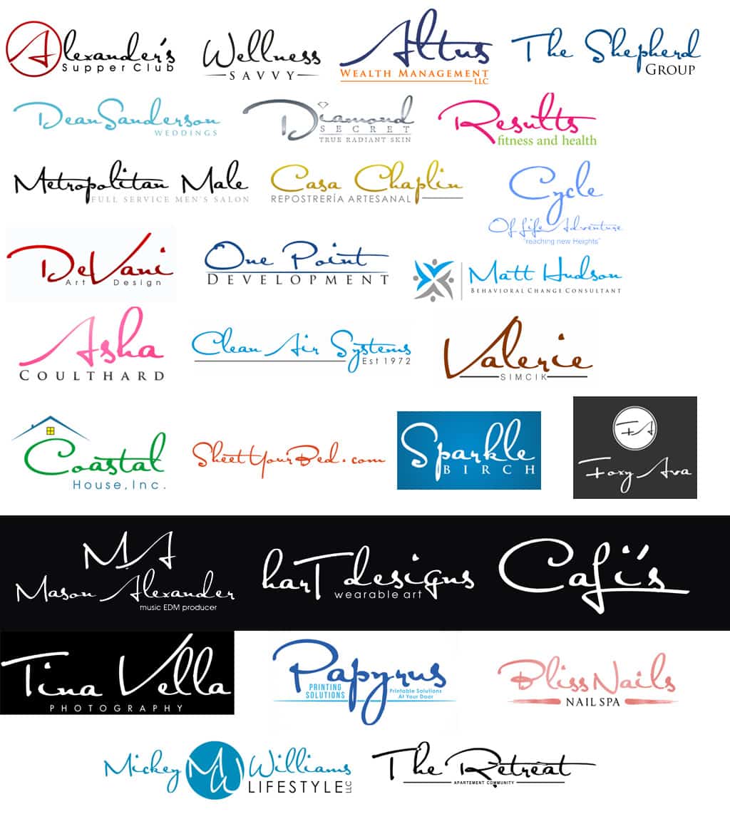
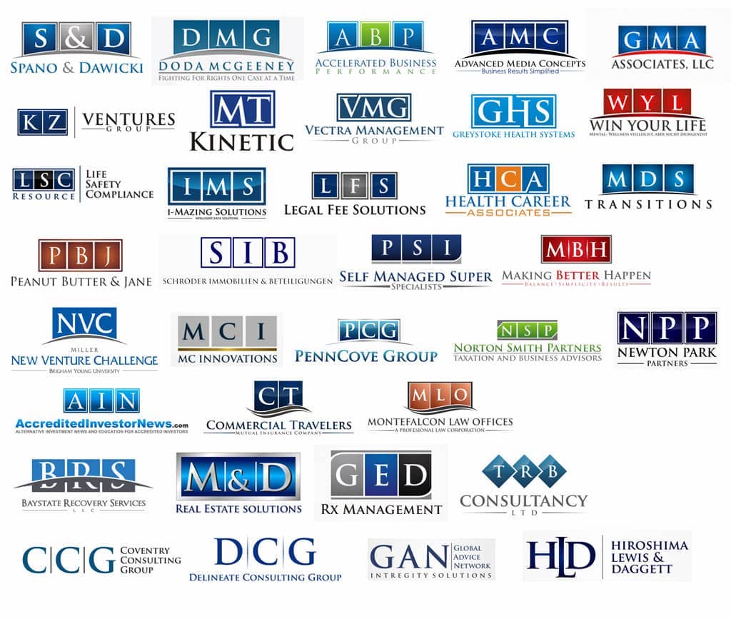
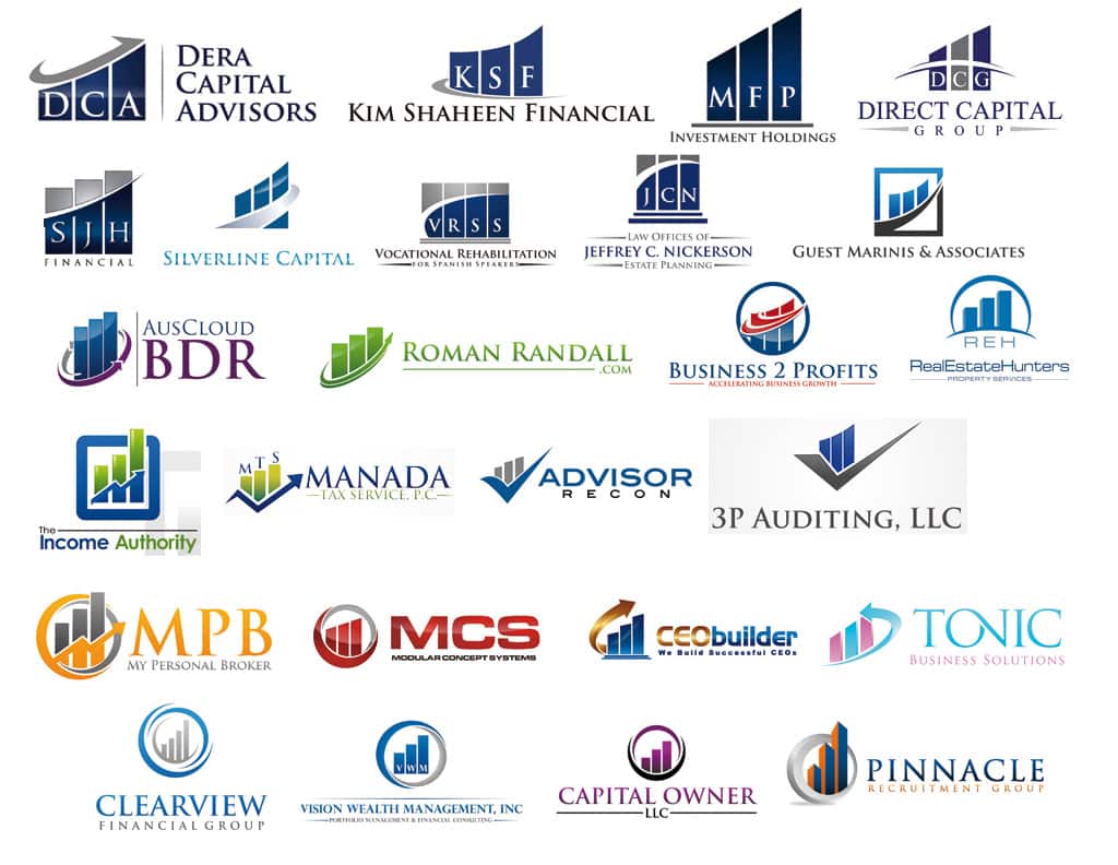
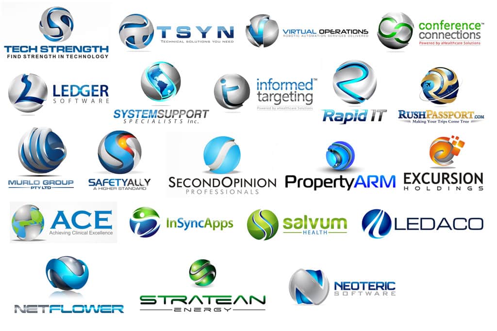
Below, you will see hundreds – yes hundreds! – of fake logos that have been used and reused with little variation. I call them fake because they fail every test of a good logo. Another name for them is generic.
A generic logo that may look “professional” on the first pass but resembles a lot of other fake logos will make your business look… meh. Generic logos lack inspiration and are, well, unexceptional. At best, they’re just OK. And while we’re talking about avoiding logo mistakes, check my fonts to avoid!
Do companies with generic logos realize “their” logo may be reused hundreds of times, across industries? Yeah, no.
So why shun fake logos, and instead pay for a truly unique logo?
Your business or organization deserves a well-designed, exceptional logo that both inspires curiosity and hints at your story. A logo that looks like it was put together with stock icons or Microsoft clip art will make your business look just like that: cheap!
Your potential customer or client may unconsciously think:
“If they didn’t take the time to craft their own logo very well, then they probably won’t take good care of my needs either.”
A capable designer will make your brand stand out from the crowd. This is one instance where you do NOT want to blend into the crowd.
Well-crafted, distinctive branding takes trial, error, and time, and usually requires a fair amount of research, experimentation, and discovery. This process can’t and shouldn’t be squeezed into a few hours or even a couple of days.
Most of my logo projects take 3-5 weeks to complete, but at the end of that time, I know each one of my clients is very happy with the time and money they’ve put into creating their logo. I know my clients are happy because I physically spend time with them discovering as much as I can about their special way of doing business.
Still not convinced that fake logos are a severe disservice to any company that uses one?
Below, I have shared the original blog post (lightly edited) by GT Graphics, which offered to share their post in exchange for attribution (hence the link). Without further ado, get ready for more generic, fake logos than you’ve likely ever seen before!
a note from GT Graphics
Generic and overused logos (avoid them!)
In the world of creative communities, a customer launches their project (for logos, corporate identities, banners, websites, etc.) and designers respond with their proposals.
The customer, here, has the possibility to get amazing designs from creatives from all over the world and the creatives have the possibility to show their best works to all the community, creating contacts with international clients.
But, in the jungle of logo design, there is a tricky trap: the spreading of generic logos. Most of the time the logo is so generic, the customer isn’t even able to get a trademark for it.
With a generic logo (not creative, not tailored to a client’s needs) a company gives the market an anonymous image of itself, devoid of the companies identity. Because of their overused logo, the company is not able to establish their brand in the marketplace. In this way, they’re going in the opposite direction of distinguishing themselves from others (which is the whole point of having a logo).
There’s a bunch of designers who submit systematically and randomly low-quality logotypes, often made without reading the client’s brief. They are essentially phishing for wins. All too frequently it happens that these designers and generic logos win contests. Maybe the customers choose these logos because they feel familiar. What they don’t know is that the web is full of similar, clone logos. We can easily say that they’re going to be cheated.
It’s good if all the customers, who launch creative contests, know this.
These are the most overused cliches, at the moment:
This is a short collection of what you can find in some creative communities, just to give you an idea, 90% of them actually sold (!).
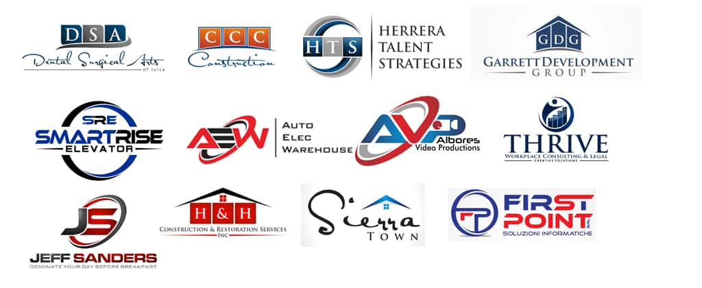
The company’s acronym cut in two colors by an arc (usually Trajan font):
The company’s acronym in “Ethnocentric” font (separated or united letters):
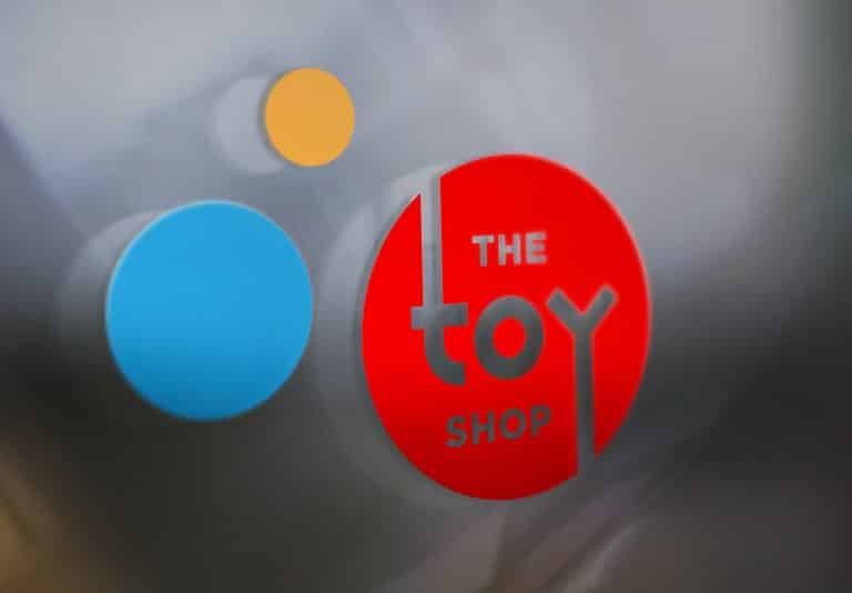
The company name within a two color circle:
Use of the font “Satisfaction”:
The company’s acronym in square boxes:
Financial graphics, towers, growth lines:
Roofs and cubic buildings:
Following, some trends that are less generic, maybe a little more quality, but overused as much as the others:
Spheres:
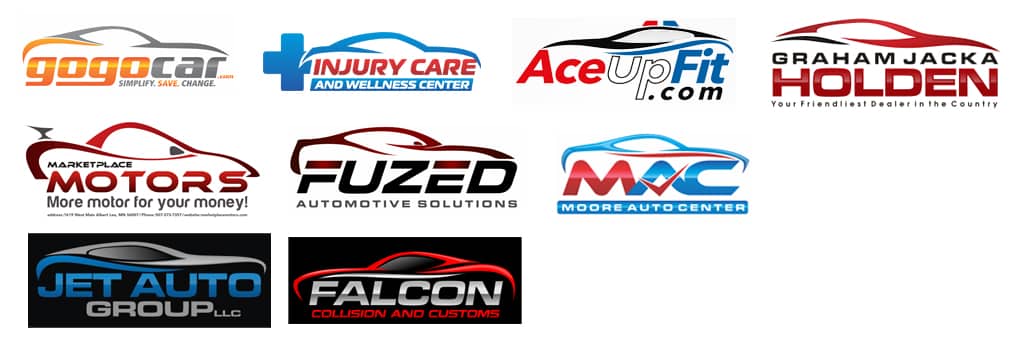
Stylized cars (all similar to a standard type):
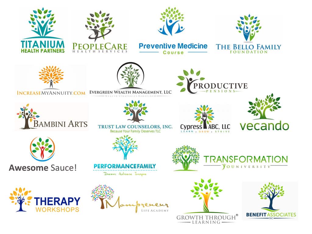
Trees where the trunks are people or hands:
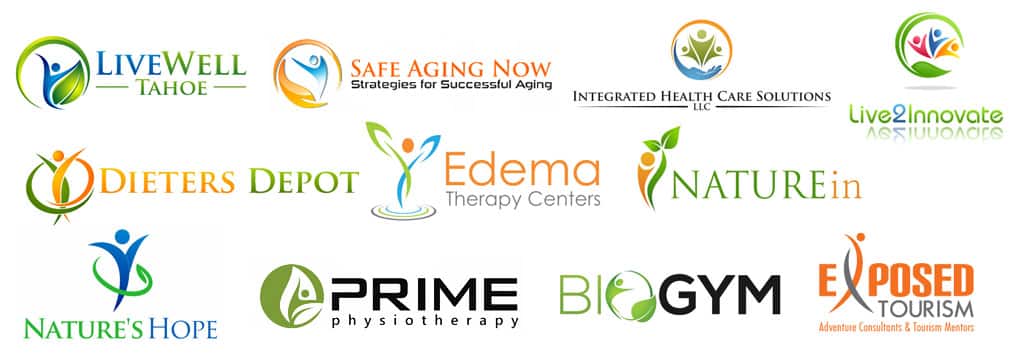
The evergreen swooshy men, V-men and leafy men:
The rainbow circle formed by stylized humans:
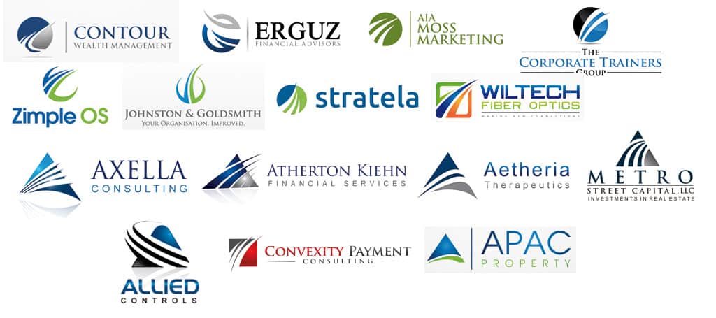
Shapes with swoosh lines through:
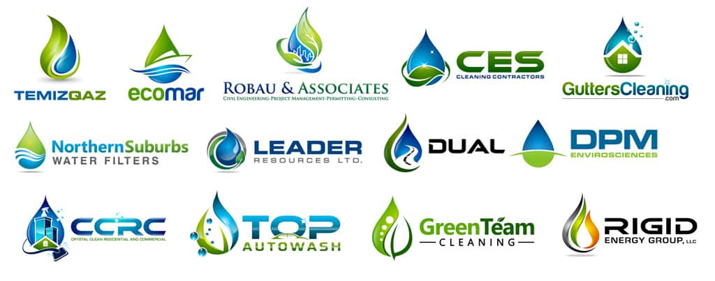
Drop shapes alone or mixed with leafs and other elements:
Linked bubbles or dots:
Gears:
And now, some examples of logos made with mixed cliches:
It's hard to market an unfocused brand.
Your business must tell a powerful story with strong optics and a persuasive storyline so you can stand out from the crowd and change more minds. Get a brilliant visual framework tailor-made for you.


